
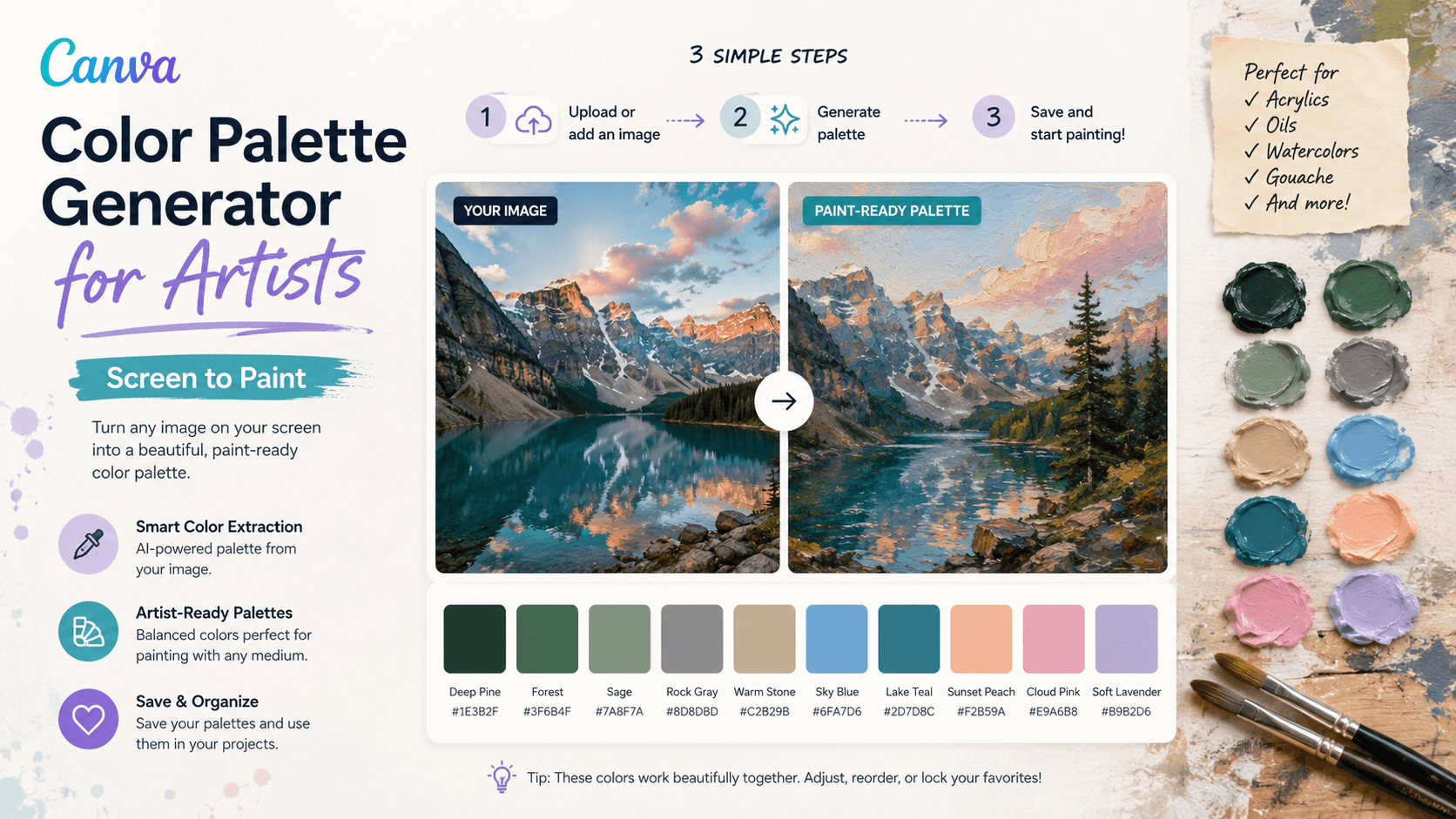
Using a Canva color palette generator for artists is one of the most effective, stress-free ways to map out a cohesive color scheme before your brush ever touches a physical canvas. For absolute beginners and seasoned traditional hobbyists alike, staring at raw paint tubes and trying to manually translate digital colors to paint can feel like an intimidating guessing game that frequently leads to muddy mixtures.
By shifting your early planning stage to a digital screen, you can completely strip away the anxiety of color theory and effortlessly design a perfect mixing blueprint for your oils, acrylics, or watercolors.
By borrowing a trick from digital design and utilizing Canva’s free visual tools, you can easily plan, simplify, and translate a reference photo into a reliable mixing blueprint for your oils, acrylics, or watercolors. Here is a straightforward, step-by-step guide to bridging the gap between your digital screen and your physical studio workspace.
Step 1: Extract Your Palette with Canva’s Photo Analyzer

Before you squeeze out ten different tubes of paint, you want to strip your subject matter down to its vital color story.
- Create a free workspace in Canva and upload your reference photo (whether it’s a landscape photo from a trip, a still life, or a unique AI-generated scene).
- Drop the photo onto your digital canvas page.
- Click on a blank area of the page, open the Background Color tile in the top menu toolbar, and scroll down to the automatically generated section labeled “Photo Colors.”
Canva instantly uses its internal color science algorithm to analyze your image and extract the 4 to 5 dominant underlying hues. This gives you an instant, uncluttered look at the core color profile of your painting, preventing you from getting distracted by minor shifts in shadow and highlight right away.
Step 2: Run the 60-Second Grayscale Value Test

A beautiful color palette will still fall completely flat on a physical canvas if the underlying values (the relationship between your lights, midtones, and darks) aren’t strong.
Before leaving Canva, select your reference photo, click Edit Photo, navigate to Filters, scroll down to Classic, and select the Greyscale filter.
Squint your eyes at the black-and-white screen version:
- Can you still clearly distinguish the major shapes?
- Is there a distinct dark anchor point, a clear midtone range, and a brilliant light highlight area?
If the image turns into a blurry, uniform block of solid gray, your values are too close together. Adjust the contrast directly in Canva until the black-and-white structure pops. If your tonal map works beautifully in gray, it is guaranteed to hold together once you bring back the paint pigments.

Step 3: Translate Digital Hex Codes to Real Paint Tubes
When you click on the swatches Canva extracted, you will see a six-character alphanumeric string called a digital Hex Code (e.g., #002366). While computer monitors display colors using additive light (RGB), physical paint behaves through subtractive mixing. You cannot match a glowing screen’s neon intensity exactly, but you can match its color relationships with a tight, limited palette of core paint tubes:
| Canva Digital Tone | Closest Physical Pigment Mix Blueprint |
Deep Midnight Blue (#002366) | Ultramarine Blue mixed with a tiny, pin-prick scoop of Burnt Umber. |
Warm Golden Glow (#E5A93C) | Base of Yellow Ochre lightened with a dash of Titanium White. |
Rich Shadow Earth (#4B3621) | Raw Burnt Umber or a rich blend of Ivory Black and Yellow Ochre. |
| Muted Spring/Olive Green | A natural earth combination of Yellow Ochre and Ivory Black. |
Olly’s Pro-Tip: Remember that less is always more. Restricting yourself to a limited palette of 3–4 foundational color tubes plus white unifies your art effortlessly, ensuring it’s mathematically impossible to create a jarring, discordant color balance.
Step 4: Arrange Your Physical Palette to Match Your Screen

Now that you have your digital color swatches mapped, clean off your physical glass or wooden handheld palette. Replicate Canva’s orderly layout in real life:
- Squeeze your pure target mixing elements (like your white, earth tones, and primaries) along the outer perimeter edges of your palette board.
- Keep the large expansive center area entirely open and clean for active paint blending.
- Dedicate a small visual corner spot to pre-mixing small puddles that mimic the exact dominant color squares Canva extracted for you.
By preparing these master color pools ahead of time, you don’t have to break your creative workflow or battle wet-on-wet drying times frantically trying to fix a color right on the canvas area.
Unleash Your Colors Safely!
Using digital design resources to simplify complex real-world steps is an excellent way to bypass rookie frustrations and build genuine creative confidence. The next time a reference photo catches your eye, let pixels plan the path before your paintbrush takes the leap!
Have you successfully translated a digital color match over to an artwork? Squeeze out your paint tubes, test your palette out, and make sure to post a picture of your completed projects on X with #prominentpainting so we can celebrate your layout triumphs together!
Want to sharpen your core color theory skills further? Check out our interactive Color Palette Generator for Artists Tool to find your medium’s perfect complement values in one single click!

Olly
Olly Farmer M.Sc, B.Sc, PGCE 25 years experience of Watercolor Painting and AI Art; teacher for 13 years; Creator of Art Tools; Art Gallery Contributor of Art Articles to Medium.com, LinkedIn and Facebook
Continue exploring
PROMINENT PAINTING
Keep your creative momentum
Get new painting guides, practical techniques and artist stories delivered without the noise.
Occasional emails. Unsubscribe whenever you like.