
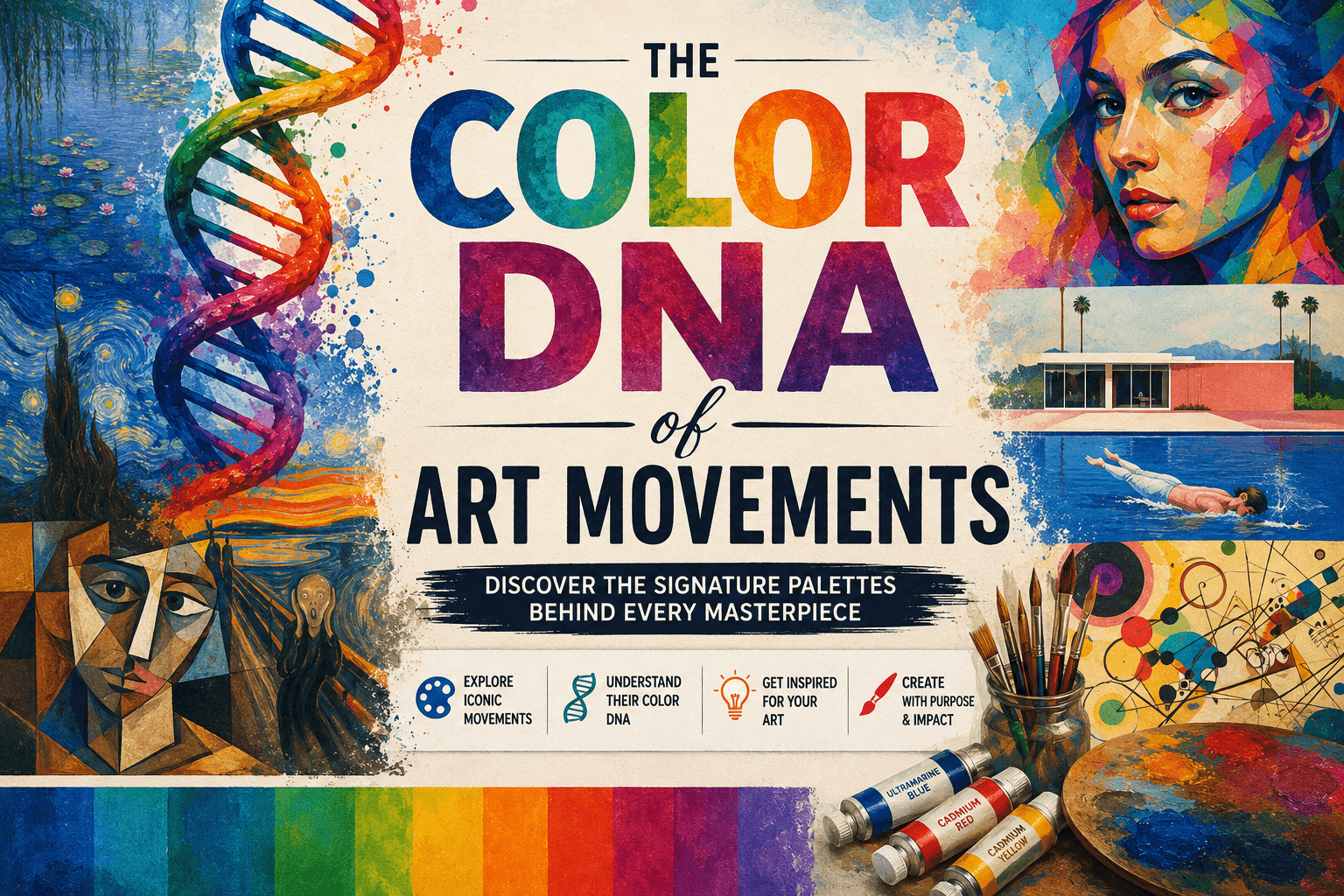
Summary: Every art movement has a unique color palette that defines its style and mood. By understanding these color combinations, you can unlock new creative possibilities in your own artwork. This guide explores the historical color palettes of major art movements, helping you mix shades with confidence. Read on to master these classic palettes and elevate your painting journey today.
You stand before a blank canvas, staring at tubes of paint. Choosing a color palette feels overwhelming, but history has already done the heavy lifting for you. Every major art movement carries a distinct color DNA. These historic color combinations did not happen by accident; they emerged from the technological limits and emotional revolutions of their time.
By looking back at the palettes of the masters, you can instantly bring structure to your own work. Understanding color theory basics is a brilliant starting point, but exploring history shows you how those rules come alive. This guide will break down the color secrets of four iconic eras. We will show you exactly how to replicate their iconic mixes, even if you are just starting out.
What is the Color DNA of an Art Movement?
The color DNA of an art movement is the specific group of pigments, tones, and contrast levels that define its visual style. These palettes were shaped by the chemical availability of historical pigments and the emotional or structural goals of the artists.
Analyzing historical palettes reveals a lot about studio practices across different eras. For centuries, artists were bound by what they could physically grind in their studios. This meant their choices were dictated by chemistry, trade routes, and geography. As new elements were discovered, entire movements blossomed overnight. When you learn to spot these color DNA fingerprints, you stop seeing old paintings as random collections of images. Instead, you see them as deliberate, beautifully limited color systems that you can borrow for your own artwork.
| Art Movement | Key Pigments & Hues | Core Visual Impact |
|---|---|---|
| Renaissance | Earth Ochres, Lead White, Lapis Lazuli | Deep Shadows, Rich Drama |
| Impressionism | Cobalt Blue, Chrome Yellow, Mauve | Shimmering Sunlight |
| Fauvism | Unmixed Cadmium Reds, Pure Orange | Raw Emotional Energy |
| Pop Art | Primary Cyan, Magenta, Yellow | Graphic, Commercial Punch |
Shifting Brightness: From the Renaissance to Modern Eras
Old Master painting methods relied on slow construction and dramatic darkness. Renaissance artists did not paint on raw white surfaces. They built deep shadows first, often utilizing earth-toned verdaccio underpainting techniques to map out values before adding rich glazes on top. Their studios used dark pigments like bone black, which was manufactured by burning animal bones in air-free chambers.
The evolution of painting colors took a massive leap when industrial chemistry arrived. Suddenly, artists were freed from the earthy, muted tones of the past. Industrial manufacturing replaced toxic old standards like Lead White and introduced brilliant synthetic options. This shift completely flipped the painting process upside down. Painters abandoned dark, multi-layered underpaintings and started working directly on bright backgrounds.
How Did Impressionist Artists Paint Light?

Impressionist artists captured light by using a vibrant, high-chroma palette of pre-mixed tube paints, completely avoiding black. They applied contrasting, pure colors directly to a bright white canvas to mimic the shimmering, prismatic effects of outdoor sunlight.
The invention of the tin paint tube changed everything for painters like Claude Monet. It allowed them to leave the studio and work outdoors. They wanted to unlock the secrets of Impressionist light, so they stopped mixing colors on their palettes. Instead, they placed strokes of pure, complementary colors directly side-by-side on the canvas.
They were heavily criticized for this choice. In fact, critics accused them of having a disease called violettomania because they used so much Manganese Violet. They also embraced vibrant greens like Paris Green to build outdoor scenery, completely unaware that the copper and arsenic mix was highly toxic. To paint like an Impressionist, throw away your black paint entirely and mix your shadows using deep blues and warm purples.
The Wild Palettes of Fauvism
At the turn of the 20th century, a group of artists completely broke the link between color and reality. This radical shift defined the Fauvism movement, where creators used color for pure emotional impact rather than description. If they wanted to paint a sky orange or a human face bright emerald green, they did it without hesitation.
Led by Henri Matisse, these artists became known as the wild beasts of the art world. They squeezed pure, unmixed pigments straight from the tube onto the surface. They championed flat forms and highly provocative combinations. If you want to use the Fauvist DNA, stop worrying about what color your subject actually is in real life. Pick your colors based on how you feel, use high saturation, and let your brushstrokes remain raw and visible.
What Colors Defined Pop Art?
Pop Art used a primary palette of bold, highly saturated colors like hot red, canary yellow, and vibrant blue. These eye-catching hues directly imitated the commercial inks used in mid-century advertising, comic book printing, and mass production.
Artists like Roy Lichtenstein wanted their work to look like it came off a printing press, not from an elite studio. He carefully selected colors that matched printers’ inks, using precise dots to build up values. Andy Warhol used similarly intense, synthetic shades to print images of everyday objects and celebrities.
This movement stripped away the delicate blending of classical art. It replaced subtle gradients with solid fields of punchy color and heavy black outlines. You can study these essential Pop Art features to understand how simplicity builds massive visual power. For a modern Pop Art project, pick three primary colors, keep your paint layers perfectly flat, and border your shapes with clean lines.
How to Apply Historical Color DNA to Your Canvas
Stealing the color DNA of the past is not cheating; it is a timeless way to train your eye. When you limit your choices to a classic palette, you force yourself to focus on value, composition, and expression. Pick one movement from this list for your next painting session and see how it changes your workflow.
FAQs: Color DNA of Art Movements
Why did Old Masters use darker color palettes?
Old Masters relied on earthy pigments like ochres and bone black because bright, affordable synthetic pigments did not exist yet. They built up contrast slowly, using dark underpaintings to create a sense of drama and structural weight before adding color glazes.
Which art movement invented painting outdoors?
The Impressionists popularized outdoor painting during the late 19th century. This shift was triggered by the invention of pre-mixed paint in metal tubes, which allowed artists to easily transport their supplies into nature.
What is arbitrary color in painting?
Arbitrary color is the practice of choosing paint colors based on emotion or design rather than real-world accuracy. This approach was heavily championed by the Fauves, who happily painted trees red or skies yellow to create intense emotional responses.
Why did the Impressionists ban black paint from their palettes?
The Impressionists avoided black paint because they believed true black did not exist in the natural shadows of the outdoor world. Instead, they mixed complementary colors like cobalt blue and deep violet to create richer, light-filled shadow areas.
How can a beginner use a limited historical color palette?
Beginners can use a limited historical palette by picking three or four colors from a specific era and hiding all other tubes. This constraint eliminates the confusion of color mixing, naturally creates color harmony, and lets you focus completely on brushwork and shapes.
Citations:
| # | Source | Specific Insight | Section |
| 1 | Artsy History of Color in Art | Monet’s violettomania, toxic green chemical history, bone black production. | What Is Color DNA? / Impressionism |
| 2 | Winsor & Newton History of Pigments | Renaissance roasting of earth tones and lapis lazuli ultramarine value. | Shifting Brightness |
| 3 | London Art College Course of Art History | Synthetic tube pigments like cobalt blue liberating Impressionists. | How Did Impressionist Artists Paint Light? |
| 4 | C&D Fine Art Earth Colours History | The Zorn and tetrachrome restricted palettes forcing harmony. | What Is Color DNA? |
| 5 | Webexhibits Renaissance & Baroque Pigments | Italian verdaccio grounds and the slow drying properties of linseed oil. | Shifting Brightness |
| 6 | Webexhibits Chronological Pigment Order | 19th-century emerald green and cobalt violet introduction timelines. | How Did Impressionist Artists Paint Light? |
| 7 | Earth Pigments Through the Ages | Industrial paint manufacturing and the drop in pre-mixed costs. | Shifting Brightness |

Olly
Olly Farmer M.Sc, B.Sc, PGCE 25 years experience of Watercolor Painting and AI Art; teacher for 13 years; Creator of Art Tools; Art Gallery Contributor of Art Articles to Medium.com, LinkedIn and Facebook
Continue exploring
PROMINENT PAINTING
Keep your creative momentum
Get new painting guides, practical techniques and artist stories delivered without the noise.
Occasional emails. Unsubscribe whenever you like.