
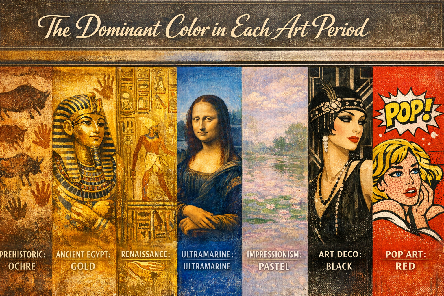
The dominant colour in each art period changed as technology and human philosophy evolved. Renaissance artists relied on earthy ochres and expensive blues, while Baroque painters favored deep blacks and dramatic whites. Rococo brightened things up with airy pastels. Finally, Impressionism exploded with vibrant, newly invented synthetic hues. Understanding these historical shifts helps artists make more intentional and confident color choices today.
Imagine trying to paint a bright summer sky, but the color blue costs more than actual gold. That was the reality for artists centuries ago. You could not simply walk into an art supply store and grab a tube of cerulean. The dominant colour in each art period was dictated by whatever materials were physically available, combined with the cultural mood of the time. You had to work with the earth you could dig up, the insects you could crush, or the rare minerals merchants brought across the world.
Our guide to color in art history explores this deeper, but the core truth is simple. Limitations force creativity. When artists only had a few pigments, they learned to master them completely. From the muted earth tones of early cave paintings to the blinding neons of modern digital art, every era has a distinct visual fingerprint. Let us look at how these palettes evolved over time. Understanding this timeline is not just a history lesson. It is a secret weapon to help you build better, more harmonious palettes in your own work today.
What Were the Colors of the Renaissance?

The dominant colors of the Renaissance were rich, natural earth tones like red ochre and yellow ochre, contrasted with brilliant ultramarine blue and lead white. These colors represented a return to classical realism and humanism.
If you are wondering what is Renaissance art, it was fundamentally a rebirth of realistic observation. Around the 1400s, the invention of oil paint allowed artists to build luminous, transparent layers. They could achieve incredibly subtle skin tones using earth pigments. However, some colors remained staggeringly expensive. Ultramarine blue, made from crushed lapis lazuli imported from Afghanistan, was often reserved exclusively for the robes of the Virgin Mary. To balance these costly brights, painters grounded their work in affordable, reliable ochres and umbers. The resulting palette felt balanced, grounded, and deeply human.
The Dramatic Palette of the Baroque Period
Baroque art was dominated by deep blacks, dark earthy browns, and highly reflective whites. Artists used this extreme contrast, known as chiaroscuro, to create intense drama and emotional tension.
As we trace the evolution of art movements, the Baroque era stands out for its theatricality. Painters like Caravaggio did not want you to just see a scene; they wanted you to feel the shock of it. They used a technique called Tenebrism, which surrounded a brightly lit subject with a pitch-black background. This required copious amounts of bone black and lead white. Lead white was toxic but unparalleled in its ability to reflect light. The colors were heavy, moody, and designed to manipulate the viewer’s eye exactly where the artist wanted it.
How Rococo Artists Brightened the Canvas
By the early 18th century, people were exhausted by the heavy religious and historical drama of the Baroque era. The Rococo movement rebelled by lightening everything up. The color palette shifted dramatically toward soft, playful pastels.
Artists swapped out bone black for light pinks, mint greens, and powdery blues. The subject matter changed from dramatic martyrdoms to aristocratic picnics and flirtatious garden scenes. This era was characterized by an overwhelming sense of lightness and grace. Painters mixed large amounts of white into their pigments to create these airy, delicate hues. It was an art style built entirely around intimacy, decoration, and joy.
Which Colors Defined the Impressionist Movement?
The Impressionist movement was defined by vibrant synthetic colors like cobalt blue, chrome yellow, and Paris green, while explicitly avoiding the use of black. They used these bright hues to capture fleeting moments of natural light.
The core characteristics of Impressionism rely entirely on modern chemistry. In the 19th century, scientists invented new synthetic pigments that were brighter and cheaper than anything previously available. Simultaneously, the invention of the metal paint tube meant artists could finally paint outdoors. They realized that shadows in nature are rarely truly black. Instead, shadows are filled with violet, blue, and deep green. Artists like Pierre-Auguste Renoir masterfully used pastels and natural light to make their canvases vibrate with energy.
| Art Period | Dominant Colors | Key Characteristics |
|---|---|---|
| Byzantine & Medieval | Gold Leaf, Ultramarine, Vermilion | Flat, spiritual, symbolic, reliance on highly expensive materials |
| Renaissance | Ochres, Ultramarine Blue, Lead White | Balanced, realistic, earthy, focused on humanism and natural light |
| Mannerism | Acidic Greens, Artificial Pinks, Icy Blues | Unnatural, elongated, tense, deliberately rebellious color choices |
| Baroque | Deep Blacks, Dark Browns, Bright Whites | High contrast, theatrical, moody, heavy use of chiaroscuro |
| Rococo | Pastel Pinks, Mint Greens, Soft Blues | Light, airy, decorative, playful, heavily mixed with white |
| Neoclassicism | Somber Blues, Muted Reds, Austere Earth Tones | Rational, heroic, subdued, a strict return to classical restraint |
| Romanticism | Deep Crimsons, Stormy Grays, Atmospheric Browns | Emotional, dramatic, sublime, focused on the wildness of nature |
| Realism | Unidealized Browns, Dull Greens, Ashy Grays | Gritty, honest, muted, a complete rejection of artistic fantasy |
| Impressionism | Cobalt Blue, Chrome Yellow, Violet | Vibrant, optical blending, explicit rejection of pure black paint |
| Post-Impressionism | Bold Yellows, Swirling Blues, Vivid Greens | Expressive, structural, highly emotive, characterized by thick impasto |
| Fauvism | Pure Reds, Wild Oranges, Unnatural Greens | Untamed, flat, explosive, using color strictly to convey emotion |
| Pop Art | Cyan, Magenta, Bright Yellow, Flat Black | Commercial, graphic, bold, mimicking mass-produced printing aesthetics |
Applying Historical Palettes to Your Modern Art
You do not need to grind your own lapis lazuli to learn from the masters. Constraining your color choices is one of the fastest ways to improve your painting. Try a Baroque exercise by painting a still life using only black, white, and a single earth tone. Then, try an Impressionist challenge where you paint a landscape without using any black paint at all.
Limiting your options forces you to focus on values and relationships rather than relying on the crutch of a massive paint collection. Pick a period from history, adopt its palette, and see how it transforms your next blank canvas.

Frequently Asked Questions
What was the most expensive color in the Renaissance?
Ultramarine blue was the most expensive color during the Renaissance. It was made from ground lapis lazuli imported from Afghanistan and often cost more than gold. Artists typically reserved it for the most important religious figures.
Did Baroque painters use black paint?
Yes, Baroque painters used extensive amounts of black paint. They heavily relied on pigments like bone black to create dark, shadowy backgrounds that made the brightly lit subjects pop out dramatically.
Why did Impressionists stop using black?
Impressionists stopped using black because they observed that shadows in the natural world are rarely pure black. They preferred to mix complementary colors, like blues and purples, to create rich, luminous shadows that captured the feeling of real sunlight.
What is chiaroscuro in art?
Chiaroscuro is an Italian term meaning “light-dark.” It refers to the strong, dramatic contrast between light and shadow in a painting. This technique was perfected during the Renaissance and heavily utilized in the Baroque period to create three-dimensional volume.
How did the invention of the paint tube change art?
The metal paint tube, invented in the 19th century, allowed artists to easily transport pre-mixed paints outside. This portability directly sparked the Impressionist movement, giving painters the freedom to capture natural light and outdoor scenes quickly.

