
Are your painted landscapes looking completely flat and lifeless? You can easily fix this common beginner mistake by mastering atmospheric perspective. This post explains why distant mountains look blue and how light interacts with air to create visual distance. You’ll learn to mute your background details and use cool colors to instantly push objects miles away. Try the simple 3-layer exercise today and transform your flat canvas into a world of realistic depth.
You’re sitting down to paint a beautiful mountain range. You mix your greens and browns carefully on the palette. You paint the distant peaks with the exact same colors as the grass near your feet. Suddenly, your landscape looks completely flat. The mountains feel like they’re glued to the front of the canvas. This is the most common hurdle for new painters. Fixing it doesn’t require years of art school. You just need to understand how air works.
When I teach my students, I see this exact frustration every single day. As an arts educator and watercolorist with over a decade of teaching experience, I started ProminentPainting.com to make painting accessible and therapeutic for artists of all levels. The “blue distance” trick is my absolute favorite way to demystify landscapes. It relies on a foundational concept called atmospheric perspective. By applying a few simple rules about color and detail, you can create the illusion of miles of space on a flat surface. Let’s look at how to achieve this effect.
What Is Atmospheric Perspective in Painting?

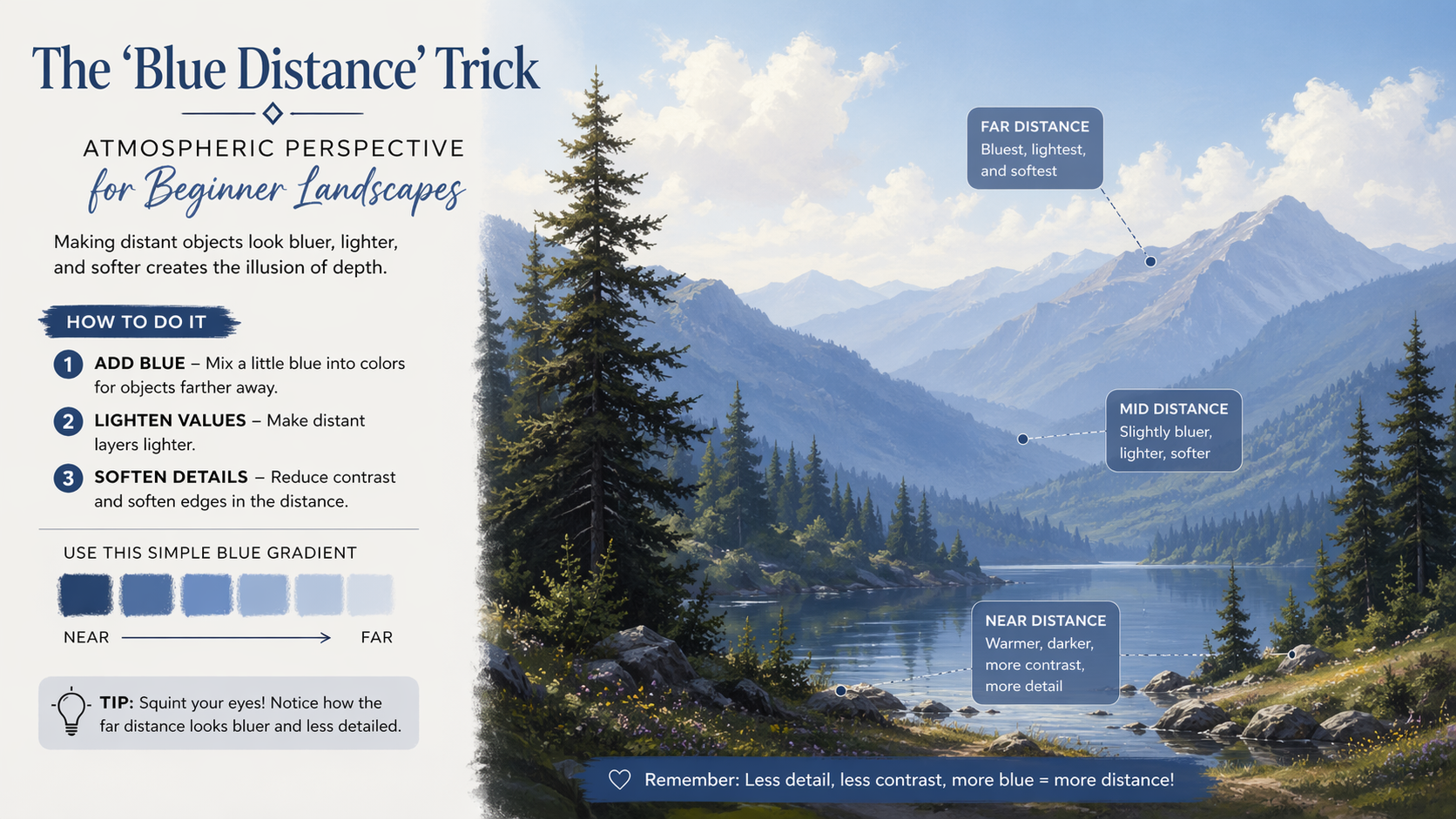
Atmospheric perspective is an artistic technique that creates the illusion of depth by making distant objects appear lighter, bluer, and less detailed. Painters use this method to mimic how the human eye naturally perceives objects far away through thick layers of atmosphere.
When you look across a vast landscape, you’re looking through miles of air. That air isn’t entirely clear. It’s full of moisture and microscopic dust particles. These particles physically change how we see things far away. To master this concept, you can explore our resources on mastering atmospheric perspective.
The Science of Air: Why Mountains Look Blue
Those distant peaks aren’t actually blue. They appear that way because of natural light scattering. As sunlight hits the atmosphere, shorter blue light waves scatter easily across the sky.
When you look at an object miles away, you’re looking through a thick filter of scattered blue light. This means your background mountains should always carry a blue or purple tint. You can learn more about how light and color interact by reviewing our color theory basics.
How Does Detail Muting Create Depth?
Detail muting creates depth by intentionally removing sharp edges and fine textures from background elements in a painting. By blurring distant objects, artists force the viewer’s eye to focus on the crisp, clear details in the immediate foreground.
It’s tempting to paint every single pine tree on a mountain five miles away. You must resist this urge. The human eye cannot resolve fine details at that distance. Instead, use soft edges and flat washes for the background. Keep your sharpest brush strokes for the objects closest to the viewer. This contrast is the secret to creating depth in paintings.
The Warm vs. Cool Color Rule
Warm colors jump forward toward the viewer. Cool colors fall back into the distance. This is a fundamental rule of painting. If you put a vibrant warm red next to a muted cool blue, the red will instantly command attention.
You should use warm yellows, oranges, and reds in your foreground. Reserve your cool blues and grays for the horizon line. It takes time to master visual depth in your art. But applying this simple color temperature rule changes everything.
How Do I Practice the 3-Layer Exercise?

You can practice the 3-layer exercise by painting a simple landscape using only three increasingly lighter shades of blue. Paint a dark blue foreground, a medium blue middle ground, and a pale blue background to instantly see how value changes create distance.
This exercise takes about fifteen minutes. Grab a piece of paper and your favorite blue paint. You might be getting started with watercolors or acrylics. Mix a dark, saturated blue for the bottom third of the page. Add white or water to make a medium tone for the middle. Finally, use a very watery or pale blue for the top third. You’ll see three distinct miles of depth appear instantly. If you prefer acrylics, you can also practice this when you paint clouds with acrylics for beginners.
Your paintings don’t have to look flat anymore. The air between you and the horizon is a physical thing you can easily capture with your brush. You just need to remember to add a touch of blue to your distant shapes. Soften those harsh background edges to push objects back visually. Force the bright, warm colors to the front of your scene to grab the viewer’s attention. Try the simple 3-layer exercise today and watch your canvas open up into miles of realistic space. Grab your favorite brushes, set up your palette, and start mixing those calming atmospheric blues right now. Don’t let the fear of a flat canvas stop you from creating.
The Masters of Atmospheric Perspective
| Artist | Era / Movement | Key Masterpiece Example | How They Mastered the “Blue Distance” |
|---|---|---|---|
| Leonardo da Vinci | High Renaissance | Mona Lisa | He literally coined the term “aerial perspective.” He used sfumato (a soft, smoky blending technique) to paint the rocky backdrop in fading, cool blue-gray tones, proving that atmosphere physically obscures distant objects. |
| Claude Lorrain | Baroque | Seaport with the Embarkation of the Queen of Sheba | He popularized the hazy, glowing horizon line. He expertly contrasted warm, highly detailed foregrounds with cool, pale blue backgrounds to make his classical landscapes stretch on for miles. |
| J.M.W. Turner | Romanticism | The Fighting Temeraire | Turner was obsessed with the physical rendering of air, mist, and light. He used washes of cool colors to almost entirely dissolve distant forms into pure atmosphere, making the air itself the subject of the painting. |
| Albert Bierstadt | Hudson River School | Among the Sierra Nevada, California | He used intense atmospheric perspective to give the American West an epic, sweeping scale. He painted towering background mountains in distinct, muted blues and purples to force them deep into the background behind highly detailed foregrounds. |
Frequently Asked Questions
What colors should I mix for distant mountains?
Mix your primary blue with a tiny touch of red to make a muted purple, then add white to lighten the value. The exact shade depends on your sky, but keeping it light and cool is essential.
Why does my landscape painting look completely flat?
Your painting likely looks flat because your background objects are as dark and detailed as your foreground objects. You need to lighten the background values to push them away.
Can I use atmospheric perspective in indoor paintings?
It is mostly used for vast outdoor landscapes where miles of air are visible. For indoor scenes, you will rely more on linear perspective and lighting to create space.
Does atmospheric perspective work with any painting medium?
Yes, this rule applies to everything from oils to digital art. The way light scatters in the atmosphere does not change based on the type of paint you use.
How do I blur the background in acrylics?
You can blend the wet paint directly on the canvas to soften the edges. You can also apply a thin, watery glaze over the dried background to mute the details.

