
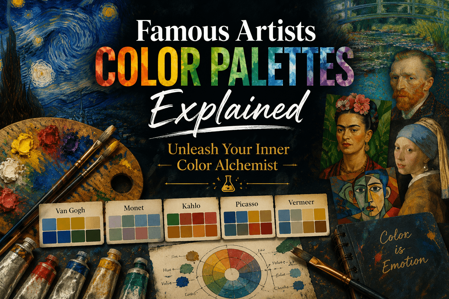
You stand in front of a blank canvas with a loaded brush, but your colors look completely flat. Mixing paint can feel incredibly intimidating when you are starting out, but history’s greatest painters already solved this puzzle for you. Every iconic creator relied on a carefully chosen set of colors to tell their stories and anchor their personal style. By studying how historical masters combined specific pigments, you can unlock new ways to express emotion and create harmony in your own artwork.

This guide breaks down the exact color selections behind ten world-famous masterpieces. You will learn how to capture their specific moods using simple, beginner-friendly combinations. Let us dive straight into the studio secrets of the masters.
Can You Paint Like the Masters with a Limited Palette?
Yes, you can replicate the impact of master painters by using a restricted selection of colors. Limiting your workspace to five or six intentional hues creates instant visual harmony across your canvas. It prevents muddy mixtures, saves money on supplies, and forces you to master light values rather than relying on dozens of confusing, expensive paint tubes.
When you are learning understanding color theory basics, less is always more. Many beginners believe that buying more colors leads to better art, but the exact opposite is true. Working with a massive range of tubes usually leads to an accidental gray sludge on your mixing tray.
Historically, many masters intentionally restricted their workspaces. By choosing to practice painting with a limited palette, you gain complete control over your color temperatures. You learn exactly how your primary and secondary pigments interact, which builds immense creative confidence.
Stealing Color Schemes from Impressionism to Abstract Art
Every artistic movement has a distinct color DNA that defines its visual story. The following historical reference table maps out the exact color configurations used in ten history-making masterpieces:
| Artist & Era | Masterpiece | Signature Color Palette | Emotional Mood |
| Claude Monet (1840–1926) | Water Lilies (1916) | Sky Blue, Soft Violet, Lavender, Sage Green, Pale Yellow, Rose Pink | Light, Airy, Impressionistic |
| Vincent van Gogh (1853–1890) | The Starry Night (1889) | Ultramarine Blue, Prussian Blue, Cobalt Blue, Chrome Yellow, Cadmium Yellow, Orange | Bold, Expressive, Emotional |
| Frida Kahlo (1907–1954) | Self-Portrait with Thorn Necklace (1940) | Deep Red, Terracotta, Olive Green, Leaf Green, Burnt Sienna, Mustard Yellow | Earthy, Symbolic, Vibrant |
| Pablo Picasso (1881–1973) | The Old Guitarist (1903) | Prussian Blue, Blue Gray, Slate Blue, Greenish Blue, Ochre, Earth Brown | Cool, Blue Period, Melancholic |
| Georgia O’Keeffe (1887–1986) | Red Canna (1924) | Crimson Red, Scarlet, Coral Pink, Soft Orange, Cream, Deep Plum | Bold, Organic, Vivid |
| Rembrandt van Rijn (1606–1669) | The Night Watch (1642) | Burnt Umber, Raw Umber, Yellow Ochre, Lead White, Warm Gray, Bone Black | Dark, Dramatic, Timeless |
| Gustav Klimt (1862–1918) | The Kiss (1907–1908) | Gold, Mustard Yellow, Olive Green, Black, Ivory, Crimson Red | Opulent, Decorative, Rich |
| Henri Matisse (1869–1954) | The Dance (I) (1909) | Cobalt Blue, Turquoise, Leaf Green, Coral Red, Orange, Pink | Bright, Joyful, Fauvist |
| Leonardo da Vinci (1452–1519) | Mona Lisa (1503–1506) | Olive Green, Warm Brown, Golden Ochre, Smoky Gray, Cream, Deep Brown | Subtle, Natural, Harmonious |
| Jackson Pollock (1912–1956) | Number 31 (1950) | Black, White, Gray, Mustard Yellow, Rust Red, Blue Gray | Raw, Abstract, Chaotic |
If you want to explore these approaches deeper, you can look into specific structural analyses. For instance, exploring Frida Kahlo’s most iconic paintings shows how her earthy tones tied directly into her cultural heritage.
Alternatively, examining the subtle sfumato blending technique reveals how Leonardo da Vinci used smoky grays and deep browns to build realistic, lifelike depth.
How Do You Select a Signature Color Palette for Your Art?
To select a signature color palette, choose three dominant colors that reflect the specific mood of your subject, add one high-contrast accent hue, and mix your own intermediate shades rather than painting straight from the tube. Testing this limited combination consistently across several canvases will naturally define your personal style.
Finding your voice takes time. When you are working to find your unique painting style, your color choices act as your visual signature. Do you prefer the high-energy, unblended coral reds and oranges of Henri Matisse? Or do you find peace in the quiet, melancholic slate blues used by Pablo Picasso?
Pick an emotional direction before you squeeze out your paint. Stick to your chosen group for a series of three to four paintings, and watch your creative identity solidify.
Studio Tips: Turning Historical Palettes into Modern Art Projects
You do not need to mimic these masterworks perfectly to learn from them. The goal is inspiration, not direct imitation. Use these core strategies from the infographic to improve your studio workflow today:
- Mix, Don’t Match: Avoid relying entirely on factory tubes. Buy a few high-quality base colors and build your own intermediate tones on your mixing board.
- Consider Value over Hue: The light, medium, and dark values of a color are far more important than the specific shade itself. If your values are correct, almost any color choice will look believable. To master this balance, you should learn to master light and shadow values to bring immediate three-dimensional structure to your canvas.
- Practice and Explore: Treat your sketchbook as a low-pressure laboratory. Spend fifteen minutes testing unusual color interactions before committing them to a large canvas.
Conclusion
Mastering your paint mixtures does not require decades of formal school or a massive collection of expensive supplies. The greatest artists achieved historical brilliance by using simplified, highly intentional selections of color to convey raw human emotion. Look closely at how the masters built their iconic work, choose a simple set of four to six colors for your next creative session, and let their historical experiments guide your brush. Grab your tools, mix your pigments with confidence, and start your next artwork today.
Frequently Asked Questions
What colors did Claude Monet use for his landscapes?
Claude Monet relied on a soft, impressionistic palette consisting of sky blue, soft violet, lavender, sage green, pale yellow, and rose pink. He used these broken, airy colors to capture shifting light and atmospheric conditions on his canvas.
Why did Pablo Picasso use mostly blue in his early work?
During his famous Blue Period, Pablo Picasso used cool blues, slate tones, and greenish-blues to express profound sorrow, isolation, and solitude. These cool color mixtures allowed him to establish a deeply melancholic, emotional mood.
How can a beginner avoid making muddy colors?
Beginners can avoid muddy colors by limiting their palette to five or six intentional hues and mixing their own intermediate tones. Muddy paint happens when too many conflicting warm and cool colors are blended together directly on the canvas.
What is the benefit of painting with an earth-toned palette?
An earth-toned palette, like those used by Leonardo da Vinci and Rembrandt, builds natural harmony, rich shadows, and realistic depth. Using umbers, ochres, and warm grays makes it much easier for beginners to manage light values effectively.
Did Jackson Pollock use standard artists’ paint for his artwork?
Jackson Pollock’s palette was raw and industrial, often utilizing commercial gloss enamel paints alongside traditional media. His choices of black, white, gray, and rust red allowed him to create chaotic, abstract motion.

Olly
Olly Farmer M.Sc, B.Sc, PGCE 25 years experience of Watercolor Painting and AI Art; teacher for 13 years; Creator of Art Tools; Art Gallery Contributor of Art Articles to Medium.com, LinkedIn and Facebook
Continue exploring
PROMINENT PAINTING
Keep your creative momentum
Get new painting guides, practical techniques and artist stories delivered without the noise.
Occasional emails. Unsubscribe whenever you like.