
Unlock Henri Matisse’s boldest secrets — from why he painted skies red, to the exact palette he reached for every single morning. This is where colour stops being decorative and starts being alive.
⚡ Key Points Summary
🎨 The Revolution — Les Fauves shocked Paris in 1905 by treating colour as an emotional force, not a tool for copying reality.
🌈 Core Principle — Non-representational colour means painting what a subject feels like, not what it literally looks like.
🖌️ The Palette — Matisse kept it tight: Vermilion, Cadmium Yellow, Cobalt Blue, Emerald Green — used at near full chroma.
📐 Depth Without Shadow — Warm colours advance, cool colours recede. Colour temperature replaces traditional perspective entirely.
🚫 Avoid the Mud — Place complementary colours next to each other, never physically mix them. Optical blending preserves full vibrancy.
💻 Goes Digital Too — Build a fixed swatch palette in Procreate or Photoshop and start on a warm mid-tone ground — the same discipline works digitally.
Podcast on Painting the Truth
Introduction to the Fauvist Colour Revolution

There’s a very particular kind of panic that strikes every developing artist around the intermediate stage. You’ve learned your anatomy, you’ve practised your perspective, you’ve watched approximately nine thousand YouTube tutorials — and yet your paintings still feel flat. Safe. Like a photograph with the life taken out. I’ve been there, and most artists I’ve spoken to through the ProminentPainting community have been there too.
The solution, it turns out, was worked out in a chaotic Parisian gallery in autumn 1905. It just took the art world a while to catch up.
Who Were ‘Les Fauves’ (The Wild Beasts) and How Did They Shake Up the Salon d’Automne in 1905?
The story goes that the critic Louis Vauxcelles walked through a room at the 1905 Salon d’Automne and spotted a small, conventional bronze sculpture sitting amid a group of paintings that looked as though they’d been made by someone having a very productive fever dream. The paintings blazed with oranges where there should have been skin tones, vibrating greens in the shadows, and skies in impossible magentas. Vauxcelles reportedly gestured at the sculpture, then at the surrounding canvases, and muttered: “Donatello au milieu des fauves” — Donatello among the wild beasts.
The “wild beasts” were Henri Matisse, André Derain, Maurice de Vlaminck, Raoul Dufy, and a handful of others. They hadn’t set out to be a movement. They were simply a loose group of painters who had arrived at a shared conclusion: colour was being treated as a servant to representation, and they wanted to set it free.
📜 Historical Context
The Salon d’Automne of 1905 was held at the Grand Palais in Paris. The room housing the Fauves’ work became known simply as la cage aux fauves — the wild beasts’ cage. Visitors were reportedly shocked, some scandalised. Others couldn’t stop looking. That tension — shock laced with fascination — is actually the ideal response to genuinely bold colour.
Henri Matisse’s Core Philosophy: Colour as an Independent Force, Not Just a Tool for Replication
Matisse had a phrase he returned to again and again: he wanted his paintings to be like a comfortable armchair — a place of rest for the frazzled modern mind. But the route to that comfort was not pastels and gentle curves. It was pure, singing colour used with complete conviction.
His argument was essentially this: a tree isn’t just green. It’s a burst of vitality, a cooling presence in summer, a memory of childhood, the smell of rain. If you paint it the colour it literally is, you capture only a fraction of what the tree means. But if you paint it the colour it feels, you capture something truer than a photograph ever could.
“Colour helps to express light, not the physical phenomenon, but the only light that really exists, that in the artist’s brain.”
Henri Matisse
Why Modern Artists Still Struggle With Expressive Colour and How Matisse’s Principles Offer the Solution
Here’s the honest truth: most of us have been trained, either explicitly or culturally, to distrust pure colour. We’ve absorbed the idea that realism equals competence, and that anything which strays too far from photographic accuracy is somehow less skilled. Matisse blows this assumption apart entirely.
His principles aren’t about throwing paint at a canvas and hoping for the best. They’re a rigorous, intentional system for using colour to communicate experience rather than merely describe it. For intermediate artists who feel stuck — who can render accurately but can’t seem to make their work sing — Fauvism is one of the most genuinely liberating frameworks available. And crucially, it’s one you can start applying this afternoon.
If you’re newer to painting and still building confidence with your tools, our beginner’s guide to getting started with painting is a great foundation before diving into expressive colour work.
The Core Principles of Fauvist Colour Theory
Fauvism is not randomness. The Fauves made deliberate, considered choices — they just chose emotion over observation as their primary guide. Understanding the specific mechanisms they used makes all the difference between muddy experimentation and work that genuinely crackles.
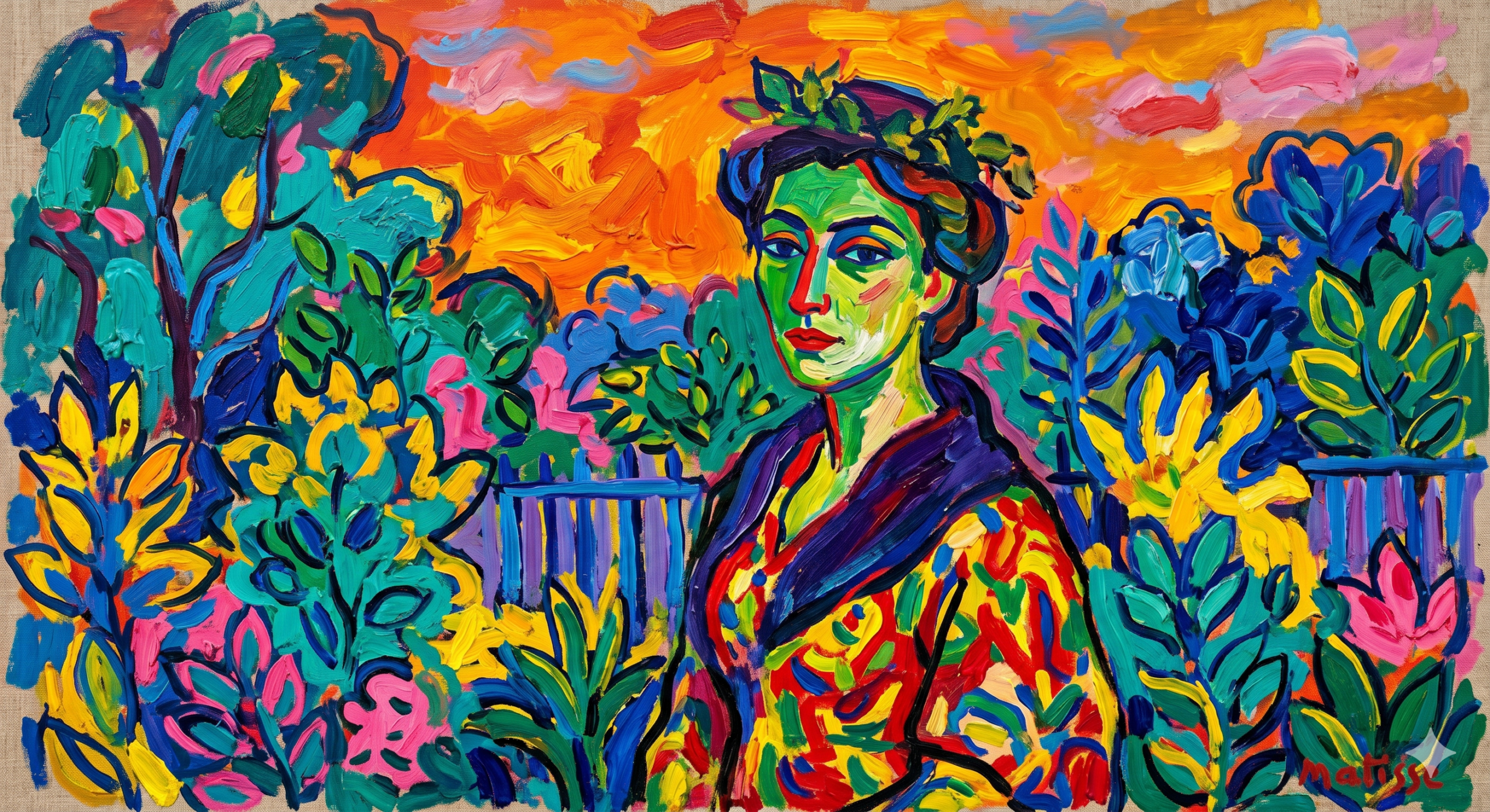
Non-Representational Colour: Painting the Sky Red and the Grass Blue to Convey Emotion Over Literal Truth
This is the principle that trips people up first, because it sounds like permission to be careless. It isn’t. Non-representational colour means choosing a colour based on the emotional or compositional role it plays rather than its local colour — the colour an object literally is in reality.
Matisse’s famous Woman with a Hat (1905) caused an uproar precisely because the woman’s face is painted in greens, yellows, oranges, and pinks that have nothing to do with human skin tone. And yet the painting has more vitality, more presence, more life than a thousand technically correct portraits. The non-representational colour choices force the viewer to read the face as a face — a living, energised thing — rather than as a collection of accurately observed tones.
💡 Practical Insight
Before you mix a single colour, ask yourself: what is the dominant mood of this subject? Energetic and warm? Paint it with high-key oranges and reds. Melancholy and cool? Push into deep blues and muted violets. Let that emotional read guide your palette from the outset.
Liberation of Colour from Form: Using Blocks of Hue to Define Space Instead of Traditional Chiaroscuro
Chiaroscuro — the classical technique of modelling form through graduated light and shadow — was the dominant mode of creating the illusion of three-dimensionality from the Renaissance onwards. Matisse found it limiting. Instead, he used flat or near-flat areas of pure colour, placed against each other, to define both form and space simultaneously.
Think about the way a shape feels solid when a darker, contrasting colour sits next to it. That’s not shadow — that’s colour doing the structural work. It’s more akin to how colour-field painters would later approach the canvas, or how stained glass windows create depth without a single graduated tone. MoMA’s overview of Fauvism and colour theory offers a fascinating look at how critics and curators have framed this liberation in the century since.
The Power of Pure Pigment: Why Matisse Used Paint Straight From the Tube or With Minimal Mixing
Every time you mix two colours together, you introduce the risk of one dulling the other. The more colours you pile in, the closer you creep to grey-brown mud. Matisse understood this intuitively — which is why his working method often involved colours used at or near their full chroma, straight from the tube, occasionally diluted with medium but rarely heavily intermixed.
This isn’t laziness or a lack of technical knowledge. It’s a deliberate choice to preserve the optical power of each pigment. A tube of cadmium red at full intensity has an almost physical impact on the eye. The moment you start nudging it with raw umber “to make it more realistic,” you’ve spent some of that capital.
Flattening the Canvas: Using Colour Relationships Instead of Linear Perspective to Create Depth
Linear perspective creates depth by making objects smaller as they recede. Atmospheric perspective makes distant things bluer and less distinct. Matisse largely abandoned both in favour of colour temperature perspective: warm colours (reds, oranges, yellows) naturally appear to advance, while cool colours (blues, violets, cool greens) appear to recede. By placing warm hues in the foreground and cool ones behind, he created plausible spatial depth on a canvas that was, compositionally, almost flat.
This is one of the most immediately useful tools in the entire Fauvist toolkit, and we’ll put it to work in the exercises below.
Anatomy of a Matisse Palette: Pigments and Vibrancy
One of the things I find endlessly fascinating about Matisse is how disciplined his palette actually was. Despite the apparent wildness of the results, he worked with a relatively small set of pigments — chosen because they gave him the maximum intensity at minimum risk of deadening each other.
The Historical Matisse Palette: Vermilion, Cadmium Yellow, Cobalt Blue, Emerald Green, and Zinc White
What’s notable about Matisse’s core palette is that it’s essentially a primary set plus one or two high-intensity additions. No earth tones to speak of. No raw umber, no burnt sienna — at least not as primary players. The earths are the enemy of chroma, and Matisse knew it.
| Pigment | Character | Role on the Palette |
|---|---|---|
| 🔴 Vermilion | Mercury sulphide — fiery, fully opaque | Dominant warm red; visual anchor |
| 🟡 Cadmium Yellow | High chroma, warm mid-yellow | Pushes heat and luminosity |
| 🔵 Cobalt Blue | Mid-cool, slightly violet-leaning | Depth, recession, temperature contrast |
| 🟢 Emerald Green | Viridian-adjacent, cool and electric | Dissonance and vibration against reds |
| ⬜ Zinc White | Less opaque than lead white, cooler tone | Tints without killing chroma |
| 🟣 Alizarin Crimson | Transparent, cool crimson | Glazing and cool shadow tones |
For a deeper look at how these pigments perform alongside each other, the Handprint pigment and colour reference is the most thorough resource on the web — an authority site that every serious painter should bookmark.
Modern Non-Toxic Alternatives for the Contemporary Studio
The traditional Matisse palette has some significant health concerns. Vermilion is a mercury compound — genuinely toxic if inhaled or ingested. Lead white is similarly problematic. The good news is that modern pigment chemistry has produced excellent alternatives that get you remarkably close to the same optical results.
| Traditional Pigment | Modern Alternative | Notes |
|---|---|---|
| 🔴 Vermilion | Pyrrole Red | Equal intensity, cadmium-free, student-safe |
| 🟡 Cadmium Yellow | Hansa Yellow Medium | Near-identical chroma, non-toxic |
| 🔵 Cobalt Blue | Phthalo Blue (Red Shade) | More intense — use sparingly; mix 50/50 with white to tame |
| 🟢 Emerald Green | Phthalo Green | Stronger than vintage Emerald; same principle |
| ⬜ Zinc White | 50/50 Titanium + Zinc White | Retains Zinc’s softer opacity without pure Titanium’s heaviness |
The Role of the ‘Canvas Void’: How Matisse Strategically Left White Canvas Showing to Make Adjacent Colours Pop
This is one of Matisse’s most underappreciated techniques, and once you start noticing it you cannot unsee it. In many of his drawings, watercolours, and even oil works, he deliberately left areas of bare canvas or paper untouched, allowing the white ground to breathe between areas of colour. That small sliver of white ground acts as an optical reset — it gives each colour patch its maximum visual impact because your eye doesn’t have to transition gradually from one hue to the next.
This is directly related to the Divisionist/Impressionist understanding of simultaneous contrast, but Matisse used it more architecturally — as a compositional device rather than a perceptual one.
🎨 Try This Today
On your next painting, try leaving a 2–3mm gap of bare canvas between every major colour area. Don’t blend the edges. Let the ground show. Notice how the colours next to those gaps appear to intensify — that’s your eye doing exactly what Matisse understood it would do.
How to Apply Fauvist Colour Principles to Your Art (Step-by-Step)
Theory is wonderful. Exercises are where the theory stops being words and starts being paint. Each of the following exercises isolates a specific Fauvist mechanism — work through them in order, and you’ll find yourself naturally integrating the principles into your broader practice.
🔴 Exercise 1: The Arbitrary Colour Still Life
Goal: Reinterpreting local colour into emotional colour.
Set up a simple still life — a piece of fruit, a cup, a cloth. Before you paint, describe the mood of the arrangement in one sentence. Is it heavy and still? Energetic and precarious? Tender and domestic?
- Based on that mood, choose a palette of three to four pure colours that feel right for that emotional read — not for the objects’ actual colours.
- Paint the still life using only those chosen colours. The apple doesn’t have to be red. The tablecloth doesn’t have to be white.
- Foreground objects: use your warmest, most intense colours. Background: coolest and least saturated (but still pure — not grey).
- Avoid blending at edges. Let the colours meet cleanly, or leave a sliver of ground showing between them.
- Step back. Ask: does it convey the mood you described? If not, which colour is fighting it — and what would you swap?

🔵 Exercise 2: Mastering Complementary Vibration
Goal: Pairing high-intensity oranges and blues side-by-side.
Complementary colours — opposites on the colour wheel — vibrate optically when placed side-by-side at full intensity. Matisse exploited this relentlessly. This exercise makes it your instinct.
- Take a reference image of a landscape or interior (a photo on your phone works perfectly).
- Identify the dominant warm areas (sunlight, foreground, focal points). Plan to paint these in pure Cadmium Orange or Cadmium Red.
- Identify the dominant cool areas (shadows, sky, receding space). Plan to paint these in pure Cobalt or Ultramarine Blue.
- Paint the composition. Where orange and blue meet, do not blend — let the edge be clean and hard.
- Observe the vibration at those edges. That electrical quality is simultaneous contrast doing exactly what it should. Maximum intensity, maximum vibration.

🟢 Exercise 3: Simplifying the Drawing
Goal: Reducing detail to let colour relationships do the heavy lifting.
Matisse once said he wanted his lines to be as economical as possible so that the colour could carry the weight. This exercise is about deliberately stripping back your drawing until it feels almost uncomfortably bare — and then discovering that the colour fills the gap.
- Choose a portrait or figure reference. Sketch the subject using fifteen lines total. No cross-hatching, no modelling, no detail marks. Just the essential contour.
- Block in colour using your Fauvist palette. Large, flat areas — no modelling within each area.
- Use colour contrast rather than line to define where the face ends and the background begins.
- Notice how, without rendering, your eye is forced to read the colour relationships. The painting either works as a whole or it doesn’t — which forces better colour decisions than detailed rendering ever allows.

If you’re looking for more structured painting challenges like these, our popular posts archive is full of technique-focused guides the community keeps coming back to.
How to Avoid Muddy Colours When Painting Boldly
The biggest fear when someone first encounters Fauvist principles is the mud problem: what if mixing all these bright colours ends up as grey-brown disaster? It’s a legitimate concern, and it has specific, learnable solutions.
The Danger of Over-Mixing: Why Optical Colour Mixing Beats Physical Palette Mixing
Mud is almost always the result of over-mixing on the palette. When you physically blend complementary colours together (red + green, orange + blue), their pigments cancel each other out — producing brown or grey. The Fauves sidestepped this entirely by placing those same colours next to each other on the canvas rather than mixing them together.
This is called optical mixing — your eye and brain do the blending at a perceptual level, while the pigments remain unmixed and fully saturated. The result appears to mix but retains all the vibrancy of the original pigments.
⚠️ Mud Watch
The most common accidental mud combinations:
- 🟠 Orange + Blue mixed = brownish grey
- 🔴 Red + Green mixed = warm brown
- 🟡 Yellow + Violet mixed = dull ochre
If any of these land on your palette uninvited, wipe the brush before it touches the canvas and place the colours separately instead.
Maintaining Clean Brushes and Medium to Preserve High-Chroma Brilliance
This sounds almost too obvious to say, but it’s responsible for more muddiness than any theoretical error: dirty brushes and contaminated medium kill chroma. The moment residual cadmium red wanders into your cobalt blue via an insufficiently wiped brush, you’ve introduced the very physical mixing you’re trying to avoid.
Working in the Fauvist tradition, have a separate brush for each primary colour area rather than continually cleaning a single brush. Keep a jar of clean medium separate from your brush-cleaning jar. And wipe — actually wipe — between colour areas. It’s an unglamorous discipline, but it’s the difference between a painting that sings and one that merely hums.
For a comprehensive rundown of the technical mistakes that cause colour problems across every medium, our artist’s troubleshooting glossary covers dirty colour, streaking, and chroma loss in detail.
How to Use Warm and Cool Tones Strategically to Establish Light Source Without Losing Saturation
The traditional approach to establishing a light source is to lighten lit areas (add white) and darken shadowed areas (add black or raw umber). Both approaches destroy chroma. The Fauvist alternative is temperature-based: use warmer versions of your hue in the light and cooler versions in the shadow — both at full intensity.
For example: a red apple in sunlight might be painted in warm Cadmium Red or Vermilion. The shadow side of the same apple isn’t a darker red — it’s a cooler red, shifting toward Alizarin Crimson or even a pure Magenta. Both are full-chroma. The warm-cool contrast reads as light and shadow without ever touching black or white, and the painting retains its full colour intensity throughout.
Applying Fauvist Colour Theory to Digital Art
The principles Matisse worked out in oil translate remarkably well to digital practice — but only if you actively resist the tools’ default tendencies. Digital painting applications are, out of the box, engineered for photorealistic accuracy. Here’s how to fight back.
Setting Up Your Digital Canvas: Why Starting on a Coloured Mid-Tone Background Is Essential
Working on a pure white digital canvas is one of the biggest traps in digital painting. White is tonally extreme — everything you put on it looks darker than it is, which leads you to unconsciously lighten your palette and desaturate as you work.
Set your background to a warm mid-tone — something in the range of a pale ochre, a warm grey, or a muted terracotta. This immediately makes high-chroma colour placements feel more controlled, and gives your painting a unified warmth that pure-white grounds rarely achieve. In Procreate, Photoshop, or Clip Studio, simply fill a base layer with your mid-tone before starting.
Using Digital Blending Modes Cautiously to Maintain a Painterly, Fauve-Like Texture
Blending modes like Overlay, Multiply, and Colour Burn interact with underlying colours in ways that produce complex, often muddy results that are difficult to predict or control. They tend to desaturate mid-tones and create a digital “glow” that looks impressive in a brief workflow video but doesn’t translate to the flat, singing colour planes that Matisse achieved.
Use blending modes sparingly if at all. If you reach for Overlay to add light, consider whether painting a warm flat tone in Normal mode at reduced opacity might achieve the same effect with less chroma damage. The best digital Fauvist work is almost entirely painted in Normal mode with deliberate, considered brush placement.
Limiting Your Digital Colour Wheel to Emulate Traditional, Physical Tubes of Paint
The infinite colour picker is, paradoxically, one of the least useful tools for expressive colour work. When every colour is simultaneously available, you tend to second-guess each choice — nudging toward “accuracy” because the accurate colour is always right there, a click away.
Build a Fauvist palette as a set of colour swatches in your application — Vermilion equivalent, Cadmium Yellow, Cobalt Blue, Emerald Green, maybe an Orange and a Violet — and commit to using only those swatches for an entire painting. You can adjust value by adding white, but keep the hues fixed. This single constraint produces more coherent, vibrant digital paintings than any other technique I’m aware of.
🖥️ Digital Studio Note
In Procreate, try the “Gouache” or “Round Brush” from the Painting set at 100% opacity with 0% streamlining. This mimics the decisive, unblended stroke quality of Matisse’s oil paint applied thickly. Resist the smudge tool entirely — it is the enemy of Fauvist colour.
Frequently Asked Questions
What is Fauvism in art?
Fauvism was an early 20th-century avant-garde art movement characterised by the use of intense, vivid, and non-naturalistic colours, painterly brushwork, and simplified drawing styles. Led by Henri Matisse and André Derain, it emerged publicly at the 1905 Salon d’Automne in Paris. It was short-lived as a formal movement — but its influence on how artists think about colour continues to this day.
How did Matisse use colour to create depth?
Instead of using traditional light and shadow (chiaroscuro), Matisse used colour temperature and contrast. Warm colours like red and yellow appear to advance toward the viewer, while cool colours like blue and violet appear to recede. By deliberately placing warm hues in the foreground and cool ones in the background — both at full chroma — he created convincing spatial depth on a canvas that was compositionally almost flat.
What colours did Henri Matisse use most?
Matisse’s core palette included cadmium red (or vermilion), cadmium yellow, cobalt blue, viridian or emerald green, and zinc white. He also used alizarin crimson, orange, and occasionally a violet or purple. His preference was consistently for pure, saturated pigments that vibrated against each other when placed side-by-side — earthy tones and black were rarely his first instinct.
How can I make my paintings look more Fauvist?
To paint in a Fauvist style, begin by making emotional rather than observational colour decisions — choose your palette based on the mood of the subject, not its literal colour. Use bright, largely unmixed colours, define your shapes with bold edges rather than gradual blending, ignore traditional shadow-and-highlight modelling in favour of warm-cool contrasts, and resist the urge to “correct” a colour choice back toward realism. The discomfort you feel at a colour that doesn’t match reality is often exactly the right sign that it’s working.
Ready to go wilder with colour? Explore more technique guides, artist deep-dives, and step-by-step tutorials in our full collection of ARTicles — new guides added every week. (AIStudCla)
