

You paint a beautiful landscape but it looks entirely flat. This happens when you ignore perspective. This guide explains how to use color temperature, overlapping, and atmospheric fading to build realistic depth in your watercolors. Practice these three concepts and your paintings will immediately look three-dimensional.
Flat paintings happen to everyone. You mix the perfect green for a distant hill and lay it down next to a tree in the foreground. Suddenly the hill looks like it sits right on top of the tree. The illusion of space breaks. Perspective in watercolor does not require a ruler or complex math. You build depth using the natural properties of water and pigment.
Many beginners assume perspective is only for drawing cityscapes or rigid buildings. You might think you can skip it if you are painting loose landscapes or florals. That is a mistake. Without basic visual rules, the human eye cannot tell what is near and what is far.
You need to learn how to create depth in paintings. Watercolor actually makes this easier than other mediums. You have the distinct advantage of transparency. By manipulating how much water you add to your paint, you can push mountains miles into the distance.
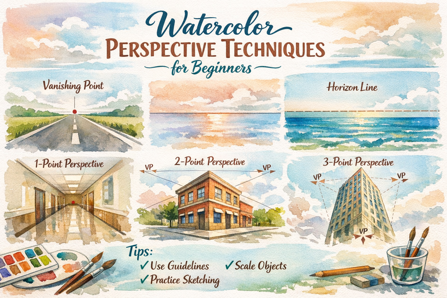
What Is Perspective in Watercolor Painting?
Perspective in watercolor is the technique of creating a three-dimensional illusion on flat paper. Artists achieve this by manipulating color temperature, pigment intensity, and the size of objects to make certain elements appear closer while others recede into the distance.
There are two main types of perspective you need to care about. Linear perspective deals with lines and scale. Atmospheric perspective deals with air, light, and color. You will use both simultaneously. You do not need a perfect vanishing point for a loose forest scene. You do need to understand how the air between you and a distant object changes how that object looks.
Tool: Getting in Perspective!

The tool below allows users to explore different compositions and perspectives easily. They can now:
- Create off-center one-point perspective grids.
- Experiment with extreme perspective effects by moving the focal point to the edges or corners.
- Quickly iterate through different compositional ideas by moving the focal point.
Link to Perspective Tool
Understanding the fundamentals of watercolor perspective is crucial for creating realistic artwork. Perspective is the technique used to depict three-dimensional space on a two-dimensional surface. It involves capturing the way objects appear to diminish in size as they recede into the distance. Here are some key concepts to grasp:
How Does Atmospheric Perspective Work?
Atmospheric perspective mimics how air and distance affect our vision. Objects further away appear lighter, less detailed, and cooler in color. In watercolor, you achieve this by adding more water to your paint mixes for background elements.
Think about looking at a mountain range. The mountain right in front of you is dark green and full of visible trees. The mountain ten miles away looks pale blue and hazy. There is a massive amount of air, dust, and moisture between your eyes and that distant peak.
In watercolor, water is your atmosphere. When mastering atmospheric perspective, you dilute your background colors heavily. You paint them wet-on-wet so the edges blur. You save your thickest paint and sharpest edges for the objects closest to the viewer.
Controlling Color Temperature for Depth
Warm colors pull forward. Cool colors push back. This is a fundamental rule of human vision. You can use this natural optical illusion to force depth into your artwork.
If you paint a yellow flower against a blue background, the yellow jumps off the page. When mixing greens for a landscape, use warmer greens containing more yellow for your foreground grass. Use cooler greens containing more blue for the distant trees. Understanding basic color theory in art gives you a massive advantage here. You do not have to draw perfectly if your colors are telling the right story.
Why Do Scale and Overlapping Matter?
Scale and overlapping provide the strongest visual cues for depth. Drawing a large object partially covering a smaller object instantly tells the human brain which item sits in the front.
If you paint a tree that is larger than a house next to it, the viewer assumes the tree is closer. If a branch crosses in front of the house, the illusion is locked in. This ties directly into one-point perspective drawing. Get your drawing right before your brush touches the paper. A bad sketch will ruin a great painting. Make sure your foreground objects are significantly larger than your background objects.
Grab a scrap piece of paper. Paint a dark warm tree over a pale cool mountain. You will see the depth immediately. Stop worrying about perfect vanishing points and focus on how water changes your pigment.
Frequently Asked Questions
How do I make background mountains look far away? Use heavily diluted paint for your background mountains. Mix a cool color like ultramarine blue or a very pale purple. Apply the paint wet-on-wet to keep the edges soft and out of focus.
Why does my landscape painting look flat? Your painting likely lacks contrast in scale and color. If your background trees are as dark and detailed as your foreground trees, the eye sees them sitting on the same plane. You must lighten distant objects.
Do I need to learn linear perspective for landscapes? You need a basic understanding of scale, but strict linear perspective is rarely necessary for natural scenes. Focus heavily on atmospheric perspective and overlapping shapes instead.
Can I use warm colors in the background? You can, but you must dilute them heavily. A very pale, hazy warm color will still recede, though a cool color will naturally push back much faster.
How do I create sharp foreground details? Use the wet-on-dry technique. Let your background layers dry completely. Then use thicker paint with less water to paint sharp, dark details directly over the top.

