Introduction
Welcome to our Ultimate Guide to the Color Wheel and watercolor mixing techniques. In this article, we will delve into the world of watercolor painting and provide you with invaluable tips and insights to help you create stunning and vibrant artworks. Whether you’re a beginner or an experienced artist, mastering the art of color mixing is essential for achieving captivating results in your watercolor paintings.
Understanding Color Theory
Before we dive into the techniques of watercolor mixing, let’s take a moment to understand the fundamentals of color theory. Colors can be classified into primary, secondary, and tertiary colors. The primary colors are red, blue, and yellow, which cannot be created by mixing other colors. Secondary colors, such as orange, green, and purple, are obtained by combining two primary colors. Tertiary colors are created by mixing a primary color with a neighboring secondary color.
The Color Wheel: Your Ultimate Tool
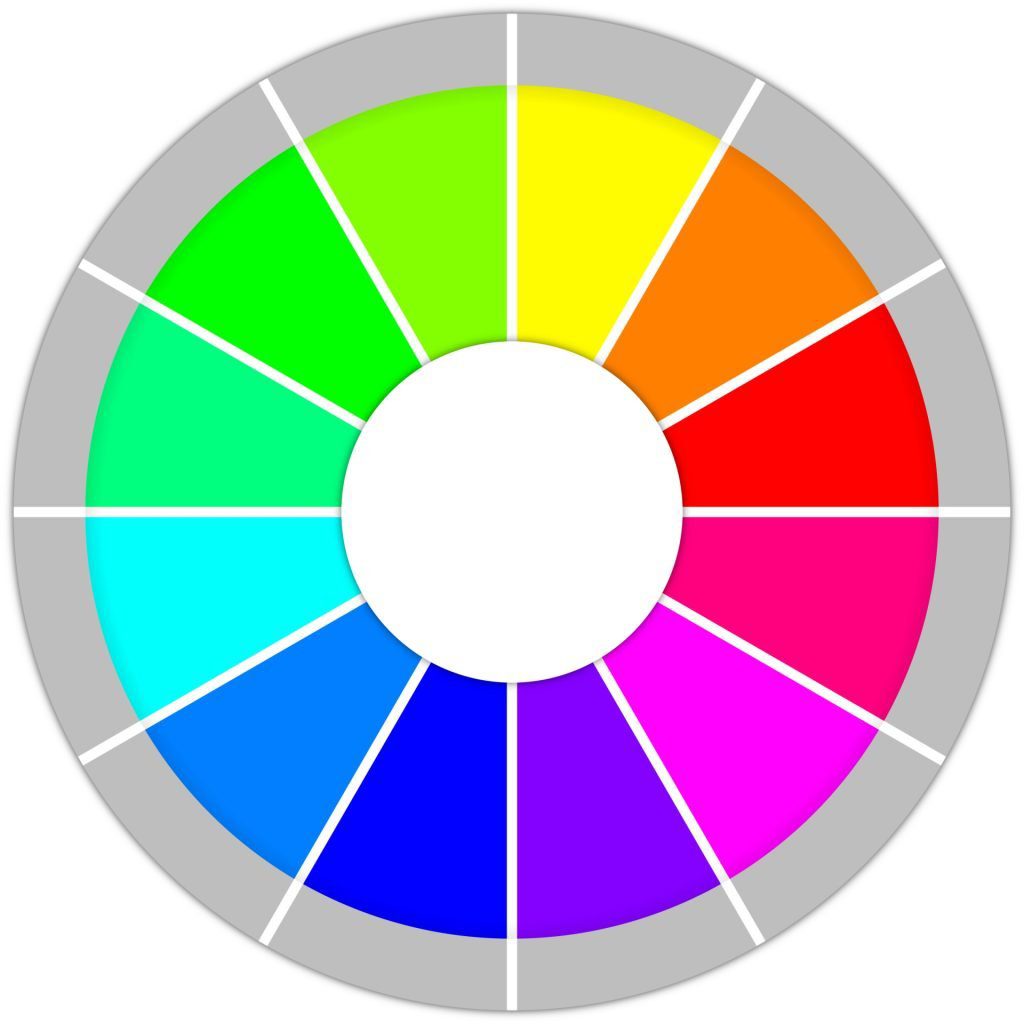
The color wheel is a visual representation of color relationships and is an invaluable tool for every watercolor artist. It consists of twelve colors arranged in a circular manner. By understanding the color wheel, you can easily identify complementary colors, analogous colors, and triadic color schemes, enabling you to create harmonious and visually appealing compositions.
Mixing Primary Colors
When it comes to watercolor mixing, understanding how to create a vast range of hues from primary colors is crucial.
The color wheel is a tool that helps artists understand and use color. It is a circular diagram that shows the relationships between different colors. The color wheel is divided into three primary colors: red, yellow, and blue. These colors cannot be created by mixing other colors. The secondary colors are created by mixing two primary colors together. The tertiary colors are created by mixing a primary color and a secondary color together.
Primary Colors
The three primary colors are red, yellow, and blue. These colors cannot be created by mixing other colors. They are the foundation of all other colors.
Secondary Colors
The three secondary colors are orange, green, and purple. These colors are created by mixing two primary colors together. Orange is created by mixing red and yellow. Green is created by mixing yellow and blue. Purple is created by mixing red and blue.
Tertiary Colors
The six tertiary colors are yellow-orange, red-orange, red-purple, blue-purple, blue-green, and yellow-green. These colors are created by mixing a primary color and a secondary color together. Yellow-orange is created by mixing yellow and orange. Red-orange is created by mixing red and orange. Red-purple is created by mixing red and purple. Blue-purple is created by mixing blue and purple. Blue-green is created by mixing blue and green. Yellow-green is created by mixing yellow and green.
Analogous Colors
Analogous colors are colors that are next to each other on the color wheel. They are often used together to create harmonious and pleasing paintings. Some examples of analogous color schemes include red, orange, and yellow; green, blue, and purple; and yellow, green, and blue.
Complementary Colors
Complementary colors are colors that are opposite each other on the color wheel. They are often used together to create dramatic and eye-catching paintings. Some examples of complementary color schemes include red and green; yellow and purple; and blue and orange.
Split-Complementary Colors
Split-complementary colors are colors that are two spaces away from each other on the color wheel. They are often used together to create paintings that are both harmonious and interesting. Some examples of split-complementary color schemes include red, orange, and blue-green; yellow, green, and red-purple; and blue, purple, and yellow-orange.
Triadic Colors
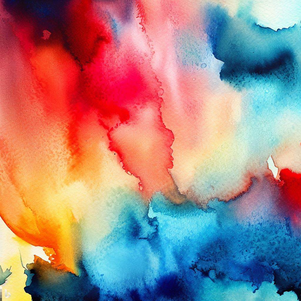
Triadic colors are colors that are evenly spaced around the color wheel. They are often used together to create paintings that are both balanced and vibrant. Some examples of triadic color schemes include red, yellow, and blue; red, green, and blue; and yellow, orange, and purple. Sample of watercolor paints below:
Tetradic Colors
Tetradic colors are four colors that are evenly spaced around the color wheel. They are often used together to create paintings that are both complex and interesting. Some examples of tetradic color schemes include red, orange, yellow, and green; red, blue, purple, and yellow; and green, blue, purple, and orange.
Monochromatic Colors
Monochromatic colors are colors that are all the same hue. They are often used together to create paintings that are both simple and elegant. Some examples of monochromatic color schemes include red, red-orange, red-purple, and red-brown; yellow, yellow-orange, yellow-green, and yellow-brown; and blue, blue-green, blue-purple, and blue-black.
Neutral Colors
Neutral colors are colors that do not have any hue. They are often used together to create paintings that are both calming and sophisticated. Some examples of neutral colors include black, white, gray, brown, and beige.
Let’s explore some techniques for mixing primary colors:
1. Layering Technique
The layering technique involves applying multiple transparent washes of different colors to create new shades. For instance, by overlaying a layer of yellow on top of blue, you can achieve a vibrant green tone. Experimenting with different layering combinations will help you discover unique color variations.
2. Wet-on-Wet Technique
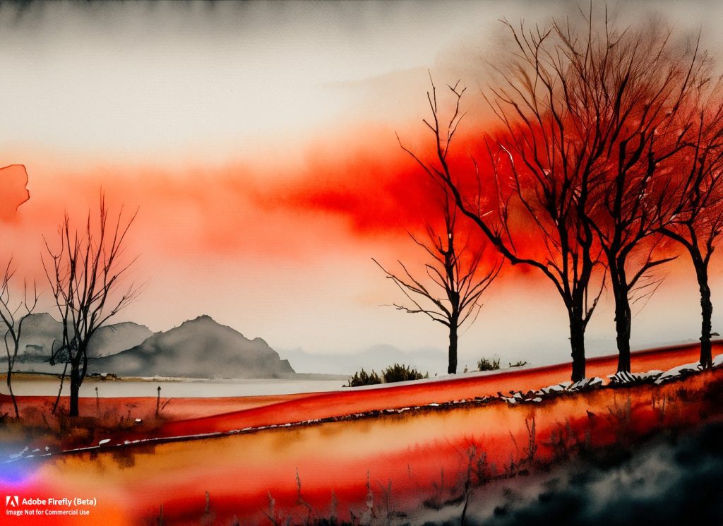
The wet-on-wet technique involves applying wet paint onto a wet paper surface. This technique allows colors to blend and flow together, creating smooth transitions and beautiful gradients. It’s particularly useful for capturing the ethereal qualities of landscapes and atmospheric effects.
3. Gradual Mixing
Gradual mixing involves gradually blending two or more colors together, creating subtle transitions and soft hues. By carefully controlling the amount of water and pigment, you can achieve seamless color gradations in your watercolor paintings.
Creating Harmonious Color Palettes
Now that you have a grasp of primary color mixing, let’s explore how to create harmonious color palettes using complementary and analogous colors.
1. Complementary Colors
Complementary colors are pairs of colors that are located opposite each other on the color wheel. Combining complementary colors can create striking visual effects and enhance the overall impact of your artwork. For example, mixing red and green or blue and orange can generate vibrant contrasts and add energy to your watercolor compositions.
2. Analogous Colors
Analogous colors are neighboring colors on the color wheel and share similar undertones. These colors create a sense of harmony and cohesion in your artwork. For instance, blending shades of blue, green, and turquoise can result in a calming and serene atmosphere in your watercolor paintings.
Tips for Successful Watercolor Mixing
To further enhance your watercolor mixing skills, consider the following tips:
1. Start with a Limited Palette
When you’re beginning your watercolor journey, it’s advisable to start with a limited palette of primary colors. This will help you understand color relationships better and allow you to achieve a wider range of hues through mixing.
2. Use a Clean Palette and Brushes
Keeping your palette and brushes clean between color mixtures is essential. Avoid cross
-contamination of colors by rinsing your brushes thoroughly or using separate brushes for each color.
3. Practice Color Gradations
Mastering smooth color gradations is key to creating realistic and visually appealing watercolor paintings. Dedicate time to practice blending colors and achieving seamless transitions.
Conclusion
Congratulations! You’ve now gained valuable insights into the world of watercolor mixing techniques. Remember, practice is key to mastering these skills. Experiment with various color combinations, explore different techniques and let your creativity flow. With time and dedication, you’ll be able to create breathtaking watercolor artworks that captivate and inspire. Happy painting!
Note: The above content is provided as a comprehensive guide to watercolor mixing techniques and is not intended to replace professional art instruction. Always continue learning and seeking inspiration to further develop your artistic abilities.
