History of Color in Art
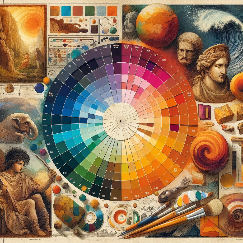
Color in art has always been a potent force, shaping the way we experience and understand the world around us. From the vibrant hues of ancient Egyptian tomb paintings to the subtle shades of Renaissance masterpieces, color in art serves as a powerful tool for expression and communication.
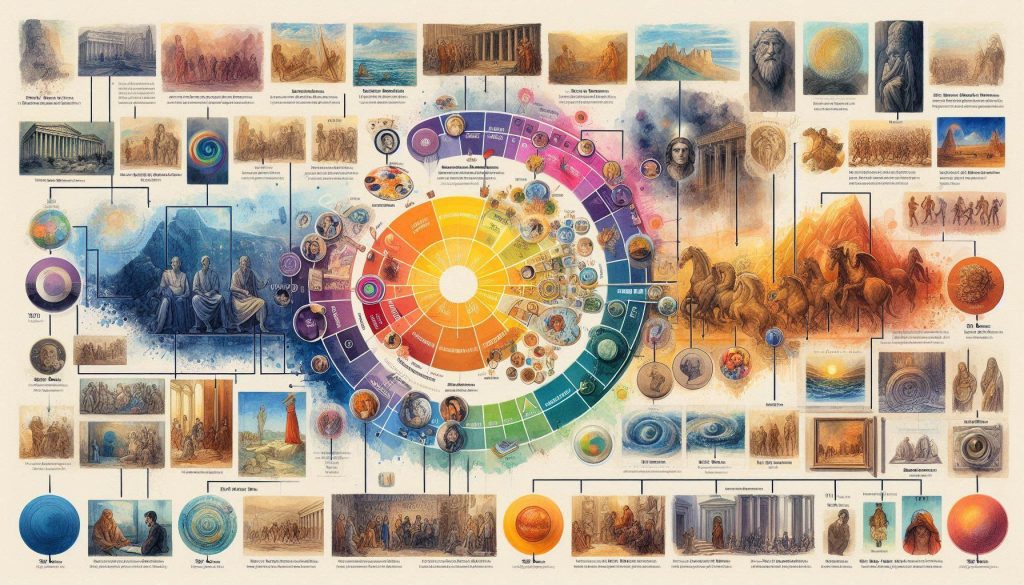
- Ancient Egypt: The Egyptians used color symbolically, with specific colors representing different gods and concepts. For example, blue was associated with the sky and water, while green symbolized fertility and growth.
- Greece and Rome: Greek and Roman artists employed color to create a sense of realism and depth in their sculptures and paintings. They also developed the concept of color harmony, using complementary colors to create visually appealing compositions.
- The Middle Ages: During the Middle Ages, color was often used to convey religious messages. Stained glass windows in cathedrals depicted biblical scenes using bright, symbolic colors.
- The Renaissance: The Renaissance witnessed a renewed interest in classical art, and with it, a return to the use of vibrant colors. Artists such as Leonardo da Vinci and Michelangelo used color to create lifelike and emotionally evocative paintings.
- The Baroque Period: The Baroque period was characterized by the use of rich, dramatic colors. Artists such as Caravaggio and Rubens used chiaroscuro (the contrast between light and dark) to create a sense of drama and intensity.
- The 19th Century: The 19th century saw the rise of Romanticism, which emphasized the use of color to express emotions and evoke a sense of wonder. Artists such as J.M.W. Turner and Caspar David Friedrich used vibrant colors to capture the beauty and grandeur of nature.
- The 20th Century: The 20th century witnessed a wide range of artistic movements, each with its own approach to color. Expressionists such as Wassily Kandinsky used color to convey emotions and inner experiences, while Minimalists such as Donald Judd used color to create simple, geometric compositions.
Color in Contemporary Art: Breaking Boundaries
From the mid-20th century onward, artistic movements often boldly redefined the role of color. Rather than solely serving representation or traditional symbolism, color itself could become the focal point of a work, a tool to challenge viewers’ expectations, and a conduit for pure feeling.
Abstract Expressionism: Emotion as Color
Abstract Expressionists, like Jackson Pollock or Mark Rothko, broke from the idea that paint must depict recognizable forms. Instead, expanses of color transmit raw emotion to the viewer. Pollock’s energetic splatters embody action and a sense of chaos, while Rothko’s vast color fields draw us into states of contemplation or even a sense of the sublime. Color, untethered from form, becomes the artwork itself.
Pop Art: Color as Commentary
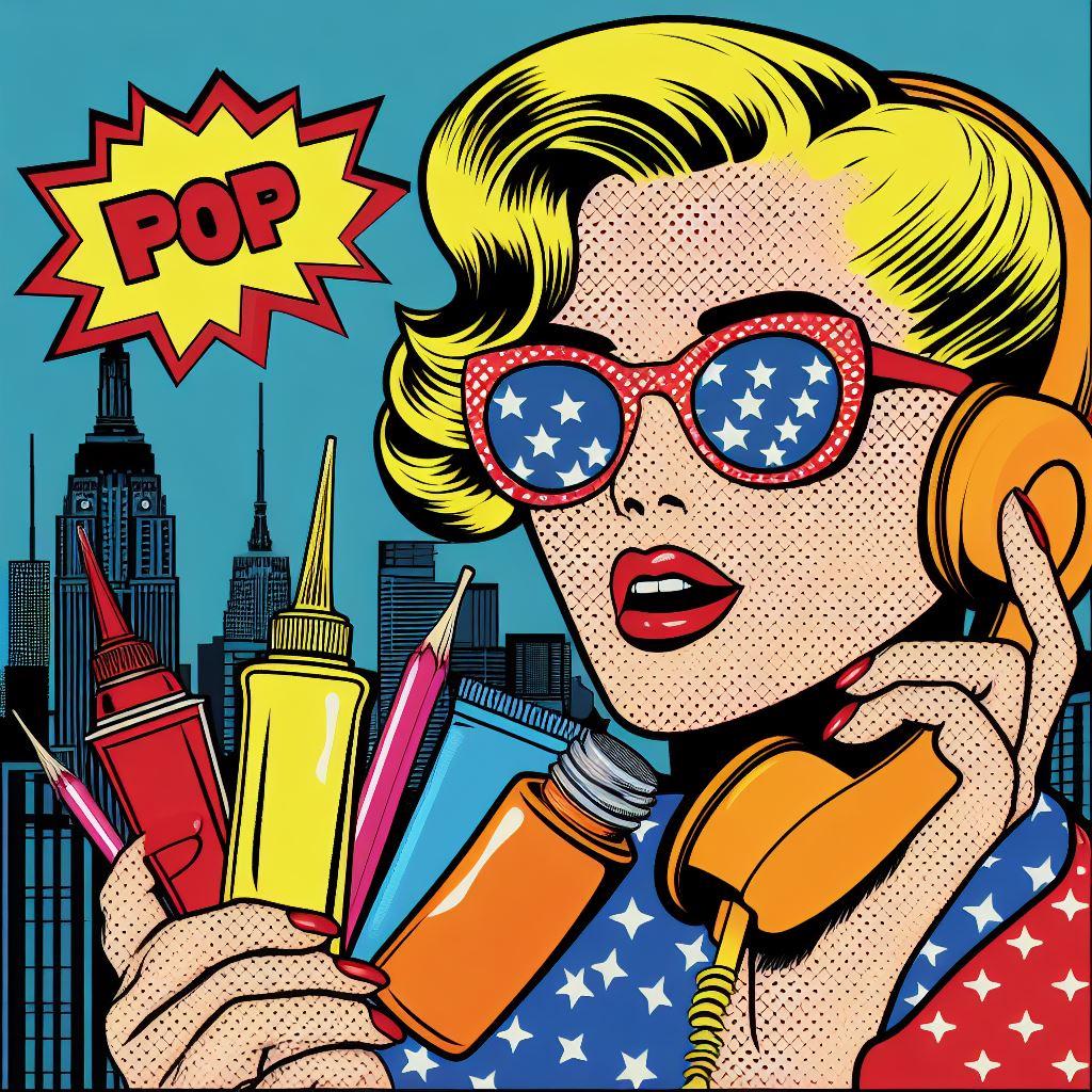
Pop artists like Andy Warhol subverted the earnestness of high art with the vibrancy of mass culture. Their bold, often clashing color choices mirrored the world of advertising, consumer goods, and celebrity. Color in Pop Art isn’t about naturalism or subtle beauty – it’s about grabbing attention and forcing a reaction on issues of everyday life raised to iconic status.
Other Modern Movements: Color’s Many Voices
- Fauvism: The Fauves (“wild beasts”) were known for their jarringly bright, often unnaturalistic color choices. Their aim was to use color to jolt viewers into experiencing pure emotional response.
- Neo-expressionism: Returning to figuration in the 1980s, Neo-expressionists employed intense, lurid colors to convey raw emotional states and social anxieties.
- Beyond the Canvas: Consider extending this section to include movements where color plays a distinct role within installations, performance art, and digital forms.

The Theory of Color in Art
Color theory is a body of knowledge that describes the relationships between colors and how they can be used to create visually appealing and meaningful compositions.
A. Color Theory Basics
- The Color Wheel: The color wheel is a circular diagram that shows the relationships between colors. It is divided into 12 sections, each representing a different hue. The primary colors (red, yellow, and blue) are located at equal intervals around the wheel. Secondary colors (orange, green, and violet) are created by mixing two primary colors. Tertiary colors (red-orange, yellow-orange, yellow-green, blue-green, blue-violet, and red-violet) are created by mixing a primary color with a secondary color.
- Primary, Secondary, and Tertiary Colors: Primary colors are the most basic colors that cannot be created by mixing other colors. Secondary colors are created by mixing two primary colors. Tertiary colors are created by mixing a primary color with a secondary color.
- Warm and Cool Colors: Warm colors (red, orange, and yellow) are associated with fire, passion, and energy. Cool colors (green, blue, and violet) are associated with water, ice, and tranquility.
- Analogous, Complementary, and Triadic Color Schemes: Analogous color schemes use colors that are adjacent to each other on the color wheel. Complementary color schemes use colors that are opposite each other on the color wheel. Triadic color schemes use three colors that are evenly spaced around the color wheel.
B. Color Psychology
Color psychology is the study of how colors affect human behavior and emotions. Different colors have been shown to evoke different moods and responses.
| Color | Emotions Evoked | Common Usage |
|---|---|---|
| Red | Passion, love, anger, danger | Excitement, energy, urgency |
| Orange | Joy, optimism, creativity | Happiness, enthusiasm, playfulness |
| Yellow | Happiness, sunshine, intellect | Optimism, hope, warmth |
| Green | Nature, growth, tranquility | Peace, harmony, balance |
| Blue | Peace, harmony, trust | Relaxation, serenity, spirituality |
| Purple | Royalty, luxury, spirituality | Mystery, intrigue, sophistication |
| Black & White | Power, sophistication, mourning | Cleanliness, purity, simplicity |
The Emotion Behind Color in Art
Color has the power to evoke a wide range of emotions in viewers. Artists throughout history have used color to create specific moods and atmospheres in their work.
- Red: Red is a powerful and intense color that can evoke emotions such as passion, love, anger, and danger. It is often used to create a sense of excitement, energy, or urgency.
- Orange: Orange is a warm and inviting color that can evoke emotions such as joy, optimism, and creativity. It is often used to create a sense of happiness, enthusiasm, or playfulness.
- Yellow: Yellow is a bright and cheerful color that can evoke emotions such as happiness, sunshine, and intellect. It is often used to create a sense of optimism, hope, or warmth.
- Green: Green is a calming and refreshing color that can evoke emotions such as nature, growth, and tranquility. It is often used to create a sense of peace, harmony, or balance.
- Blue: Blue is a cool and soothing color that can evoke emotions such as peace, harmony, and trust. It is often used to create a sense of relaxation, serenity, or spirituality.
- Purple: Purple is a rich and elegant color that can evoke emotions such as royalty, luxury, and spirituality. It is often used to create a sense of mystery, intrigue, or sophistication.
- Black and White: Black is a powerful and mysterious color that can evoke emotions such as power, sophistication, or mourning. White is a pure and innocent color that can evoke emotions such as cleanliness, purity, or simplicity.
Artists use color to create specific emotional responses in viewers. By understanding the emotional impact of different colors, artists can create works of art that convey their intended message or mood.
The Science of Color Perception: It’s All in Your Head (and Eyes)
The colors we see are not simply “out there” in the world. They’re a product of the amazing interaction between light, our eyes, and our brains. Let’s break down the basics:
- Light Makes Color Possible: Objects don’t have inherent color. Instead, they absorb certain wavelengths of light and reflect others. It’s those reflected wavelengths that reach our eyes and trigger the color-seeing process.
- Your Eye: The Color Detector: In your retina, you have specialized cells called cones. These come in three types, each sensitive to different ranges of wavelengths (roughly red, green, and blue). The signals from these cones are sent to the brain, which interprets them as color.
- Additive vs. Subtractive Color Mixing
- Additive: This is the color system of light itself. When we combine different colored lights (think stage spotlights), we add wavelengths together. Adding all wavelengths gives us white light.
- Subtractive: This applies to pigments like paints. Each pigment absorbs some wavelengths and reflects others. Mixing pigments subtracts more wavelengths, leading to darker and muddier tones.
- It’s Not Just About Your Eyes
- Lighting Conditions: The type of light hitting an object dramatically changes which wavelengths are reflected. Think how different a red dress looks in sunlight vs. a dimly lit room.
- Your Brain Does the Heavy Lifting: Color isn’t just about the raw data from your eyes. Your brain takes into account surrounding colors, your memories, and expectations to adjust what you consciously perceive.
Practical Applications for Artists: Harnessing the Power of Color
Understanding color theory and its emotional impact allows for strategic choices in your artwork. Here are a few key tools to put into practice:
Building an Effective Color Palette
- Start with a purpose: What mood or feeling do you want to convey? Warm colors for energy, cool for tranquility, etc.
- Think in relationships: Consider color schemes like analogous (colors next to each other on the wheel) or complementary (opposites) for harmony or vibrant contrast.
- Limit your choices: Often, a smaller palette (around 5 colors) creates a more cohesive work, allowing you to explore each color’s nuances.
Color Mixing Techniques
- Master your primaries: Know how to use your primary colors (red, yellow, blue) to achieve the widest range of other colors.
- It’s not just about hue: Understand terms like value (lightness/darkness of a color) and saturation (intensity or dullness) and how to modify those while mixing.
- Embrace experimentation: Keep a mixing journal, noting what colors you combined and the results. Surprising discoveries happen this way!
Choosing Colors for Emotional Impact
- Use the Emotional Color Wheel: Many resources offer guides on the traditional emotions associated with colors (red for passion, blue for peace, etc.) Use these as a starting point.
- Tap into personal associations: Do certain colors evoke specific memories or feelings for you? Trust those connections to make your work more resonant.
- Don’t neglect neutrals: Black, white, and shades of gray are powerful tools for modulating the intensity of other colors and creating contrast for focus.
Conclusion
Color is a powerful tool that artists have used throughout history to express themselves and communicate with viewers. From the vibrant hues of ancient Egyptian tomb paintings to the subtle shades of Renaissance masterpieces, color has played a vital role in shaping the way we perceive and interpret art. By understanding the history, theory, and emotion behind color in art, we can appreciate the depth and complexity of this essential element of artistic expression.
