
Learning color harmony mixing is one of the most exciting skills you can master as an artist. Whether you’re just starting your painting journey or looking to improve your technique, understanding how colors work together will transform your artwork from ordinary to extraordinary. This comprehensive guide will teach you simple, proven methods to create stunning color combinations that make your paintings pop with vibrancy and life.
Key Points Summary
- Master 5 essential color harmony types: complementary, analogous, triadic, split-complementary, and monochromatic
- Learn the “mother color” technique to prevent muddy mixtures
- Understand warm vs. cool color temperature for dynamic paintings
- Practice specific mixing ratios and brush techniques
- Avoid common mistakes that dull your colors
- Use practical exercises to build your color mixing confidence
Understanding Color Harmony Basics
What is Color Harmony in Painting?

Color harmony is like creating a beautiful song with paint – it’s when colors work together to create pleasing, balanced combinations that feel right to the eye. Think of it as the difference between a choir singing in tune versus everyone singing different notes at once.
The foundation of all color harmony mixing starts with the color wheel. This simple tool shows you exactly which colors are friends and which ones create exciting contrasts. Primary colors (red, yellow, blue) are your building blocks, while secondary colors (orange, green, purple) come from mixing two primaries together.
The Color Wheel Simplified
Understanding the color wheel doesn’t have to be complicated. Imagine it as a clock where each “hour” represents a different color. Colors sitting next to each other (like 1 o’clock and 2 o’clock) are called analogous colors – they’re neighbors and naturally get along well.
Colors sitting directly across from each other (like 12 o’clock and 6 o’clock) are complementary colors. These opposites create the most dramatic and vibrant effects when used together. For more foundational knowledge, check out our Color Theory Basics guide.
Essential Color Mixing Techniques
Primary Color Mixing Fundamentals
Starting with just three colors – red, yellow, and blue – you can mix almost any color you need. This might sound impossible, but it’s the secret that professional artists have used for centuries.
Basic Mixing Ratios:

- Orange: 2 parts yellow + 1 part red
- Green: 2 parts yellow + 1 part blue
- Purple: 1 part red + 1 part blue
The key is to add colors slowly. You can always add more, but you can’t take color away once it’s mixed.
Temperature-Based Mixing Approach
Every color has a “temperature” – it’s either warm (like sunshine) or cool (like shadows). Warm colors include reds, oranges, and yellows, while cool colors include blues, greens, and purples.
Pro Tip: When mixing colors, pay attention to temperature. A warm red mixed with a cool blue creates a different purple than a cool red mixed with a warm blue. This temperature awareness is what separates beginner painters from advanced artists.
For detailed guidance on paint selection, explore our Choosing the Best Paints for Beginners: A Complete Guide.
5 Proven Color Harmony Schemes for Color Harmony Mixing
Color Harmony Studio
Create beautiful color palettes and discover the perfect pigment mixes for your artwork. Click on the color wheel to select your base hue.
🎨 Color Wheel
🎨 Generated Palette
🎨 Pigment Mixing Guide
Pro Tip: Click on any swatch’s “Mix Details” button to see the exact pigment ratios needed to recreate that color.
1. Complementary Harmony Mixing
Complementary colors sit opposite each other on the color wheel – red and green, blue and orange, yellow and purple. When placed side by side, they make each other appear more vibrant and exciting.
How to Mix Complementary Colors Without Creating Mud:
- Start with your dominant color (let’s say red)
- Add tiny amounts of its complement (green) to create rich, neutral tones
- Never mix them 50/50 – this creates muddy brown
- Use the 80/20 rule: 80% of one color, 20% of its complement
2. Analogous Color Techniques
Analogous colors are neighbors on the color wheel – like blue, blue-green, and green. These create peaceful, harmonious paintings that feel calm and unified.
Step-by-Step Analogous Color Mixing Process:
- Choose your main color (blue)
- Mix in small amounts of its neighbors (blue-green and green)
- Create variations by adjusting the ratios
- Keep all mixtures within this color family for unity

3. Triadic Color Combinations

Triadic harmony uses three colors equally spaced on the color wheel – like red, yellow, and blue (the primaries) or orange, green, and purple (the secondaries).
Creating Vibrant Triadic Harmonies Easily:
- Use one color as your dominant tone (60%)
- Use the second color for medium areas (30%)
- Use the third color for small accents (10%)
4. Split-Complementary Methods
Instead of using direct opposites, split-complementary uses one color plus the two colors on either side of its complement. For example, if you choose blue, you’d use yellow-orange and red-orange instead of just orange.
5. Monochromatic Variations
Monochromatic doesn’t mean boring! It uses different shades, tints, and tones of a single color. Think of all the different blues in the ocean – from pale sky blue to deep navy.
Avoiding Common Color Mixing Mistakes

Why Colors Turn Muddy
The biggest frustration for new painters is when their beautiful, vibrant colors turn into muddy brown or gray. Here’s why this happens and how to prevent it:
Common Muddy Color Causes:
- Mixing too many colors together (stick to 2-3 maximum)
- Using dirty brushes or palettes
- Over-mixing colors on the canvas
- Mixing complementary colors equally (50/50)
Over-Mixing Prevention
“The secret to vibrant colors is knowing when to stop mixing. Sometimes the most beautiful effects happen when colors blend naturally on the canvas.”
Quick Rules to Prevent Over-Mixing:
- Mix colors on your palette, not on the canvas
- Clean your brush between colors
- Stop mixing when you see streaks of different colors – this creates visual interest
- Use a palette knife for cleaner mixes
For troubleshooting help, reference our Common Painting Mistakes Beginners Make article.
Advanced Vibrant Color Techniques
The Mother Color Technique Explained
The “mother color” technique is a professional secret for creating unified, harmonious paintings. Here’s how it works:
- Choose one color that will appear in every mixture (your “mother color”)
- Add tiny amounts of this color to every other color you mix
- This creates subtle connections throughout your painting
- Common mother colors include Raw Umber, Yellow Ochre, or Ultramarine Blue
Optical Mixing Effects
Instead of physically mixing colors on your palette, you can let the viewer’s eye do the mixing. This technique, used by Impressionist masters like Monet, creates more vibrant results than pre-mixed colors.
How to Use Optical Mixing:
- Place small dots or strokes of pure color next to each other
- Step back and let your eye “mix” the colors
- This creates more luminous effects than palette mixing
Learn more about these techniques in our Mastering Impressionism Light Techniques guide.
Color Temperature Shifts
Professional painters use subtle temperature changes to create depth and interest. Cool colors recede (appear farther away) while warm colors advance (appear closer).
Warm vs Cool Color Mixing Strategies:
- For shadows: Add cool colors (blues, purples)
- For highlights: Add warm colors (yellows, warm reds)
- For distance: Cool and lighten colors
- For foreground: Warm and intensify colors
Practical Color Mixing Exercises
Building a Limited Palette for Maximum Harmony
Start with just five colors: Cadmium Red, Cadmium Yellow, Ultramarine Blue, Burnt Umber, and Titanium White. This limited palette forces you to mix everything, improving your color knowledge quickly.
Essential Color Mixing Tools Every Artist Needs:
- Palette knife – for clean color mixing
- Mixing palette – glass or disposable paper palettes work best
- Color mixing chart – to track successful combinations
- Clean brushes – prevent color contamination
- Medium ratios – for proper paint consistency
Beginner Practice Projects
Exercise 1: Complementary Color Study Paint simple objects using only complementary pairs. Try painting an orange using only blue and orange mixes.
Exercise 2: Temperature Gradations Create smooth transitions from warm to cool versions of the same color.
Exercise 3: Limited Palette Painting Complete a full painting using only three colors plus white.
For more structured learning, check out our Painting Techniques for Beginners: Beyond Basic Strokes to Advanced Styles.
Medium-Specific Color Harmony Tips
Acrylic Color Mixing
Acrylics dry quickly, so work fast and keep colors moist with a spray bottle. For detailed acrylic techniques, see our Mastering Acrylic Painting: A Complete Guide for Beginners.
Oil Paint Color Mixing
Oils stay workable longer, allowing for subtle blending and glazing effects. Learn more in our Oil Painting for Beginners: Your Step-by-Step Journey.
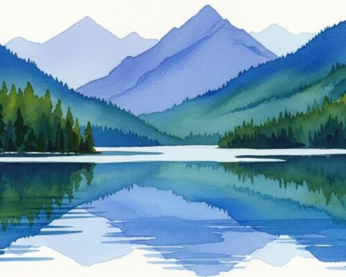
Watercolor Harmony
Watercolors blend naturally on wet paper, creating unique mixing opportunities. Explore our A Beginner’s Guide to Watercolors for specific techniques.
Recommended Video:
Frequently Asked Questions
What colors make brown when mixed? Brown is created by mixing all three primary colors together, or by mixing complementary colors like orange and blue, or red and green.
How do you make purple without blue? You cannot make true purple without blue, as purple is a secondary color created by mixing red and blue. However, you can create purple-like colors using magenta and small amounts of other colors.
Why do my colors look muddy? Muddy colors typically result from mixing too many colors together, using dirty brushes, or mixing complementary colors in equal proportions.
What’s the difference between hue and saturation? Hue is the pure color (red, blue, yellow), while saturation refers to the intensity or purity of that color. High saturation means vivid color, low saturation means dull or grayish color.
How to make colors more vibrant? Use pure colors straight from the tube, mix fewer colors together, use complementary colors side by side, and avoid over-mixing.
What colors go well together? Analogous colors (neighbors on the color wheel), complementary colors (opposites), and triadic combinations (three equally spaced colors) all create pleasing combinations.
Conclusion
Mastering color harmony mixing transforms your paintings from amateur to professional-looking artwork. By understanding the five essential harmony schemes, avoiding common mixing mistakes, and practicing with focused exercises, you’ll develop the confidence to create stunning color combinations in every painting.
Remember, great color mixing is a skill that improves with practice. Start with simple exercises using limited palettes, and gradually expand your techniques as you become more comfortable. Whether you’re working with acrylics, oils, or watercolors, these fundamental principles of color harmony mixing will serve you throughout your artistic journey.
The key to vibrant, harmonious colors isn’t in having hundreds of paint tubes – it’s in understanding how colors relate to each other and knowing when to mix and when to let colors speak for themselves.

