
The world of illustration is often divided into two camps: the textured, painterly look of traditional media and the crisp, clean geometry of digital vector art. But what if you could bridge that gap? Enter the world of flat graphic illustration with posca pens.
For decades, graphic designers relied on computers to achieve that perfect, matte “sticker-like” finish. However, a massive resurgence in analog creation has artists reaching for Posca pens (and their rivals) to create “manual vectors.” This style is characterized by bold blocks of solid color, razor-sharp edges, and a complete lack of visible brushstrokes.
Whether you are a seasoned designer looking to get away from the screen or a beginner wanting to make art that pops, this guide will cover everything from selecting the right nibs to digitizing your work for print.
Key Takeaways:
- The Aesthetic: How to mimic digital vector art using analog tools.
- The Gear: Why Smooth Bristol board and PC-1MR nibs are non-negotiable.
- The Technique: Secret circular motions to prevent streaks in large areas.
- The Workflow: A step-by-step guide to scanning and vectorizing your physical art.
Why Acrylic Paint Pens are Perfect for Flat Design
Unlike watercolors or alcohol markers, which rely on transparency and blending, acrylic paint pens are opaque. This opacity is the secret sauce to flat graphic illustration with acrylic paint pens. It allows you to layer light colors over dark ones—a feat impossible with standard markers—and achieve a solid, consistent hue that looks printed.

The “Manual Vector” Aesthetic
The goal of this style is to create an image that looks like it was made in Adobe Illustrator, but retains the warmth and “soul” of a hand-drawn piece. This is often called the “Manual Vector” look. To achieve this, you must eliminate the evidence of the tool. There should be no streak marks, no paper grain showing through, and no uneven pooling of ink. You are essentially acting as a human printer, laying down pigment in flat, perfect zones.
If you are interested in how other styles prioritize precision, check out our guide on outline drawing art.
Acrylic vs. Alcohol Markers
Many beginners mistake Posca pens for alcohol markers (like Copics). For flat graphics, alcohol markers can be frustrating because they are transparent; if you overlap strokes, the color darkens, creating “banding.”
Acrylic pens, specifically Posca markers, contain liquid acrylic paint. Once dry, the paint forms a permanent, plastic-like layer. This means you can color a solid red circle, let it dry, and then draw a crisp white line right over it. This ability to stack layers is crucial for the “cut-out” paper look of flat design.
The Matte Finish Advantage
Posca ink dries to a beautiful, chalky matte finish. This is ideal for scanning and photographing because it does not reflect light (unlike glossy oil paints or shiny inks). This natural matte quality makes the colors appear incredibly velvety and deep, mimicking the look of high-quality screen prints.
For more on how materials affect the final look, read about acrylic painting surfaces.
Essential Gear: Building Your Kit
You cannot achieve a professional flat graphic look with standard copier paper and a single marker size. The “flat” look requires specific tools designed to hold heavy ink loads without warping.
Decoding Posca Nib Sizes for Graphics

Posca offers a confusing array of tips, but for graphic illustration, you only need to master three specific types:
- PC-1MR (0.7mm): Note the “R”. This stands for “Ring.” Unlike the standard PC-1M (which has a scratchy bullet tip), the 1MR has a metal-clad plastic tip, similar to a fineliner. This is the holy grail for crisp, vector-like outlines and cleaning up ragged edges.
- PC-3M & PC-5M: These are your workhorses. The bullet tips are made of firm felt. The 3M is perfect for small coloring zones, while the 5M puts down enough ink to cover medium areas quickly.
- PC-17K: The “Rectangular” tip. If you need to fill a background sky with solid blue, do not use a small pen—you will get streaks. The broad 15mm width of the 17K allows for a “wet edge” that merges seamlessly.
The Best Paper for Flat Illustration (Critical Choice)
If you use textured paper, the acrylic ink will settle into the valleys of the grain, ruining the illusion of a flat digital surface.
- Smooth Bristol Board (Industry Standard): This is the best surface for flat graphic illustration with acrylic paint pens. Brands like Strathmore (300 or 400 series Smooth) provide a glass-smooth finish that allows the ink to sit on top rather than sinking in instantly.
- Yupo Paper: A synthetic, plastic paper. Because it is non-porous, the ink stays wet longer (up to 20 seconds). This allows you to push the paint around and remove streaks before they dry. However, it requires patience as drying times are doubled.
- Hot Press Watercolor Paper: “Hot Press” means the paper was ironed smooth during manufacturing. It is durable and can handle heavy layers of paint without buckling, unlike thinner sketch paper.
To understand why paper texture matters, look at how surface affects charcoal vs. pastel.
Tape & Masking Tools
To get those laser-straight horizons found in vector art, you need tape.
- Washi Tape: Low tack, easy to remove, but paint can sometimes bleed under it.
- Artist/Drafting Tape: Stronger hold.
- Liquid Masking Fluid: A rubbery fluid you paint on, let dry, and peel off later to preserve white areas. This is essential for detailed negative space.
Core Techniques for Flat Graphic Style
Now that you have the gear, how do you actually apply the paint to avoid the dreaded “marker streaks”?
Mastering the “Streak-Free” Fill

The number one enemy of flat illustration is visible stroke lines.
- The Circular Method: Never color in straight back-and-forth lines (like a coloring book). Instead, use small, tight overlapping circles. This breaks up the grain direction and keeps the “leading edge” of the paint wet, allowing it to self-level before drying.
- The Cross-Hatch Fill: If you must use linear strokes, do one layer horizontally. Let it dry completely. Then, do a second layer vertically. The weave pattern creates a dense, opaque block.
- Wet-on-Wet Speed: You must work quickly. If the ink dries halfway through a shape, you will get a visible seam. Keep the ink flowing!
Achieving Laser-Sharp Edges
- “Cutting In”: Before filling a shape, trace the inner perimeter with your PC-1MR or 3M. This creates a dam. Then fill the center. This prevents you from accidentally coloring outside the lines while trying to fill quickly.
- The “Tape-Burnish” Trick: When using tape for a straight line, apply the tape, then paint a thin layer of the background color (or white) along the tape edge first. Let it dry. Then paint your main color. The first layer seals the tape, preventing the main color from bleeding underneath.
Layering Logic for Flat Design
Acrylics dry fast, but not that fast.
- Order of Operations: Always work Background -> Foreground. In flat design, it is easier to paint a blue sky and then paint a yellow sun on top of it, rather than trying to paint blue around a circle.
- The 90-Second Rule: Wait at least 90 seconds before touching a painted area. If it is cool to the touch, it is still wet.
- The White Basecoat: Posca colors are opaque, but neon colors (yellow, pink, light green) are naturally more translucent. To make them “pop” on dark paper, paint the shape white first, let it dry, and then apply the neon color.
Understanding color interactions is vital. Check out our color mixing chart for painters.
Troubleshooting Common “Flat Art” Problems
Even pros run into issues. Here is how to save your drawing.

Paper Pilling & Tearing
“Pilling” occurs when the paper fibers roll up into little balls. This happens when you scrub the nib over the same spot while the paper is wet.
- The Fix: Stop immediately. Let it dry. Once dry, lightly brush off the pills and paint a second coat gently. Do not press hard!
The “Blobs” & Splatters
Pressure builds up inside the pen barrel due to heat or altitude.
- The Burp: If your pen is flowing too fast, hold it upright (nib up) and press the tip down once to release gas. This is called “burping” the pen.
- Splatter Control: Never shake the pen over your artwork. Shake it away from the desk.
Fixing Mistakes
The beauty of flat graphic illustration with acrylic paint pens is the undo button.
- Paint Over: If you go over the line, wait for it to dry perfectly. Then, use the background color (or white) to paint over the mistake. It acts like correction fluid.
- Scraping: On very smooth Bristol or Yupo, you can sometimes use an X-Acto knife to gently scrape away a small paint splatter.
Competitive Landscape: Posca vs. The Rest
Is Posca the only game in town? Not anymore. Let’s look at the data for 2025.
Comparison: Top Acrylic Marker Brands (2025 Data)

| Feature | Uni Posca | Molotow One4All | Arrtx Acrylic |
|---|---|---|---|
| Price Per Pen (Avg) | ~$3.50 – $5.00 | ~$7.00 – $9.00 | ~$1.00 – $1.50 |
| Opacity Rating | High (Industry Std) | Very High | Medium-High |
| Refillable? | No (Officially) | Yes (Designed for it) | No |
| Nib Durability | Medium (Felt tips fray) | High (Harder tips) | Medium |
| Color Range | 66+ Colors | 50+ Colors | 60+ Colors |
| Best For | General Flat Illustration | Graffiti / High Wear | Budget / Sketching |
Posca vs. Molotow One4All
Molotow is the premium choice. Their ink is slightly more opaque and flows smoother. The pens are refillable, reducing plastic waste. However, they are expensive.
Posca is the industry standard for a reason: accessibility. You can find them anywhere, and their color palette is tuned perfectly for illustration (great pastels).
Posca vs. Arrtx/Ohuhu Acrylics
Budget brands like Arrtx have flooded Amazon. Are they good? Yes, actually. For a beginner, Arrtx provides great coverage. The downside is lightfastness (they may fade faster) and the nibs tend to wear out quicker than Posca.
If you are looking for other supplies, check out our guide to art and craft supplies.
Professional Workflow: From Sketch to Digital
You have created a beautiful manual vector. Now, how do you get it onto a screen for Instagram or a client print?
Digitizing Your Posca Art

- Scanning: Do not just take a photo with your phone. Use a flatbed scanner. Scan at 300 DPI minimum (600 DPI is better for resizing later).
- Photoshop Levels: Open the scan. Go to
Image > Adjustments > Levels. Drag the white slider in to make the paper background pure white (#FFFFFF). Drag the black slider to deepen the darks. This removes the subtle texture of the paper, enhancing the “flat” vector look. - Vectorizing: If you need to blow the image up for a billboard, move the file to Adobe Illustrator. Use the Image Trace function (Preset: High Fidelity Photo or 16 Colors). This converts your painted shapes into mathematical vector paths.
Sealing Your Original Work
Acrylic marker sits on top of the paper. It can be scratched.
- Matte Varnish: To keep the “flat” look, you must use a Matte spray varnish (like Krylon Crystal Clear Matte or Liquitex Matte). Do not use Gloss, or you will lose the graphic aesthetic.
- Glass Protection: If framing, ensure the glass does not touch the artwork, as acrylics can stick to glass over years in humid conditions. Use a matte.
For more on preserving art, see our guide on art conservation for beginners.
Artist Showcase & Inspiration
Who is leading the charge in this style?

Profiles in Flat Style
- Tom Haugomat: A master of limited palettes and negative space. He often leaves the paper white to represent light, painting only the shadows. His work is a perfect example of how “less is more” in flat illustration.
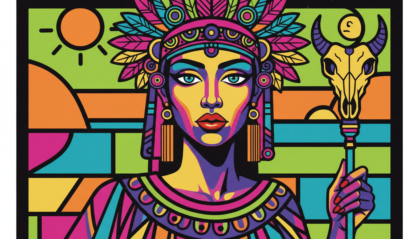
- Aurelia Durand: Famous for her vibrant, pop-art style characters. She uses Posca pens to create joyful, energetic illustrations that celebrate diversity. Her work shows how to use clashing neons effectively.
Style Exercises
Stuck? Try these starter projects:
- The Geometric Landscape: Draw a mountain range using only triangles. Use 4 shades of blue. Practice layering the foreground mountains over the background ones.
- The Pop-Art Portrait: Take a photo of a friend. Trace the main shapes (hair, face, glasses). Fill them in with unrealistic colors (purple skin, green hair). Focus on clean edges.
Looking for more inspiration? Explore what is pop art or dive into simple sketching prompts.
FAQs: Flat Graphic Illustration with Posca Pens
Q: How do I color large areas with Posca pens without streaks?
A: Use the widest nib available (PC-17K or PC-8K). Work wet-on-wet using circular motions. Do not let the edge dry before you connect the next stroke.
Q: What is the best paper for Posca markers flat illustration?
A: Smooth Bristol Board (Strathmore 300 series) is the best. It prevents bleeding and keeps lines sharp.
Q: How do I fix mistakes with acrylic paint pens?
A: Wait for the mistake to dry completely. Then, simply paint over it with the correct color. Posca is opaque enough to cover black with white (though it may take two coats).
Q: Can I use Posca pens on canvas?
A: Yes! However, standard canvas has a weave texture. For a flat graphic look, you should prime the canvas with Gesso and sand it smooth before painting. Learn more about how to repair minor canvas damage.
Q: How long do Posca markers take to dry?
A: On paper, they are touch-dry in about 60-90 seconds. On non-porous surfaces like plastic or glass, wait at least 20 minutes.

