
Summary: Art is deeply personal. Color blindness does not lock you out of enjoying or creating beautiful work. By focusing on values, shapes, and contrast, you can experience a richer visual world. This guide explores how color-deficient individuals perceive art, highlights new accessibility tools in museums, and provides practical advice for starting your own creative practice today.
You stand in front of a famous landscape painting. Everyone else talks about the vivid greens and deep reds. You see mud. It is frustrating. But art is not a locked room. You just need a different key.
Color vision deficiency affects roughly 8% of men and 0.5% of women globally. For a long time, the art world ignored this reality. Galleries celebrated complex color fields while leaving a large portion of the population guessing.
Today, that is changing. We now know that you do not need perfect color vision to be deeply moved by a painting. Learning to look past the hues allows you to appreciate art without feeling overwhelmed.
How Do Colorblind People Perceive Art?

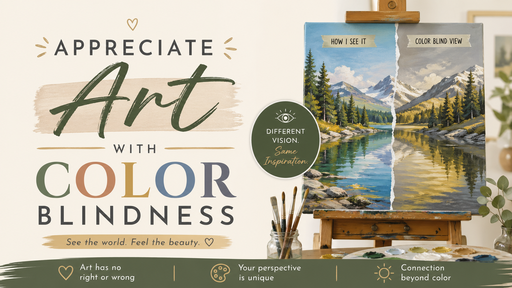
Colorblind individuals perceive art through values, contrast, and shapes rather than traditional hues. While they might miss certain red and green distinctions, they often develop a heightened sensitivity to texture, composition, and the emotional weight of light and dark balance.
A recent 2024 design study confirmed that people with color vision deficiency naturally rely on patterns, shapes, and sharp contrast to interpret visual information. Your brain compensates brilliantly. Where someone else sees a clash of red and green, you might notice a brilliant use of thick brushstrokes.
Modern research into digital experiences also shows that alternative sensory cues keep visual engagement high. You are just reading the painting in a different language. You might be the first person in the room to notice the understanding rhythm in art because you are not distracted by bright colors.
The Hidden Advantage of Seeing Values Over Hues
Every painting has two main components. It has hue (the actual color) and value (how light or dark the color is). Beginners often obsess over hues. Masters obsess over values.
As a colorblind observer, you already have a heightened, natural sense of values. You immediately see the underlying skeleton of a painting. If a piece lacks strong light and dark contrast, it will look flat to you. This makes you an excellent judge of solid composition.
If you want to understand color theory basics, start by looking at a black-and-white photograph of a famous painting. The power of the image survives entirely on its values.
Are There Special Glasses For Viewing Art At Museums?
Yes. Many museums now offer specialized EnChroma glasses that visitors can borrow. These glasses filter light to increase the contrast between red and green signals. This helps people with color vision deficiency experience a much wider and richer range of colors.
The push for accessibility is expanding rapidly. The Ackland Art Museum in North Carolina rolled out these glasses in late 2024. In 2025, major institutions like the Andy Warhol Museum in Pittsburgh followed suit.
This simple tool makes a massive difference. Recent tourism data from Albany shows that 85% of people are more likely to visit cultural attractions if these glasses are available. Always ask the front desk if they have accessibility tools before you start your gallery tour.
Making Your Own Marks Without Fear
Olly Farmer is an arts educator, watercolorist, and the Founder of ProminentPainting.com. Backed by over a decade of teaching experience, he is dedicated to making painting accessible for artists of all levels.
In my decade of teaching, I have worked with several students who worried their color deficiency meant they could not paint. When we implemented a strict focus on value studies, we saw their confidence completely transform.
Do not let color blindness stop you from picking up a brush. Start by exploring our complete guide to art mediums. Charcoal, graphite, and monochromatic ink are brilliant starting points. They remove the pressure of color matching entirely. You can just focus on drawing what you actually see.
Can You Be A Successful Painter If You Are Colorblind?
Absolutely. Many successful artists have color vision deficiencies. They succeed by using limited palettes, relying on strong lighting sources, and prioritizing tonal values over complex color matching. Focusing on shapes and contrast allows them to build incredibly compelling and unique compositions.
Many modern creators use their unique vision as a stylistic signature. They intentionally limit their palettes to ambers and blues. Painting with a limited palette forces you to be creative. It builds intense visual harmony.
Start Creating Today
You do not need to see the world exactly like everyone else to capture its beauty. Your unique vision is an asset. It allows you to see the structural truth of an image. Grab a sketchbook and a dark pencil today. Look for the brightest light and the darkest shadow in the room. Draw exactly what you see.
Frequently Asked Questions
Does being colorblind mean I only see in black and white? No. A very small percentage of people see only in black and white (achromatopsia). Most colorblind individuals simply have trouble distinguishing between specific colors like red and green.
Should I tell my art teacher that I am colorblind? Yes. A good teacher will adjust their instruction. They can help you focus on color values and contrast rather than pushing you to perfectly match a specific hue.
How do colorblind artists mix their paints? Many artists pre-mix their palettes or read the labels on their paint tubes very carefully. Some use digital color-picking tools to verify their choices before applying paint to the canvas.
Can I use regular sunglasses to see color better? Standard sunglasses only reduce the amount of light entering your eye. You need specially engineered lenses like EnChroma glasses to actively filter specific wavelengths and improve color contrast.
Is digital art easier for colorblind people? Digital art can be much easier. Software programs have precise color sliders, hex codes, and layers. This removes the guesswork from traditional paint mixing and gives you total control over your palette.

