Watercolor painting is a beautiful and expressive art form that allows artists to create stunning works of art. One of the key elements in creating captivating watercolor paintings is achieving harmonious color combinations. A well-executed watercolor harmony can evoke emotions, set a mood, and make your artwork stand out. In this article, we will explore ten effective ways to improve your watercolor harmonies and create visually striking paintings that capture the viewer’s attention.
1. Understand Color Theory
To improve your watercolor harmonies, it is essential to have a solid understanding of color theory. Familiarize yourself with the color wheel, which illustrates the relationships between primary, secondary, and tertiary colors. Learn about complementary colors, analogous colors, and color temperature. This knowledge will serve as a foundation for creating harmonious color schemes in your watercolor paintings.
2. Choose a Limited Palette
When it comes to watercolor harmonies, less is often more. Instead of using an overwhelming array of colors, opt for a limited palette of three to five harmonious hues. By limiting your color choices, you can create a sense of cohesion and prevent your painting from becoming visually chaotic. Experiment with different combinations to discover which colors work best together.
3. Create a Color Mood Board

Before starting a new watercolor painting, gather inspiration by creating a color mood board. Collect images, photographs, or even fabric swatches that resonate with the mood or atmosphere you want to convey in your artwork. Analyze the colors present in these references and use them as a guide when selecting your palette. This practice will help you achieve a unified and harmonious color scheme throughout your painting.
4. Practice Color Mixing
Mastering the art of color mixing is crucial for achieving harmonious watercolor harmonies. Experiment with mixing different colors to create various shades, tints, and tones. Understand how each color interacts with others, and learn to control the intensity and transparency of your pigments. This skill will allow you to fine-tune your color choices and create smooth transitions between hues.
5. Consider Color Temperature
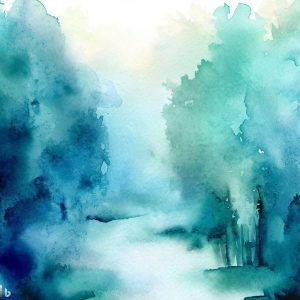
Color temperature refers to the perceived warmth or coolness of a color. Warm colors, such as reds, oranges, and yellows, evoke energy and vibrancy, while cool colors, such as blues and greens, convey calmness and serenity. Understanding color temperature can help you set the mood in your watercolor paintings. Experiment with warm and cool color combinations to create contrast and visual interest.
6. Pay Attention to Value
Value, or the relative lightness or darkness of a color, plays a significant role in creating depth and dimension in your watercolor paintings. Develop an understanding of value by practicing monochromatic studies and exploring the tonal range of your chosen colors. By incorporating a range of values into your artwork, you can add depth and realism to your watercolor harmonies.
7. Use Color Harmonies
Color harmonies are predefined combinations of colors that are aesthetically pleasing to the eye. Some popular color harmonies include complementary, analogous, and triadic schemes. Complementary colors are opposite each other on the color wheel and create high contrast and visual impact. Analogous colors are adjacent to each other and create a harmonious and cohesive effect. Triadic color schemes consist of three colors that are evenly spaced around the color wheel, offering a balanced and vibrant result. Experiment with different color harmonies to find the ones that resonate with your artistic vision.
8. Embrace Negative Space
Negative space refers to the empty or unoccupied areas in a painting. By strategically utilizing negative space, you can enhance the impact of your watercolor harmonies. Negative space allows colors to breathe and creates a sense of balance and harmony within your artwork. Experiment with leaving areas unpainted or using lighter washes to emphasize the negative space and make your colors pop.
9. Study Other Artists
One of the most effective ways to improve your watercolor harmonies is to study the works of other accomplished artists. Analyze their color choices, techniques, and overall compositions. Take note of how they use color to create mood, convey emotion, and establish focal points. By studying and learning from other artists, you can expand your own artistic repertoire and develop a unique style that sets your watercolor paintings apart.
10. Practice, Practice, Practice
Improving your watercolor harmonies requires dedication and practice. Set aside regular time for painting and experiment with different techniques and color combinations. Embrace the process of trial and error, and don’t be afraid to take risks and push your boundaries. With consistent practice, you will refine your skills and develop a keen eye for creating captivating watercolor harmonies.
What are some common Color Harmonies used in watercolor painting?
Watercolor painting offers a wide range of color harmonies that can be used to create beautiful and harmonious paintings. Here are some common color harmonies used in watercolor painting:
- Triadic Color Scheme: This color scheme consists of three colors that are evenly spaced around the color wheel. The most common set of triads are the primary colors; yellow, red, and blue.
- Complementary Color Scheme: This color scheme consists of two colors that are opposite each other on the color wheel, such as red and green or blue and orange. Using complementary colors can create vibrant and harmonious watercolor paintings.
- Analogous Color Scheme: This color scheme consists of colors that are next to each other on the color wheel, such as blue, blue-green, and green. Using analogous colors can create a harmonious and calming effect in your watercolor paintings.
- Dominant Hue Color Scheme: This color scheme involves choosing one color as the dominant hue and using it in most of the other colors you mix. Repeat the color frequently throughout the painting to create a cohesive and harmonious effect.
- Monochromatic Color Scheme: This color scheme involves using a single color to create art. By using a range of light-to-dark values, you can make the subject stand out and develop this important skill.
Experimenting with different color harmonies and techniques can help you find the ones that work best for you and create beautiful and harmonious watercolor paintings.
Table illustrating some popular Color Harmonies
| Color Harmony | Description | Example Colors |
|---|---|---|
| Complementary | Colors that are opposite each other on the color wheel. They create high contrast and visual impact. | Red and green, blue and orange, yellow and purple |
| Analogous | Colors that are adjacent to each other on the color wheel. They create a harmonious and cohesive effect. | Red, orange, and yellow, blue, green, and cyan, purple, blue, and magenta |
| Triadic | Colors that are evenly spaced around the color wheel. They offer a balanced and vibrant result. | Red, blue, and yellow, cyan, magenta, and yellow, blue, green, and red |
| Tetradic | Four colors that are evenly spaced around the color wheel. They can be used to create a variety of effects, from balanced and harmonious to vibrant and dynamic. | Red, blue, yellow, and green, cyan, magenta, yellow, and black, blue, green, red, and orange |
| Split-complementary | A variation of the complementary color scheme, where one of the complementary colors is replaced by its two neighbors on the color wheel. This creates a more subtle and harmonious effect. | Red and green-yellow, blue and orange-yellow, yellow and blue-purple |
| Monochromatic | A color scheme that uses only one color and its variations, such as tints, shades, and tones. This can create a calm and serene effect, or it can be used to create a sense of drama by using contrasting values and intensities. | Red, light red, medium red, dark red, black red |
| Neutral | A color scheme that uses neutral colors, such as black, white, and gray. This can create a sense of sophistication and elegance, or it can be used to create a sense of calm and tranquility. | Black, white, gray, beige, brown, tan |
It is important to note that these are just a few examples of color harmonies. There are many other possibilities, and the best way to find the right color scheme for your painting is to experiment and see what works best.
In conclusion, achieving harmonious watercolor harmonies is an art form in itself. By understanding color theory, choosing a limited palette, practicing color mixing, considering color temperature and value, using color harmonies, embracing negative space, studying other artists, and dedicating time to practice, you can significantly improve your watercolor paintings. Remember, each artist has a unique style, so don’t be afraid to experiment and find your own voice within the realm of watercolor harmonies.
