
Imagine trying to cook a gourmet five-course meal using only four ingredients. It sounds impossible, right? In the culinary world, that might be a recipe for disaster. But in the art world, specifically in oil painting, this restriction is the secret weapon of the masters. Welcome to the Zorn Palette Challenge.
Whether you are a seasoned pro tired of muddy colors or a beginner overwhelmed by the hundreds of tubes at the art store, this challenge will change how you see color forever. By limiting your tools, you are forced to expand your skills.
In this guide, we aren’t just going to talk about painting faces (which is what everyone else talks about). We are going to dive deep into the physics of pigments, show you how to paint landscapes without blue paint, and look at the real-world costs of this method.
Key Takeaways:
- Simplicity: Learn to mix a full spectrum using only 4 specific tubes.
- Harmony: Automatically unify your paintings; it is almost impossible to make a “bad” color combination.
- Economy: Save hundreds of dollars on art supplies.
- Technique: Master value control and color temperature.

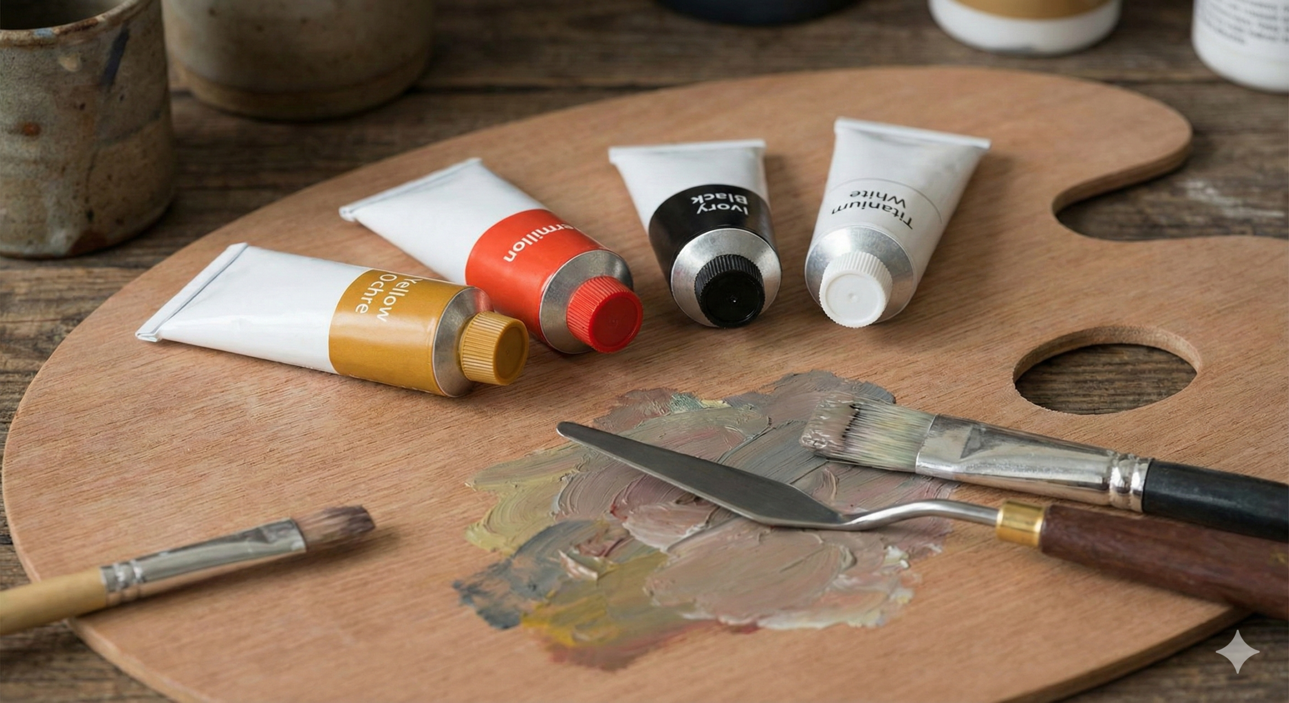
The four colors that changed the history of portrait painting.
What is the Zorn Palette?
The Zorn Palette is a specific arrangement of four colors that creates a surprisingly wide range of hues (colors). It is named after the Swedish virtuoso artist Anders Zorn (1860–1920). While Zorn didn’t “invent” this palette—it has roots going back to the Renaissance and the limited palette movements of the 17th century—he made it famous.
The History: Anders Zorn & The 19th Century “Limited” Movement
Anders Zorn is often mentioned in the same breath as John Singer Sargent and Joaquin Sorolla. He was a master of Alla Prima (wet-on-wet) painting. While Zorn did use other colors (like Cobalt Blue and Viridian) when the subject absolutely demanded it, many of his most famous masterpieces hanging in the Zorn Museum were created using just four pigments.
Why did he do this? In the late 19th century, there was a move toward realism in art, focusing on capturing light and atmosphere rather than just filling in outlines. A limited gamut allowed Zorn to paint quickly and capture the essence of a scene without getting bogged down in color theory.
The “Authentic” vs. “Modern” Palette
If you want to take the Zorn Palette Challenge, you have a choice to make: go historical or go practical.

1. The Authentic Palette (What Zorn Used):
- Yellow Ochre (PY43): A natural earth pigment.
- Vermilion (PR106): A mercury-based red (very toxic and expensive).
- Ivory Black (PBk9): Historically made from charred ivory scraps.
- Lead White (PW1): Also known as Flake White (toxic).
2. The Modern Palette (What You Should Use):
- Yellow Ochre (PY43): Still the king of earth tones.
- Cadmium Red Light (PR108): A safer, more affordable, and lightfast substitute for Vermilion.
- Ivory Black (PBk9): Now made from charred animal bones (the crucial “blue” of the palette).
- Titanium White (PW6): The standard opaque white used today.
Why It Works: The Theory of “Relative Color”
This is where the magic happens. If you look at Ivory Black on a palette, it looks black. But color is relative. If you place a cool black next to a warm orange (Cadmium Red + Yellow Ochre), your eye tricks you. The black appears blue.
This is called Color Temperature. By manipulating warm and cool colors, you can convince the viewer they are seeing greens, blues, and purples, even though you never squeezed a tube of blue paint. This concept is fundamental to color theory basics.
The Physics of the Pigments (Technical Deep Dive)
To master this challenge, you need to understand your tools. Not all paints are created equal, and substituting the wrong specific pigment code can ruin the effect.
Yellow Ochre (PY43 vs PY42)
Yellow Ochre is the “sunlight” of your palette.
- Natural (PY43): This is actual earth. It is generally more transparent and has a “grit” to it. It glows when glazed.
- Synthetic (PY42): This is Mars Yellow. It is more opaque and uniform.
Tip: For the Zorn palette, stick to PY43 if you can. The transparency helps when mixing flesh tones, allowing light to bounce through the layers, similar to the techniques used in Renaissance art.
Ivory Black (PBk9) – The Secret Blue
This is the most critical tube. You might be tempted to use Mars Black (PBk11) or Lamp Black because you have them lying around. Don’t.
- Mars Black is warm and opaque (brownish undertone). It will turn your mixtures into mud.
- Ivory Black (PBk9) is semi-transparent and has a distinct cool blue undertone.
Warning: Drying Times
Ivory Black is an incredibly slow-drying pigment because of its oil content. It can take 4 to 7 days to dry to the touch. If you paint a fast-drying white over wet Ivory Black, your painting will crack (a phenomenon called “sinking in” or delamination). We will discuss how to manage this in the “Real World Data” section.
The Red Debate: Vermilion vs. Cadmium Red Light
Vermilion is the historical choice, but a 37ml tube can cost over $100 and contains mercury. Unless you are a professional doing museum restorations, skip it.
Cadmium Red Light (PR108) is the modern hero. However, it is a “bully.” It has incredibly high tinting strength. A tiny dot of Cadmium Red can overpower a whole pile of Yellow Ochre.
- Mixing Tip: When mixing, add the red to the other colors in tiny increments. Do not add other colors to the red.
The White: Lead vs. Titanium
Zorn used Lead White, which dries very fast and creates a long, ropey texture ideal for thick impasto strokes.
Titanium White (PW6) is what 99% of us use. It is slower drying and “short” (buttery). It is also the most opaque white. Because Titanium is so strong, it can make colors look “chalky” if you use too much. To counteract this, some artists mix a little Zinc White or use a “Mixing White” tube.
Choose your specific pigment codes carefully for the best results.
The Zorn Palette Challenge (Step-by-Step)
Ready to start? We are breaking this down into three levels of difficulty. But first, let’s look at your wallet.
Setup: Material List & Cost Analysis
One of the best reasons to try this palette is the cost savings. High-quality blue and violet pigments (like Cobalt or Cadmium Purple) are expensive. Here is the breakdown based on 2024 pricing estimates.
| Pigment | Modern Option (Winsor & Newton / Gamblin) | Authentic Option (Michael Harding / Old Holland) |
|---|---|---|
| Yellow | Yellow Ochre ($16) | Yellow Ochre ($18) |
| Red | Cadmium Red Light ($23) | Genuine Vermilion ($112+) |
| Black | Ivory Black ($12) | Ivory Black ($14) |
| White | Titanium White ($14) | Cremnitz/Lead White ($35+) |
| Total Cost | ~$65.00 | ~$179.00+ |
Recommendation: Start with the ~$65 modern setup. Use the money you saved to buy better brushes or high-quality canvas.
Level 1: The Apprentice (Portrait Study)
This is where the Zorn palette shines. Human skin tones—regardless of ethnicity—are essentially variations of orange (Yellow + Red) toned down with grey (Black + White).
The Mission: Paint a portrait or a hand study.
The “Flesh Tetrahedron” Mixing Method:

- Base Orange: Mix Yellow Ochre + Cadmium Red.
- Lighten: Add White to create varying values of peach/pink.
- Desaturate: Add the tiniest touch of Ivory Black (which acts as blue) to cool down the mixture for shadow areas.
This prevents the “clown makeup” look that beginners often get when using too many bright colors. If you need help drawing the anatomy first, check out this guide on mastering drawings in hands.
Level 2: The Journeyman (Landscape Study)
This is the skyscraper opportunity. Most blogs tell you Zorn is only for portraits. They are wrong. You can paint convincing landscapes, but you have to be clever.
The Mission: Paint a simple landscape with trees and sky.
The Gap Strategy:
You have no blue. So, how do you paint the sky?
- The Sky Hack: Mix Ivory Black + Titanium White. This creates a “cool grey.” When you place warm green trees next to it, the grey sky will look blue to the viewer. This is an optical illusion.
- Zorn Greens: To make green, you mix Yellow + Blue. Since Ivory Black is your blue:
- Olive Green: Yellow Ochre + Ivory Black.
- Warm Green: Add more Yellow.
- Muted Green: Add a touch of Red (Red is the complement to Green, so it dulls it).
This palette creates earthy, moody landscapes, reminiscent of the Romanticism art movement.

Using relative color, Black and Yellow create convincing landscape greens.
Level 3: The Master (Still Life High Chroma)
The Mission: Paint a still life that contains a lemon and a violet grape.
The Reality Check: You are going to fail, but you will fail gracefully.

- The Lemon: You cannot mix a high-chroma, neon lemon yellow. Yellow Ochre is an earth tone. You have to paint a “ripe” or “shadowed” lemon.
- The Violet: You cannot mix a true purple. Red + Black = a muddy maroon.
This level teaches you Chroma Control. You learn to make your dull yellow look bright by surrounding it with dark, cool greys. It forces you to focus on value (light vs. dark) rather than hue. This is a technique often seen in Baroque art.
Critical Mixing Guide & Charts
To stop yourself from creating “mud,” you need to organize your palette. Arrange your colors in strings.
The 3 Primary Strings
Imagine three lines of paint on your palette:
- String A (The Warm String): White | Yellow Ochre | Cadmium Red.
- Result: Cream, flesh tones, intense oranges, pinks.
- String B (The Cool String): White | Ivory Black.
- Result: A scale of cool greys that simulate blue.
- String C (The Green String): Yellow Ochre | Ivory Black.
- Result: Olive greens to deep forest blacks.
Troubleshooting “Mud”
“Mud” happens when you mix warm and cool colors without a plan, usually resulting in a desaturated brown-grey.
- The Fix: Keep your “light” mixtures clean. Do not let Ivory Black touch your pure White/Yellow mixtures unless you intend to desaturate them.
- Brush Hygiene: Wipe your brush between strokes! With a limited palette, dirty brushes ruin the subtle temperature shifts.
For a visual aid, consider using a color mixing chart printable to map out your Zorn combinations before you start painting.
Real World Data & Comparisons
Let’s look at the technical data that most art teachers forget to mention.
Drying Time Showdown (Gamblin vs W&N)
Oil paints dry at different rates. This creates tension on the canvas.
| Color | Drying Speed | Advice |
|---|---|---|
| Lead White | Very Fast (1-2 days) | Use only on rigid panels. |
| Yellow Ochre | Fast/Medium (2-3 days) | Safe for underpainting. |
| Cadmium Red | Slow (5+ days) | Use sparingly. |
| Ivory Black | Very Slow (4-7+ days) | DANGER ZONE. |
The Danger: If you paint a thick layer of Ivory Black, and then the next day paint a layer of Lead White over it, the White will dry first. As the Black underneath continues to dry and shrink, it will crack the white surface.
The Solution: If you are painting in layers (indirect painting), add a drying medium like Galkyd or Liquin to your Ivory Black to speed it up. Or, paint “Fat over Lean” (start with thin paint, end with thick paint). This is crucial oil painting for beginners knowledge.
Cost Per Square Inch: Limited vs Full Palette
If you cover a 16×20 canvas:
- Full Palette (12 colors): You waste paint trying to mix specific shades. Average cost: ~$4.50 in paint.
- Zorn Palette (4 colors): You mix from a unified source. Average cost: ~$2.10 in paint.
- Savings: Over a year of painting, this allows you to buy significantly more canvases.

A limited palette means less waste and easier cleanup.
FAQs:
Can I use Lamp Black instead of Ivory Black?
You can, but it is less ideal. Lamp black is cooler than Mars Black, but it has a very high tinting strength and can be greasy. Ivory Black (PBk9) is preferred for its transparency and specific blue bias.
Is this palette suitable for acrylics?
Absolutely. The physics of color remain the same. However, acrylics dry much darker (color shift), so your “Zorn Greens” might dry looking almost black. You will need to add more white to your mixtures than you would with oils. If you are starting out, check out this guide on acrylic painting tools.
How do I mix purple with the Zorn Palette?
Technically, you can’t mix a vibrant violet. Red + Black gives you a deep, muted aubergine or plum color. If your subject relies heavily on bright purples (like a lilac flower), the Zorn palette might not be the right choice. However, for deep shadows in clothing or drapery, the Zorn “purple” is incredibly harmonious.
Can I use this for abstract art?
Yes! Abstract art relies on composition and value. The Zorn palette forces you to focus on these elements. See abstract art movements for inspiration on how limitations spark creativity.
Final Thoughts: Why Restriction Creates Freedom
The Zorn Palette Challenge is more than just a frugal way to paint; it is a masterclass in discipline. By removing the distraction of infinite color choices, you are forced to learn the true language of painting: Value, Temperature, and Chroma.
When you master these four tubes, you will find that your paintings look more unified and “old master” like than ever before. You will stop fighting with your materials and start working with them.
So, grab your Yellow Ochre, Cadmium Red, Ivory Black, and Titanium White. Step up to the canvas. The challenge awaits.
If you are looking for more inspiration on how limitation breeds genius, read about the famous painters and paintings throughout history who did more with less.

