Keith Haring burst onto the New York art scene in the 1980s, captivating audiences with his vibrant, energetic drawing style. His distinctive approach, characterized by bold lines, dancing figures, and universal symbols, quickly became recognizable worldwide. More than just visually appealing, Haring’s art carried powerful messages, making complex ideas accessible to everyone. From the bustling subway stations of New York City to grand museum exhibitions, a Keith Haring drawing transcended traditional art spaces and became a revolutionary force in contemporary art.
Key Points:
- Keith Haring developed a unique visual language using continuous flowing lines and simplified figures
- His iconic symbols like the Radiant Baby, Barking Dog, and Dancing Figures carry deep social and political meanings
- Haring worked across multiple mediums from subway chalk drawings to large-scale murals and silkscreen prints
- His art democratized contemporary art by making it accessible to everyone, not just gallery visitors
- Despite his short life, Haring’s influence on street art, activism, and popular culture remains immense
The Foundations of Haring’s Style: Simplicity and Motion
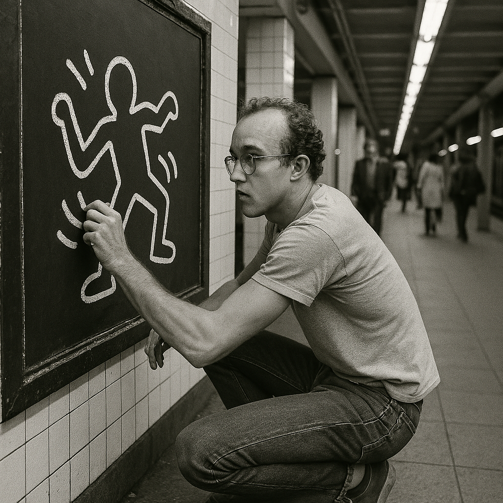
Keith Haring developed a unique visual language rooted in simplicity. His drawings often feature continuous, flowing lines and simplified figures, creating a sense of constant movement and energy. This immediate, almost primal quality made his art incredibly approachable and impactful, even for those unfamiliar with traditional art forms. Every Keith Haring drawing seems to pulse with life, as if the figures might leap off the wall at any moment.
Haring’s work borrowed elements from street art, graffiti, and comic strips. He believed art should be for everyone, not just a select few, and his drawing style reflected this philosophy. By stripping down complex forms to their basic essence, he created a visual vocabulary that transcended language barriers and cultural divides. His approach aligned perfectly with the emerging evolution of street art movement that was transforming urban landscapes in the 1980s.
The technical execution of Haring’s style involved several key elements:
- Thick, Continuous Lines: Haring rarely lifted his chalk or marker, creating unbroken contours that gave his figures a unified, organic quality
- Simplified Forms: Human figures reduced to their most basic shapes—circles for heads, rectangles for bodies, stick-like limbs
- Dynamic Movement: Radiating lines, dancing poses, and diagonal compositions that convey constant action
- Flat Perspective: No shading or depth, everything exists on the same visual plane
- High Contrast: Bold black lines against white or colored backgrounds for maximum visual impact
This minimalist approach meant anyone could recognize and understand a Keith Haring drawing instantly. Unlike abstract expressionism that required interpretation, Haring’s visual language spoke directly and democratically to all viewers.
Keith Haring’s Connection to Pop Art
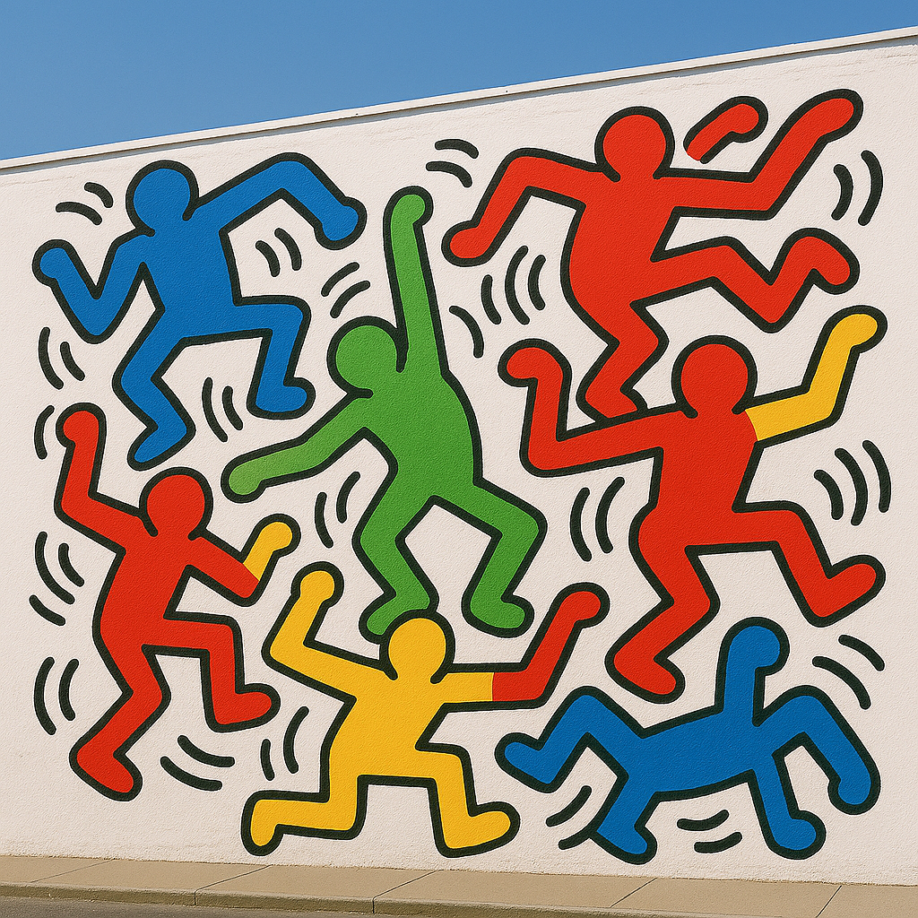
Haring emerged during the height of Pop Art’s influence, and his work shared many characteristics with the movement. Like Andy Warhol and Roy Lichtenstein, Haring embraced bold lines and bright colors that drew from commercial and popular culture. His use of repetition and accessible imagery echoed Andy Warhol’s style of elevating common elements to high art status.
However, Haring took Pop Art one step further by literally bringing it to the streets. While Warhol celebrated consumer culture from within gallery spaces, Haring delivered his messages directly to commuters, children, and everyday people who might never enter a museum. This commitment to accessibility made his work both a continuation of and a departure from traditional Pop Art principles.
Decoding Haring’s Iconic Symbols and Their Meanings
Beyond their energetic appearance, Keith Haring drawing works are rich with symbolism. Each recurring figure, from the ‘Barking Dog’ to the ‘Flying Saucer,’ carried a specific meaning, often reflecting social and political commentary. Understanding these symbols unlocks layers of meaning in what might initially seem like simple drawings.
The Radiant Baby
Perhaps Haring’s most famous symbol, the Radiant Baby appears frequently throughout his work. This crawling infant surrounded by radiating lines symbolizes:
- Innocence and purity
- The promise of the future
- Hope and new beginnings
- The potential energy of youth
- Life force and vitality
The Radiant Baby became so iconic that it now serves as the logo for the Keith Haring Foundation, continuing his legacy of supporting children’s programs and AIDS organizations.
The Barking Dog
This aggressive, snarling canine figure represented:
- Authority and oppression
- Media manipulation and propaganda
- Blind loyalty and following orders
- The darker aspects of human nature
- Systems of control and power
Haring used the Barking Dog particularly when addressing themes of political corruption, censorship, and authoritarian control.
Dancing Figures
The joyful, interlinked human figures that appear in many Haring works symbolize:
- Unity and community
- Celebration and joy
- Human connection
- Collective power
- Love and togetherness
These figures often appear in groups, emphasizing Haring’s belief in the power of people coming together for positive change.
Additional Symbolic Elements
Flying Saucers/UFOs: Technology, the unknown, and otherworldly perspectives on human problems
Television Sets: Media influence, information overload, and the power of broadcast messaging
Dollar Signs: Capitalism, greed, and the commodification of art and life
Hearts: Love, compassion, and human emotion
Snakes: Temptation, danger, and corrupting influences
This visual vocabulary allowed Haring to discuss complex topics like war, nuclear disarmament, apartheid, and the AIDS epidemic in a way that was accessible and thought-provoking. His use of symbolism in art created layers of meaning that viewers could decode based on their own experiences and knowledge.
Video: Draw like Keith Haring
Evolution of Keith Haring’s Drawing Mediums
A comparison of the different surfaces and tools Keith Haring utilized throughout his career, highlighting his versatility and commitment to accessible art.
| Medium/Surface | Characteristics | Typical Location/Context | Impact/Purpose |
|---|---|---|---|
| Chalk on Black Paper | Temporary, spontaneous, public | NYC Subway Stations (billboard covers) | Democratizing art, direct communication with public |
| Marker/Ink on Paper | Sharp lines, quick execution, intimate scale | Sketchbooks, small studies, illustrations | Developing ideas, personal expression, detailed work |
| Acrylic/Enamel on Canvas/Tarpaulin | Bold colors, durable, large scale | Galleries, museums, murals | Formalizing street art, commercial work, large public statements |
| Paint on Walls/Structures | Monumental, permanent or semi-permanent, public | Murals (e.g., Bowery Mural), hospitals, schools | Community engagement, social commentary, large-scale accessibility |
| Silkscreen Prints | Reproducible, graphic, affordable | Art editions, posters, merchandise | Mass distribution of art and messages, commercial viability |
This versatility in materials demonstrated Haring’s commitment to reaching audiences wherever they were. Whether someone encountered his work on a subway platform, purchased an affordable poster, or viewed a museum piece, the core message remained consistent and powerful.
The Subway Art Project: Democracy in Action
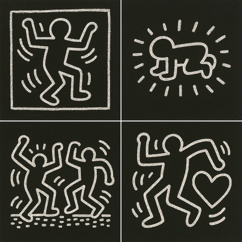
Haring’s most revolutionary contribution to art accessibility was his subway drawing project, which began in 1980. He discovered that New York’s Metropolitan Transportation Authority covered expired advertising panels with matte black paper—perfect surfaces for white chalk drawings. These blank panels became his canvas, and he transformed empty advertising spaces into free art galleries.
Every day, Haring would ride the subways with white chalk in his pocket, creating spontaneous drawings on these black panels. He worked quickly—each drawing took only minutes—because he never knew when a transit cop might arrive or an onlooker might become aggressive. This practice had several profound impacts:
Accessibility: Thousands of commuters saw original Haring art daily, free of charge. No gallery admission, no museum membership required.
Immediacy: The temporary nature meant each drawing existed briefly before being removed or covered. This ephemeral quality made encounters feel special and fleeting.
Interaction: Unlike art behind velvet ropes, subway riders could touch, photograph, and engage directly with Haring’s work. Many did, and Haring encouraged this interaction.
Risk: Creating these drawings was technically illegal, though rarely prosecuted. This element of danger aligned with the rebellious spirit of street art as social activism.
Between 1980 and 1985, Haring created thousands of these subway drawings. Many were photographed by Tseng Kwong Chi, documenting this important chapter of urban art history. The project demonstrated that meaningful art could exist outside traditional institutional spaces, influencing how street art would boost local economies and transform urban landscapes in the decades to come.
“Art is for everybody. I think the museum walls are the wrong walls. That’s why I go to the subway.”
Keith Haring
Haring’s Activism Through Art
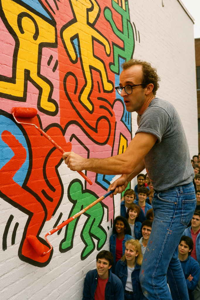
What distinguishes a Keith Haring drawing from purely aesthetic works is its deep commitment to social activism. Haring used his platform and visual language to address urgent issues of his time, creating art that was both beautiful and politically engaged.
AIDS Awareness and Activism
After being diagnosed with AIDS in 1988, Haring became even more vocal about the epidemic that was devastating communities worldwide. His “Silence = Death” poster and other AIDS-related works raised awareness at a time when many institutions remained silent about the crisis. He created:
- Free posters distributed in hospitals and community centers
- Benefit artwork for AIDS organizations
- Public education materials explaining safe sex
- Memorial pieces honoring friends lost to the disease
Haring’s willingness to discuss AIDS openly, even as he battled the disease himself, helped reduce stigma and encouraged others to get tested and seek treatment.
Anti-Apartheid Stance
Haring created numerous works condemning South African apartheid, including a poster for a “Free South Africa” concert. His universal visual language made these messages accessible to international audiences, contributing to the global movement against racial segregation.
Nuclear Disarmament
During the height of Cold War tensions, Haring produced powerful anti-nuclear weapons imagery. His simplified visual style made the terror of nuclear war understandable even to children, emphasizing the stakes of the arms race.
LGBTQ+ Rights
As an openly gay artist during a time of widespread homophobia, Haring’s very existence as a successful, visible queer person was radical. His art celebrated gay culture and challenged heteronormative assumptions about what art and artists should be.
Drug Awareness
Haring created the iconic “Crack is Wack” mural in 1986 on a handball court in Harlem, addressing the crack cocaine epidemic devastating urban communities. Though initially painted without permission, the mural’s powerful message led the city to preserve it as a landmark.
This commitment to activism through art demonstrated that Keith Haring drawings weren’t just about aesthetics—it was about using visual communication to create positive social change. His approach influenced generations of artists who saw art as a tool for addressing injustice and inequality.
The Technical Brilliance Behind Simplicity
While Haring’s style appears deceptively simple, achieving his aesthetic required considerable technical skill and intentionality. Understanding the technique behind a Keith Haring drawing helps artists appreciate the mastery involved.
Line Quality and Confidence
Haring’s lines are remarkably consistent and confident. There’s no hesitation, no sketching, no erasing. This assuredness came from:
- Thousands of hours of practice drawing the same basic forms
- Deep understanding of human anatomy, even when simplified
- Muscle memory that allowed rapid execution
- Complete confidence in his visual vocabulary
When you watch footage of Haring working, you see him move with balletic grace, each line flowing naturally from the previous one. This fluidity is the result of extraordinary technical control masquerading as spontaneity.
Composition and Visual Balance

Despite their apparent spontaneity, Haring’s compositions are carefully balanced. He understood principles of:
- Positive and Negative Space: Using empty areas to make figures pop
- Visual Weight: Distributing elements evenly across the picture plane
- Rhythm and Repetition: Creating patterns that guide the eye through the composition
- Scale Relationships: Sizing elements to create hierarchy and emphasis
These principles, foundational to any strong artwork, operate subtly beneath Haring’s seemingly simple surfaces.
Color Theory Application
When working in color, Haring demonstrated sophisticated understanding of color relationships:
- Primary colors (red, yellow, blue) for bold, eye-catching impact
- High contrast combinations for visibility
- Flat, unmodulated color fields in the Pop Art tradition
- Strategic use of color to emphasize meaning (red for danger, yellow for caution, etc.)
This technical foundation allowed Haring to work quickly and intuitively while still producing visually sophisticated, powerful artwork.
The Lasting Influence of Keith Haring’s Drawings

Despite his tragically short life—Haring died at age 31 in 1990—his impact on art and popular culture is immense and enduring. His distinctive drawing style continues to inspire artists, designers, and activists globally. He broke down barriers between high art and street art, proving that meaningful messages could be conveyed through simple, engaging imagery.
Influence on Contemporary Artists
Numerous contemporary artists cite Haring as a major influence:
- Shepard Fairey (creator of the Obama “Hope” poster) adopted Haring’s approach to making art accessible and politically engaged
- KAWS borrowed Haring’s simplified character approach and commercial accessibility
- Takashi Murakami extended Haring’s blurring of high and low art into Japanese pop culture
- Banksy followed Haring’s model of creating meaningful public art outside institutional spaces
Impact on Design and Commercial Art
Haring’s aesthetic has permeated virtually every aspect of visual culture:
- Fashion collaborations with brands from Uniqlo to Coach feature his designs
- His imagery appears on everything from skateboards to sneakers
- Music videos, album covers, and concert posters borrow his style
- Graphic designers regularly reference his bold lines and vibrant colors
- His approach to icons and symbols influenced emoji and digital communication design
Educational Legacy
The Keith Haring Foundation, established before his death, continues his mission of:
- Supporting children’s arts programs
- Funding AIDS research and education
- Providing emergency grants to community organizations
- Making art accessible to underserved populations
Through the Foundation, Haring’s commitment to using art for social good continues decades after his death.
Cultural Permanence
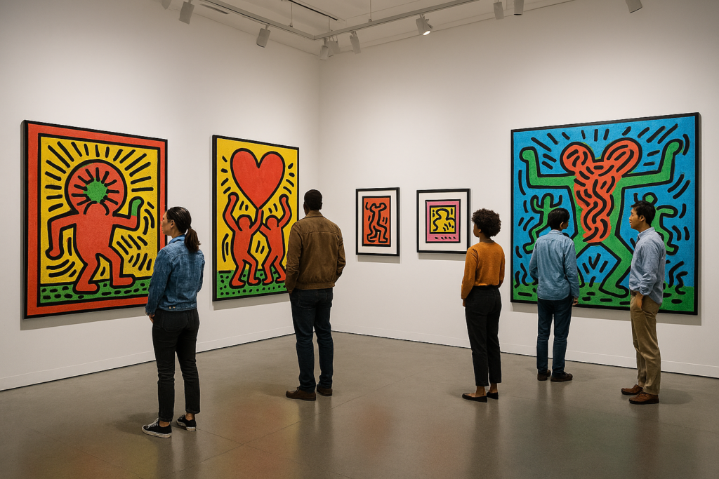
Perhaps most remarkably, Keith Haring drawings have achieved true cultural permanence. His work is instantly recognizable across generations and cultures. Children who draw stick figures with radiating lines are unconsciously referencing Haring. His visual vocabulary has become part of our collective visual language, proving that truly great art transcends its moment to become timeless.
His legacy reminds us that art doesn’t need to be complicated to be profound, expensive to be valuable, or displayed in museums to be important. Haring proved that simple lines and sincere commitment to making the world better can create art that lasts forever.
Learning From Keith Haring: Drawing Like Haring
Many people wonder how to draw like Keith Haring, and the good news is that his style is highly learnable. Here’s how to approach creating your own Haring-inspired work:
Step 1: Start with Basic Shapes
Begin by practicing Haring’s fundamental forms:
- Circles for heads
- Rounded rectangles or ovals for torsos
- Simple cylinders for limbs
- Basic geometric shapes for hands and feet
Step 2: Master Continuous Lines
Practice drawing without lifting your pen or chalk. This creates the unbroken, flowing quality characteristic of a Keith Haring drawing:
- Draw figure outlines in one continuous motion
- Let lines flow naturally from one form to the next
- Don’t worry about perfection—embrace the energy of unbroken lines
Step 3: Add Movement
Haring’s figures never stand still. Add dynamism through:
- Diagonal limbs suggesting motion
- Radiating lines around figures showing energy
- Overlapping figures creating rhythmic patterns
- Action poses—jumping, dancing, running
Step 4: Develop Your Own Symbols
While you can practice drawing Haring’s iconic symbols, creating your own visual vocabulary is more meaningful:
- Choose 5-10 simple symbols that represent concepts important to you
- Repeat these symbols across multiple drawings
- Let your symbols evolve as you develop your style
- Consider what social messages you want to convey
Step 5: Work in Public
Following Haring’s democratic approach:
- Create art in accessible spaces where people can encounter it naturally
- Consider sidewalk chalk, poster projects, or community murals
- Share your work on social media to reach broad audiences
- Think about how your art can serve communities, not just yourself
Practice Exercises
- The 60-Second Figure: Set a timer and draw a complete Haring-style figure in one minute
- Symbol Development: Draw 50 variations of one symbol to find your preferred version
- Message Work: Create a drawing that communicates one specific social message
- Public Art Documentation: Visit hidden meanings in famous paintings and street art in your area, photograph them, and study how artists communicate in public spaces
Remember, Haring created thousands of drawings before developing his signature style. Consistent practice and genuine passion for communicating visually are more important than natural talent.
Conclusion: The Enduring Power of Keith Haring Drawing
Keith Haring’s drawings are more than just captivating visuals; they are a vibrant testament to the power of art as a universal language. Through his iconic lines and symbols, he created a bridge between the art world and everyday life, inspiring millions and advocating for social change. His keith haring drawing style proved that art could be simultaneously sophisticated and accessible, serious and joyful, beautiful and meaningful.
Haring’s legacy reminds us that art can be profound, accessible, and an enduring force for good. In an increasingly complex world, his simple lines and sincere messages continue to enlighten and unite audiences across the globe. Whether you encounter his work in a museum, on a t-shirt, or recreated as street art in your own city, the spirit of Keith Haring—democratic, joyful, and activist—lives on. His belief that art belongs to everyone, not just the elite, revolutionized how we think about creativity, accessibility, and the role of artists in society.
The power of Keith Haring drawings aren’t just in what it looks like, but in what it represents: a world where art serves people, where simple images carry profound messages, and where creativity can be a force for positive change. That vision remains as relevant and necessary today as it was in the 1980s, ensuring that Keith Haring’s artistic revolution will continue inspiring new generations for decades to come.
Frequently Asked Questions
What is the meaning behind Keith Haring’s ‘Radiant Baby’?
The Radiant Baby is one of Haring’s most recognizable symbols, representing innocence, purity, hope, and the potential of youth. The crawling infant surrounded by radiating lines symbolizes birth, life, new beginnings, and the life force radiating from all humans. It often appeared in contexts celebrating children or discussing themes of future generations and their wellbeing. The Radiant Baby has become the logo for the Keith Haring Foundation, which supports children’s programs and AIDS organizations worldwide.
Where did Keith Haring get his inspiration for his drawings?
Haring drew inspiration from various sources, including New York City graffiti art and street culture, comic books and cartoons (particularly Walt Disney and Dr. Seuss), ancient hieroglyphs and petroglyphs, traditional African and Oceanic art, Jean Dubuffet’s Art Brut movement, and Pierre Alechinsky’s calligraphic approach. His experiences in New York City’s vibrant street culture of the 1980s were a major influence on his dynamic style. The subway environment, with its constant motion and diverse audiences, particularly shaped his commitment to creating accessible public art.
How did Keith Haring make his drawings accessible to everyone?
Haring made his art accessible through multiple strategies: working in public spaces like subway stations and streets where anyone could view it for free, using simple, universal symbols that were easy to understand regardless of language or education, creating affordable reproductions like posters and merchandise so people could own his work, opening the Pop Shop in 1986 to sell affordable items featuring his designs, painting murals in hospitals, schools, and community centers, and collaborating with children’s programs to make art education available to underserved communities. He believed art should not be confined to galleries for the elite but should exist wherever people lived and worked.
What kind of messages did Keith Haring convey through his art?
Haring used his drawings to convey diverse messages including love, unity, peace, and equality as core themes; AIDS awareness and safe sex education during the epidemic; anti-apartheid activism and racial justice; nuclear disarmament and peace advocacy; LGBTQ+ rights and visibility; drug abuse prevention (like his famous “Crack is Wack” mural); environmental protection; and children’s rights and education. His art served as a powerful form of activism and social commentary, addressing serious issues through accessible visual language that could reach broad audiences.
Can I learn to draw like Keith Haring?
Yes, many people successfully learn to draw in Haring’s style! His technique emphasizes bold, continuous lines without lifting the pen or chalk, simplified figures reduced to basic geometric shapes, strong sense of movement and energy in compositions, development of your own set of recurring symbols, high contrast and clear visual communication, and working quickly and confidently without excessive planning. Start by practicing basic shapes and continuous line drawing, then develop your own symbolic vocabulary. The key is consistent practice and genuine passion for visual communication. Remember that Haring created thousands of drawings before perfecting his style, so patience and persistence are essential.
Why is Keith Haring’s art still relevant today?
Haring’s art remains relevant because the social issues he addressed—inequality, health crises, discrimination, and social justice—continue to affect our world. His democratic approach to art accessibility resonates in our digital age where art reaches global audiences through social media. His influence on street art, graphic design, and popular culture continues to expand. The Keith Haring Foundation keeps his activist mission alive through grants and programs. His visual language has become part of our collective cultural vocabulary, influencing everything from fashion to digital icons. Most importantly, his belief that art should serve communities and address real-world problems provides a model for contemporary artists seeking to make meaningful contributions to society.
What was Keith Haring’s relationship with hip-hop culture?
Keith Haring was deeply connected to hip-hop culture, which was emerging simultaneously with his art in 1980s New York. He designed album covers for hip-hop artists, painted at clubs where hip-hop was played, collaborated with rappers and DJs, recognized hip-hop as a parallel democratic art form reaching the same communities he wanted to reach, and saw connections between graffiti writing and his own visual language. Both Haring’s art and hip-hop shared values of accessibility, street credibility, and speaking to urban youth culture. This connection helped bridge visual art and music communities in revolutionary ways.
How much is Keith Haring’s original artwork worth today?
Original Keith Haring artworks vary dramatically in value depending on size, medium, provenance, and rarity. Small drawings and sketches might sell for $50,000-$100,000, medium-sized paintings typically range from $500,000-$2 million, large-scale important works can exceed $5-6 million at auction, while prints and posters remain relatively affordable at $500-$5,000. His most valuable work, painted on tarpaulin and featuring his iconic imagery, set records exceeding $6 million. However, true to Haring’s democratic vision, affordable reproductions and merchandise ensure his art remains accessible regardless of economic status. The Keith Haring Foundation carefully manages his legacy to balance artistic value with accessibility.
Did Keith Haring have formal art training?
Yes, Keith Haring attended the School of Visual Arts (SVA) in New York City from 1978-1980, where he studied semiotics (the study of signs and symbols), though he never completed his degree. His education in semiotics heavily influenced his approach to creating universal visual language. Before SVA, he briefly attended the Ivy School of Professional Art in Pittsburgh. However, Haring often credited his subway drawings and street art practice as his most important education, saying that engaging directly with diverse public audiences taught him more than formal instruction. His ability to synthesize academic knowledge of symbols with street art immediacy created his unique approach.
What happened to Keith Haring’s subway drawings?
Most of Keith Haring’s original subway drawings were temporary and no longer exist. The chalk drawings were created on black paper covering expired advertising panels in New York subway stations. They were regularly removed by transit workers or worn away by touching and weather. A few were preserved by collectors who carefully removed the panels. Photographer Tseng Kwong Chi extensively documented these subway drawings, creating an important visual record. Some documentation also exists through photographs by other artists and fans. Today, these photographs serve as the primary evidence of this important chapter in Haring’s career. The ephemeral nature of the subway project was intentional—Haring wanted to create art that lived briefly and powerfully rather than becoming permanent commodities.
Citations
- The Keith Haring Foundation – https://www.haring.com/ – Official foundation established by Keith Haring before his death, featuring comprehensive information about his life, work, and ongoing legacy
- MoMA Learning: Keith Haring – https://www.moma.org/learn/moma_learning/keith-haring/ – Educational resources from the Museum of Modern Art about Haring’s artistic techniques, influences, and impact
- Tate Modern: Keith Haring – https://www.tate.org.uk/art/artists/keith-haring-1254 – Comprehensive artist biography and analysis of major works from one of the world’s leading modern art museums
- Haring, Keith. Keith Haring Journals. Penguin Books, 2010. – Personal writings providing insight into Haring’s thoughts, creative process, and philosophy
- Gruen, John. Keith Haring: The Authorized Biography. Simon & Schuster, 1991. – Definitive biography documenting Haring’s life, artistic development, and cultural impact

