
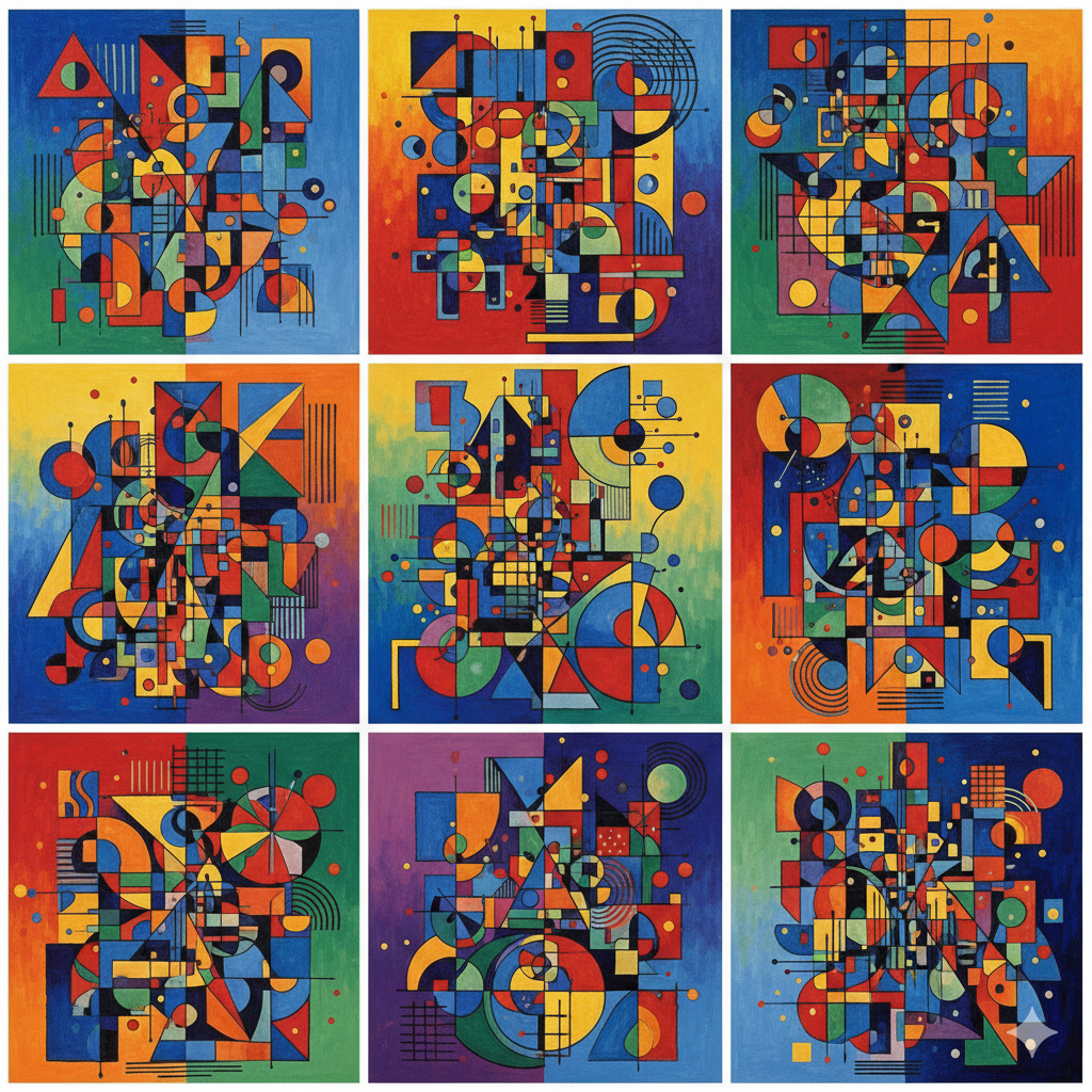
Have you ever looked at a painting and felt a swirl of emotions without seeing any recognizable objects? That’s the magic of abstract art, and few artists mastered it quite like Wassily Kandinsky. Known as one of the pioneers of pure abstraction, Kandinsky believed art should express inner feelings and ideas through colors, shapes, and lines, much like music. In this Kandinsky abstract tutorial, we’re going to dive into the vibrant world of this revolutionary artist and learn how to create your very own abstract masterpiece. Don’t worry if you’re a complete beginner – we’ll break down his style and techniques into simple, easy-to-follow steps.
Key Points:
- Kandinsky pioneered abstract art by using colors and shapes to express emotions rather than depicting real objects
- His art was influenced by synesthesia—the ability to “hear” colors and “see” sounds
- Creating Kandinsky-inspired art requires basic supplies: acrylic paints, brushes, canvas, and creative freedom
- The tutorial covers essential elements like geometric shapes, color choices, and layering techniques
- Abstract art has no rules—experimentation and personal expression are encouraged
Understanding Kandinsky’s Vision: The Basics of Abstraction
Before we pick up our brushes, let’s briefly understand what made Kandinsky’s art so groundbreaking. Unlike traditional painting techniques that focused on realistic representation, Wassily Kandinsky felt that colors and forms could speak directly to the soul when freed from depicting real-world objects. He even believed he could ‘hear’ colors—a neurological condition known as synesthesia, where one sense triggers another.
Kandinsky’s journey into abstract painting involved moving away from traditional landscapes and portraits towards purely non-objective art. He was a founding member of Der Blaue Reiter (The Blue Rider), an expressionist movement in early 20th-century Germany, and later taught at the famous Bauhaus school, where he developed his theories about the spiritual and emotional power of art.
His revolutionary approach explored how different shapes—circles, squares, triangles—and colors evoked specific feelings and ideas. A circle represented harmony and the cosmos, while a triangle suggested dynamic movement and spiritual aspiration. Understanding this foundation will help you make more intentional choices in your own abstract work, turning random marks into meaningful visual expressions.

Essential Art Supplies for Your Kandinsky Project
To get started with this Kandinsky abstract tutorial, you’ll need a few basic art supplies. The beauty of abstract art techniques is that it doesn’t require a huge investment, and you can often work with what you have. We recommend using acrylic paints as they are versatile, dry quickly, and are easy to clean up, making them perfect for beginners exploring abstract expressionism.
Here’s a quick list to get you ready:

- Acrylic paints: A basic set with primary colors (red, blue, yellow), secondary colors (green, orange, purple), plus black and white
- Paintbrushes: Various sizes including both flat and round brushes (sizes 2, 6, and 10 are versatile)
- Canvas or thick paper: Start with an 11×14″ or 16×20″ canvas panel or heavyweight watercolor paper
- Palette: A plastic palette, ceramic plate, or even a paper plate works perfectly
- Water container: For cleaning brushes between colors
- Paper towels or rags: For wiping and blending
- Pencil: For light sketching (optional)
- Painter’s tape: For creating crisp geometric edges (optional)
- Apron or old shirt: To protect your clothes!
If you’re just starting your artistic journey, check out our guide on choosing the best paints for beginners to make informed choices about quality and budget.

BUY Abstract Art Supplies
Kandinsky’s Elements: Colors and Shapes
A guide to how Wassily Kandinsky perceived different colors and basic geometric shapes:
| Element | Kandinsky’s Interpretation/Feeling | Common Usage in His Art |
|---|---|---|
| Red | Energy, passion, warmth, power | Dynamic accents, focal points, represents fire and movement |
| Blue | Spirituality, calm, depth, cold | Backgrounds, vastness, meditative areas, represents heaven |
| Yellow | Earthly, exciting, aggressive, joy | Bright spots, radiating energy, represents earthly matter |
| Green | Peace, balance, stability, natural | Transitional areas, soothing elements, represents growth |
| Circle | Harmony, cosmos, spiritual | Floating forms, central elements, represents infinity |
| Square | Calm, material, static | Stable foundations, structured areas, represents earthly matter |
| Triangle | Aggression, dynamism, spiritual aspiration | Upward movement, sharp contrasts, represents thought |
Understanding these associations helps you make more intentional choices, but remember—your personal interpretation is equally valid. Color theory basics can help you understand why certain colors work harmoniously together while others create exciting tension.
The Psychology Behind Kandinsky’s Color Choices
Kandinsky didn’t choose colors randomly. He believed deeply in creating mood with color choices, assigning specific emotional and spiritual qualities to each hue. His writings, particularly “Concerning the Spiritual in Art,” outlined his theories about how colors affected the human soul.
Warm colors (reds, oranges, yellows) moved toward the viewer, creating excitement and energy, while cool colors (blues, greens, purples) receded, offering calm and contemplation. He also paid attention to value—the lightness or darkness of a color—knowing that a pale yellow evokes entirely different feelings than a deep, saturated one.
This psychological approach to color makes Kandinsky’s work particularly powerful. When you’re creating your own abstract piece, think about the emotions you want to express, then choose colors that align with those feelings. Are you feeling energetic? Reach for vibrant reds and oranges. Seeking peace? Blues and greens might be your palette.
Step-by-Step Kandinsky Abstract Tutorial: Creating Your Own Masterpiece
Now for the fun part! Let’s get hands-on and create your artwork. Remember, there’s no right or wrong in abstract art, especially when channeling Kandinsky. The goal is to express feelings and ideas through color and form, so let your intuition guide you. This approach is central to many abstract painting ideas that encourage experimentation.
Step 1: Start with a Background Wash

Begin by applying a thin layer of a primary or secondary color to your canvas. This sets the mood for your entire composition. Kandinsky often used blues for spiritual depth or yellows for earthly energy. Mix your chosen color with a bit of water to create a translucent wash, then apply it using broad brushstrokes or a sponge across the entire surface.
Pro tip: Don’t worry about perfect coverage. Some texture and variation add interest. Let this layer dry completely before moving to the next step—this usually takes 15-30 minutes with acrylics.
Step 2: Introduce Basic Shapes
Using a different color, start painting simple geometric shapes—circles, squares, triangles—across your canvas. Think about their placement and how they interact with each other. Will your circle float in the upper corner, suggesting lightness? Or rest heavily at the bottom?
Using shapes and lines in abstract art is fundamental to creating visual interest and guiding the viewer’s eye. Don’t aim for perfection; aim for feeling. Kandinsky’s shapes often had slightly irregular edges, giving them an organic, handmade quality that made the art feel alive.
Pro tip: Vary your sizes—combine large shapes with smaller ones for visual hierarchy. Use different values (light and dark versions) of the same color for depth.
Step 3: Add Lines and Dots

Now, bring in lines—thick, thin, straight, wavy, dashed—and dots of varying sizes. These elements add rhythm and movement to your composition, much like notes in a musical score. Kandinsky often used black lines to define areas or create energetic pathways that connected different sections of the painting.
Try different tools for variety:
- Use the edge of a flat brush for straight lines
- The tip of a round brush for curved, flowing lines
- A toothpick or the back of a paintbrush for fine details
- Your fingertips for organic dots and marks
Lines can cross over shapes, connect them, or stand alone as independent elements. They’re particularly effective for creating a sense of motion and directing the viewer’s eye through the composition.
Step 4: Layer and Overlap
Don’t be afraid to paint over existing shapes or colors. Layering adds depth and complexity to your work, making it more visually interesting. You can use transparent washes (paint thinned with water) to let underlying colors show through, or opaque colors to completely cover previous marks.
This layering technique is similar to glazing methods used in traditional painting, but with a freer, more spontaneous approach. As shapes overlap, they create new colors where they intersect—let these happy accidents guide your next decisions.
Pro tip: Step back from your canvas regularly (every 5-10 minutes) to see the overall composition. Sometimes what looks busy up close creates perfect harmony from a distance.
Step 5: Refine and Balance
Step back and look at your composition. Does anything feel out of place? This is where understanding the 7 principles of painting—particularly balance, contrast, and unity—becomes helpful.
Consider these questions:
- Is there visual balance? (Not necessarily symmetrical, but areas of similar visual weight distributed throughout)
- Do your colors work together harmoniously, or is there intentional contrast?
- Is there a focal point where the eye naturally lands first?
- Does the composition feel complete, or does it need one more element?
Add smaller details, adjust colors, or intensify lines until you feel a sense of balance and dynamic tension, much like a musical composition. Let your inner artist guide your finishing touches!
Pro tip: Sometimes less is more. Resist the urge to fill every space. Kandinsky often left areas of his canvas relatively simple to let other areas shine.

Common Challenges and How to Overcome Them
Every artist faces obstacles when creating abstract art. Here are solutions to common issues beginners encounter:
“My painting looks too busy and chaotic”
Solution: Try limiting your color palette to 3-4 colors plus black and white. Create visual rest areas—spaces with less detail where the eye can relax. Consider painting over some elements with your background color to simplify.
“My colors look muddy when mixed”
Solution: This happens when complementary colors (opposites on the color wheel like red and green) mix together. Clean your brush thoroughly between colors, or embrace the muted tones as neutrals. Learn more about color mixing fundamentals to avoid unwanted color interactions.
“I don’t know when to stop”
Solution: Set your painting aside for a few hours or overnight. Fresh eyes reveal whether it needs more work. If you’re hesitant to add more, it’s probably finished. Take a photo on your phone—sometimes viewing it digitally provides new perspective.
“My shapes don’t look interesting”
Solution: Vary their sizes, overlap them, tilt them at angles, and let some extend off the canvas edges. Perfect circles and squares can feel mechanical—intentional imperfection adds character.
Beyond the Tutorial: Exploring Kandinsky’s Legacy
Kandinsky’s influence extends far beyond his own paintings. His theories about art and spirituality influenced entire movements, from Abstract Expressionism to contemporary modern abstract painting. His teaching at the Bauhaus school shaped generations of artists, designers, and architects.
Many museums worldwide feature Kandinsky’s work, including:
- The Guggenheim Museum in New York (home to a significant Kandinsky collection)
- Centre Pompidou in Paris
- Lenbachhaus Museum in Munich
- The Tate Modern in London
If you’re interested in learning more about his techniques and philosophy, consider these resources:
- “Concerning the Spiritual in Art” by Wassily Kandinsky (available as a free PDF from many sources)
- “Point and Line to Plane” by Wassily Kandinsky
- The Guggenheim’s online collection at guggenheim.org
Taking Your Abstract Art Journey Further
This Kandinsky abstract tutorial is just the beginning of your exploration into non-representational art. Once you’re comfortable with these basic techniques, consider experimenting with:
- Different painting mediums: Try watercolors for softer effects, or oil paints for rich, blendable colors
- Larger scales: Working big can be liberating and forces you to use your whole arm, not just your wrist
- Musical inspiration: Play different types of music while painting and see how it influences your color and shape choices
- Series work: Create a series of 3-5 paintings exploring variations on a theme
- Mixed media: Incorporate collage elements, fabric, or texture paste
Remember that Kandinsky himself evolved his style throughout his career, from romantic-influenced landscapes to completely abstract compositions. Give yourself permission to experiment and find your unique artistic voice.
Sharing Your Kandinsky-Inspired Art
Creating art is fulfilling, but sharing it with others adds another dimension to your creative practice. Consider:
- Photographing your finished piece in good natural light and sharing it on social media with hashtags like #AbstractArt #KandinskyInspired #AbstractPainting
- Joining online art communities like DeviantArt or Reddit’s r/AbstractArt
- Participating in local art shows or community exhibitions
- Creating a simple online portfolio using free platforms like Behance or Instagram
- Gifting your artwork to friends and family
Many artists find that viewer interpretations of their abstract work reveal meanings they hadn’t consciously intended—and that’s part of the magic! Abstract art invites personal interpretation, making each viewer’s experience unique.
Video Tutorial: Painting Like Kandinsky
For visual learners, this tutorial demonstrates Kandinsky-inspired abstract painting techniques in action:
Watch this step-by-step video demonstration of creating a Kandinsky-style abstract painting
Conclusion
You’ve now taken your first steps into the exciting world of abstract art, guided by the revolutionary spirit of Wassily Kandinsky. Remember, the essence of this Kandinsky abstract tutorial isn’t about copying his work perfectly—it’s about understanding his approach and making it your own. Abstract painting for beginners is a journey of self-expression, where colors, shapes, and lines become your language for communicating emotions and ideas that words cannot capture.
Don’t be afraid to experiment, make mistakes, and most importantly, have fun. Kandinsky himself said, “The artist must train not only his eye but also his soul.” Your unique perspective, feelings, and creative choices are what will make your abstract art truly yours. Keep exploring, keep creating, and let your inner world shine through your art. Every brushstroke is a step forward in discovering your artistic voice, and every canvas is an opportunity to express something beautifully, wonderfully, uniquely you.
Frequently Asked Questions
What kind of paint did Kandinsky use?
While Wassily Kandinsky experimented with various mediums throughout his career, including oil paint, watercolors, and tempera, he primarily worked with oils for his major abstract works. However, for this beginner Kandinsky abstract tutorial, acrylic paints are recommended due to their versatility, faster drying time, and ease of cleanup, making them ideal for those just starting with abstract art.
Is it okay if my abstract art doesn’t look exactly like Kandinsky’s?
Absolutely! The goal of this tutorial is to be inspired by Kandinsky’s approach to abstraction, not to copy him exactly. Your unique feelings, interpretations, life experiences, and brushstrokes will make your abstract art truly yours. Kandinsky himself evolved his style constantly and encouraged artists to find their own visual language. Embrace your individuality—that’s what makes art meaningful!
How do I know when my abstract painting is ‘finished’?
Knowing when to stop is one of the biggest challenges in abstract art. A good rule of thumb is to step away from your painting for several hours (or even overnight), then return with fresh eyes. If you feel a sense of balance, visual interest, and emotional expression, and adding more would clutter or detract from the piece, it’s likely finished. Trust your artistic intuition—sometimes a painting tells you when it’s complete.
What is synesthesia and how did it influence Kandinsky?
Synesthesia is a neurological condition where stimulation of one sensory pathway leads to automatic, involuntary experiences in another sense. Kandinsky famously experienced chromesthesia, a type of synesthesia where he could ‘hear’ colors and ‘see’ sounds. This profoundly influenced his abstract art, allowing him to think of paintings as visual music and create compositions based on how colors and shapes “sounded” to him. His paintings often have titles related to music, like “Composition” and “Improvisation.”
Can kids do this Kandinsky abstract tutorial?
Yes! Kandinsky-inspired abstract art is perfect for children because it emphasizes creative freedom, experimentation, and emotional expression rather than technical precision. Kids often excel at abstract art because they haven’t yet learned to doubt their instincts. Simplify the steps, use washable paints, and encourage them to think about how colors and shapes make them feel. It’s a wonderful way to introduce art history while building confidence and fine motor skills.
What’s the difference between abstract art and non-objective art?
While the terms are often used interchangeably, there’s a subtle distinction. Abstract art starts with something recognizable from reality and simplifies or distorts it (think Picasso’s abstract portraits). Non-objective art, which Kandinsky pioneered, has no reference to the real world at all—it’s purely about colors, shapes, and forms. Kandinsky’s mature works are non-objective, created entirely from his imagination and emotional expression.
How can I develop my own abstract style after learning from Kandinsky?
Start by practicing Kandinsky-inspired work to understand the fundamentals, then gradually introduce your own elements. Experiment with different color palettes that resonate with you personally, try different shapes and mark-making techniques, and pay attention to what naturally emerges when you’re most relaxed and flowing with the creative process. Study other abstract artists too—Paul Klee, Joan Miró, and Mark Rothko each offer different approaches. Your unique style will develop naturally through consistent practice and experimentation.
Do I need formal art training to create meaningful abstract art?
Not at all! One of the beautiful aspects of abstract art is its accessibility. While understanding concepts like color theory and composition helps, emotional authenticity and willingness to experiment matter more than formal training. Many celebrated abstract artists were self-taught or came from non-art backgrounds. Focus on expressing your genuine feelings and ideas, and your art will be meaningful regardless of your training background.
Citations
- The Guggenheim Museum: Wassily Kandinsky Collection – Comprehensive resource on Kandinsky’s life, works, and artistic philosophy: https://www.guggenheim.org/artist/wassily-kandinsky
- Tate Gallery: Wassily Kandinsky – Biographical information and analysis of his major works and contributions to abstract art: https://www.tate.org.uk/art/artists/wassily-kandinsky-1377
- Khan Academy: Kandinsky’s Abstraction – Educational resource exploring Kandinsky’s journey into abstraction and his theories about color and form: https://www.khanacademy.org/humanities/art-history
- MoMA Learning: Abstract Expressionism – Context for understanding Kandinsky’s influence on later abstract movements: https://www.moma.org/learn/
- Adobe Color Wheel – Practical tool for understanding color theory and creating harmonious color palettes: https://color.adobe.com

