
The principles of painting for beginners include balance, contrast, emphasis, movement, pattern, rhythm, and unity/variety. These seven fundamental concepts serve as the building blocks for creating successful paintings and artworks, especially for those just starting their artistic journey. Understanding these principles helps beginner artists organize their compositions, guide the viewer’s eye, and communicate their ideas effectively. Whether you’re picking up a paintbrush for the first time or have been experimenting with painting for a while, mastering these basic principles will help take your art from amateur to impressive.
Key Points:
- The seven principles of painting are balance, contrast, emphasis, movement, pattern, rhythm, and unity/variety
- These principles help artists create visually appealing and effective compositions
- Understanding these concepts improves both the creation and appreciation of art
- Each principle has multiple methods of application in different painting styles
- Even when rules are broken, understanding the principles helps artists do so purposefully
Understanding the Principles of Art and Design

The principles of art and design are universal concepts that have guided artists for centuries. They work together with the elements of art (line, shape, color, value, form, texture, and space) to create artwork that connects with viewers. Let’s break down each principle and understand how they function in painting.
Balance: Creating Visual Stability
Balance refers to the distribution of visual weight in a painting. Just like a physical scale, elements in a painting can feel “heavy” or “light” based on their size, color, and position. There are three main types of balance:
- Symmetrical Balance: When elements are arranged equally on both sides of a central axis, creating a mirror image. Renaissance portraits often use symmetrical balance to create a sense of formality and stability.
- Asymmetrical Balance: When different elements create equilibrium without exact mirroring. For example, a large shape on one side might be balanced by several smaller shapes on the other. Impressionist paintings often use asymmetrical balance for a more dynamic feel.
- Radial Balance: When elements radiate from a central point, like the petals of a flower. Mandalas and some abstract works use radial balance to create harmony.
“Balance is not just about equal weight, but about creating visual harmony that feels right to the eye.”
Art educator Robert Henri
Contrast: Creating Visual Interest

Contrast occurs when elements differ dramatically from each other. Strong contrast creates visual excitement and helps direct the viewer’s attention. Artists can create contrast through:
- Value contrast: Light versus dark areas
- Color contrast: Complementary colors (opposites on the color wheel) like red and green
- Textural contrast: Smooth versus rough surfaces
- Size contrast: Large versus small elements
- Shape contrast: Geometric versus organic forms
The masterful use of contrast can be seen in the dramatic light and shadow techniques of painters like Caravaggio, who used extreme value contrast (called chiaroscuro) to create powerful emotional effects.
Emphasis: Creating Focal Points
Emphasis guides the viewer to the most important areas of your painting. Without emphasis, a painting can feel flat or confusing. Artists create emphasis through:

- Making one element larger than others
- Using brighter colors for important elements
- Placing the focal point at natural points of interest (like the intersection points in the rule of thirds)
- Using more detail in the focal area
- Creating pathways that lead to the focal point
For example, in Georgia O’Keeffe’s paintings, she often emphasized flower centers by making them extraordinarily large and detailed compared to the rest of the composition.
Movement: Guiding the Eye
Movement in painting doesn’t mean actual motion but rather how the artist guides the viewer’s eye through the composition. Good movement creates a visual journey that keeps viewers engaged. Artists create movement through:
- Directional lines and shapes
- Repeated elements that create a pathway
- Gradual changes in color or size
- The implied direction of figures or objects
- Diagonal compositions that create energy
For instance, in Van Gogh’s “Starry Night,” the swirling brushstrokes create a sense of movement that guides the eye around the painting. Learn more about creating movement in your paintings in our guide to finding your painting style.
Pattern: Creating Visual Rhythm
Pattern is the deliberate repetition of elements to create visual interest. Patterns can be:
- Regular and predictable (like a checkerboard)
- Irregular but still recognizable (like the patterns in nature)
- Hidden but contributing to the overall harmony
Patterns are particularly important in decorative art styles like those found in Islamic art or the works of artists like Gustav Klimt.
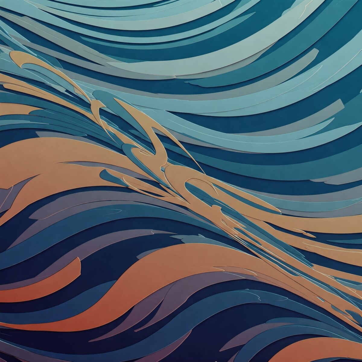
Rhythm: Creating Visual Flow
Rhythm is closely related to pattern but focuses on the flow and movement created by repetition. Like musical rhythm, visual rhythm can be:
- Regular: Consistent spacing between repeated elements
- Progressive: Elements that gradually change in size or spacing
- Flowing: Curved or undulating repetition that creates a sense of grace

You can see rhythm in action in the wave patterns of Japanese artist Hokusai, or in the rhythmic brushwork of Chinese landscape painting.

Unity/Variety: The Balancing Act
Unity and variety form two sides of an important balance in painting:
- Unity means that all parts of the composition work together as a whole. Without unity, a painting feels disjointed.
- Variety prevents monotony by including different elements. Without variety, a painting becomes boring.
The challenge for artists is finding the right balance. Too much unity creates boredom; too much variety creates chaos.
Applying the Principles of Art and Design in Your Paintings
Understanding these principles is just the first step. Here’s how you can apply them in your own artwork:
Practice Exercises
| Principle | Exercise | Materials Needed |
|---|---|---|
| Balance | Create three small compositions showing different types of balance | Paper, pencil, paints |
| Contrast | Paint a scene focusing on one type of contrast | Canvas, paints |
| Emphasis | Create a painting with a clear focal point | Canvas, paints |
| Movement | Design a composition that leads the eye in a specific path | Paper, pencil, paints |
| Pattern | Create a pattern and incorporate it into a larger work | Paper, ruler, paints |
| Rhythm | Create a painting with visual rhythm using repeated elements | Canvas, paints |
| Unity/Variety | Create a cohesive painting with enough variation to keep interest | Canvas, paints |
Analyzing Master Works
A great way to understand these principles is to analyze famous paintings:
- How did Claude Monet use emphasis in his water lily paintings?
- How did Frida Kahlo create balance in her self-portraits?
- How did Pablo Picasso use contrast in his Cubist works?
Using the Principles Together
The principles of art and design don’t work in isolation. A successful painting integrates multiple principles working together. For example:
- Contrast can create emphasis
- Rhythm can enhance movement
- Balance can contribute to unity
As you develop your painting skills, try focusing on one principle at a time before attempting to integrate them all.
Breaking the Rules: When Principles Become Guidelines
Once you understand the principles of art and design, you can make informed decisions about when to follow them and when to break them. Many revolutionary art movements began by challenging established principles:
- Cubism broke traditional rules of perspective and representation
- Abstract Expressionism often prioritized emotional expression over traditional composition
- Dada deliberately subverted conventional artistic principles
However, even when breaking rules, the most successful artists understand the principles they’re challenging. As Pablo Picasso famously said, “Learn the rules like a pro, so you can break them like an artist.”
Conclusion
The principles of art and design—balance, contrast, emphasis, movement, pattern, rhythm, and unity/variety—provide artists with powerful tools for creating effective compositions. By understanding and applying these principles, you can create paintings that not only express your ideas but also engage viewers on multiple levels. Whether you’re working in oils, acrylics, watercolor, or digital media, these fundamental concepts remain constant guides to creating successful artwork. Remember that mastering these principles is a journey, not a destination. As you continue to create, you’ll develop a deeper understanding of how these principles work together to create powerful visual experiences.
FAQ: 7 Principles Of Painting For Beginners
What is the difference between elements and principles of art?
The elements of art are the building blocks used to create artwork: line, shape, color, value, form, texture, and space. The principles of art are guidelines for using these elements effectively: balance, contrast, emphasis, movement, pattern, rhythm, and unity/variety. Elements are what you use; principles are how you use them.
How do I apply the principles of art in photography?
The same principles apply in photography as in painting. Consider balance when framing your shot, use contrast to create interest, create emphasis through focus or lighting, suggest movement through composition, look for natural patterns, create rhythm through repetition, and aim for unity while including variety in your images.
What are some examples of balance in famous paintings?
Leonardo da Vinci’s “The Last Supper” uses symmetrical balance with Christ at the center. Van Gogh’s “Starry Night” uses asymmetrical balance with the heavy cypress tree on one side balanced by the village on the other. Kandinsky’s circular compositions often demonstrate radial balance with elements radiating from a central point.
How do color theory and contrast work in painting?
Color theory helps artists understand how colors interact. Contrast in color involves using complementary colors (opposites on the color wheel like blue/orange, red/green, yellow/purple) to create visual tension and interest. Value contrast (light vs. dark) creates depth and focal points. For more information, see our article on color theory basics.
What is the golden ratio in art?
The golden ratio (approximately 1:1.618) is a mathematical proportion found in nature that artists have used for centuries to create pleasing compositions. It can be applied to the placement of elements, the proportions of the canvas, or even the spacing between elements to create natural-looking balance and harmony. Similar to the rule of thirds, it provides guidelines for creating balanced compositions.

