
Colors in art and painting are more than just visual elements – they’re emotional tools that shape how viewers feel. Whether you’re brushing bold reds across a canvas to ignite passion or layering soft blues to evoke calm, understanding how to create mood with color choices is key to mastering your craft. This guide explores the science of color psychology, practical techniques for artists, and expert tips to transform your paintings into emotional experiences, giving you the tools to connect deeply with your audience through every hue.

Key Points Summary
- Colors like red can stir passion, while blue brings calm, based on psychological studies.
- Techniques such as using contrast or monochromatic shades help artists craft specific moods.
- Cultural differences and personal experiences influence how viewers interpret colors in art.
- Practical tips, like layering colors or adjusting for lighting, make mood creation actionable.
Understanding Color Psychology: The Artist’s Foundation

Color psychology studies how hues influence emotions, a critical concept for artists aiming to connect with their audience. A 2020 study of over 4,500 people across 30 countries found that many link red to love, while others associate blue with relief. In painting, these effects come alive—red can stir excitement or tension, while blue soothes the soul. This science gives artists a palette of colors to wield with intention.
For painters, this means every stroke matters. Green, often tied to contentment, can evoke nature’s peace, perfect for landscapes. Yellow, connected to joy, adds a burst of optimism but risks overwhelming if overdone. By tapping into these psychological effects, you can guide viewers through an emotional journey on canvas.
Emotional Effects of Colors: A Painter’s Quick Guide
Here’s a table of how colors influence mood in art, tailored for painting applications:
| Color | Mood Impact | Best Painting Use |
|---|---|---|
| Red | Passion, energy, tension | Dramatic portraits, intense scenes |
| Blue | Calm, sadness, peace | Serene seascapes, introspective works |
| Green | Contentment, growth | Lush landscapes, calming abstracts |
| Yellow | Joy, warmth, caution | Sunny still lifes, cheerful compositions |
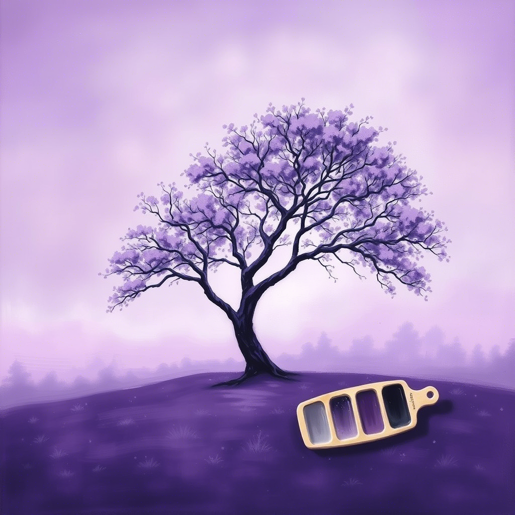
| Purple | Mystery, luxury, depth | Royal portraits, dreamlike scenes |
This guide shows why color choices in painting aren’t arbitrary. Red’s fiery energy suits bold statements, while blue’s tranquility invites quiet reflection.
Practical Techniques: Painting Moods with Color

Evoking Emotion Through Hues
In art, painting with color psychology starts with intent. Want to convey passion? Layer warm reds and oranges—many people tie red to love, making it a visceral choice for emotional depth. For tranquility, blend cool blues and greens; their calming effect mirrors nature’s stillness. A single painting can shift moods – use red in the foreground for intensity, fading to blue for distance and peace.

Building Atmosphere with Contrast: Contrast amplifies mood. Pair opposites like red and green for a vibrant, energetic clash—ideal for dynamic abstracts. Or, soften the vibe with neighbors like blue and purple, creating harmony in serene works. Balancing these relationships lets you match the mood to your vision.
Using Monochromatic Depth
A monochromatic approach—varying shades of one color—can be surprisingly powerful. A painting in deep purples might feel mysterious and luxurious, while light yellows radiate warmth and unity. This technique adds sophistication, letting subtle mood shifts emerge through tone alone.
Color Theory Basics: Your Artistic Edge
Color theory is every painter’s secret weapon for crafting mood. Here’s how it applies:
- Opposites (e.g., red and green) create bold, high-energy moods.
- Neighbors (e.g., blue and green) foster calm and cohesion.
- One hue in different shades builds elegance and focus.
Saturation and brightness refine this further. Vivid reds scream urgency, while muted blues whisper calm. Mastering these basics lets you paint emotions with precision.
Pablo Picasso once said,
“Colors, like features, follow the changes of the emotions.”
This wisdom captures the heart of painting—colors aren’t just pigment; they’re the language of feeling, a truth every artist can embrace.
Cultural and Personal Layers in Art
Color perception varies, adding depth to your work. White might symbolize purity in Western art but mourning in Eastern traditions, shifting its mood on canvas. Personal experiences matter too—a viewer who associates yellow with joy might feel uplifted where another sees caution. Considering your audience’s lens helps you hit the right emotional notes.
Scientific Insights: Color’s Power on Canvas

Research supports color’s impact, though it’s still unfolding. Studies show red can boost energy (and even athletic performance), while blue enhances alertness through biological responses. In painting, this suggests red can energize a composition, while blue invites contemplation. Results vary—personal reactions differ – so test your palette to see how it resonates.
Tips to Create Mood with Color
- Start with Intent: Define the mood first—anger demands red, peace calls for blue.
- Layer Wisely: Build depth with gradients to shift emotions subtly across the canvas.
- Use Lighting: Paint under varied light—cool tones pop in daylight, warm ones glow at night.
- Balance Boldness: Accent bright colors against muted bases for impact without chaos.
These tips make creating mood with color choices actionable, whether you’re sketching your first piece or refining a masterpiece.
Paint Your Emotions
In art and painting, creating mood with color choices is both craft and instinct. Red sparks fire, blue offers refuge, and every shade in between tells a story. This guide equips you to wield colors with purpose—whether through contrast, harmony, or depth. Lean on color theory, experiment boldly, and paint for your audience’s heart. Your canvas is waiting to feel alive.
Ready to brush emotion onto your canvas? Start painting and watch your colors speak!

