
Creating harmonious color combinations is one of the most challenging aspects of painting, whether you’re working with oils, watercolors, acrylics, or pastels. Understanding how colors interact and complement each other can transform your artwork from amateur to professional. Our interactive color palette generator for artists takes the guesswork out of color selection, providing you with scientifically-based color harmonies and specific pigment recommendations for your chosen medium.
Key Points Summary

• Interactive Tool Benefits: Generate five different color harmonies (complementary, triadic, analogous, tetradic, monochromatic) from any base color
• Medium-Specific Guidance: Get pigment recommendations tailored for oils, watercolors, acrylics, and pastels
• Professional Color Theory: Apply centuries of artistic knowledge using scientifically-based color relationships
• Practical Application: Copy hex codes, view color swatches, and access specific pigment names for easy shopping
• Skill Development: Learn to avoid common color mistakes and master advanced mixing techniques
• Time-Saving: Eliminate guesswork and create harmonious palettes instantly for any painting project
Why Color Theory Matters in Painting
Color theory forms the foundation of successful artwork. Professional artists understand that random color choices rarely create compelling paintings. Instead, they rely on established color relationships that have been proven to create visual harmony and emotional impact.
The human eye naturally responds to certain color combinations. When you use a color palette generator for artists, you’re leveraging centuries of artistic knowledge combined with modern color science. This approach helps you create paintings that immediately capture viewers’ attention and hold their interest.
Great masters like Monet, Van Gogh, and Picasso all understood color relationships intuitively. As renowned color theorist Johannes Itten once said,
“Color is life; for a world without colors appears to us as dead.”
Today’s artists can achieve similar results by using tools that reveal these same color harmonies systematically.
Understanding Color Harmonies for Painting
Complementary Colors
Complementary colors sit opposite each other on the color wheel, creating maximum contrast and visual impact. When painting with complementary colors, you achieve vibrant, dynamic compositions that naturally draw the eye.

Examples of complementary color pairs include:
- Red and green (perfect for landscape painting)
- Blue and orange (ideal for sunset scenes)
- Yellow and purple (excellent for floral compositions)
Triadic Color Schemes
Triadic colors are three colors evenly spaced around the color wheel. This harmony creates vibrant yet balanced compositions without being as intense as complementary schemes. Triadic palettes work exceptionally well for abstract paintings and modern art pieces.
Analogous Colors
Analogous colors are neighbors on the color wheel, creating serene and comfortable designs. These palettes work beautifully for peaceful landscapes, portraits with soft lighting, and botanical paintings where harmony is more important than contrast.
Tetradic Color Combinations
Tetradic schemes use four colors forming a rectangle on the color wheel. This advanced harmony offers rich color variety while maintaining balance. Professional artists often use tetradic palettes for complex compositions requiring multiple focal points.
Monochromatic Variations
Monochromatic palettes use different shades, tints, and tones of a single color. This approach creates sophisticated, elegant paintings with subtle depth. Monochromatic schemes work particularly well for atmospheric paintings and studies focusing on form and light.
How Our Color Palette Generator Works
Our interactive tool simplifies color theory application by automatically generating five different harmony types from any base color you choose. Simply select your starting color using the color picker, choose your painting medium, and watch as the generator creates professionally balanced palettes.
The tool provides:
- Visual color swatches for easy reference
- Hex color codes for digital artists
- Specific pigment names for each medium
- Click-to-copy functionality for quick reference
Medium-Specific Pigment Recommendations
Oil Painting Pigments
Oil paints offer the widest range of traditional pigments. Our color palette generator for artists recommends classic pigments like:
Reds: Cadmium Red Light, Alizarin Crimson, Quinacridone Rose provide excellent mixing capabilities and lightfastness.
Blues: Ultramarine Blue, Prussian Blue, and Cerulean Blue offer different temperature variations essential for atmospheric effects.
Yellows: Cadmium Yellow Light and Medium, Indian Yellow, and Naples Yellow give you warm and cool yellow options.
Watercolor Pigments
Watercolor painting requires transparent pigments that mix cleanly without becoming muddy. Recommended watercolor pigments include:
Transparent Options: Winsor Red, Winsor Blue, and Winsor Yellow provide intense, clean colors perfect for layering techniques.
Earth Tones: Burnt Sienna, Raw Sienna, and Burnt Umber create beautiful natural colors for landscapes and portraits.
Acrylic Paint Selection
Acrylic paints combine the opacity of oils with the convenience of water-based media. Key acrylic pigments include:
Synthetic Pigments: Phthalo Blue, Quinacridone Crimson, and Hansa Yellow offer exceptional color strength and mixing properties.
Traditional Formulations: Cadmium equivalents and traditional earth tones provide familiar color characteristics in acrylic form.
Pastel Color Choices
Soft pastels require pure pigments for maximum color impact. Essential pastel colors include:
Pure Pigments: Cadmium Red, Ultramarine Blue, and Chrome Yellow provide intense, vibrant colors.
Tinted Varieties: Pastels come in numerous tints and shades, allowing for subtle color variations within your chosen harmony.
Step-by-Step Guide to Using the Color Generator
- Choose Your Base Color: Start with a color that inspires you or matches your subject matter. This could be the dominant color in your reference photo or simply a color you want to explore.
- Select Your Medium: Choose between oils, watercolors, acrylics, or pastels. This selection affects the pigment recommendations you’ll receive.
- Generate Palettes: Click the generate button to create five different color harmony options based on your base color.
- Explore Each Harmony: Review the complementary, triadic, analogous, tetradic, and monochromatic options to see which best suits your artistic vision.
- Note Pigment Recommendations: Each palette includes specific pigment names for your chosen medium, making shopping and mixing easier.
- Copy Color Codes: Click any color swatch to copy its hex code for future reference or digital work.
🎨 Artist Color Palette Generator
Common Color Mistakes Artists Make
Overusing Bright Colors
Beginning artists often use too many saturated colors, creating chaotic compositions. Our color palette generator helps you balance intense colors with more neutral tones.
Ignoring Temperature
Every color has a temperature bias toward warm or cool. Mixing colors with conflicting temperatures often creates muddy results. The generator helps you identify temperature relationships within harmonies.
Skipping Color Studies
Many artists jump into final paintings without testing color combinations. Use the generator to plan color studies before starting major works.
Using Too Many Colors
Successful paintings often use limited palettes. The generator’s harmony-based approach naturally limits your color choices while ensuring they work together.
Essential Paint Colors by Medium
| Medium | Primary Colors | Essential Earth Tones | Key Mixing Colors | White Options |
|---|---|---|---|---|
| Oil Paints | Cadmium Red Medium, Ultramarine Blue, Cadmium Yellow Light | Burnt Sienna, Raw Umber, Yellow Ochre | Alizarin Crimson, Prussian Blue, Viridian | Titanium White, Zinc White |
| Watercolors | Winsor Red, Ultramarine, Winsor Yellow | Burnt Sienna, Payne’s Gray, Raw Sienna | Quinacridone Rose, Cerulean Blue, Sap Green | Chinese White (minimal use) |
| Acrylics | Cadmium Red Hue, Phthalo Blue, Hansa Yellow | Burnt Umber, Mars Black, Red Ochre | Quinacridone Crimson, Phthalo Green, Dioxazine Purple | Titanium White, Mixing White |
| Pastels | Cadmium Red, Ultramarine, Chrome Yellow | Burnt Sienna, Van Dyke Brown, Yellow Ochre | Rose Madder, Cerulean Blue, Viridian | Titanium White, Zinc White |
Advanced Color Theory Techniques

Color Temperature Mixing
Understanding warm and cool variations within each hue elevates your color mixing skills. For example, Cadmium Red leans warm while Alizarin Crimson appears cooler. These temperature differences affect how colors interact in mixtures.
Optical Color Mixing
Instead of physically mixing colors on your palette, try placing pure colors next to each other on the canvas. Viewers’ eyes will optically mix these colors, creating vibrant results impossible to achieve through physical mixing.
Color Dominance
Successful color schemes typically feature one dominant color family with smaller amounts of accent colors. The generator helps you identify which colors should dominate and which should serve as accents.
Seasonal Color Palette Inspiration
Spring Palettes
Spring paintings benefit from fresh, light colors. Try analogous schemes featuring yellow-greens, greens, and blue-greens with touches of warm yellows and soft pinks.
Summer Combinations
Summer scenes work well with complementary schemes featuring warm yellows and oranges contrasted with cool blues and purples.
Autumn Harmonies
Fall landscapes shine with triadic schemes combining warm oranges, cool purples, and yellow-greens for rich, complex color relationships.
Winter Moods
Winter paintings often use monochromatic blue or purple schemes with subtle warm accents to suggest distant light or warmth.
Famous Artists and Their Signature Color Palettes
| Artist | Period/Movement | Primary Colors Used | Signature Palette Characteristics | Notable Works Using This Palette |
|---|---|---|---|---|
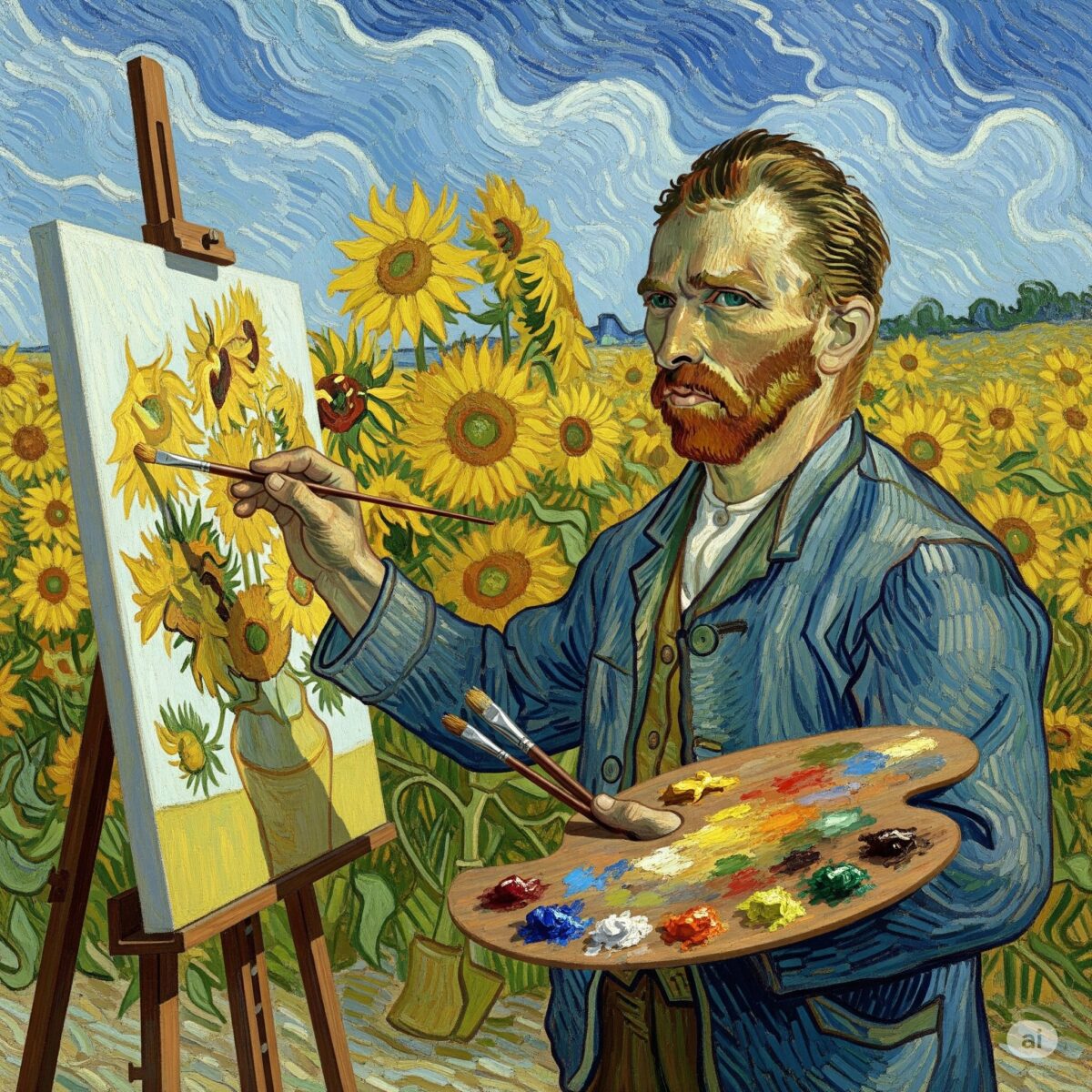
| Vincent van Gogh | Post-Impressionist (1853-1890) | Ultramarine Blue, Chrome Yellow, Vermillion Red, Emerald Green | Bold, contrasting complementary colors; thick impasto application | “Starry Night,” “Sunflowers,” “The Bedroom” |
| Pablo Picasso | Blue Period (1901-1904) | Prussian Blue, Cerulean Blue, White, touches of Brown | Monochromatic blue dominance with subtle warm accents | “The Old Guitarist,” “Blue Nude,” “The Blue Room” |
| Claude Monet | Impressionist (1840-1926) | Ultramarine, Cobalt Blue, Cadmium Yellow, Vermillion, Viridian Green | Light, atmospheric colors; pure pigments mixed optically | “Water Lilies,” “Rouen Cathedral,” “Haystacks” |
| Henri Matisse | Fauvism (1869-1954) | Cadmium Red, Chrome Yellow, Cobalt Blue, Viridian Green | Pure, unmixed colors applied directly; high contrast | “Woman with a Hat,” “The Dance,” “The Red Room” |
| Johannes Vermeer | Dutch Golden Age (1632-1675) | Ultramarine Blue, Lead White, Yellow Ochre, Vermillion | Limited but luminous palette; expensive pigments | “Girl with a Pearl Earring,” “The Milkmaid,” “View of Delft” |
| Georgia O’Keeffe | American Modernist (1887-1986) | Cadmium Red, Raw Sienna, Ultramarine, Titanium White | Earth tones with bold color accents; subtle gradations | “Red Poppy,” “Black Iris,” “Ram’s Head White Hollyhock” |
| Mark Rothko | Abstract Expressionist (1903-1970) | Cadmium Red, Alizarin Crimson, Ultramarine Blue, Raw Umber | Layered, luminous color fields; emotional color relationships | “Red Study,” “Orange, Red, Yellow,” “Blue, Green, and Brown” |
| Frida Kahlo | Surrealism/Mexican Folk Art (1907-1954) | Cobalt Blue, Cadmium Yellow, Vermillion Red, Raw Umber | Vibrant Mexican colors; symbolic color usage | “The Two Fridas,” “Self-Portrait with Thorn Necklace,” “The Broken Column” |
| Leonardo da Vinci | High Renaissance (1452-1519) | Ultramarine Blue, Vermillion, Yellow Ochre, Burnt Umber, Lead White | Subtle earth tones; masterful sfumato technique | “Mona Lisa,” “The Last Supper,” “Lady with an Ermine” |
| Jackson Pollock | Abstract Expressionist (1912-1956) | Titanium White, Mars Black, Cadmium Yellow, Alizarin Crimson | Dynamic color interactions; paint directly from tube | “No. 1, 1950,” “Autumn Rhythm,” “Blue Poles” |
| Pierre-Auguste Renoir | Impressionist (1841-1919) | Cadmium Red, Chrome Yellow, Ultramarine Blue, Titanium White | Warm, flesh-toned palette; luminous skin colors | “Luncheon of the Boating Party,” “Dance at Moulin de la Galette,” “The Swing” |
| Edward Hopper | American Realist (1882-1967) | Cadmium Yellow, Ultramarine Blue, Raw Umber, Titanium White | Muted, atmospheric colors; strong light-shadow contrasts | “Nighthawks,” “Automat,” “Room in New York” |
| Wassily Kandinsky | Abstract Art (1866-1944) | Cadmium Yellow, Ultramarine Blue, Vermillion Red, White | Primary color relationships; spiritual color theory | “Composition VII,” “Yellow-Red-Blue,” “Several Circles” |
| Paul Cézanne | Post-Impressionist (1839-1906) | Ultramarine Blue, Chrome Yellow, Vermillion, Viridian Green | Geometric color relationships; modulated color planes | “Mont Sainte-Victoire,” “The Card Players,” “Still Life with Apples” |
| Andy Warhol | Pop Art (1928-1987) | Fluorescent Pink, Electric Blue, Bright Yellow, Black | Bold, commercial colors; high contrast silkscreen effects | “Campbell’s Soup Cans,” “Marilyn Diptych,” “Elvis Presley” |
Key Insights for Modern Artists
Timeless Color Combinations:

- Complementary pairs: Blue and orange (van Gogh), red and green (Matisse)
- Analogous harmonies: Blues and greens (Monet), warm earth tones (O’Keeffe)
- Monochromatic schemes: Picasso’s Blue Period, Rothko’s color fields
Quality Over Quantity: Most master artists worked with surprisingly limited palettes, often 6-8 core colors that they mixed extensively rather than using dozens of different pigments.
Medium Considerations:
- Oil painters (da Vinci, Vermeer): Slower drying allowed for subtle blending
- Watercolorists: Transparent pigments for luminous effects
- Acrylic artists (Warhol, Pollock): Quick-drying enabled bold, direct application
Color Psychology in Art
Colors evoke emotional responses that can enhance your artistic message. Understanding these psychological associations helps you choose appropriate color palettes for different subjects.
Warm Colors (reds, oranges, yellows) create feelings of energy, passion, and warmth.
Cool Colors (blues, greens, purples) suggest calm, serenity, and distance.
Neutral Colors (grays, browns, blacks, whites) provide balance and sophistication.
Digital Color Matching for Traditional Media
Modern artists often work from digital references or want to match specific colors from photographs. Our color palette generator bridges this gap by providing hex codes alongside traditional pigment names.
When matching digital colors to traditional paints, remember that:
- Monitors display colors differently than pigments reflect light
- Traditional pigments have mixing limitations that digital colors don’t
- Print colors may not match screen colors exactly
Troubleshooting Common Mixing Problems

Muddy Colors
Muddy colors result from mixing complementary colors in equal proportions or combining too many different hues. The generator’s scientific approach to color harmony helps prevent these issues.
Colors That Don’t Match Your Vision
Sometimes generated palettes don’t match your artistic vision. Use the tool as a starting point, then adjust saturation, value, or temperature to better suit your needs.
Limited Pigment Availability
Not every recommended pigment may be available in your preferred brand. Research pigment alternatives with similar characteristics, or contact paint manufacturers for substitution recommendations.
Building Your Personal Color Library
Professional artists develop personal color preferences over time. Use the color palette generator to explore new combinations while building your understanding of color relationships.
Keep a color journal documenting successful combinations from the generator. Note which pigments work best for different subjects and lighting conditions.
Conclusion
Mastering color theory doesn’t happen overnight, but tools like our color palette generator for artists accelerate your learning process. By understanding the science behind color harmonies and having access to specific pigment recommendations for your chosen medium, you can create more confident, professional-looking artwork.
Whether you’re painting your first landscape or your hundredth portrait, thoughtful color choices separate amateur work from professional art. Use this interactive tool to explore new color relationships, discover unfamiliar pigments, and push your artistic boundaries.
Remember that color theory provides guidelines, not rigid rules. Great art often comes from understanding these principles well enough to know when and how to break them effectively. Start with the generator’s scientifically-based harmonies, then develop your personal color voice through experimentation and practice.
The journey toward color mastery is ongoing, but with the right tools and understanding, every painting becomes an opportunity to explore the infinite possibilities of color interaction.
Frequently Asked Questions
What is the best color palette generator for artists?
Our interactive color palette generator provides scientifically-based color harmonies with specific pigment recommendations for oils, watercolors, acrylics, and pastels. It generates five different harmony types (complementary, triadic, analogous, tetradic, and monochromatic) from any base color you choose.
How do you choose a color palette for painting?
Start with your subject matter or mood, then select a base color that represents your vision. Use color theory principles like complementary (opposite colors) for high contrast, analogous (neighboring colors) for harmony, or triadic (three evenly spaced colors) for vibrant balance. Consider your painting medium when selecting specific pigments.
What are the 5 color harmonies?
The five main color harmonies are: 1) Complementary (opposite colors), 2) Triadic (three evenly spaced colors), 3) Analogous (neighboring colors), 4) Tetradic (four colors forming a rectangle), and 5) Monochromatic (variations of one color). Each creates different visual effects and emotional impacts.
How many colors should be in a painting palette?
Most successful paintings use 5-7 colors maximum. Professional artists often work with limited palettes of 3-5 colors plus white and a mixing color. This creates harmony and prevents muddy color mixing. Beginners should start with even fewer colors to master mixing techniques.
What is the difference between warm and cool colors?
Warm colors (reds, oranges, yellows) advance visually and create energy, while cool colors (blues, greens, purples) recede and suggest calm. Every color has warm and cool variations – for example, Cadmium Red is warm while Alizarin Crimson appears cooler. Understanding temperature helps create depth and mood.
How do you avoid muddy colors when painting?
Avoid muddy colors by: limiting your palette, understanding color temperature, not overmixing on the palette, using clean brushes, and avoiding mixing complementary colors in equal proportions. Our color generator helps by providing harmonious combinations that naturally avoid muddy results.
Can I use the same color palette for different painting mediums?
While color theory remains consistent across mediums, specific pigments vary. Watercolors require transparent pigments, oils offer the widest range, acrylics provide convenience, and pastels need pure pigments. Our generator provides medium-specific pigment recommendations for each harmony.
What colors make the best neutral grays?
Create beautiful neutral grays by mixing complementary colors (red and green, blue and orange, yellow and purple) rather than black and white. This produces more vibrant, colorful grays. Vary the proportions to create warm or cool gray variations.

