
Have you ever looked at a painting that was made of only one color but felt like it contained the whole world? There is a strange magic in limitation. When you strip away the rainbow, you are left with the raw bones of art: value, texture, and emotion.
Welcome to the Blue Period Challenge.
This isn’t just a fun internet trend; it is a deep dive into the psychology of color and the discipline of the Old Masters. Inspired by Pablo Picasso and his legendary phase of melancholic genius, this guide will take you through the science of blue pigments, the history of emotional painting, and a practical 7-day roadmap to transform your art skills.
Whether you are a seasoned oil painter or someone looking for tips and creative uses for colouring books, this challenge will change the way you see the color blue forever.
Introduction: Why Paint in Only Blue?
Why blue? Why not red or green?
Statistically, blue is the world’s heavyweight champion of color. Research shows that blue is the favorite color of roughly 57% of men and 35% of women. It is the color of the sky and the sea, representing vastness, serenity, and distance. But in art, it has a double edge. It can mean peace, but it can also mean profound sadness.
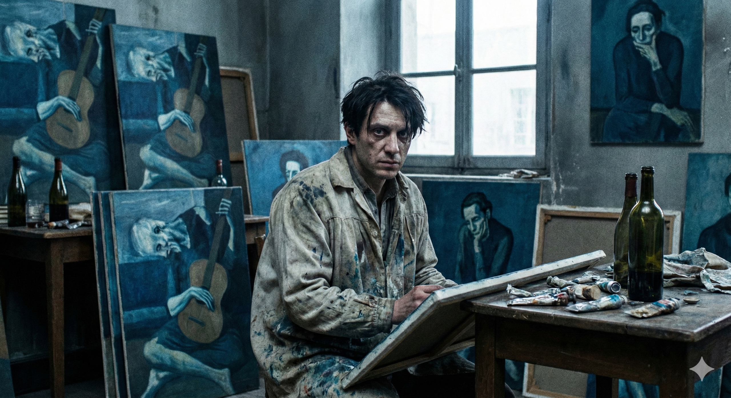
The Historical Weight: Picasso’s Grief
The most famous example of monochromatic mastery is Pablo Picasso’s Blue Period (1901–1904). This wasn’t a stylistic choice made on a whim; it was born from tragedy. After the suicide of his close friend Carles Casagemas, Picasso sank into a deep depression.
He began painting almost exclusively in shades of blue and blue-green, only occasionally warmed by other colors. His subjects were the outcasts of society: beggars, prostitutes, and the blind. By restricting his palette, he forced the viewer to focus not on the “decoration” of the scene, but on the emotional weight of the subjects. To understand how art shaped history and culture, one must look at how Picasso used blue to communicate grief without saying a word.

The Psychological Impact
Blue is a “cool” color, meaning it recedes visually. When you look at a red object, it seems to come toward you. Blue pulls away. This creates an immediate sense of atmospheric depth and isolation.
The Challenge Objective
The goal of the Blue Period Challenge is simple but difficult: create a series of artworks using only blue pigments (plus white and black).
By removing the crutch of multiple colors, you are forced to master:
- Value: How light or dark a color is.
- Temperature: The subtle difference between a “warm” blue and a “cool” blue.
- Emotion: Conveying a mood through composition and tone alone.
The Science of Blue: Pigments & Properties
Before you pick up a brush, you need to understand your tools. Not all blues are created equal. If you grab the wrong tube, your painting will look flat. If you grab the right ones, you can create a universe of depth.
To really succeed, you need to know the difference between the historic “Royal Blues” and the modern chemical powerhouses. For a broader look at materials, check out our guide to art and craft supplies.
The Royal Blue: Lapis Lazuli vs. Synthetic Ultramarine
For centuries, the most coveted color in the world was Lapis Lazuli. Mined primarily in Afghanistan, this semi-precious stone was ground down to create genuine Ultramarine. It was so expensive—more than gold—that Renaissance artists reserved it only for the robes of the Virgin Mary.
Today, we use Synthetic Ultramarine Blue, invented in the 19th century. It is chemically almost identical but affordable.
The Modern Powerhouses: Phthalo vs. Prussian
- Prussian Blue: The first modern synthetic pigment. It is deep, moody, and has a slight green undertone. It dries very fast.
- Phthalo Blue: A terrifyingly strong color. It is a modern organic pigment that is incredibly intense. A tiny drop can swallow your entire palette.
Pigment Data Comparison
Here is a breakdown of the most common blue pigments you will use in this challenge. Note the stark difference in cost and drying times (specifically for oil paint).
| Pigment Name | Est. Cost (37ml Tube) | Drying Time (Oil) | Opacity | Toxicity Note |
|---|---|---|---|---|
| Genuine Lapis Lazuli | $200.00+ | Slow (5-7 Days) | Semi-Transparent | Non-Toxic |
| Synthetic Ultramarine | $19.00 | Medium (3-5 Days) | Transparent | Safe |
| Cobalt Blue | $45.00 | Fast (2-3 Days) | Semi-Opaque | Toxic (Inhalation hazard) |
| Prussian Blue | $15.00 | Very Fast (2 Days) | Transparent | Safe |
| Phthalo Blue | $14.00 | Medium (4-6 Days) | Transparent | Safe (Staining) |
Safety & Toxicity
A quick note on safety: Cobalt Blue and Cerulean Blue often contain actual cobalt, a heavy metal. While generally safe to paint with, you should never spray-apply them (inhaling the dust is dangerous) and keep them off your skin. If you are worried about toxicity, stick to Ultramarine and Phthalo. For more on how science intersects with your palette, read about how science influences art.

Setting the Rules: The 7-Day Blue Period Challenge
Are you ready to paint? This challenge is designed to be completed over one week. It builds your skills progressively.
Materials List
You do not need many supplies, but you need the right ones.
- Warm Blue: French Ultramarine (leans toward violet/red).
- Cool Blue: Phthalo Blue (Green Shade) or Cerulean Blue.
- Titanium White: For mixing tints.
- Ivory Black (Optional): Some purists avoid black, but for this challenge, it helps reach the deepest values (shades).
- Canvas/Paper: 7 small surfaces (6×6 inches is perfect).
Day 1-2: The Value Hierarchy
Your first task isn’t a masterpiece; it’s a math problem. You need to create a Value Scale.

The Exercise:
Create a 9-step scale.
- Step 1 is pure White.
- Step 9 is pure Black (or your darkest Blue).
- Step 5 is the perfect middle grey/blue.
Why do this?
Most beginners paint everything in the middle range (steps 3-7). This results in “muddy” or low-contrast paintings. By mapping out your values, you ensure your highlights sparkle and your shadows are deep. If you struggle with mixing, consult our color mixing chart for painters.
Key Terminology:
- Tint: Color + White.
- Tone: Color + Grey.
- Shade: Color + Black.
Day 3-4: Temperature Checks
This is the hardest part of the challenge. How do you paint “warm” and “cool” colors when you are only using blue?
The Science of Temperature:
- Ultramarine Blue contains a tiny bit of red. When mixed with white, it creates a warm, almost lavender sky blue.
- Phthalo Blue contains a tiny bit of yellow/green. It creates a cold, icy cyan.

The Exercise:
Paint two simple spheres.
- Sphere A: Light it with “Warm” light (Ultramarine tints) and shadow it with cool darks.
- Sphere B: Light it with “Cool” light (Phthalo tints) and shadow it with warm darks.
Notice how they vibrate differently? This is Color Temperature. Mastering this subtle shift helps in everything from landscapes to Vermeer-style interior lighting.
Day 5-6: Texture & Application
Now that you have your colors mixed, how do you apply them?
- Scumbling: Taking a little bit of opaque paint (Blue + White) on a dry brush and scrubbing it over a dry, dark layer. This creates a misty, atmospheric look—perfect for fog or distant mountains.
- Glazing: Taking transparent paint (Pure Ultramarine or Prussian) mixed with a medium (oil or water) and applying it in thin layers over a dry painting. This creates a stained-glass effect that glows.

If you are using acrylics, you may need specific acrylic painting tools or retarders to keep the paint wet long enough to blend.
Day 7: The Emotional Self-Portrait
It’s graduation day.
Combine everything you have learned.
- Subject: Yourself (or a willing model).
- Mood: Choose one: Melancholy, Serenity, or Isolation.
- Technique: Use your Value Scale to ensure high contrast. Use Temperature to bring the face forward and push the background back.
This connects deeply to the tradition of portraiture. As you paint, consider the evolution of portrait painting through the ages—from the rigid realism of the Renaissance to the emotional deconstruction of the modern era.
Common Struggles & How to Fix Them
Even with a limited palette, things can go wrong. Here are the top three complaints from artists attempting the Blue Period Challenge.
1. “Why does my painting look muddy?”
Muddy color usually happens when you mix “Warm” and “Cool” blues together with too much white.
- The Fix: Keep your mixtures clean. If you are using Phthalo Blue for the light, don’t mix it with Ultramarine for the shadow unless you want a desaturated grey-blue. Also, check your opacity. Transparent shadows look deep; opaque shadows look chalky.
2. “I can’t get dark enough values.”
If you are using Cerulean or Cobalt blue, you will never get a true dark. They are mid-tone pigments.
- The Fix: You need Prussian Blue or Indanthrone Blue. These pigments are naturally almost black straight out of the tube. Alternatively, mix your blue with a tiny touch of Burnt Umber (if allowed) or Ivory Black. For more on managing your palette, see our comprehensive color mixing primer.
3. “It looks flat.”
If your painting looks like a cartoon, you are likely missing mid-tones.
- The Fix: Go back to your Day 1 Value Scale. You probably have bright highlights and dark darks, but you are missing the steps 4, 5, and 6 that curve the form and create 3D volume.
Advanced Techniques: Glazing and Grisaille
If you breezed through the 7-day challenge, it’s time to level up. The Blue Period technique is closely related to Grisaille (painting in grey).

The Blue Grisaille Method
Instead of painting directly, try this Old Master technique:
- Paint the entire image in Ivory Black and White only. Focus 100% on values.
- Let it dry completely.
- Glaze pure transparent blue (Ultramarine or Prussian) over the top.
The black and white underpainting acts as a map, and the blue glaze brings it to life. This technique was used to create the dramatic lighting seen in Tenebrism.
Scumbling for Atmosphere
Picasso often used opaque whites to create a “haze” around his figures. By scumbling a light blue tint over a dark background, you simulate the way air particles scatter light (the Rayleigh scattering effect). This creates the “Blue Period Haze” that makes the figures look like they are existing in a dream or a memory.
To understand how to manipulate light further, look at how the Impressionists broke rules in our article on mastering impressionist light techniques.
Conclusion: Beyond the Blue

The Blue Period Challenge is more than just an exercise in restriction; it is an exercise in seeing.
By the end of this challenge, you won’t just see “blue.” You will see temperature shifts, value hierarchies, and the emotional weight of a single hue. You will understand why Yves Klein patented his own blue (International Klein Blue) and why Van Gogh loved the collision of blue and yellow.
You will have mastered the tools necessary to paint not just what you see, but what you feel.
Did you complete the challenge? We want to see it! Share your results on social media with #BluePeriodChallenge.
If you are looking for your next burst of creativity after this deep dive, check out our guide on finding art inspiration.
FAQ: Mastering the Blue Palette
Q: Can I use acrylics for the Blue Period Challenge?
A: Absolutely. However, acrylics dry much faster than oils. You may need a retarder medium to achieve the smooth blends required for the atmospheric effects.
Q: Is Cobalt Blue toxic to touch?
A: Cobalt Blue contains cobalt, a heavy metal. It is generally safe if it touches your skin briefly, but you should wash it off immediately. Do not eat, drink, or smoke while painting with it, and never sand it down without a mask.
Q: What is the difference between Prussian Blue and Phthalo Blue?
A: Prussian Blue is moody, slightly desaturated, and dries very fast. Phthalo Blue is electric, incredibly intense, and clean. Phthalo will “take over” a mixture much faster than Prussian.
Q: How do I paint warm skin tones with only blue paint?
A: You can’t paint actual skin tones, but you can simulate the feeling of warmth. Use Ultramarine Blue mixed with white for the lit areas of the face. Because Ultramarine leans toward violet/red, it will appear “warmer” than the background if the background is painted with a greenish-blue like Phthalo.
Q: Why is Lapis Lazuli pigment so expensive?
A: Genuine Lapis Lazuli pigment is made from semi-precious stones mined in difficult terrain (mostly Afghanistan). The process of extracting the pure blue pigment from the rock is labor-intensive and yields a small amount of product, driving the price up to $200+ per tube.

