
Introduction: When Highbrow Technique Meets Lowbrow Culture
Imagine walking into a prestigious art museum. To your left, a somber 17th-century portrait. To your right? A three-foot-tall painting of a weeping plush bunny holding a chainsaw, painted with the same exquisite, painstaking detail as a da Vinci. Welcome to the world of Pop Surrealism and Lowbrow Character Design.
Once dismissed by critics as “feral art,” this movement has clawed its way from the gritty pages of 1970s Underground Comix (championed by the legendary Robert Williams) to the white walls of elite museums. It represents a collision of worlds: the technical rigor of the Old Masters meets the trash culture of cartoons, hot rods, and kitsch.
But why does this matter to you as an artist or collector? Because the art world has shifted. We have moved away from the abstract expressionism of the mid-20th century toward narrative, character-driven art. Whether it’s the vinyl toys on a collector’s shelf or the canvas in a gallery, characters are the new currency. In this guide, we will dissect the aesthetics, reveal the secret painting recipes of the giants, and analyze the exploding market value of this subversive movement.
- Key Takeaways:
- The Roots: From Robert Williams’ Juxtapoz Magazine to the “High-Low” merge.
- The Look: Why “Creepy-Cute” works psychologically.
- The Tech: Specific glazing recipes and digital workflows.
- The Money: Why a drawing of a grumpy girl can sell for $24.9 million.

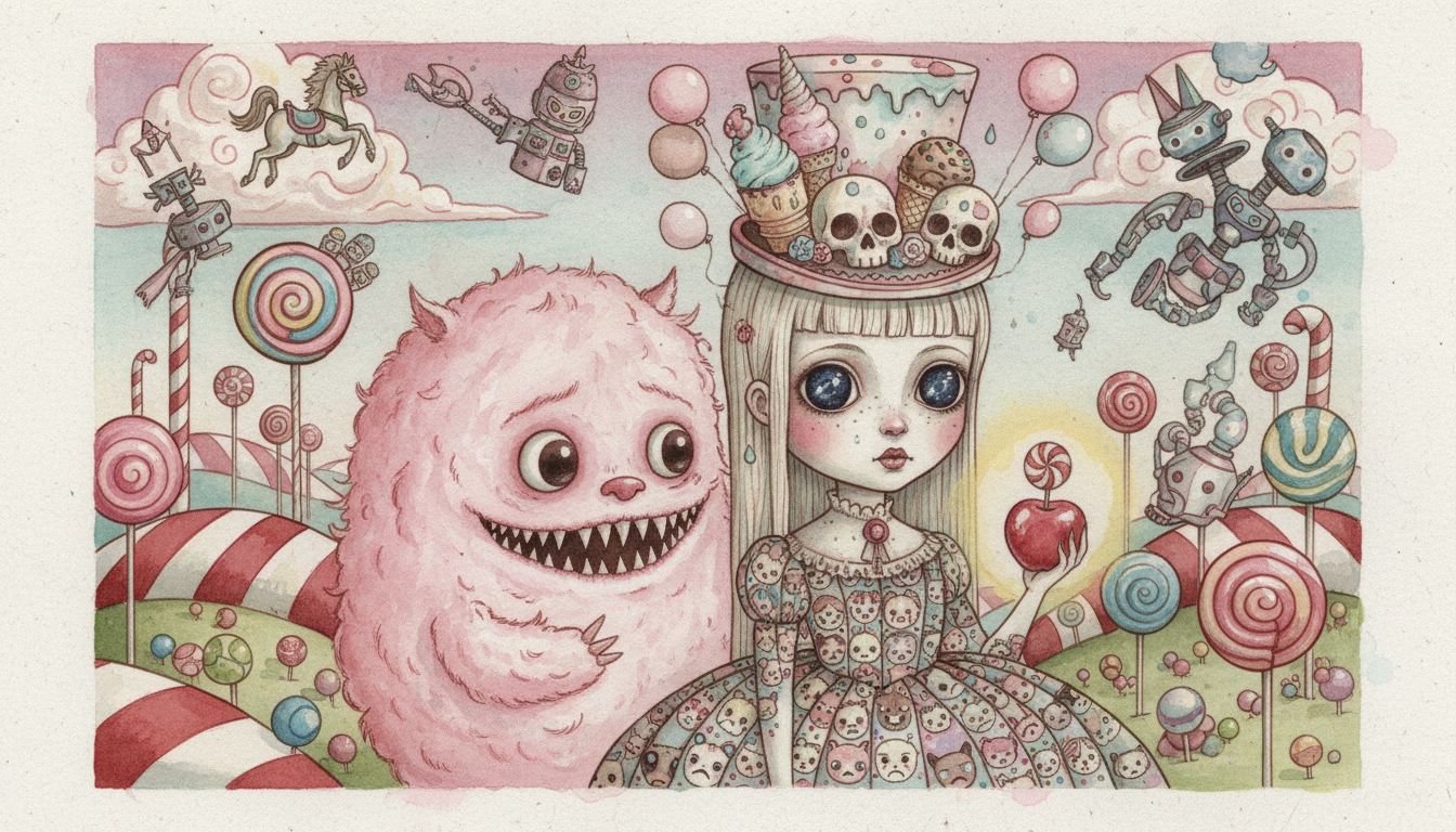
The Aesthetics of the “Creepy-Cute”
The heart of Pop Surrealism and Lowbrow Character Design lies in a specific emotional trigger: the “Creepy-Cute.” It creates cognitive dissonance—you want to hug the character, but you’re also slightly terrified of it.
The “Big Eye” Phenomenon
Why are the eyes always so big? It’s not just a stylistic choice; it’s biology. This is the psychological impact of neoteny. Humans are hardwired to respond to “baby-like” features—large heads, round faces, and enormous eyes. Artists like Margaret Keane pioneered this in the 60s, but modern Pop Surrealists weaponize it.
Technical Breakdown:
- Placement: Eyes are set lower on the face, often below the horizontal midline.
- Spacing: While realistic eyes are one “eye-width” apart, Lowbrow characters often push this wider to look more innocent (like a prey animal) or narrower to look manic.
- Iris-to-Sclera Ratio: In reality, we see a lot of the white (sclera). In Pop Surrealism, the iris often consumes 80-90% of the visible eye, creating that “liquid,” emotional look.
Proportions and Anatomy Rules

You can’t break the rules effectively until you know them. However, Lowbrow art has its own set of “Standard Deviations.”
- The “Chibi” Influence: Borrowing from Japanese manga, characters often stand just 2 to 4 heads tall. This instantly signals “toy-like” appeal.
- The Golden Ratio of Cute: Through deep research into character appeal, the most successful designs often utilize a Head-to-Torso ratio of 1:0.8. The head is actually larger than the torso.
- Extremities: Hands and feet are often exaggerated. Thick, rubber-hose limbs (reminiscent of 1930s animation) or hyper-realistic, porcelain doll hands are used for narrative emphasis.
If you are struggling with drawing hands in this style, check out our guide on mastering drawings in hands to understand the underlying anatomy before you distort it.
The Narrative Layer
This is where the “Surrealism” kicks in. A cute character is just a cartoon. A cute character holding a piece of raw meat while floating in a void of geometric shapes? That’s Art.
- Subversion: This involves mixing “innocent” symbols (teddy bears, pink frosting, religious icons) with “adult” or “morbid” themes (skulls, meat, political satire).
- Anthropomorphism: Mark Ryden is famous for his yaks and Abe Lincoln hybrids; Todd Schorr paints sophisticated ape-men. By blending human and animal traits, artists can explore human nature without painting a specific person.
Master Techniques: How the Giants Paint
How do these artists achieve finishes that look like they belong in the Louvre? They cheat time by using time-consuming methods.
The “Old Master” Approach (Mark Ryden, Todd Schorr)

Artists like Mark Ryden and Todd Schorr don’t just “paint.” They build a surface. Their technique is heavily influenced by the Renaissance art tradition.
- Indirect Painting: They rarely paint “alla prima” (wet-on-wet). Instead, they start with a monochromatic underpainting (grisaille) to establish value.
- Glazing: Once dry, they apply transparent layers of oil paint. This allows light to pass through the color and bounce off the white canvas below, creating a glowing effect.
- The Porcelain Finish: To get that toy-like smoothness, they often sand the surface lightly between layers of gesso and paint, removing every brushstroke.
The “Acrylics as Oils” Method (Greg ‘Craola’ Simkins)
Greg Simkins creates work that looks like oil but is almost entirely acrylic. For years, artists have asked for his secret. Through our research into his workshops and tutorials, here is the “Holy Grail” recipe for acrylic blending.
The Simkins blending Recipe:

- Paint: Nova Color Acrylics or Golden Fluid Acrylics.
- The Magic Mix: 50% Acrylic Retarder + 50% Slow Dry Matte Liquid/Medium.
- Application: Dip your brush in the mix, then the paint. It keeps the acrylic wet for minutes rather than seconds, allowing for soft, smoky blends previously only possible with oils.
- Tools: He prefers Trekell Golden Taklon brushes, which are soft enough to eliminate bristle marks.
If you are new to this medium, read our color mixing primer to understand how pigments interact before adding retarders.
Digital Sorcery (Ray Caesar)
Ray Caesar represents the digital evolution. He doesn’t paint on canvas; he sculpts in a virtual void.

- Virtual Puppets: Using 3D modeling software like Maya, he builds his characters with internal skeletons. He can pose them, light them, and move the camera before rendering.
- Texture Mapping: He wraps his 3D models in digital “skins” derived from photos of real skin, vintage fabrics, and insect carapaces, creating a hyper-real surrealism.
Step-by-Step Character Design Workflow
Ready to create your own icon? Here is a workflow adapted from top Lowbrow character designers.
Phase 1: Concept & Silhouette

Start with the “Coffee Stain” method. Don’t try to draw a character; draw random blobs or shapes. Let your brain find the creature inside the shape (Pareidolia).
- Silhouette Check: Fill your character in with solid black. Is it readable? If it looks like a blob, the design is weak. Distinct shapes are vital for concept art.
Phase 2: The Face Construction
When placing the features, remember the Canon of Cute.
- Draw a circle for the head.
- Draw a horizontal line below the center. This is your eye line.
- The Glassy Eye Technique: Paint the iris dark. Add a lighter “U” shape at the bottom (reflected light). Finally, add a sharp, pure white dot (specular highlight) crossing the pupil and iris. This contrast makes the eye look wet.
Phase 3: Narrative Accessories
Don’t just draw a girl in a dress. Give her a narrative.
- Add cultural artifacts: Logos, vintage toys, or religious icons.
- If you are exploring themes of consumerism, perhaps look at Pop Art characteristics for inspiration on how to incorporate branding into your surreal world.
The Business of Lowbrow: Market Data & Statistics
Is this art just for fun, or is it an asset? The market data for Pop Surrealism and Lowbrow Character Design suggests it is one of the hottest investment sectors in the contemporary art world.
The days of these artists being ignored by high-end auction houses are over. Below is a breakdown of the market giants.
Auction Record Breakers & Market Leaders
| Artist | Notable Work | Price Realized (Approx.) | Market Niche |
|---|---|---|---|
| Yoshitomo Nara | Knife Behind Back (2000) | $24.9 Million | The “King” of Big Eye art; Blue-chip investment. |
| KAWS | The KAWS Album (2005) | $14.8 Million | Street art crossover; Vinyl toys & Canvas. |
| Mark Ryden | Queen Bee | $714,000 | The Godfather of Pop Surrealism; High prestige. |
| Todd Schorr | Gallery Originals | $17,500 – $80,000+ | A “Painter’s Painter.” Lower auction volume, high gallery demand. |
Note: Data reflects peak auction records and average gallery listings as of recent market analysis.
The Collector’s Landscape

There is a massive distinction between auction records and the primary market.
- Gallery Pricing: Artists like Todd Schorr or Greg Simkins often sell out their shows at galleries like KP Projects or La Luz de Jesus Gallery before the doors even open.
- Art Toys: For those who cannot afford a $50,000 painting, “Art Toys” (vinyl figures by KidRobot or Medicom) have become a legitimate asset class. A KAWS figure bought for $200 in 2010 can resell for $3,000+ today.
For more insights on where the money is flowing, check our report on art market trends in 2025.
Tools of the Trade (Materials List)
To replicate the smooth, illustrative quality of this genre, standard student-grade supplies won’t cut it. You need materials that allow for high pigment load and smooth leveling.
- Paints:
- Nova Color: A favorite of muralists and Lowbrow artists for its heavy body and vibrant pigment.
- Old Holland Oils: For those following the Ryden path. High pigment density.
- Golden Open Acrylics: These stay wet longer, mimicking oils.
- Mediums:
- Liquin Original: Essential for oil painters to speed up drying time for glazing layers.
- Slow Dry Blending Medium: The acrylic painter’s best friend.
- Surfaces:
- Birch Wood Panels: Most Pop Surrealists prefer wood over canvas. The texture of canvas weave ruins the “plastic toy” illusion. Panels can be sanded glass-smooth.
For a deeper dive into preparing your surface, read our guide on acrylic painting surfaces.

Common Pitfalls & How to Avoid Them
Even with the best tools, beginners often fall into specific traps when attempting this style.
1. “Dead Eyes”
The eyes are the soul of Lowbrow art. A common mistake is painting the white of the eye (sclera) pure white.
- The Fix: The eyeball is a sphere. You must shade the corners of the sclera with grey or light blue to show roundness. Furthermore, you must paint the internal shadow cast by the upper eyelid onto the iris. Without this, the eye looks like a flat sticker.
2. “Plastic Skin” vs. Texture
While the goal is smooth blending, over-blending can make a character look like a cheap 3D render.
- The Fix: Leave some texture in specific areas—the fur of a teddy bear, the rust on a robot, or the lace on a dress. This contrast makes the smooth skin look even smoother.
3. Derivative Designs
It is easy to look at Mark Ryden and just paint a girl with a big head and a piece of meat. That is copying, not creating.
- The Fix: Find your own “Subversive Symbols.” If Ryden uses meat, maybe you use modern technology, fast food wrappers, or digital glitches. To find your unique angle, explore how to find art inspiration.
Conclusion: Finding Your Unique Voice in the Underground
Pop Surrealism and Lowbrow Character Design is more than just big eyes and shiny surfaces. It is a rebellion against the seriousness of the traditional art world, wrapped in a package of incredible technical skill. It validates the cartoons you watched, the toys you collected, and the weird dreams you have.
From the feral origins in Juxtapoz magazine to the multi-million dollar gavels at Sotheby’s, this movement has proven it is here to stay. Whether you are picking up a Trekell brush to try Greg Simkins’ blending technique or scouring the market for the next Todd Schorr print, remember that this art form thrives on personality.
Don’t just paint what you see; paint what you feel – especially if what you feel is a little bit creepy and a whole lot of cute.

Frequently Asked Questions (FAQ)
What is the difference between Pop Surrealism and Lowbrow Art?
While often used interchangeably, “Lowbrow” generally refers to the earlier, grittier roots in underground comix, hot rod culture, and punk (think Robert Williams). “Pop Surrealism” describes the evolution of that style into more refined, painterly techniques and broader subject matter (think Mark Ryden or Ray Caesar).
How do I paint glowing eyes for Pop Surrealism characters?
To achieve a glow, use a technique called “blooming.” Paint the iris normally, then glaze a very thin, transparent layer of the eye color (e.g., neon blue) over the surrounding skin and lids. Finally, add a pure white highlight in the center of the iris.
Why is Lowbrow art becoming so popular in 2025?
As the generation raised on cartoons, video games, and anime comes into wealth, they are investing in art that reflects their nostalgic visual language. Furthermore, the art market trends show a shift away from abstract minimalism toward narrative, figurative art.
Can I use digital tools for Pop Surrealism?
Absolutely. Artists like Ray Caesar are pioneers in this. Digital painting software allows for the same glazing and layering techniques as oils. Check out our list of the best digital painting and drawing apps to get started.
What is the best head-to-body ratio for Lowbrow characters?
For the “Chibi” or “Super Deformed” look, a ratio of 1:1 or 1:2 (Head to Body) is common. For a slightly more mature but still stylized look, the 1:0.8 ratio mentioned in the article works best.

