You’re standing in front of your canvas with brushes ready, colors mixed, and absolutely no idea what to paint. It’s not that you lack skill—you just can’t find the right reference photo. Google Images is a copyright minefield, stock photos look stiff and boring, and hiring a live model costs hundreds of dollars. Sound familiar? Welcome to every traditional painter’s nightmare: the dreaded blank canvas stare caused not by lack of talent, but by lack of subject matter.
Here’s the good news: AI reference photos for artists can solve this problem forever. Tools like Midjourney let you generate painting references that are uniquely yours—with perfect lighting, ideal composition, and zero copyright headaches. This isn’t about replacing your artistic skill; it’s about creating an infinite digital reference library that works for you 24/7.
Key Points Summary:
- Use Midjourney to create copyright-free reference images specifically designed for oil painting
- Generate scenes with ideal lighting conditions (Rembrandt lighting, golden hour) without studio setup
- Control composition elements like props, poses, and atmospheric effects
- Learn specialized prompting techniques to get “paintable” references with good values and simplified shapes
- Translate digital RGB colors into physical pigments with practical workflow tips
Why Use AI for Reference? The “Artist’s Assistant” Mindset
Think of Midjourney as your tireless studio assistant who never complains, never charges by the hour, and can conjure any scene you imagine. Traditional painters have always relied on reference materials—whether it’s photographs, live models, or plein air studies. AI simply adds another tool to your reference arsenal.
Copyright Freedom That Actually Matters
Let’s address the elephant in the studio: copyright. While AI art copyright remains complex in legal circles, here’s what matters for traditional painters. When you use an AI-generated image as a reference to create a physical oil painting, you’re creating something new. Your brushwork, color choices, compositional adjustments, and artistic interpretation transform that digital reference into an original copyrightable work—your painting.
This is fundamentally different from printing an AI image and calling it art. You’re using AI the same way photographers have used reference photos for decades: as a jumping-off point for creating something uniquely yours.
Lighting Control at Your Fingertips
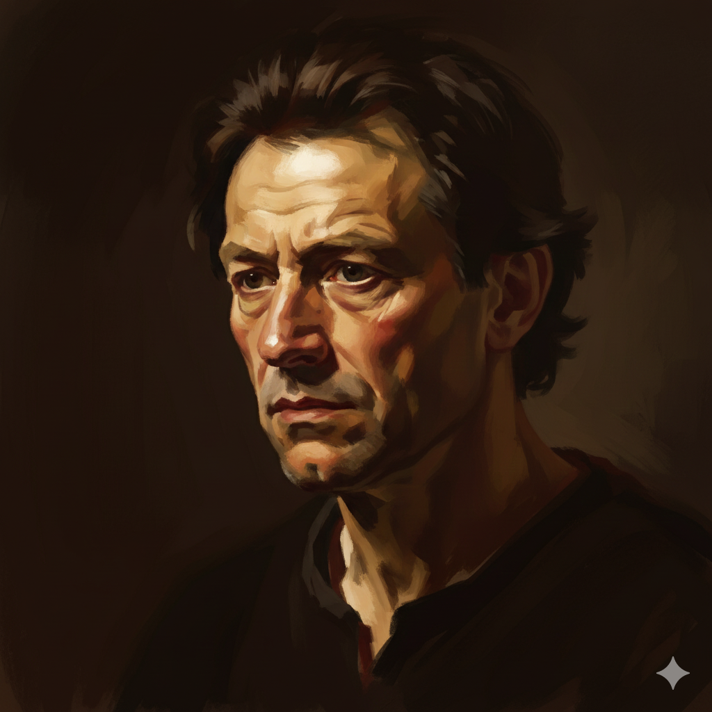
Want Rembrandt lighting but don’t have thousands of dollars for studio equipment? Need golden hour glow for a landscape but it’s raining outside? With AI tools, you can request specific lighting conditions instantly. Type “Rembrandt lighting” or “raking light across weathered face” and watch the magic happen.
Understanding light and shadow becomes infinitely easier when you can generate dozens of examples showing exactly how light behaves in different scenarios. This accelerates your learning curve dramatically.
Specific Compositions Without Buying Props
Need a still life with three lemons, a copper pot, and a piece of purple velvet on a weathered wooden table? Don’t spend money buying props—generate the scene and study how those colors interact. Curious how shadows fall across draped fabric? Create ten variations in ten minutes and observe the patterns.
This approach mirrors how Renaissance masters used to sketch compositional studies before committing to canvas. You’re simply using pixels instead of paper for your preliminary work.
The Setup: Getting Midjourney Ready for Painters
Before diving into advanced prompting, let’s cover the basics. I’ll keep this brief since detailed installation guides exist elsewhere, but these settings matter specifically for painters.
Aspect Ratios That Match Your Canvas
Most oil painters work on standard canvas proportions. Here’s how to match them in Midjourney:
| Canvas Size | Midjourney Command | Best For |
|---|---|---|
| 16×20″ | --ar 4:5 | Portraits, figures |
| 18×24″ | --ar 3:4 | Vertical compositions |
| 24×36″ | --ar 2:3 | Dramatic portraits |
| 24×30″ | --ar 4:5 | Standard portraits |
| Landscape formats | --ar 16:9 or --ar 3:2 | Panoramic scenes |
Always add the aspect ratio to your prompt. Otherwise, you’ll get square images that don’t translate well to canvas.
Stylize Settings: Less Is More
Here’s a secret most digital artists won’t tell you: Midjourney’s default settings create images that are too “fantasy art” for traditional painting references. Those over-stylized, hyper-detailed results look impressive on screen but are terrible for studying form and value.
Recommendation: Use lower stylize settings (--s 50 or --s 100) to keep images more realistic and less embellished. This gives you cleaner references with masses and shapes you can actually paint.

Example command:
elderly fisherman portrait --ar 3:4 --s 75This produces a reference that’s realistic enough to study without being so detailed that it overwhelms your painting process.
AI Reference Photos for Artists: Prompting for “Paintability”
Here’s where this guide earns its keep. Most AI tutorials focus on creating pretty pictures for Instagram. We’re interested in creating paintable references—images with strong values, good composition, and simplified forms that translate beautifully to oil painting techniques.
Keyword Magic: Values & Lighting
Great paintings live or die by their value structure. Flat, even lighting makes boring paintings. So how do you prompt for dramatic, paintable light?
Use these lighting keywords:
- Chiaroscuro – Dramatic light-dark contrasts (think Caravaggio)
- Tenebrism – Extreme darks with selective highlights
- Raking light – Light skimming across surfaces to reveal texture
- North light – Cool, even illumination (ideal for portraits)
- Golden hour – Warm, angled sunlight
- Rim light – Backlighting that creates glowing edges
- Dappled light – Filtered light through leaves or windows
Why this matters: Flat, office-lighting references are useless for learning to paint. You need to see how light carves form, creates depth, and directs the viewer’s eye. These keywords give you references worth studying.
Keyword Magic: Simplification
AI loves detail—maybe too much detail. You’ll get every eyelash, every leaf, every wrinkle rendered in painful specificity. But painters don’t copy detail; they interpret form and suggest detail.
Use these simplification prompts:
- “Broad brushstrokes”
- “Sargent style” (references John Singer Sargent’s loose, economical approach)
- “Alla Prima” (direct, wet-into-wet painting style)
- “Simplified shapes”
- “Painterly” or “impressionistic”
- “Loose brushwork”
- “Economy of detail”
Why this matters: When you study references with simplified forms, you learn to see the big shapes first—exactly what every painting instructor preaches. You’re training your eye to identify masses before moving to details.
The Ultimate Prompt Formula for Generate Painting References
After hundreds of prompts, here’s the formula that consistently produces excellent painting references:
[Subject] + [Lighting Condition] + [Camera Angle] + [Artistic Style for Texture] --ar [Ratio] --s [Stylize Value]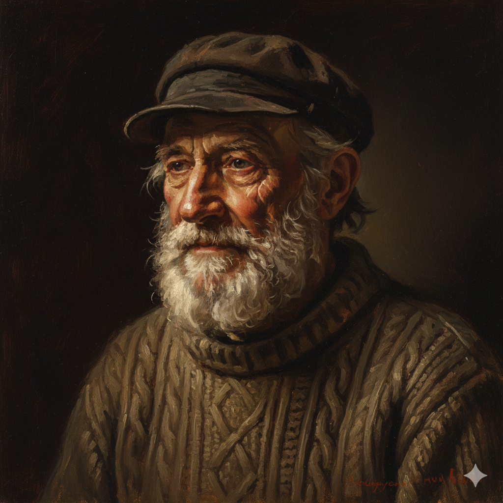
Examples:
Portrait of an elderly fisherman, dramatic side lighting, deep shadows, Rembrandt style, visible brushwork --ar 3:4 --s 75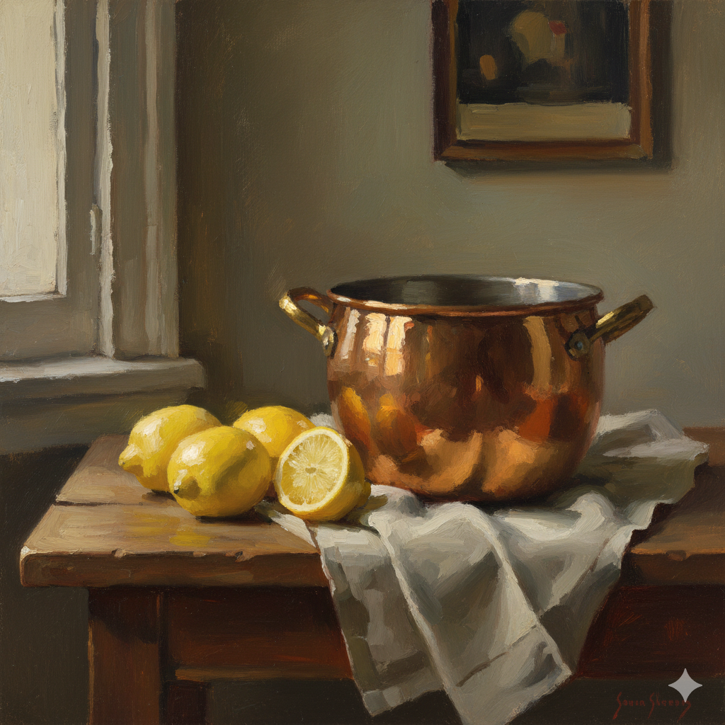
Still life with copper pot and lemons, north light from left, soft shadows, Sargent style broad brushstrokes --ar 4:5 --s 60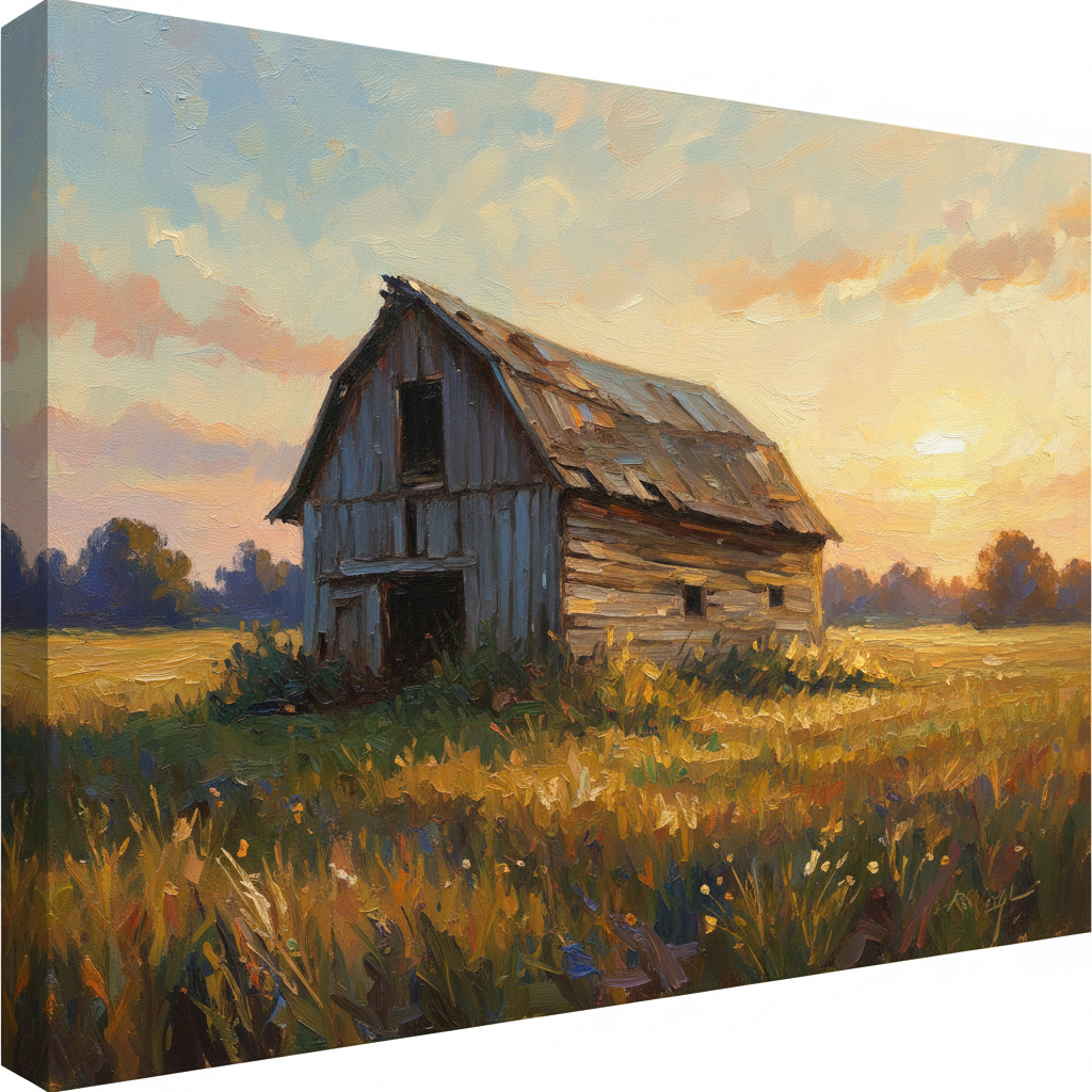
Old barn in field, golden hour light, low angle view, impressionistic loose brushwork --ar 16:9 --s 80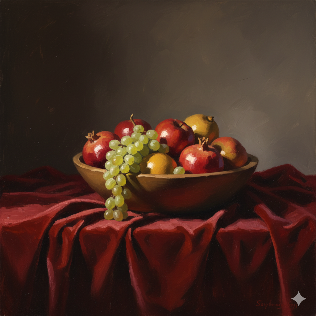
Bowl of fruit on velvet cloth, raking light across surfaces, painterly simplified shapes --ar 4:5 --s 70Notice how each prompt specifies what (subject), how it’s lit (lighting), from where (angle), and how to simplify it (style reference). This combination produces references that actually help you become a better painter.
Curating and Fixing: The “Digital Sketchbook” Phase
Generated your first batch of AI images? Excellent. Now comes the curatorial work. Not every AI generation will be painting-ready. You need to evaluate, edit, and sometimes combine multiple results to get what you need.
The “Uncanny Valley” Check
AI occasionally produces anatomical weirdness—especially with hands, eyes, and complex poses. Before you commit 20 hours to painting something, check for:
- Hand problems – Extra fingers, impossible bending, missing joints
- Eye issues – Misaligned gaze, different sizes, odd proportions
- Perspective failures – Objects at impossible angles
- Lighting contradictions – Shadows falling from multiple directions
Here’s the truth: Don’t panic if hands look wrong. As a painter, you can fix them. Crop the composition differently, reference your own hand in a mirror, or generate a separate close-up of hands. You are the master; the AI is the servant.
The goal isn’t perfection in the AI generation—it’s gathering enough good visual information to inform your painting decisions.
Compositing: Mash It Up
Sometimes you’ll generate an image with a fantastic face but boring background. Or perfect lighting on the figure but cluttered composition. Solution? Use free photo editing tools like Photoshop, GIMP, or Canva to combine the best parts of multiple AI generations.
Take the face from Image A and the background from Image B. Adjust the lighting to match. This is exactly what photographers do when shooting references—you’re just doing it digitally with more control.
The Grayscale Test: Does Your Value Structure Work?
Here’s a professional trick: before painting anything, convert your reference to black-and-white and evaluate the value structure. Does the composition still work? Can you clearly read the major shapes?
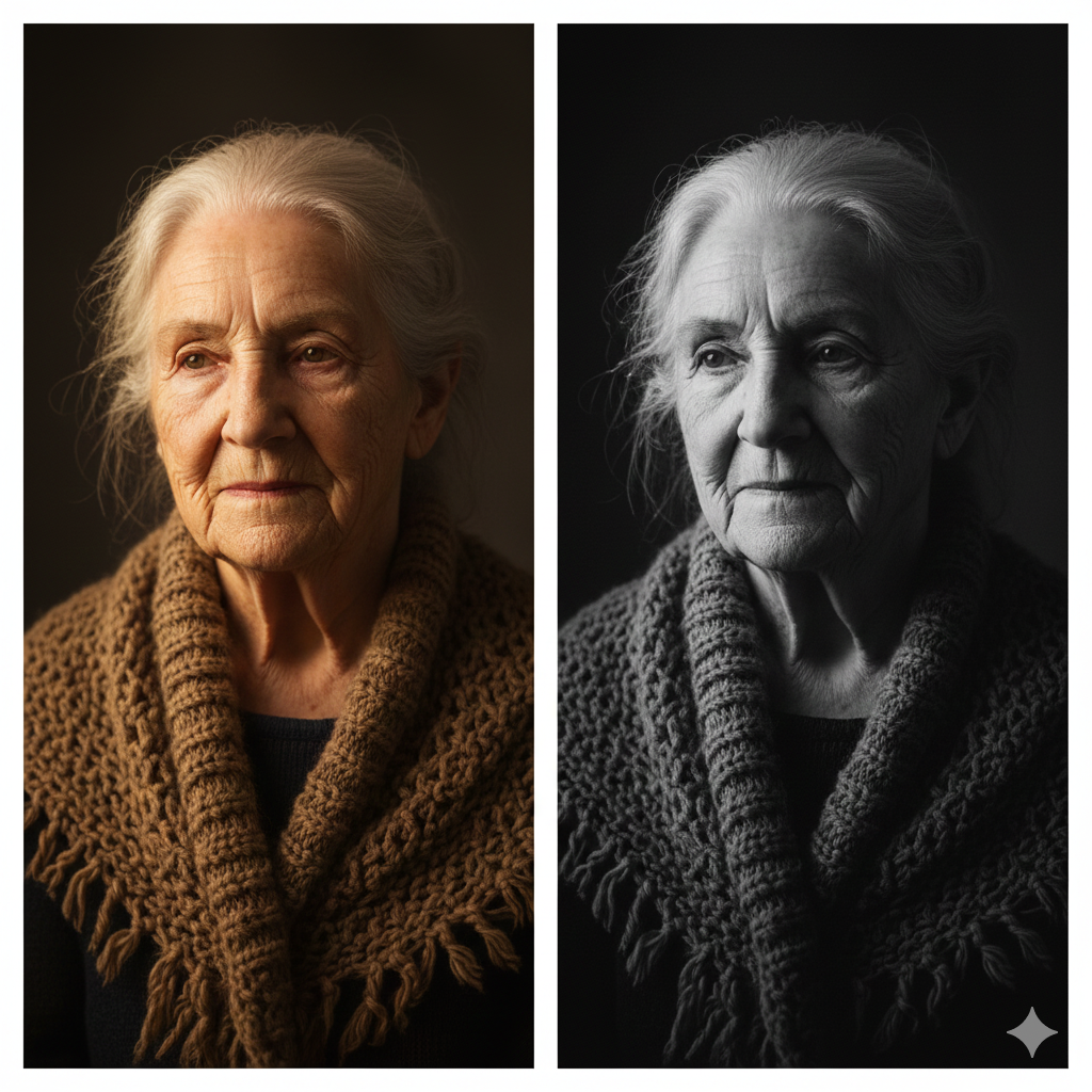
How to do this:
- Import your AI image into any editing program
- Convert to grayscale (Desaturate or Black & White adjustment)
- Squint at it
- Ask: “Does the light guide my eye where I want it to go?”
If the grayscale version looks flat or confusing, your painting will too—no matter how skilled you are with color mixing. Fix the values before you paint by generating new versions with different lighting prompts.
Translating Pixels to Pigment: The Workflow
You’ve got your perfect AI reference. Now comes the real work: translating that glowing screen image into physical oil paint. This transition requires understanding a fundamental truth about color theory in art.
RGB Versus Pigment: The Great Divide
Your computer screen creates colors using additive color (RGB—Red, Green, Blue light). Oil paints use subtractive color (pigments that absorb light). This means the glowing, neon brightness you see on screen is physically impossible to achieve with traditional paints.
Critical mistake to avoid: Don’t try to match the screen’s intensity. You’ll waste hours mixing paint and feel frustrated when you can’t achieve that electric blue or glowing red.
What to do instead:
- Accept that your painting will be less saturated than the screen
- Focus on relationships between colors rather than exact matches
- Understand your palette’s limitations and work within them
- Use chromatic intensity strategically where it matters most
Print It Out: See the Real Colors
Want to know what colors you can actually mix? Print your reference on high-quality matte paper. The printed version shows colors closer to what’s achievable with pigments.
Pro tip: Print multiple versions at different exposures. Sometimes a slightly darker print reveals value relationships more clearly than the original.
Upscaling for Detail
AI images are often low-resolution. When you’re trying to see how light hits a cheekbone or how fabric folds, pixelation becomes a problem.
Solution: Use free AI upscalers like:
Upscale your reference before printing or using the grid method. This lets you see details clearly without the AI “making up” information that wasn’t there.
- BigJPG – Enlarges images without blurring
- Topaz Gigapixel AI – Professional option for serious work
- Upscayl – Free, open-source upscaler
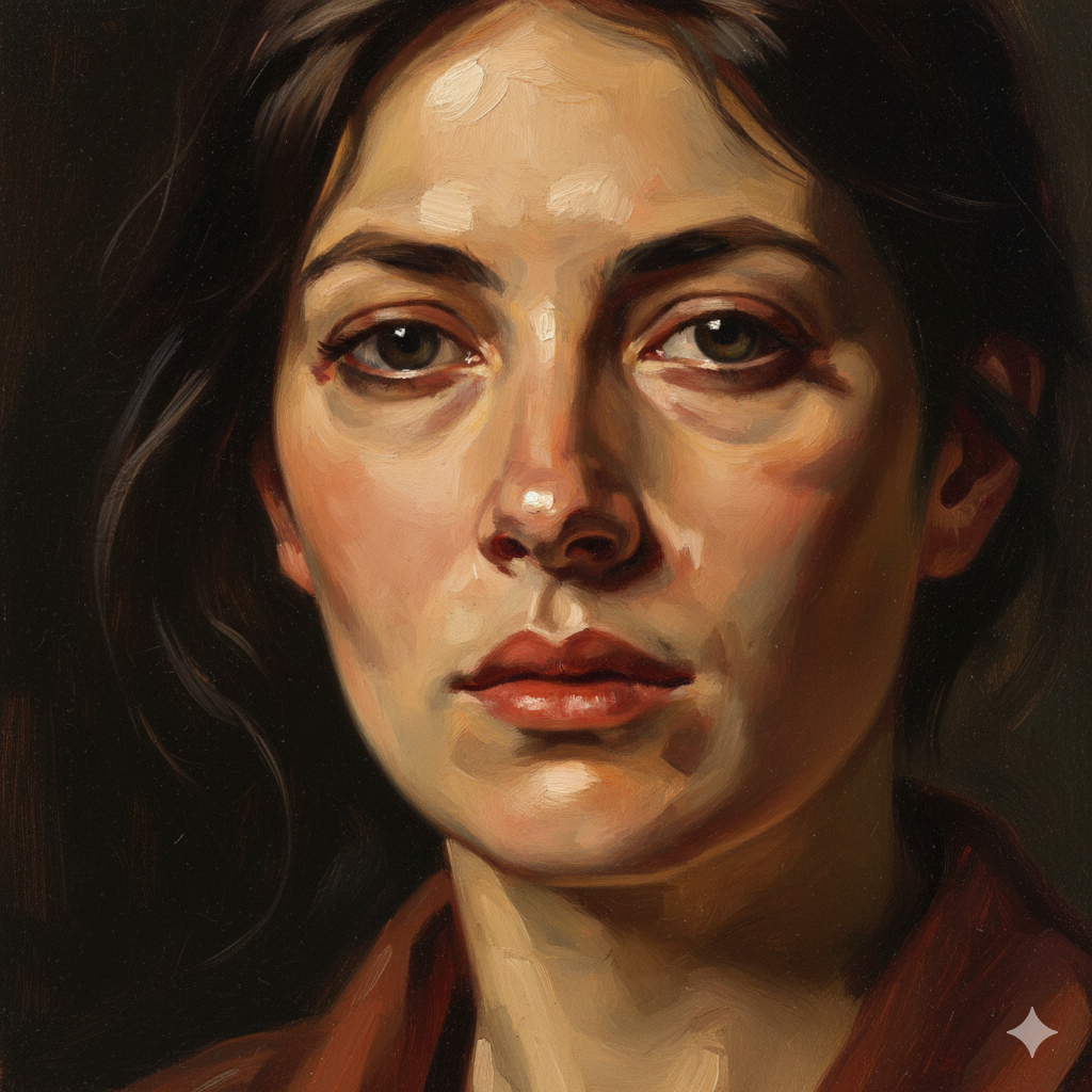
Handling Soft Edges: Where to Add Drama
AI-generated images often look airbrushed—everything is soft and blended. But paintings need variety in edge quality to feel alive. Some edges should be hard and defined (like where a lit cheek meets shadow). Others should be soft or lost (like fabric folds in deep shadow).
Your job as the painter: Interpret where edges should be. Study how master painters handled edges. Use your artistic judgment to add sharpness where attention should focus and soften edges where forms recede.
Case Study: From Midjourney Generation to Finished Oil Painting
Let’s walk through a real example to see this workflow in action.
Step 1: The Prompt
Portrait of working-class woman, 1920s clothing, golden hour window light from left, Sargent style painterly brushwork, warm shadows --ar 3:4 --s 70Step 2: Evaluation
Generated image shows beautiful lighting but the hands have six fingers and the background is too busy. Solution: crop tighter on the face and shoulders, eliminating the problematic hands. Note the warm golden tones and strong value contrast between lit and shadow sides.
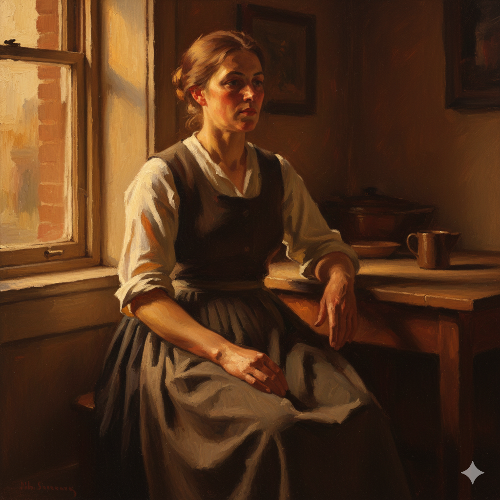
Step 3: Grayscale Check
Converted to black-and-white, the value structure is excellent. The lit cheek reads clearly against darker background. Shadow side has enough detail to stay interesting without competing with the light.
Step 4: Color Notes
Printed reference shows warm yellows and oranges on lit side, cool blue-violets in shadows (classic golden hour effect). Made notes about specific color temperature shifts at form edges.
Step 5: The Painting
Blocked in major shapes with thinned paint. Established darkest darks and lightest lights first to anchor value range. Used palette knife in hair for texture. Softened edges where forms turned away from light. Added harder edges at focal points (eyes, nose tip).
Result: A painting that feels alive and authentic—not a copy of the AI reference, but an interpretation informed by it. The original AI generation was a starting point. The finished painting reflects choices about color, brushwork, and edge quality that only a human painter can make.
Advanced Techniques: Going Beyond Basic References
Once you’re comfortable with basic AI reference generation, these advanced techniques will expand your creative possibilities.
Creating Atmospheric Perspective

Want to paint convincing landscapes? Prompt for atmospheric effects:
Mountain landscape, heavy fog in valley, atmospheric perspective, layers receding into distance, cool blues in background, warm foreground --ar 16:9 --s 65This teaches you how landscape painting masters handle depth through color and value shifts.
Studying Fabric and Drapery
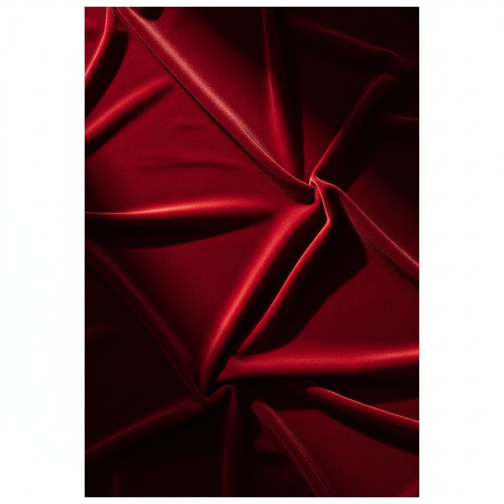
Drapery is notoriously difficult. Generate dozens of examples:
Red velvet draped fabric, raking light showing texture, deep shadows in folds, simplified geometric shapes --ar 4:5 --s 60Study how light reveals form in fabric. Notice where highlights appear, how shadows nest in folds, and where reflected light bounces into deep creases.
Gesture and Movement
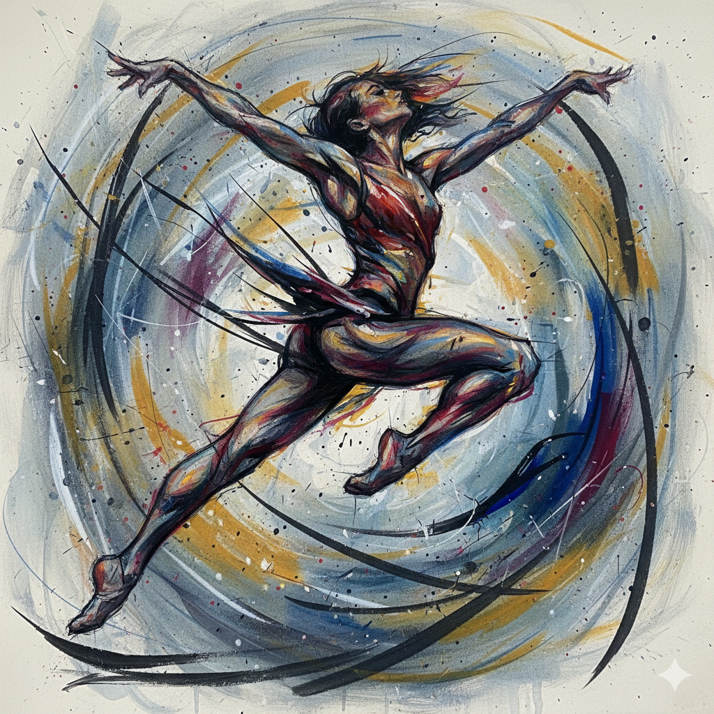
Static poses are easy. Movement is hard. Practice with:
Dancer mid-leap, blurred movement, gesture drawing quality, dynamic composition, energetic brushstrokes --ar 3:4 --s 80These references help you understand how to suggest motion in static paintings—a skill that separates good painters from great ones.
Common Mistakes and How to Avoid Them
Mistake #1: Copying Instead of Interpreting
The problem: Treating your AI reference like a paint-by-numbers template.
The solution: Use the reference for information—lighting direction, color temperature, compositional ideas—but make painting decisions based on your artistic goals. Painting is interpretation, not reproduction.
Mistake #2: Over-Relying on Detail
The problem: Trying to include every detail the AI generated.
The solution: Remember that John Singer Sargent often simplified and suggested rather than rendered everything. Your painting will be stronger if you’re selective about what you include.
Mistake #3: Ignoring Color Temperature
The problem: Mixing flat, lifeless colors that match the reference’s hue but miss the warm/cool shifts.
The solution: Study how temperature changes at form boundaries. Lit areas tend warm, shadows tend cool (or vice versa). This color temperature dance creates dimensional form.
Mistake #4: Not Testing Your Composition
The problem: Starting a large painting based on the first AI generation you get.
The solution: Generate 10-20 variations. Try different angles, lighting, and crops. Do value sketches. Test compositions before committing to canvas.
Ethical Considerations: Using AI Responsibly
As traditional painters embracing AI tools, we should think carefully about AI art ethics and our role in this evolving landscape.
Be Transparent
If you’re selling paintings or entering competitions, be honest about using AI-generated references. Most art shows care about the final painted work, not where you found your reference—but transparency builds trust.
The Copyright Gray Zone
While using AI references for traditional painting generally creates new copyrightable work (your painting), the legal landscape continues evolving. Stay informed about copyright discussions in the art community.
AI Doesn’t Replace Skill
The most important point: Midjourney doesn’t make you a better painter. It gives you better references to study while you develop your skills through practice. The tool is neutral—your growth comes from the hours you spend mixing paint, studying form, and making artistic decisions.
Think of AI like a camera. Photography didn’t kill painting; it freed painters to explore new territories. AI can do the same if we approach it thoughtfully.
Conclusion: AI Doesn’t Kill Creativity—It Accelerates the Boring Parts
Learning to use Midjourney for generating AI reference photos for artists isn’t about replacing traditional skill. It’s about eliminating the frustrating, time-consuming parts of finding reference materials so you can spend more time doing what you love—mixing paint, making brushstrokes, and bringing your artistic vision to life on canvas.
The blank canvas stare doesn’t have to come from lack of ideas. With tools like Midjourney, you have an infinite reference library available 24/7. You can study lighting scenarios that would take hours to set up in real life. You can explore compositions without buying expensive props. You can practice painting diverse subjects without travel or model fees.
But remember: the AI generates the reference. You make the art.
Your brushwork, color decisions, compositional adjustments, and interpretive choices transform pixels into paintings. The tool is powerful, but your artistic judgment remains irreplaceable.
Ready to try it yourself? Start simple. Generate a basic portrait with dramatic lighting. Print it, do value studies, then paint it. Compare your results. What worked? What didn’t? Adjust your next prompt based on what you learned.
That’s the real power of AI for traditional painters—rapid iteration, instant feedback, and endless opportunities to practice your craft without financial or logistical barriers.
Did you use AI-generated references for your latest painting? We’d love to see how you interpreted the digital source material in traditional media. Submit your work to the Prominent Painting Community and share your Midjourney-to-canvas journey with fellow painters!
Frequently Asked Questions
Can I use AI-generated images as references for oil paintings?
Yes, AI-generated images make excellent reference material for traditional oil paintings. When you create a physical painting based on an AI reference, you’re making artistic interpretations through brushwork, color mixing, and compositional choices that transform the digital reference into an original artwork. This is no different from photographers using photo references—the final painting is your copyrightable creation.
What’s the best AI tool for creating painting references?
Midjourney is currently the best option for traditional painters because it creates highly realistic images with good composition and lighting. Other options include DALL-E 3, Stable Diffusion, and Leonardo AI. For painters specifically, focus on tools that let you control stylization levels—you want realistic references, not heavily stylized fantasy art.
How do I avoid making my AI references look too digital?
Use lower stylize settings (–s 50 to –s 100 in Midjourney) and include prompts like “painterly,” “Sargent style,” or “broad brushstrokes.” Also request specific lighting conditions like “Rembrandt lighting” or “golden hour” rather than flat, even illumination. This creates references that feel more organic and paintable.
Should I tell people I used AI references for my paintings?
Transparency builds trust in the art community. Most artists and galleries care about the final painted work—your skill, technique, and artistic vision—not whether you used photos, live models, or AI-generated references. However, if you’re entering competitions or selling work, check guidelines and be honest about your process.
Can AI help me learn to paint better?
AI references help you study lighting, composition, and form without the expense of studio setups or models. However, AI doesn’t teach painting technique—that comes from practice, study, and often instruction. Think of AI as giving you excellent practice material, but your skill improves through the hours you spend painting, not from using the tool itself.
How do I convert AI colors to realistic oil paint colors?
AI screens use RGB (additive) color while oil paints use subtractive pigment mixing. Print your AI reference on matte paper to see achievable colors, or focus on color relationships rather than exact matches. Study color theory for artists to understand how to translate digital brightness into realistic paint values.
What if the AI generates hands or faces incorrectly?
Use imperfect AI generations as partial references. Crop problematic areas out of your composition, use your own hand as a reference, or generate multiple versions focusing specifically on the problematic area. Remember: you’re the artist interpreting the reference, not copying it exactly.
Citations:
- Midjourney Documentation. “Getting Started Guide.” Midjourney
- U.S. Copyright Office. “Copyright and Artificial Intelligence: Part 1.” United States Copyright Office
- Bargue, Charles, and Jean-Léon Gérôme. The Bargue Drawing Course.
- Gurney, James. Color and Light: A Guide for the Realist Painter.
- Schmid, Richard. Alla Prima II: Everything I Know About Painting – And More. Stove Prairie Press, 2013.
- BigJPG AI Image Upscaler
- Topaz Labs. “Gigapixel AI.”


