Color Mixing Chart Printable for Painters: Your Complete Guide to Mastering Color Theory

Whether you’re just starting your artistic journey or looking to improve your color mixing skills, a color mixing chart printable is one of the most valuable tools you can have in your art studio. These visual guides help you understand how colors work together, prevent muddy mixes, and create beautiful, vibrant paintings every time. In this comprehensive guide, we’ll explore everything you need to know about creating and using color mixing charts for acrylics, oils, and watercolors.

Color mixing chart printable guide showing artist workspace with acrylic watercolor oil paint charts and palette setup
Transform your painting with professional color mixing charts – your essential guide to mastering color theory across all paint mediums.

Key Points Summary

  • Color mixing charts are essential reference tools for all painters
  • Different paint types require specific mixing approaches
  • Primary, secondary, and tertiary colors form the foundation of all mixing
  • Free printable templates save time and provide professional guidance
  • Proper technique prevents common mistakes like muddy colors
  • Understanding color temperature and bias improves mixing results

What is a Color Mixing Chart and Why Every Painter Needs One

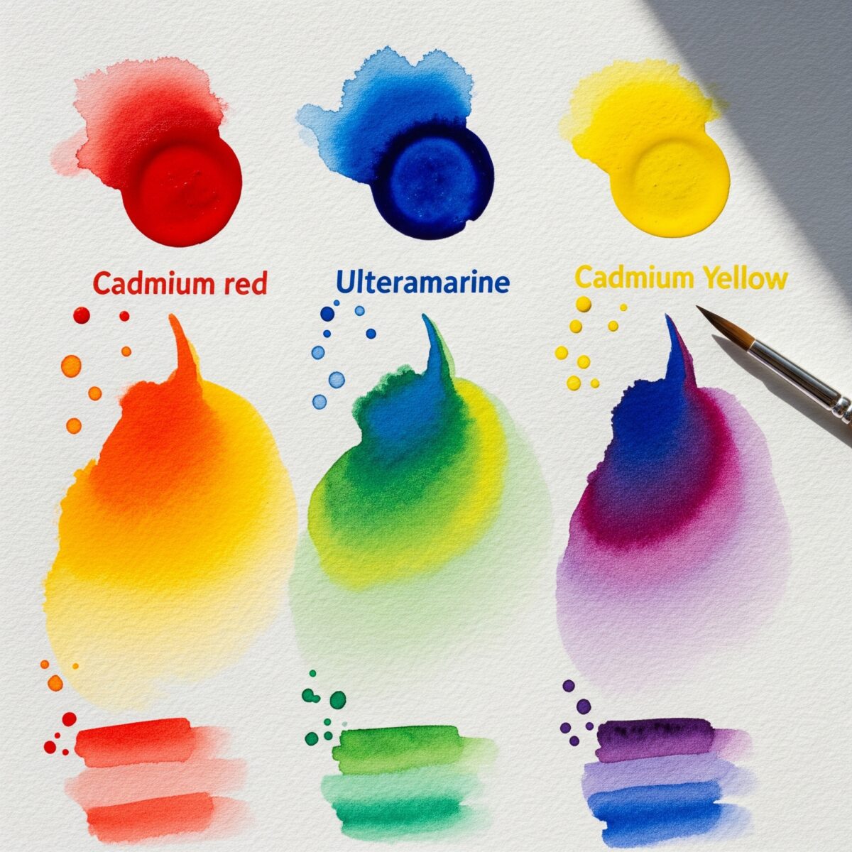
A color mixing chart is a visual reference tool that shows you exactly how different colors combine to create new hues. Think of it as a recipe book for colors – instead of guessing how much red to add to yellow to get the perfect orange, your chart tells you the exact ratios to use.

Every painter, from complete beginners to seasoned professionals, benefits from having these charts. They eliminate guesswork, save paint, and help you achieve consistent results. Most importantly, they teach you color theory fundamentals that will improve every painting you create.

How to Use the Paint Mixing Charts

Welcome to your interactive paint mixing guide! Each chart is designed to give you a quick visual reference for how different colors blend together.

  • Find Your Colors: The pure, unmixed paint colors are listed along the top row and the far-left column of each chart.
  • See the Mix: Follow a row and a column to where they meet in the middle. The swatch at that intersection shows the result of mixing those two colors.
  • Get More Info: Hover your mouse over any of the mixed swatches. A small tooltip will appear, telling you exactly which two colors were combined to create that specific shade.
  • Create a Physical Copy: Each chart has a “Print Chart” button. Click it to open a clean, print-ready version of the chart for your studio wall.

Each chart simulates the unique properties of the paint type—from the transparent look of watercolors to the opaque, bold finish of acrylics and the rich texture of oils. Enjoy exploring the possibilities!

`); printWindow.document.close(); setTimeout(() => { printWindow.focus(); printWindow.print(); printWindow.close(); }, 250); } shadowRoot.querySelectorAll('.print-button').forEach(button => { button.addEventListener('click', (e) => printChart(e.target.dataset.articleId, e.target.dataset.chartTitle)); });// INITIALIZE ALL CHARTS generateGrid({ gridId: 'watercolor-grid', palette: palettes.watercolor, createSwatchFn: createUniversalSwatch, mixFn: mixFns.additive }); generateGrid({ gridId: 'acrylic-grid', palette: palettes.acrylic, createSwatchFn: createUniversalSwatch, mixFn: mixFns.additive }); generateGrid({ gridId: 'oil-grid', palette: palettes.oil, createSwatchFn: createUniversalSwatch, mixFn: mixFns.subtractive }); });

Benefits of Using Color Mixing Charts

Color mixing charts offer several key advantages:

  • Consistency: Recreate the same colors across multiple painting sessions
  • Efficiency: No more wasting paint on failed color experiments
  • Learning: Build your understanding of color relationships naturally
  • Reference: Quick visual guide when you’re in the middle of painting
  • Confidence: Know your colors will work before you apply them to canvas

Understanding Primary, Secondary, and Tertiary Colors

Before diving into specific paint types, let’s review the color basics that form the foundation of all mixing. The traditional color wheel uses three primary colors that cannot be created by mixing other colors together.

The Color Foundation

Color TypeColorsHow They’re Made
PrimaryRed, Yellow, BlueCannot be mixed from other colors
SecondaryOrange, Green, PurpleMade by mixing two primary colors
TertiaryYellow-orange, Red-orange, etc.Made by mixing primary and secondary colors

Primary colors are your starting point – red, yellow, and blue. These are the building blocks of every other color you’ll ever mix. When you combine two primary colors in equal amounts, you get secondary colors: orange (red + yellow), green (yellow + blue), and purple (red + blue).

Tertiary colors fill the gaps between primary and secondary colors on the color wheel. These include yellow-orange, red-orange, red-purple, blue-purple, blue-green, and yellow-green. Understanding these relationships helps you predict how colors will interact in your paintings.

“Color is a power which directly influences the soul.”
Wassily Kandinsky

Color Mixing Charts for Different Paint Types

Each paint medium has unique characteristics that affect how colors mix. Let’s explore the specific considerations for the three most popular painting mediums.

Acrylic Paint Mixing Charts

Acrylic paint color mixing chart printable with palette knife demonstration showing proper mixing ratios

Acrylic paints are perfect for beginners because they’re forgiving, fast-drying, and easy to clean up. When creating your acrylic color mixing chart, remember that acrylics dry slightly darker than they appear when wet.

Key Acrylic Mixing Tips:

  • Work quickly since acrylics dry fast
  • Use a spray bottle to keep your palette moist
  • Add small amounts of color gradually
  • Mix more than you think you’ll need

For acrylic painting techniques, start with a basic palette of cadmium red, cadmium yellow, ultramarine blue, and titanium white. These four colors can mix almost any hue you need.

Watercolor Mixing Charts

Watercolor color mixing chart printable showing wet-on-wet blending techniques for beginners
Learn watercolor color mixing with this printable guide featuring wet-on-wet blending techniques and transparency effects.

Watercolor mixing is unique because of the medium’s transparency and the way colors flow together on wet paper. Your watercolor mixing chart should account for different paint concentrations and wet-on-wet versus wet-on-dry techniques.

Watercolor Mixing Considerations:

  • Transparency affects how colors appear when layered
  • Water amount changes color intensity
  • Paper texture influences color flow
  • Colors continue to blend after application

Watercolor painting basics require understanding how pigments interact with water. Start with professional-grade paints like Daniel Smith or Winsor & Newton for the most predictable mixing results.

Oil Paint Mixing Charts

Oil paints offer the longest working time and the richest color saturation, but they require different mixing approaches than water-based paints. Oil paint charts should show how colors appear both when freshly mixed and after they’ve had time to “set.”

Oil Paint Mixing Characteristics:

Oil paint color mixing chart printable featuring brush blending techniques and color temperature guide
  • Slow drying time allows for extended blending
  • Colors may shift slightly as they dry
  • Paint consistency affects mixing results
  • Some pigments are more transparent than others

For oil painting fundamentals, choose quality paints from brands like Gamblin or Winsor & Newton. These provide consistent pigment loads and predictable mixing behavior.

How to Create Your Own Printable Color Mixing Chart

Creating your own color mixing chart is a valuable learning exercise that helps you understand your specific paints and preferences. Here’s a step-by-step process to make your own professional-quality chart.

Materials Needed

  • White paper or canvas board
  • Your chosen paint colors
  • Brushes or palette knife
  • Ruler and pencil
  • Labels or permanent marker

Step-by-Step Process

  1. Plan Your Layout: Draw a grid on your paper – 6×6 squares work well for beginners
  2. Mix Your Colors: Start with primary colors and systematically mix combinations
  3. Paint Your Swatches: Make each square about 1 inch and apply paint evenly
  4. Label Everything: Write the mixing ratios below each swatch (like “2:1 Red:Yellow”)
  5. Let It Dry: Allow your chart to dry completely before handling
  6. Scan or Photograph: Create a digital backup for easy printing

This hands-on approach teaches you more about color relationships than any purchased chart could. Plus, you’ll have a reference specifically tailored to your paint brands and mixing style.

Essential Color Mixing Techniques for Beginners

Successful color mixing isn’t just about knowing which colors to combine – it’s also about technique. These fundamental methods will help you achieve clean, vibrant mixes every time.

Gradual Addition Method

Always add small amounts of stronger colors to weaker ones. For example, when mixing pink, add tiny amounts of red to white rather than trying to lighten red with white. This saves paint and gives you better control over the final color.

Temperature Awareness

Every color has a temperature bias – it leans either warm or cool. Understanding this helps you mix cleaner colors and avoid common color mixing mistakes. For instance, a warm red (cadmium red) mixed with a warm yellow (cadmium yellow) creates a vibrant orange. But mixing a cool red (alizarin crimson) with a cool yellow (lemon yellow) results in a duller orange.

Testing Before Committing

Always test your mixed colors on a separate piece of paper before applying them to your painting. Colors can look different when surrounded by other hues, and this simple step prevents costly mistakes.

Common Color Mixing Mistakes and How to Avoid Them

Even experienced painters occasionally struggle with color mixing. Here are the most common problems and their solutions.

Muddy Colors

Muddy colors happen when you mix too many hues together or combine colors that are too far apart on the color wheel. The solution is to use fewer colors in each mix and stick to colors that are close neighbors on the color wheel.

Inconsistent Results

If your mixed colors look different each time, you’re probably not measuring your paint ratios consistently. Keep notes about successful mixes and measure your paint amounts carefully.

Wrong Color Temperature

When your mixed color looks “off” even though you used the right base colors, check the temperature bias of your paints. Cool blues and warm blues create very different purples when mixed with red.

Advanced Color Mixing: Temperature and Bias

color wheel
Color Wheel – from Flickr

Once you’ve mastered basic color mixing, understanding color temperature and bias will take your paintings to the next level. This knowledge helps you create mood with color and achieve more realistic color relationships.

Understanding Color Temperature

Warm colors (reds, oranges, yellows) advance in a painting and create energy and excitement. Cool colors (blues, greens, purples) recede and create calm, peaceful feelings. Every color has both warm and cool versions.

Color Bias in Practice

Professional artists often use a “split primary” palette that includes both warm and cool versions of each primary color. This gives you maximum mixing flexibility and helps you achieve cleaner secondary colors.

Split Primary Palette Example:

  • Warm Red: Cadmium Red
  • Cool Red: Alizarin Crimson
  • Warm Yellow: Cadmium Yellow
  • Cool Yellow: Lemon Yellow
  • Warm Blue: Ultramarine Blue
  • Cool Blue: Phthalo Blue

Free Printable Color Chart Templates and Resources

While creating your own charts is educational, having professional templates saves time and provides excellent reference material. Here are the best resources for free printable color mixing charts.

Recommended Free Resources

Many art education websites offer high-quality printable color charts. Look for charts that include:

  • Multiple paint mediums
  • Mixing ratios clearly labeled
  • Color temperature indicators
  • Space for your own notes

The National Gallery of Art provides excellent educational resources including color theory materials suitable for all skill levels.

Digital vs. Physical Charts

Both digital and physical charts have advantages. Digital charts are easily accessible on your phone or tablet while painting outdoors. Physical charts don’t require power and can be pinned to your easel for constant reference.

Frequently Asked Questions

What are the 3 primary colors in paint?

The three primary colors in traditional paint mixing are red, yellow, and blue. These colors cannot be created by mixing other colors together and serve as the foundation for all other colors.

How do you make secondary colors?

Secondary colors are made by mixing two primary colors in equal proportions: red + yellow = orange, yellow + blue = green, and red + blue = purple.

What colors make brown paint mixing chart?

Brown is created by mixing all three primary colors together, or by mixing a primary color with its complement (like orange + blue). The exact shade depends on the ratios used.

Why do my colors look muddy?

Muddy colors result from mixing too many different hues together or combining colors that are opposite on the color wheel without careful consideration of ratios and paint quality.

How to avoid muddy colors when mixing?

To avoid muddy colors, limit your mixes to 2-3 colors maximum, use high-quality paints, understand color temperature, and practice mixing complementary colors in small amounts.

What is color temperature in painting?

Color temperature refers to whether a color appears warm (reds, oranges, yellows) or cool (blues, greens, purples). Every color has a temperature bias that affects how it mixes with other colors.


A color mixing chart printable is more than just a reference tool – it’s your pathway to confident, successful color mixing in every painting you create. Whether you’re working with acrylics, oils, or watercolors, understanding how colors interact will transform your artistic abilities. Start with the basics, practice regularly, and don’t be afraid to experiment. With time and practice, color mixing will become second nature, allowing you to focus on the joy of creating beautiful art.

Important Resources

Essential Reading

Paint and Supply Resources

External Resources

Leave a Comment

Scroll to Top

Discover more from

Subscribe now to keep reading and get access to the full archive.

Continue reading