
The use of color in art has evolved dramatically over the centuries, reflecting changes in technology, philosophy, and cultural values. By comparing the colors used in Renaissance and modern art, we can gain insight into how artists have expressed their visions and emotions differently across time. This journey through the vibrant palettes of the past and present reveals the technical advancements and the shifting perceptions of beauty and meaning in art.
Introduction
Color is a powerful tool in art, capable of conveying emotion, depth, and narrative. During the Renaissance, artists developed techniques and palettes that defined an era of rebirth in art, science, and culture. In contrast, modern art embraces a wide range of colors and styles, often breaking traditional rules to explore new forms of expression. By examining the colors used in these two periods, we can appreciate how each era’s unique approach to color enhances our understanding of art’s evolution.
The Renaissance Palette
.jpg "Vibrant Evolution: Comparing Colors in Renaissance and Modern Art 3")
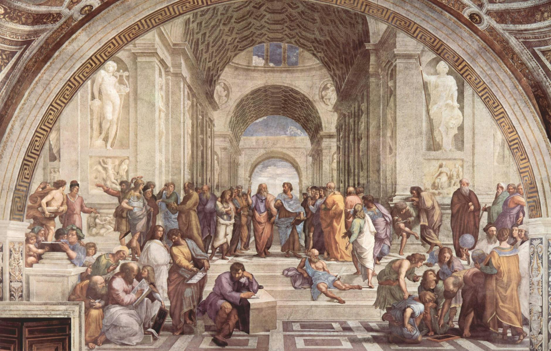
The Renaissance was a period of renewed interest in the classical ideals of beauty, harmony, and proportion. Artists like Leonardo da Vinci, Michelangelo, and Raphael revolutionized the use of color, creating works that remain iconic today.
Pigments and Materials
During the Renaissance, artists had access to a limited but richly vibrant range of pigments. Natural materials such as minerals, plants, and even insects provided the basis for their colors. For example, ultramarine, derived from lapis lazuli, was prized for its deep blue hue and often reserved for depicting the robes of the Virgin Mary. Vermilion, made from cinnabar, provided a brilliant red, while verdigris, from copper acetate, offered a striking green.
Symbolism and Significance
Colors in Renaissance art were imbued with symbolic meanings. Blue represented the divine and the celestial, while red conveyed passion, power, and sacrifice. Gold, often used in religious art, symbolized heaven and the divine light. These color choices were not merely aesthetic but were intended to convey deeper spiritual and moral messages.
Techniques and Innovations
Renaissance artists mastered techniques such as chiaroscuro, the use of light and shadow, to create depth and volume. They also employed sfumato, a method of blending colors seamlessly to achieve a soft, realistic effect. The development of oil paint allowed for greater flexibility and vibrancy in color application, enabling artists to achieve more lifelike representations.
Modern Art’s Color Revolution
In stark contrast to the Renaissance, modern art is characterized by a departure from traditional techniques and an embrace of experimentation. Artists in the 19th and 20th centuries began to explore new ways to use color, leading to a diverse and dynamic range of styles.
Industrial Pigments and Synthetic Colors
The industrial revolution brought about significant advancements in pigment technology. Synthetic colors became widely available, offering artists an unprecedented spectrum of hues. This accessibility allowed for bold and varied use of color, as seen in the works of artists like Vincent van Gogh, who used intense yellows and blues to convey emotion and movement.
Abstract Expression and Emotional Impact
Modern art often prioritizes emotional expression over realistic representation. Artists like Wassily Kandinsky and Mark Rothko used color to evoke mood and provoke thought. Kandinsky believed that colors had inherent spiritual qualities, while Rothko’s color field paintings aimed to create an immersive, emotional experience for the viewer.
Breaking Traditional Boundaries
_1906.jpg "Vibrant Evolution: Comparing Colors in Renaissance and Modern Art 4")
Movements such as Fauvism, led by Henri Matisse, and Abstract Expressionism challenged traditional notions of color harmony and composition. Fauvists used vivid, non-naturalistic colors to create a sense of vibrancy and spontaneity. Abstract Expressionists like Jackson Pollock and Willem de Kooning used color in bold, unconventional ways, often applying paint directly from the tube to achieve dramatic effects.
Comparative Analysis
When comparing the colors of Renaissance and modern art, several key differences and similarities emerge.
Technological Advancements
The technological advancements between these periods are stark. Renaissance artists worked with a limited palette derived from natural sources, while modern artists benefited from a vast array of synthetic pigments. This evolution allowed modern artists to experiment with colors that were previously unavailable, leading to new artistic possibilities.
Symbolism and Intent
While Renaissance art often used color to convey symbolic meanings and religious themes, modern art uses color more for its emotional and psychological impact. The intent behind color choices has shifted from conveying prescribed messages to exploring individual expression and subjective experiences.
Techniques and Styles
The techniques of applying color have also evolved. Renaissance artists focused on creating realistic depictions with smooth transitions and subtle shading. Modern artists, however, often use color in more abstract and expressive ways, prioritizing boldness and impact over realism.
Cultural and Philosophical Shifts
The cultural context of each period significantly influenced how color was used. The Renaissance was a time of rediscovering classical ideals and humanism, reflected in the harmonious and balanced use of color. In contrast, the modern era, marked by rapid social and technological changes, embraced a more fragmented and diverse approach to color, reflecting the complexities and uncertainties of contemporary life.
Renaissance Art Colors
Exploring the colors of the Renaissance reveals a world of meticulous craftsmanship and profound symbolism.
The Role of Blue
In Renaissance art, blue was not merely a color but a symbol of divine presence and celestial harmony. Derived from lapis lazuli, a precious stone, ultramarine blue was a color reserved for the most sacred and important figures, often the Virgin Mary. This rarity and expense underscored its significance, making it a powerful tool for conveying spiritual themes.
The Importance of Red
Red in Renaissance art symbolized a range of emotions and themes, from love and passion to sacrifice and power. Vermilion and madder lake were commonly used reds, each with its unique properties. Vermilion’s bright, intense hue made it ideal for depicting elements of importance and vitality, while madder lake offered a softer, more nuanced red for subtler effects.
Green and its Variations
Green, sourced from verdigris and malachite, played a crucial role in representing nature and life. It symbolized growth, fertility, and the natural world. Renaissance artists skillfully used green to balance compositions and create a sense of harmony and realism in their landscapes and backgrounds.
The Significance of Gold
Gold, often applied as leaf or powder, was a symbol of divine light and eternal value. Used extensively in religious art, it highlighted the heavenly realm and the scenes’ sacred nature. The use of gold also reflected the wealth and power of the patrons who commissioned such works, adding another layer of meaning to the art.
Modern Art Colors
Modern art’s approach to color is a testament to the era’s spirit of innovation and rebellion against traditional norms.

Exploring New Blues
Modern artists have redefined the use of blue, moving beyond its traditional connotations. Yves Klein, for example, created his own patented color, International Klein Blue, which he used to explore the spiritual and infinite aspects of the color. This bold, monochromatic use of blue contrasts sharply with the more restrained and symbolic use seen in Renaissance art.
Redefining Red
Red in modern art often serves as a vehicle for emotional intensity and political commentary. The vibrant reds used by artists like Kazimir Malevich and Barnett Newman break free from traditional symbolism, instead of using color to create a visceral impact. Newman’s “Vir Heroicus Sublimis” uses large fields of red to evoke a sense of the sublime and the heroic, demonstrating how modern artists use color to evoke pure emotion and existential themes.
The Versatility of Green
Green in modern art can be both a calming presence and a jarring statement. Artists like Henri Matisse used green in bold, unexpected ways, as seen in his work “The Green Stripe,” where a vivid green line defines the contours of a face. This unconventional use of green challenges viewers’ perceptions and invites them to see color in new, subjective ways.
The Role of Metallics
While gold and other metallics were predominantly symbolic in Renaissance art, modern artists have used these materials to explore themes of industrialization, wealth, and decay. Andy Warhol’s use of gold in his “Gold Marilyn Monroe” juxtaposes celebrity culture and traditional religious iconography, highlighting the commercialization of fame.
Color Theory and Emotional Impact

Modern art’s embrace of color theory has expanded the emotional and psychological impact of color in ways that Renaissance artists could not have anticipated.
Kandinsky and Spiritual Color
Wassily Kandinsky was one of the pioneers in exploring the spiritual and emotional effects of color. He believed that colors had inherent spiritual qualities and could evoke specific feelings and responses in the viewer. His work “Composition VII” uses a vibrant palette to create a sense of chaos and movement, demonstrating how modern artists use color to convey complex, abstract ideas.
Rothko and Emotional Depth
Mark Rothko’s color field paintings are another example of modern art’s deep engagement with color theory. By using large blocks of color, Rothko aimed to create an immersive experience that would evoke profound emotional responses. His use of color is less about representation and more about creating a direct, visceral connection with the viewer.
FAQs: Comparing Colors in Renaissance and Modern Art
What are the main differences in the use of color between Renaissance and modern art?
Renaissance art primarily used natural pigments with symbolic meanings, focusing on realism and religious themes. Modern art, benefiting from synthetic pigments, uses color for emotional expression and abstraction, often breaking traditional rules.
How did technological advancements impact the colors used in art?
Technological advancements allowed modern artists to access a broader range of synthetic pigments, enabling them to experiment with more vibrant and varied colors than those available to Renaissance artists, who relied on natural sources.
Why was blue so significant in Renaissance art?
Blue, derived from the costly lapis lazuli, symbolized divine presence and celestial harmony. Its rarity and expense made it a powerful tool for conveying spiritual themes, particularly in religious art.
How do modern artists use color to evoke emotion?
Modern artists use color to create emotional and psychological impact, often employing bold, unconventional palettes. Artists like Kandinsky and Rothko explored how colors could evoke specific feelings, using color as a primary means of expression.
What role did symbolism play in the color choices of Renaissance artists?
Renaissance artists used color symbolically to convey deeper spiritual and moral messages. Each color had specific connotations, such as blue for divinity, red for passion and sacrifice, and gold for divine light.
How has the use of green evolved from the Renaissance to modern art?
In the Renaissance, green symbolized growth and nature, used to create harmony in compositions. In modern art, green has been used more subjectively and provocatively, challenging traditional perceptions and evoking varied emotional responses.
Conclusion
The comparison of colors used in Renaissance and modern art reveals a fascinating evolution in artistic expression. From the symbolic and harmonious palettes of the Renaissance to the bold, experimental hues of modern art, each period reflects its unique cultural and philosophical context. Understanding these differences enhances our appreciation of art’s rich history and its ongoing capacity to inspire and provoke thought.

