
Are you frustrated with muddy colors, flat-looking artworks, or pastels that won’t stick to your paper? You’re not alone! Pastel painting mistakes are incredibly common, even among experienced artists. While pastels offer unique beauty with their rich pigments and expressive potential, they also present specific challenges that can make or break your artwork. The good news is that knowing these common pitfalls can dramatically accelerate your improvement and help you create the vibrant, professional-looking pieces you’ve always wanted.
Key Points Summary
- Overworking leads to muddy colors – Learn strategic layering and when to stop
- Wrong paper choice kills your artwork – Match paper texture to your desired effect
- Poor value contrast creates flat paintings – Plan your lights and darks first
- Incorrect fixative use dulls your colors – Apply sparingly with proper technique
- Lack of composition planning wastes potential – Sketch thumbnails before you start
Understanding Pastel Painting Challenges
 3")
Before diving into specific mistakes, it’s important to understand why pastels can be tricky. Unlike other mediums, pastels are pure pigment held together with minimal binder. This gives them incredible color intensity but also means they behave differently than watercolors or acrylics. The medium requires a delicate balance between control and spontaneity.
Mistake 1: Overworking and Muddying Colors
Why This Happens
The biggest culprit behind muddy pastel paintings is overworking. This occurs when you:
- Apply too many layers without planning
- Use a heavy hand, especially with soft pastels
- Mix too many colors directly on the paper surface
- Blend vigorously without purpose
- Don’t know when to stop working on a passage
How to Avoid This Mistake
Master Strategic Layering Work from hard to soft pastels, building up layers gradually. Hard pastels create the initial structure, while soft pastels add the final rich color notes.
 4")
| Pastel Type | When to Use | Purpose |
|---|---|---|
| Hard Pastels | Initial layers | Structure, fine details |
| Semi-Soft | Middle layers | Color building |
| Soft Pastels | Final layers | Rich color, final touches |
Use a Light Touch Think of pastels like makeup – build slowly rather than applying heavily. Your paper’s tooth (texture) can only hold so much pigment before it becomes saturated.
Blend Purposefully
- Use your fingers for soft, natural blending
- Try tortillons for controlled, precise blending
- Color shapers work well for specific areas
- Sometimes, leaving colors unblended creates more vibrancy
Pro Tip: “Less is often more in pastel painting. Each stroke should have intention.”
Professional pastel artist technique
Understand Color Purity Instead of physically mixing colors on paper, try optical blending – placing pure colors next to each other so the eye mixes them. This maintains the vibrancy that makes pastels special.
Mistake 2: Choosing the Wrong Paper (or Not Understanding Paper Tooth)
 5")
Why This Happens
Many beginners grab whatever paper they have handy, not realizing that paper choice is crucial for pastel success. Smooth papers can’t grip the pigment, while overly textured surfaces might not suit your style.
Understanding Paper “Tooth”
Paper tooth refers to the texture that grips and holds pastel particles. Without adequate tooth, your pastels will:
- Slide around instead of adhering
- Create patchy, uneven coverage
- Refuse to build up in layers
Best Paper Choices for Different Styles
Sanded Papers (UArt, Pastelmat)
- Best for: Detailed work, multiple layers
- Texture: Fine to medium grit
- Advantages: Holds lots of pigment, allows extensive layering
Canson Mi-Teintes
- Best for: General pastel work, beginners
- Texture: Medium tooth on one side, smoother on reverse
- Advantages: Affordable, widely available, versatile
Velour Paper
- Best for: Soft, painterly effects
- Texture: Fabric-like surface
- Advantages: Creates unique soft textures, great for atmospheric effects
Quick Paper Selection Guide
Choose your paper based on your intended style:
- Detailed, realistic work: Sanded papers
- Loose, impressionistic style: Mi-Teintes or similar
- Soft, atmospheric effects: Velour or textured papers
Mistake 3: Neglecting Value Contrast and Form
Why This Happens
Getting caught up in beautiful colors is easy, but many artists forget about value (how light or dark something appears). Without proper value planning, paintings look flat and lack dimension, regardless of how pretty the colors are.
The Foundation: Value Studies
Before touching your good paper, create thumbnail sketches focusing only on values. Use:
- Charcoal or graphite for grayscale studies
- Just three values: light, medium, dark
- Quick 2-3 inch sketches to plan composition
Building Form with Light and Shadow
 6")
Understanding your light source is crucial for creating three-dimensional forms:
Key Light Elements:
- Highlight: Brightest area where light hits directly
- Form Shadow: Area turning away from light
- Cast Shadow: Shadow the object throws
- Reflected Light: Subtle light bouncing back into shadows
Pushing Your Contrast
Don’t be afraid of strong darks and bright lights. Many beginners play it safe with middle values, creating bland results. Understanding light and shadow is fundamental to creating engaging artwork.
Practical Exercise: Before starting your painting, squint at your reference. The major light and dark shapes should be immediately obvious. If they’re not, your values need more contrast.
Mistake 4: Ineffective or Over-Reliance on Fixative
Why This Happens
Fixative seems like a magic solution to make pastels “stick,” but many artists use it incorrectly, leading to:
- Dulled, darkened colors
- Uneven application creating blotchy areas
- Over-reliance preventing proper layering techniques
- Health issues from improper ventilation
Understanding Fixative’s Purpose
Fixative doesn’t permanently “glue” pastels down. Instead, it:
- Stabilizes layers temporarily
- Allows additional layers on top
- Reduces smudging during transport
- Should be used sparingly, if at all
Proper Application Technique
 7")
When you do use fixative:
- Work in a well-ventilated area (preferably outdoors)
- Spray from 12-18 inches away
- Use light, even coats – multiple thin layers beat one heavy coat
- Allow complete drying between coats
- Test on scraps first to see how it affects your specific pastels and paper
Types of Fixative
- Workable Fixative: Allows additional layers on top
- Final Fixative: For completed work (harder to work over)
Alternatives to Heavy Fixative Use
Consider these healthier alternatives:
- Glassine interleaving between layers while working
- Careful handling and transport in protective boxes
- Immediate framing under glass for finished pieces
- Pastel storage boxes with foam padding
Mistake 5: Poor Composition and Lack of Planning
Why This Happens
Excitement to start painting often leads artists to skip the planning phase. Without a clear vision, you might:
- Jump straight into painting without composition planning
- Copy reference photos too literally without artistic interpretation
- Lack a clear focal point or visual flow
- Create unbalanced or confusing compositions
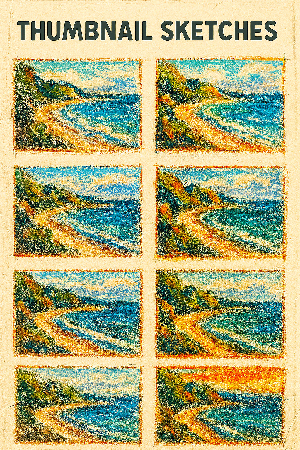
The Power of Thumbnail Sketches
 8")
Spend 15-20 minutes on thumbnails before starting your main painting:
- Try 3-4 different compositions of the same subject
- Focus on major shapes, not details
- Plan your value pattern (where lights and darks go)
- Establish your focal point clearly
Basic Composition Principles for Pastels
Rule of Thirds Divide your paper into nine equal sections. Place important elements along these lines or at their intersections for more dynamic compositions.
Leading Lines Use natural or implied lines to guide the viewer’s eye through your painting toward your focal point.
Negative Space The empty areas around your subject are just as important as the subject itself. Plan these carefully for balance.
Balance Distribute visual weight throughout your composition. A large, light object can balance a small, dark one.
Working from Reference Photos
Transform references instead of copying them:
- Simplify complex scenes – remove distracting elements
- Enhance lighting for more drama
- Adjust colors for better harmony
- Change proportions if needed for better composition
Artist Insight: “A painting should be about one thing. If you can’t describe your painting in one sentence, your composition needs work.”
Essential Pastel Painting Supplies
 9")
Having the right tools makes avoiding these mistakes much easier. Here are the basics:
Must-Have Pastels
- Starter set of soft pastels (24-48 colors)
- Set of hard pastels for initial work
- Pastel pencils for details
Paper Options
Start with quality art supplies designed for pastels:
- Canson Mi-Teintes (beginner-friendly)
- Strathmore 400 Series Pastel Paper (affordable option)
- UArt Sanded Paper (for advanced work)
Blending Tools
- Tortillons (paper blending stumps)
- Blending foam tools
- Color shapers (rubber-tipped tools)
- Clean rags for large area blending
Bonus Tips for Pastel Success
Studio Setup
- Work vertically when possible to prevent pastel dust from settling in your work
- Use good lighting – natural north light or full-spectrum bulbs
- Wear old clothes or an apron
- Keep wet wipes handy for cleaning fingers
Storage and Care
- Store pastels in compartmented boxes to prevent breakage
- Keep different hardnesses separate
- Clean tools regularly to prevent color contamination
- Store finished work flat with protective interleaving
Practice Regularly
Like any skill, pastel painting improves with consistent practice. Try these art challenges to stay motivated:
- Daily color studies (15-20 minutes)
- Value practice with monochromatic subjects
- Texture exploration – different paper and technique combinations
Learning from Mistakes: A Growth Mindset
Remember, even master artists made these same mistakes when learning. The key is viewing mistakes as learning opportunities rather than failures. Many famous paintings had “mistakes” that turned into happy accidents or unique stylistic elements.
Keep a sketchbook dedicated to improving your art skills through experimental techniques and studies. Document what works and what doesn’t – this becomes invaluable reference material for future paintings.
Troubleshooting Quick Fixes
 10")
If Your Colors Look Muddy:
- Stop adding layers immediately
- Try lifting some pigment with a kneaded eraser
- Add fresh, pure color in small amounts
- Consider starting over with better planning
If Pastels Won’t Stick:
- Check if your paper is too smooth
- Try a different paper with more tooth
- Ensure you’re not pressing too hard initially
- Build up layers more gradually
If Your Painting Looks Flat:
- Add stronger darks and lighter lights
- Create more variation in your edges (some sharp, some soft)
- Enhance your focal point with more contrast
- Check that you have a clear light source
Conclusion
Avoiding these top 5 common mistakes in pastel painting – overworking colors, choosing wrong paper, neglecting values, misusing fixative, and poor planning – will transform your artwork from frustrating experiments into successful, vibrant pieces. Remember that pastel painting mistakes are part of the learning journey, and each “mistake” teaches you something valuable about the medium.
The key is to approach pastels with patience, proper preparation, and an understanding of the medium’s unique characteristics. Start with simple subjects, focus on one technique at a time, and gradually build your skills. Soon you’ll be creating the expressive, professional-looking pastel paintings you’ve always admired.
Keep practicing, stay curious, and don’t be afraid to experiment. Your best pastel paintings are waiting for you on the other side of these common mistakes!
Frequently Asked Questions
Why does my pastel painting look muddy or dull?
Muddy pastels usually result from overworking the surface or mixing too many colors directly on paper. The solution is to plan your color layers strategically, use a lighter touch, and understand when to stop working on an area. Additionally, using fixative incorrectly can dull your colors – use it sparingly and only when necessary.
What is the best paper for pastel painting to avoid common issues?
For beginners, Canson Mi-Teintes offers good tooth and affordability. For more advanced work requiring multiple layers, sanded papers like UArt or Pastelmat provide superior grip. The key is matching paper texture to your intended style – detailed work needs more tooth, while loose styles can use smoother surfaces.
How can I fix mistakes or unwanted marks in my pastel art?
Gentle lifting with a kneaded eraser works for light marks. For heavier applications, try a stiff brush to remove excess pigment. Sometimes strategic layering can cover mistakes effectively. Prevention is better – work light to dark and plan your composition with thumbnail sketches first.
How do I make my pastel paintings more vibrant and less flat?
Focus on value contrast first – ensure you have strong lights and darks. Use optical color mixing instead of physical mixing to maintain color purity. Plan your composition with thumbnail value studies, and don’t be afraid to push your contrasts further than seems natural.
Is fixative necessary for pastel paintings and how should I use it correctly?
Fixative isn’t always necessary and can dull colors. When used, spray light, even coats from 12-18 inches away in well-ventilated areas. Use workable fixative between layers if needed, and consider alternatives like glassine interleaving or immediate framing under glass for finished pieces.
Additional Resources
Recommended Reading
- Pastel Painting Techniques by Guy Roddon – Comprehensive guide to pastel methods
- The Pastel Book by Bill Creevy – Materials and techniques reference
Online Learning Platforms
- Pastel Society of America – Educational resources and exhibitions
- International Association of Pastel Societies – Global pastel art community
- Artist’s Network – Free pastel painting tutorials and tips
Video Tutorials
- YouTube: “Pastel Painting for Beginners” – Multiple beginner-friendly video series
- Craftsy Pastel Classes – Structured online courses
Art Supply Sources
- Dick Blick Art Materials – Wide selection of pastel supplies
- Jerry’s Artarama – Professional-grade pastels and papers
- Art Supply Warehouse – Competitive prices on bulk supplies

