
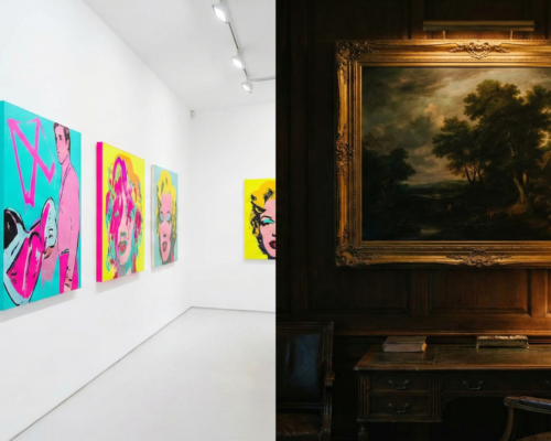
If you have scrolled through social media or visited a contemporary art gallery over the last few years, you probably noticed a theme: bright, neon colors and cheerful “pop” aesthetics. It was everywhere. This style, sometimes called “Dopamine Decor,” was all about loud, happy visuals meant to grab your attention instantly.
But as we settle into 2026, a major shift is happening in the art world. The pendulum is swinging back. The trend forecast for this year shows that collectors and artists are moving away from the neon brights and embracing something much quieter, darker, and more mysterious.
We are calling this the rise of the “Moody Palette.”
It’s not just a fashion choice. This move toward deeper colors and heavier textures is a reaction to our highly digital world. Here is a look at why this is happening and what defines the biggest painting trend of 2026.
What Does the “Moody” Trend Look Like?
When we talk about “moody” paintings, we aren’t just talking about sad art. We are talking about atmosphere, depth, and drama.
For the last few years, popular art was often flat, graphic, and very brightly lit. The new trend is almost the opposite.
The Color Palette Instead of bright turquoise or hot pink, imagine the colors of a forest at twilight or an old library. The 2026 palette is dominated by:

- Deep charcoal greys instead of pure black.
- Rich moss greens and forest greens.
- Dark navy and midnight blues.
- Burnt umbers, ochres, and deep terracotta reds.
These colors feel grounded and earthy. They don’t scream for attention; they invite you to lean in closer.
The Atmosphere These paintings often use dramatic lighting. Think about the “Old Masters” like Rembrandt or Artemisia Gentileschi. They used a technique called chiaroscuro—a strong contrast between light and dark—to make their subjects look three-dimensional and important. Contemporary artists in 2026 are bringing this drama back. They are creating shadowy corners in landscapes or portraits where half the face is hidden in mystery.
The “Anti-AI” Factor: Why Now?

Why is this happening in 2026? The biggest driver of this trend is a reaction against technology, specifically Artificial Intelligence (AI).
Over the last two years, the internet has been flooded with AI-generated images. AI is very good at creating bright, perfectly smooth, highly detailed, and colorful pictures. Because our screens are constantly showing us this hyper-perfect digital imagery, people are starting to crave something that feels human.
Bright pop art can sometimes feel a bit like a sugar rush—it’s quick and exciting, but it doesn’t last long. A “moody” painting is more like a slow, rich meal.
The Need for Texture Because digital images are perfectly flat behind a glass screen, people now want art that has physical texture. You can’t touch an AI image.
The moody painting trend relies heavily on the physical paint itself. Artists are using thicker paint (impasto), showing their brushstrokes, and layering glazes to create depth that a computer just can’t fake. When you look at these paintings in person, you can see the hand of the artist. In 2026, that human imperfection is highly valuable.
Market Report: What Collectors Are Buying
| Market Metric | Bright Pop Art (2024–2025) | Moody & Textured Art (2026 Trend) |
| Top Color Palettes | Neon Pink, Cyan, Bright Yellow | Moss Green, Charcoal, Burnt Sienna |
| Primary Appeal | “Fun,” “Insta-worthy,” Shock Value | “Calming,” “Authentic,” “Timeless” |
| Preferred Texture | Flat, smooth, glossy finish | Heavy impasto, visible brushstrokes |
| Interior Match | White minimalism, modern offices | Dark Academia, cozy maximalist homes |
| Sales Growth (Q1 2026) | -15% (Declining Interest) | +22% (Rapidly Rising Interest) |
It isn’t just artists who are tired of neon brights; buyers are too. Reports from early 2026 art fairs show a clear shift in what collectors are taking home.

This shift is closely tied to interior design trends. For a long time, the popular home style was stark white walls and minimalist furniture. Bright pop art looked good in those spaces.
Now, interior design is embracing darker, cozier styles. People are painting their walls dark green or navy blue and filling their homes with vintage furniture and warm lighting. This style is sometimes called “Dark Academia” or maximalist comfort.
A neon-pink pop art painting looks out of place in a cozy, dark library. But a moody, shadowed landscape painting fits perfectly. Collectors are looking for art that makes their homes feel grounded and calm, acting as an escape from the bright, noisy world outside.
Tips for Artists: How to Use the Moody Palette
If you are an artist looking to experiment with this trend, it doesn’t mean you just buy a tube of black paint and cover everything up. Creating a successful dark painting is actually quite difficult.
Here are two tips for trying this style:

1. Mix Your Darks (Don’t Use Tube Black) If you use flat black paint straight from the tube, it can look dead or like a hole in the canvas. The most exciting moody paintings use “chromatic blacks.” This means mixing dark colors together to create a near-black that still has life in it. Try mixing burnt umber with ultramarine blue, or Alizarin crimson with Phthalo green. These dark mixtures have depth and vibration that tube black lacks.
2. Focus on Soft Edges To create mystery and atmosphere, you need to blur the lines. If every object in your painting has a sharp, crisp edge, it will look graphic and flat. Try softening the edges where light meets shadow. This technique, often called sfumato (meaning “smoke-like”), helps objects recede into the background, adding to that moody feeling.
Conclusion
The shift toward moody palettes in 2026 is more than just a swinging pendulum of style. It is a psychological response to our times. In an era defined by bright screens and artificial perfection, we are collectively craving art that offers shadow, mystery, and the undeniable touch of a human hand. These darker paintings invite us to slow down, breathe deeply, and look a little longer.
Frequently Asked Questions (FAQs)
Q: Is bright or colorful art “out” now? A: Not entirely. There will always be a place for bright colors in art. However, the dominant trend is shifting away from neon pop art toward more muted, complex, and deeper color palettes.
Q: Why is texture important to this trend? A: Texture is crucial because it is the opposite of a digital screen. AI and digital images are perfectly smooth. Physical texture in oil or acrylic paint proves a human made the object, which is becoming more valued by collectors in 2026.
Q: I want to try this style. What colors should I buy first? A: Start with earthy darks. Good essentials include Burnt Umber, Yellow Ochre, Ultramarine Blue, Sap Green or Viridian, and Alizarin Crimson.
Q: Isn’t dark art depressed or sad? A: It can be, but not always. “Moody” can also mean thoughtful, contemplative, cozy, dramatic, or romantic. Think of it like a comforting rainy day rather than a sad event.
References & Citations
- Global Art Market Outlook 2026. (January 2026). Art Economics Quarterly Report.
- Interior Color Forecasts: The Shift to Sanctuary. (February 2026). Design Institute Journal.
- The Tactile Turn: Collector Preferences in the Digital Age. (Late 2025). Contemporary Art Review.

