
Ever noticed something feels “off” in your painting despite perfect colors? The issue isn’t your color mixing – it’s your grasp of value and tone. While color captures emotion, value (lightness or darkness) creates depth and realism. As artists say, “Value does all the work, but color gets all the credit.”
This guide removes color to reveal great art’s foundation. We’ll examine vision science, explore overlooked pigment value data, and share expert techniques to eliminate flatness.
Understanding value transforms paintings from cartoonish to captivating, giving them the dimensional punch of museum masterpieces. Master this often-ignored fundamental, and watch your artwork gain instant professionalism.
Key Takeaways
- Value vs. Tone: Value is the measurement of light/dark; tone usually refers to a color mixed with gray, though artists often use them interchangeably.
- The Biology of Sight: Humans rely on contrast (rods) more than color (cones) to understand shapes.
- Pigment Secrets: Not all colors are born equal – Yellow is naturally light (Value 9), while Violet is naturally dark (Value 2).
- The Mixing Myth: A 50/50 mix of black and white does not make a middle gray.
- Materials Matter: We break down the cost and physics of the best paints for value studies.
Introduction: Why Value Beats Color Every Time
Imagine walking through a dim room at night. You can’t see the red of the rug or the blue of the curtains, but you don’t bump into the furniture. Why? Because your eyes are incredibly good at distinguishing light from dark. This biological survival mechanism is exactly what you need to tap into to become a better painter.
The “Black and White Photo” Test
The easiest way to understand the importance of value is to take a photo of your favorite painting and turn it black and white. If the painting is strong, the image will still look clear, with distinct shapes and depth. This is how we know that value and tone in painting are the foundation of structure.
If you take a photo of a beginner’s painting and desaturate it, it often turns into a wash of middle-gray mush. Without distinct values, the forms disappear.
Defining the Terms: Value vs. Tone (Are they the same?)
In the art world, terminology can get confusing. Let’s clear it up:
- Value: Strictly refers to the lightness or darkness of a color on a scale from White (10) to Black (0).
- Tone: Often refers to a color that has been “toned down” by adding gray (or its complement).
- Shade: A color mixed with black.
- Tint: A color mixed with white.
However, many artists use “tonal value” or just “tone” to mean the same thing as value. For the purpose of this guide, when we say “tone,” we are talking about how light or dark the paint is.
The Biological Basis: Rods vs. Cones in Human Vision
Your eye has two types of photoreceptors:
- Cones: Detect color (Red, Green, Blue). They need a lot of light to work.
- Rods: Detect light intensity (Value). They are much more numerous and sensitive.
When you learn how to appreciate art without feeling overwhelmed, you are essentially training your brain to switch focus from the “loud” information (color/cones) to the “structural” information (value/rods).

The Science of Sight: Measuring Light and Dark
To master painting, we have to stop guessing and start measuring. Just like a musician reads notes, a painter must read values.
The Munsell Color System Explained
Albert Munsell created a system in the early 20th century that changed art education. He visualized color in three dimensions: Hue (color), Value (lightness), and Chroma (intensity).
The Munsell Value Scale is the industry standard. It runs from 0 (Absolute Black) to 10 (Absolute White). Most tube paints fall somewhere in between. Understanding where your tube of paint sits on this scale before you mix it is a superpower.
Light Reflectance Value (LRV) in Artist Paints
When you buy house paint, you might see an “LRV” number on the swatch. This measures how much light the color bounces back. Artists use a similar concept. Titanium White reflects almost all light (High Value), while Ivory Black absorbs almost all light (Low Value).
The 9-Step Value Scale (Denman Ross Legacy)
Denman Ross, a Harvard professor, popularized the 9-step scale used in art schools today.

- Step 1: Black
- Step 5: Middle Gray (The visual center)
- Step 9: White
Many beginners struggle because they paint everything in the “safe zone” of values 4, 5, and 6. This results in the dreaded “flat” look. To create drama, you need to stretch your values to the extremes.
Chart: Natural Munsell Values of Common Pigments
This is where research meets the palette. Many artists don’t realize that colors have a “native” value. For example, you cannot paint a dark shadow with pure yellow because yellow is naturally a Value 9. To make it dark, you must change its nature (add brown/black).
Here is the data on where common pigments sit on the value scale naturally (Mass Tone):
| Pigment Name | Munsell Value (0=Black, 10=White) | Transparency | Best Use |
|---|---|---|---|
| Ivory/Bone Black | 1.0 (Darkest) | Semi-Opaque | Deepest accents, occlusion shadows. |
| Ultramarine Blue | 1.25 (Very Dark) | Transparent | Dark shadows, mixing rich blacks. |
| Alizarin Crimson | 2.0 | Transparent | Dark cool shadows. |
| Burnt Umber | 2.5 (Dark) | Semi-Transparent | The standard for underpaintings. |
| Phthalo Green | 3.0 | Transparent | Jewel tones, mixing darks. |
| Cadmium Red | 4.25 (Mid-Dark) | Opaque | Mid-tone accents. |
| Cadmium Orange | 6.25 | Opaque | Light mid-tones. |
| Yellow Ochre | 7.0 | Semi-Opaque | Earthy lights, skin tones. |
| Cadmium Yellow Lt | 8.75 (Light) | Opaque | Highlights, bright lights. |
| Titanium White | 9.8 (Lightest) | Opaque | Mixing tints, highest lights. |
Data synthesized from Golden Artist Colors & Munsell studies.
Knowing this helps you choose the right tube. If you need a dark value, reach for Ultramarine or Burnt Umber, not Cerulean Blue (which sits at a mid-range Value 4).
Essential Materials for Value Studies
You don’t need a full studio to master value. In fact, limiting your supplies is the best way to learn.
Student vs. Professional Grade: Cost Analysis for Practice
Beginners often fear wasting expensive paint. This fear stifles experimentation.
- Professional Grade: High pigment load. A tiny bit of black creates a massive amount of gray. Expensive ($15-$30/tube).
- Student Grade: More filler/binder. You need to use more paint to get deep darks, and mixing can result in shifting colors due to fillers. Cheaper ($5-$8/tube).
Recommendation: For value studies, buy Professional Grade White (you use it the most and need the opacity) and Student Grade Earth Tones (Burnt Umber/Black). This balances cost with performance.
For more on selecting paints, check out our guide on choosing the best paints for beginners.

Best Pigments for Monochrome Studies
To practice value, try painting with just one dark color and white. This is called a monochrome study.
- Burnt Umber + White: Creates a warm, sepia-tone look (like old photographs). Excellent for portraits.
- Ivory Black + White: Creates a cold, blue-ish gray. Good for industrial scenes.
- Ultramarine Blue + Burnt Sienna + White: Mixing these two darks creates a “chromatic black” that is livelier than tube black.
Table: Drying Times of Common Value-Study Pigments
If you are working in oils, drying time matters. You don’t want to wait a week for your study to dry.
| Speed | Approx Time (Touch Dry) | Common Pigments |
|---|---|---|
| Fast | ~2 Days | Burnt Umber, Raw Umber, Prussian Blue, Flake White |
| Medium | ~5 Days | Ultramarine Blue, Titanium White, Ivory Black, Burnt Sienna |
| Slow | >5 Days | Alizarin Crimson, Cadmium Yellows, Zinc White |
Source: Winsor & Newton Drying Rates.
Tip: For fast drying value studies, stick to the Umbers.
Core Techniques for Mastering Value
Now that we have the materials, let’s look at the techniques used by masters like John Singer Sargent.

The “Squinting” Technique: How to Simplify Complexity
This is the number one secret of professional artists. When you squint your eyes at a subject:
- Color saturation fades.
- Detail blurs out.
- The big shapes of light and dark merge.
Squinting forces your brain to see the “value hierarchy.” If you are painting a portrait, squinting helps you see that the shadow under the nose and the shadow under the chin are actually one connected dark shape.
Massing: The Sargent Method (Middle Values First)
John Singer Sargent, a master of portrait painting, didn’t draw every eyelash. He used a technique called “Massing.”
- Identify the big shape of the Light.
- Identify the big shape of the Shadow.
- Paint these two average values first.
- Only add the darkest darks and lightest lights at the very end.
This prevents the “confetti effect” where a painting looks like a bunch of disconnected spots.
Notan: The Japanese Concept of Light/Dark Balance
“Notan” is a Japanese design concept involving the play of light and dark elements. A Notan sketch is a small 2-value drawing (pure black and pure white) done before painting. It checks if your composition works. If the Notan looks interesting, the painting will likely be successful.
Grisaille: Painting in Gray to Establish Form
Grisaille (pronounced gree-zeye) is a technique where the artist completes the entire painting in grayscale first. Once dry, they apply transparent glazes of color over the top. This separates the challenge of value from the challenge of color.
Learn more about these foundational methods in our introduction to painting.
The Physics of Light on Form (The Anatomy of a Shadow)
To render a 3D object on a 2D canvas, you must understand the physics of how light hits an object. Whether it’s an apple or a face, the rules are the same. This is often called the “Form Principle.”
Highlight and Center Light
- Highlight: The exact point where the light source hits the object. This is usually the lightest value (Value 9-10). On wet or shiny objects, this has a hard edge.
- Center Light: The general illuminated area around the highlight.
The Terminator (Core Shadow)
The point where the light can no longer reach around the form is called the Terminator. This creates the Core Shadow. It is the darkest part of the shadow on the object itself. It usually has a soft edge on round objects (like a cheek) and a hard edge on boxy objects.
Reflected Light (The most common beginner mistake)

Light bounces off the table or surrounding walls and hits the shadow side of the object. This is Reflected Light.
- The Mistake: Beginners make reflected light too bright (Value 7 or 8).
- The Rule: Reflected light must effectively remain in the shadow family (Value 3 or 4). If you make it too light, the object loses its solidity.
Cast Shadow vs. Form Shadow
- Form Shadow: The shadow on the object (soft edges).
- Cast Shadow: The shadow the object throws onto the ground (harder edges, especially near the object).
- Occlusion Shadow: The Darkest Dark. This is the tiny crevice where the object touches the surface. No light gets here. This is where you use your Value 0-1 accents.
For a deeper dive into creating realism, read about mastering depth in oil painting.
High Key vs. Low Key: Setting the Mood
Your choice of value range determines the emotional impact of the painting.
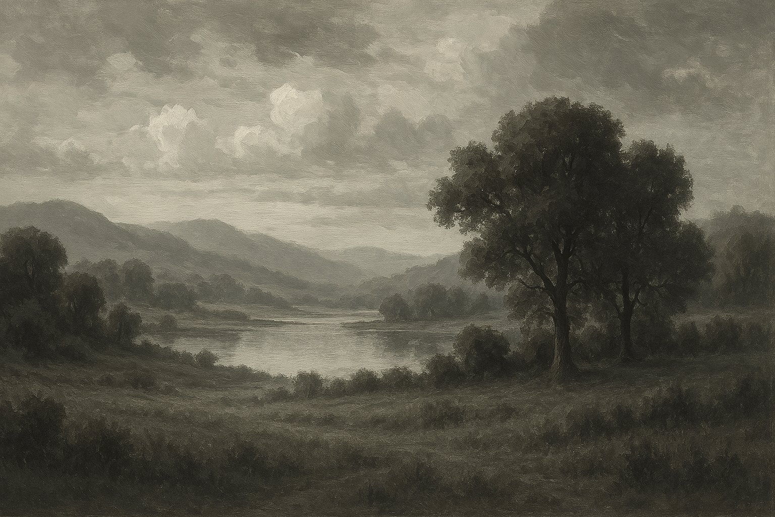
High Key: Monet and Impressionism (Values 6-9)

“High Key” paintings use mostly light values. Think of Impressionist landscapes by Claude Monet.
- Mood: Cheerful, sunny, ethereal, faded.
- Palette: Lots of white, yellows, pinks, and light blues. Shadows are often purple or blue, not black.
Low Key: Rembrandt and Tenebrism (Values 1-4)
“Low Key” paintings are dominated by darks. Think of Rembrandt or Caravaggio. This style is often called Chiaroscuro or Tenebrism.
- Mood: Dramatic, mysterious, somber, intense.
- Palette: Black, Burnt Umber, deep reds. The light is used sparingly to focus the viewer’s eye.
Case Study: Whistler vs. Monet Value Ranges
If you analyze James McNeill Whistler’s Nocturne in Black and Gold, almost 80% of the canvas is Value 1-3. Contrast this with Monet’s Water Lilies, where 80% of the canvas is Value 6-9. Both are masterpieces, but they use the value scale in opposite ways to evoke different feelings.
Step-by-Step Exercise: Painting the Perfect Value Scale
Before you paint a masterpiece, paint a ladder. Creating a 9-step value scale is the best exercise for “calibrating” your eyes.
The “50/50 Mixing Myth”
Here is where physics tricks us. If you mix 50% Black paint and 50% White paint, you do not get a middle gray (Value 5). You get a dark charcoal gray (Value 2 or 3).
- Why? Black pigments (Carbon/Mars) have a much higher “tinting strength” than Titanium White. White is easily overwhelmed.
Correct Mixing Ratios for Acrylic and Oil

To find the true Middle Gray (Visual Center):
- Start with a pile of White.
- Add a tiny speck of Black (about 1 part Black to 9 or 10 parts White).
- It is always easier to darken a light mixture than to lighten a dark mixture. Always add dark to light.
- Mix and assess.
Visual Center vs. Physical Center
- Physical Mix: ~10% Black + 90% White.
- Visual Result: 50% Gray.
When painting your scale, place your Black (1) and White (9) first. Then mix your Middle Gray (5). Once you have the middle, try to find the value between 1 and 5, and then between 5 and 9. This “halving” method is easier than going step-by-step.
Need help with mixing? See our color mixing primer.
Troubleshooting Common Value Problems
Even experienced artists run into these issues. Here is how to fix them.
“My Painting Looks Flat” (Lack of Contrast)

Diagnosis: You are likely painting everything in the mid-tones (Values 4-6).
The Fix: Find your darkest dark and your lightest light. Put them next to each other in the focal point. This is called “simultaneous contrast” and it creates instant pop. Check out fixing painting mistakes for more.
“My Shadows Look Muddy” (Mixing too many values)
Diagnosis: You are over-blending your edges or introducing White into your shadows.
The Fix: Keep shadows transparent and thin. Avoid adding white to shadow mixtures if possible, as white makes colors “chalky” and kills the depth.
“I Can’t See the Value of Red” (Using a Red Filter)
Diagnosis: Red is tricky. It grabs our attention so much we think it is lighter than it is.
The Fix: Use the camera on your phone with a black-and-white filter (Mono) to check your reference. Or, use a piece of red acetate (a red filter). Looking through red plastic removes the color red from the object, leaving only the value visible.
FAQs: About Value and Tone
Is tone the same as shade?
No. Tone usually refers to a color mixed with gray (lowering chroma), or the general lightness/darkness (value). Shade specifically means a color mixed with black.
What is the difference between tint, tone, and shade?
- Tint: Color + White.
- Tone: Color + Gray.
- Shade: Color + Black.
Which color has the lightest inherent value?
Yellow. In its purest tube form, yellow is closest to white (Value 8-9). Violet is naturally the darkest (Value 2).
Why do oil paints dry at different speeds?
It depends on the amount of oil the pigment absorbs. Burnt Umber absorbs oil quickly and dries fast. Ivory Black is very oily and dries slowly.
Final Thoughts: The 10-Minute Value Sketch Habit
Here’s the thing about value – it’s your turning point. The moment you stop coloring and start sculpting with light.
You don’t need mastery overnight. Before your next painting, take 10 minutes with just Burnt Umber and White. Squint hard. Ignore details. Map the light and dark.
If your value sketch works, your painting works – regardless of the colors you layer on top.
Happy painting!

