
You don’t need years of training to learn from history’s masters. This guide breaks down the simple, beginner-friendly techniques of icons like Van Gogh and Monet to help you start your creative journey. By focusing on bold colors and expressive shapes rather than perfection, you’ll find the confidence to pick up a brush and enjoy the process.
Many beginners stare at a blank canvas and feel like an imposter because they aren’t “naturally gifted” like the legends of art history. It is easy to think that famous artists possessed a secret, magical talent that cannot be taught, but the truth is much more encouraging. Most iconic painters succeeded because they actually broke the rigid “rules” of traditional art to find simpler, more expressive ways to communicate their vision.
In this post, we’ll explore legendary figures whose work serves as a practical roadmap for your own creative growth. We won’t just look at old paintings; we’ll deconstruct their methods into easy steps you can use today. Whether you are a total novice or looking for a fresh perspective, these masters offer lessons in color, texture, and creative courage. As a watercolorist and educator with over a decade of experience, I’ve seen how these simple shifts in mindset can turn intimidation into inspiration.
Why is Vincent van Gogh the Best Artist for Beginners to Study?
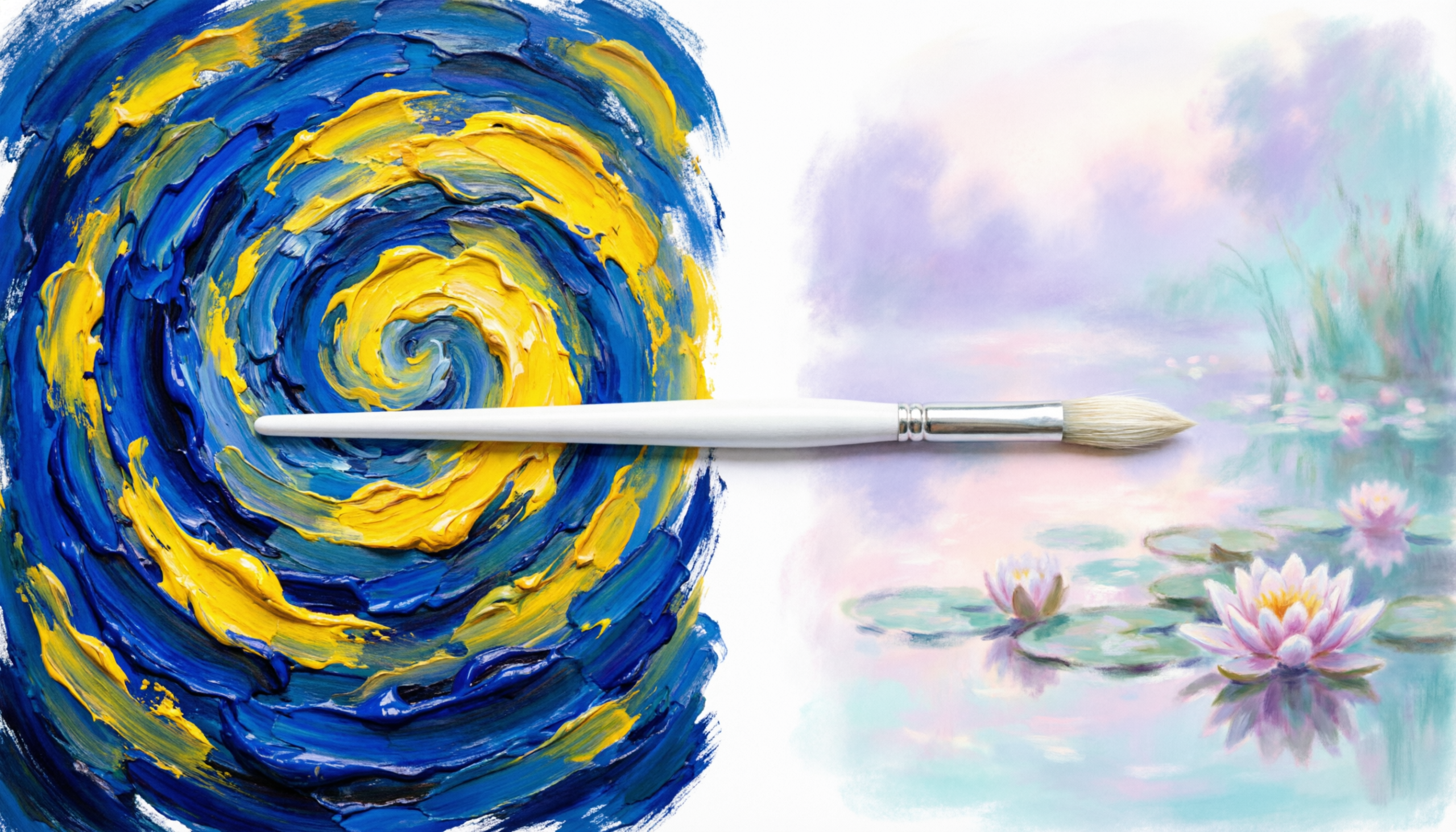
Vincent van Gogh is ideal for beginners because his style prioritizes emotional expression and visible, rhythmic brushstrokes over photographic perfection. His “impasto” technique uses thick, unblended paint, which allows new artists to see exactly how color is applied without the stress of complex blending or fine details.
Van Gogh’s work, like the famous Starry Night, is essentially a map of his movements. When you look closely, you can see every individual mark his brush made. For someone just starting, this is incredibly liberating because it proves that your brushwork doesn’t have to be invisible to be beautiful.
Instead of trying to make a sky look “real,” Van Gogh used swirling lines to show how the wind felt to him. You can practice this by using heavy body acrylics and laying the paint on thick. Don’t worry about smoothing it out; let the texture of the paint tell the story of your hand moving across the surface.

How Does Claude Monet Make Painting Landscapes Easier?
Claude Monet simplifies painting by focusing on “broken color” and light rather than intricate, realistic details. Instead of painting every leaf on a tree, he used small dabs of different colors that the human eye “blends” from a distance. This removes the pressure to be precise and encourages a faster, more intuitive way to work.
Monet was a leader of the Impressionists, a group that wanted to capture a “first impression” of a scene. They often painted en plein air, which is just a fancy way of saying they painted outdoors. Because the sun is always moving, they had to work quickly.
For a beginner, this “fast and loose” approach is a perfect antidote to perfectionism. You can try this by setting a timer for twenty minutes and painting a simple vase of flowers. Use short, choppy strokes and avoid the temptation to go back and fix “mistakes”. This technique helps you focus on the big picture rather than getting stuck on one tiny corner of the canvas.
Master the Bold Simplicity of Andy Warhol
If you feel like you can’t draw “well,” Andy Warhol is the artist for you. Warhol was a leader of the Pop Art movement, which celebrated everyday objects like soup cans and soda bottles. He showed the world that anything can be art if you look at it with enough interest.
Warhol often used bold, flat colors and repetitive images. This is a fantastic way for beginners to practice color theory. You don’t have to worry about complex shading or 3D perspective; you can just focus on how a bright yellow background looks against a vibrant blue subject.
When I taught art in a formal classroom setting, I used Warhol’s style to help students who felt they lacked “artistic flair”. We would take a simple shape and paint it four different times in four different color schemes. This repetition builds muscle memory and helps you understand which colors pop and which ones recede without the pressure of a “serious” composition.
Why is Georgia O’Keeffe’s Focus on Scale Important?
Georgia O’Keeffe helps beginners by teaching them to “zoom in” on simple subjects to the point where they become almost abstract. By enlarging small details, like the center of a flower, she removes the struggle of complex landscapes. This allows the artist to focus entirely on smooth color transitions and organic shapes.
Many new painters get overwhelmed because they try to fit too much into one painting. O’Keeffe’s secret was to take one tiny thing and make it the whole world. Her work is a lesson in “less is more”.

To try this at home, take a photo of a leaf or a shell and crop it until you can only see a small portion of the texture. Use this as your reference. Because the subject is so simple, you can spend your time learning how to blend colors softly or how to create a clean edge between two shapes. It is a very mindful and therapeutic way to spend an afternoon.
Learning Abstract Courage from Wassily Kandinsky
Wassily Kandinsky is often credited with painting the first purely abstract works in modern art. He believed that colors and shapes could communicate feelings just like music does. He didn’t want to paint “things” at all; he wanted to paint the sound of a trumpet or the feeling of joy.
For a beginner, Kandinsky offers the ultimate freedom: the freedom from “looking right”. In abstract art, there are no mistakes, only choices. You can use circles, triangles, and wiggly lines to fill your canvas.
This style is perfect for those days when you want to create but don’t have a specific subject in mind. Put on your favorite album and try to “paint the music” using only shapes and colors. You’ll find that this practice builds a deep connection with your materials and helps you understand the weight and balance of a composition without the distraction of realism.
Conclusion
Studying the masters isn’t about becoming a copycat; it is about finding the “cheat codes” they used to make art feel alive. Whether it is Van Gogh’s thick swirls or Monet’s soft dabs, these techniques prove that great art is often about simplification rather than complication. The goal is to demystify the process so you can start creating without intimidation.
As a watercolorist and educator, I’ve seen that the biggest hurdle for most beginners is simply getting started. These famous artists show us that art is a language we can all learn to speak. You don’t need to be a legend to enjoy the act of painting.
Ready to put these master techniques into practice? Grab your primary colors and head over to our Beginner’s Guide to Acrylics to start your first master-inspired study today!
Frequently Asked Questions
Do I need expensive oil paints to paint like Van Gogh? No, you do not need expensive oils to mimic his style. You can achieve a very similar thick, textured look using heavy body acrylics or by adding a “modeling paste” to standard acrylic paint.
What is the easiest famous painting for a beginner to recreate? Many find Andy Warhol’s Soup Cans or Georgia O’Keeffe’s close-up flowers to be the most accessible starting points. These subjects use bold, clear shapes and limited color palettes that are easier to manage than complex scenes.
How do I choose which artist style matches my personality? If you are energetic and expressive, you might love Van Gogh’s thick brushwork. If you prefer calm and atmosphere, Monet might be your match. The best way to find out is to spend thirty minutes trying a small sketch in each style.
Can I learn painting techniques just by looking at famous art? Looking is a great first step, but “doing” is where the real learning happens. By trying to recreate a specific stroke or color choice, you gain a physical understanding of how the artist solved creative problems.
Why do famous artists use “weird” colors that don’t look real? Artists like the Impressionists and Expressionists used color to represent light, shadow, or emotion rather than literal reality. This allows the viewer to “feel” the painting rather than just identify the objects in it.

