
In our digital age dominated by high-resolution graphics and sophisticated design software, there exists a surprisingly resilient art form that proves creativity can flourish within the simplest constraints. This is ASCII art (or drawing with text characters) – the practice of creating images using nothing more than the letters, numbers, and symbols found on your keyboard. Far from being merely a nostalgic relic of early computing, ASCII art represents a fascinating intersection between the logical world of text and the expressive realm of visual art.
Key Points You’ll Learn
• Historical Origins: Discover how ASCII art evolved from ancient pattern poetry through typewriters to modern digital expression
• Essential Techniques: Master character value theory, monospaced fonts, and manual creation methods
• Digital Tools: Explore modern ASCII art generators and AI-powered creation software
• Professional Applications: Learn how programmers and contemporary artists use text-based art today
• Practical Skills: Get hands-on guidance for creating your first ASCII artwork
• Accessibility Considerations: Understand the challenges and solutions for inclusive ASCII art sharing

This comprehensive guide will take you through the rich history, fundamental techniques, and modern applications of this unique medium. Whether you’re an artist looking to explore new creative territories or simply curious about this intriguing form of expression, you’ll discover how the humble keyboard can become a powerful canvas for artistic creation.
The Historical Roots of Text-Based Art
Ancient Origins in Pattern Poetry
The concept of using text characters for visual effect extends far deeper into history than most people realize. Long before the first computer was ever conceived, poets and scribes were experimenting with the visual potential of written language. As early as the 3rd and 2nd centuries BCE, Greek poets were crafting “pattern poetry” – arranging text on the page to create shapes that related directly to the poem’s subject matter.
This tradition of concrete poetry continued to evolve through the centuries. A particularly famous example can be found in George Herbert’s 1633 poems “Easter Wings” and “The Altar,” where the stanzas are physically arranged to mirror the shapes described in the verses. These works demonstrate humanity’s enduring desire to blur the boundaries between reading and seeing, between language and image.
The Printing Press Revolution
The invention of the printing press around 1450 revolutionized not just literature, but also opened new possibilities for typographic art. One of the most celebrated examples appears in Lewis Carroll’s “Alice in Wonderland” (1865), where the Mouse’s “long and sad tale” is printed in a winding, tail-like curve – a visual pun made possible by the precision of mechanical typesetting.
From Typewriters to Teletypes

The late 19th century introduction of the typewriter marked a crucial evolution in text-based art. Typists began creating intricate pictures as early as 1867, with manufacturers actually encouraging this practice by sponsoring competitions. Creating typewriter art was a painstaking process, requiring multiple passes of a single sheet of paper through the rollers, with every keystroke being permanent and irreversible.
The transition from typewriter to teletypewriter represented a fundamental conceptual shift. While typewriter art remained a physical object, teletype art became transmissible data. By the 1920s, text-based images were being sent electronically, liberated from physical constraints and transformed into pure information – a direct precursor to sharing digital art online.
Understanding ASCII Art Fundamentals
The Critical Importance of Monospaced Fonts
The absolute foundation of traditional ASCII art lies in understanding font selection. All serious ASCII art must be created using monospaced (fixed-width) fonts such as Courier, Monaco, or Consolas. In these fonts, every character occupies exactly the same amount of horizontal space – an ‘i’ is just as wide as an ‘M’.
This uniformity transforms your text editor into a reliable grid system, where each character functions as a predictable pixel. Using a proportional font like Arial, where letters have varying widths, would cause your carefully aligned lines to distort and the entire image to collapse. Just as a painter must understand their canvas, a text artist must master the grid-based foundation that makes their medium possible.
The Theory of Character Value
The core artistic principle behind effective ASCII art is understanding character value – the relative lightness or darkness that different symbols create visually. This concept directly parallels the complete guide to light and shadow that traditional painters must master.
Some characters naturally fill more of their allocated space than others, creating an illusion of grayscale through varying visual densities. This technique mirrors stippling or cross-hatching in conventional drawing, where artists build up tonal variations through the accumulation of marks.
Dark Areas and Shadows: For the deepest shadows and darkest regions, use dense characters that cover substantial background space. The most effective options include $, @, B, %, 8, W, M, and #.
Light Areas and Highlights: For bright highlights and light sources, employ sparse characters that are mostly empty space. The period (.), comma (,), apostrophe (‘), and space character are ideal for these applications.
Mid-Tones: The vast majority of other characters – lowercase letters (a, e, s, k), parentheses, and numbers – fill the spectrum between light and dark, enabling smooth tonal transitions and realistic form modeling.
ASCII Tonal Values Timeline
Complete ASCII Tonal Scale
From absolute black (left) to pure white (right)
Connection to Traditional Painting
This ASCII tonal progression directly correlates to value scales used in traditional painting. Just as painters mix tints and shades to create value gradations, ASCII artists select characters to achieve similar tonal effects. Understanding this progression helps artists in both mediums create convincing form, depth, and atmospheric perspective.
The key principle remains the same: successful artwork depends on a well-organized value structure, whether achieved through pigment mixing or careful character selection. This timeline demonstrates how digital artists can apply fundamental artistic principles using the constraints and possibilities of ASCII character sets.
Essential Techniques for Manual Creation
Building Structure with Line Art
Beyond simple tonal shading, skilled ASCII artists employ a sophisticated vocabulary of structural techniques. These methods parallel the various painting techniques for beginners and beyond that traditional artists must learn.
Outlines and Linear Elements: The skeleton of most ASCII images is constructed using simple line-forming characters. The forward-slash (/), backslash (), vertical bar (|), and underscore (_) serve as the fundamental building blocks for creating structural elements and defining shapes.
Creating Smooth Curves: One of the greatest challenges in ASCII art is creating organic, flowing curves using angular characters. Master artists develop clever character sequences that trick the eye into perceiving smooth lines. For example, the combination ~”-.,_ can create a much more fluid curve than simply repeating hyphens or other single characters.
Edge Polishing Techniques: To avoid the jagged, “stair-stepped” appearance that can plague ASCII art, experienced artists “polish” their work by using lighter characters like ., ,, :, and ‘ along the outer edges of shapes. This creates a softer transition to the background and enhances the overall visual quality.
Advanced Compositional Strategies
Creating compelling ASCII art requires understanding how to organize visual elements effectively. This involves applying many of the same essential elements of composition that guide traditional visual arts.
Focal Points: Use the densest, most visually striking characters to draw attention to key areas of your composition. The strategic placement of characters like @ or # can create strong focal points that guide the viewer’s eye.
Visual Flow: Arrange your characters to create movement and rhythm throughout the piece. This might involve using diagonal lines to create dynamic energy or employing repetitive patterns to establish visual rhythm.
Contrast and Emphasis: The wide range of character densities available allows for dramatic contrast effects. By juxtaposing very light characters against very dark ones, you can create striking visual emphasis and dramatic impact.
Modern Digital Tools and Generators
Understanding ASCII Art Algorithms
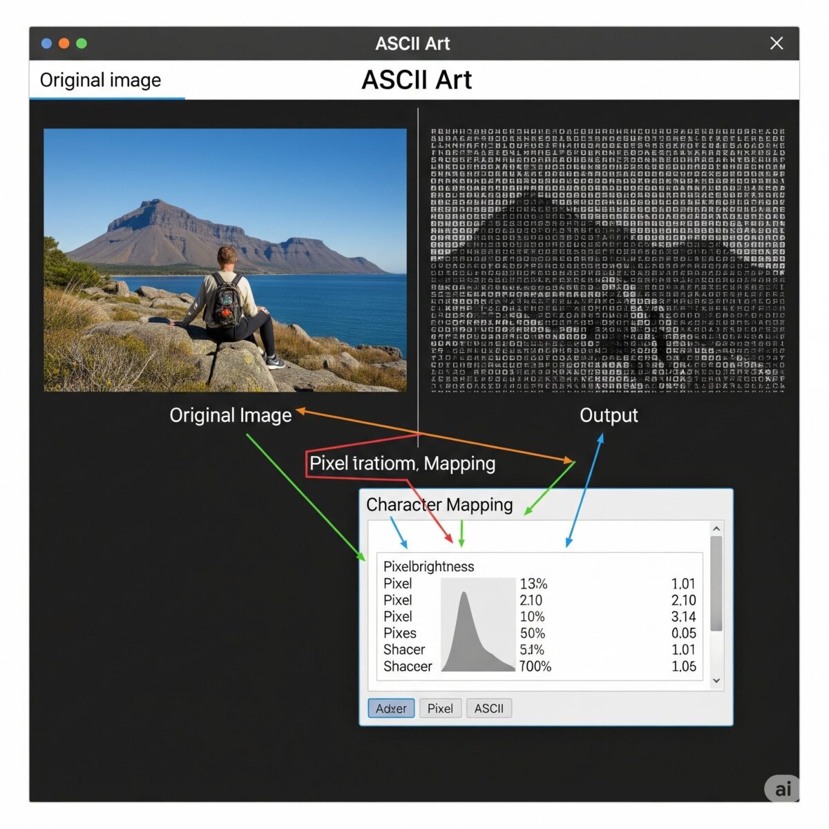
While manual creation remains the heart of the craft, modern ASCII art generators offer fascinating insights into how computational systems can interpret and recreate visual information. These tools automate the conversion process, transforming existing images into text-based artworks through sophisticated algorithms.
The basic process begins with image analysis – the software resizes the input image and converts it to grayscale. Then, it systematically examines each pixel, measures its brightness value, and maps that brightness to a specific character from a pre-sorted “character ramp.” Dark pixels receive dense characters like #, while light pixels get sparse ones like periods.
Advanced Machine Learning Approaches

Contemporary ASCII art generation has evolved beyond simple brightness mapping. Modern machine learning models can create “structure-based” art that better captures lines, shapes, and essential visual elements. This technological advancement mirrors the broader explosion of creativity seen in AI art generation, where algorithms are taught not just to mimic tonal values, but to understand form and structure.
These advanced systems analyze edge detection, contour recognition, and pattern identification to create ASCII art that preserves more of the original image’s essential characteristics while maintaining the aesthetic appeal of hand-crafted text art.
Contemporary Applications and Challenges
From Code Comments to Fine Art
ASCII art has found renewed relevance in diverse contemporary contexts. In programming, developers frequently embed ASCII diagrams in their code comments to visually explain complex software architecture or data structures. This represents a return to the medium’s technical origins while serving practical modern purposes.
Simultaneously, the conceptual principles of text art resonate deeply within the fine art world. Artists like Jenny Holzer and Barbara Kruger use text as their primary medium to explore themes of power, consumerism, and identity, challenging traditional boundaries between words and images. Their work contributes significantly to the ongoing dialogue between modern vs. contemporary art, demonstrating how historical forms can be recontextualized for contemporary expression.
Social Media and Accessibility Challenges
ASCII art has found new life on social media platforms, where it’s used for viral memes, eye-catching posts, and creative expression. However, this digital renaissance presents significant accessibility challenges. Screen reader software used by visually impaired individuals interprets ASCII art as a jumble of nonsensical punctuation, making the content confusing and inaccessible.
The recommended solution involves posting screenshots of ASCII art with descriptive alt-text. While this addresses the accessibility issue, it creates a fascinating paradox: to make text art accessible, one must convert it into an image, sacrificing the “copy-and-paste” nature that defines it as a truly text-based medium.
Getting Started: Your First ASCII Creation
Choosing Your Tools
Begin with a simple text editor that supports monospaced fonts. Popular choices include Notepad++ (Windows), TextEdit (Mac), or any code editor like Visual Studio Code. Set your font to Courier, Monaco, or Consolas at a comfortable size for detailed work.
Practice Exercises
Simple Shapes: Start with basic geometric forms like squares, triangles, or circles. Use the underscore (_) for horizontal lines, the vertical bar (|) for vertical lines, and forward/backslashes for diagonals.
Gradients: Practice creating smooth tonal transitions by arranging characters from darkest to lightest. This exercise will develop your understanding of character values and how they interact visually.
Copying References: Find simple line drawings or high-contrast photographs to recreate. This practice will help you understand how to translate complex visual information into the limited vocabulary of ASCII characters.
Building Complexity

As your skills develop, experiment with more complex subjects. Faces, landscapes, and architectural elements provide excellent challenges for advancing your technique. Remember that successful ASCII art often requires simplification – not every detail from a reference image needs to be included.
FAQs: Drawing with Text Characters
What is ASCII art exactly?
ASCII art is a graphic design technique that uses computers for presentation and consists of pictures pieced together from the 95 printable (from a total of 128) characters defined by the ASCII Standard from 1963 and ASCII compliant character sets with proprietary extended characters. Essentially, it’s the art of creating images using only keyboard characters like letters, numbers, and symbols.
How do I make ASCII art from text?
Just open LetterArt, the ASCII art generator on Canva, type your text, and let the tool do the work. With one click, your words quickly transform into ASCII art, ready to be used in your designs, or copied and pasted anywhere you like. For manual creation, use a monospaced font in any text editor and arrange characters to form shapes and patterns.
Can I convert images to ASCII art?
Yes, you can easily convert images to ASCII art using online generators. Use our free online ASCII Art tool to easily and quickly convert images to ASCII art. Perfect for creative projects and fun. These tools analyze your image’s brightness values and map them to appropriate text characters.
What fonts work best for ASCII art?
ASCII art requires monospaced fonts where every character occupies the same width. The most popular choices include Courier, Monaco, Consolas, and other fixed-width fonts. Proportional fonts like Arial or Times New Roman will cause your art to appear distorted and misaligned.
Is ASCII art still relevant today?
Absolutely! ASCII art remains popular in programming for code documentation, in social media for creative posts, and in digital art communities. It’s also experiencing a renaissance as artists explore the aesthetic possibilities of constraint-based creativity in our high-tech world.
How long does it take to learn ASCII art?
Basic ASCII art techniques can be learned in a few hours, but mastering advanced skills like realistic portraits or complex scenes takes considerable practice. Starting with simple shapes and gradually building complexity is the most effective approach for beginners.
What are the best ASCII art generators?
Use our free online ASCII Art Generator to easily and quickly convert text to stunning ASCII Art. The creative tool you’ve been seeking. Popular options include TAAG (Text to ASCII Art Generator), various online converters, and specialized software for both text and image conversion.
Conclusion: Embracing the Art of Constraint
ASCII art represents a unique intersection of technology, creativity, and human ingenuity. It demonstrates that meaningful artistic expression can emerge from the most constrained circumstances, transforming limitations into opportunities for creative exploration. This medium offers artists a distinctive way to bridge the logical world of language with the expressive realm of visual art.
Whether you choose to meticulously craft images by hand or explore the possibilities offered by modern generators, you’re participating in a rich artistic tradition that spans centuries. The principles you learn from ASCII art – understanding value, managing contrast, and working within constraints – will enhance your appreciation for all forms of painting and visual art.
In our age of unlimited digital possibilities, there’s something profoundly satisfying about creating art with nothing more than the keys beneath your fingers. So open a text editor, embrace the constraints, and begin exploring. Your keyboard is waiting to become a canvas, and the only limit is your imagination.

