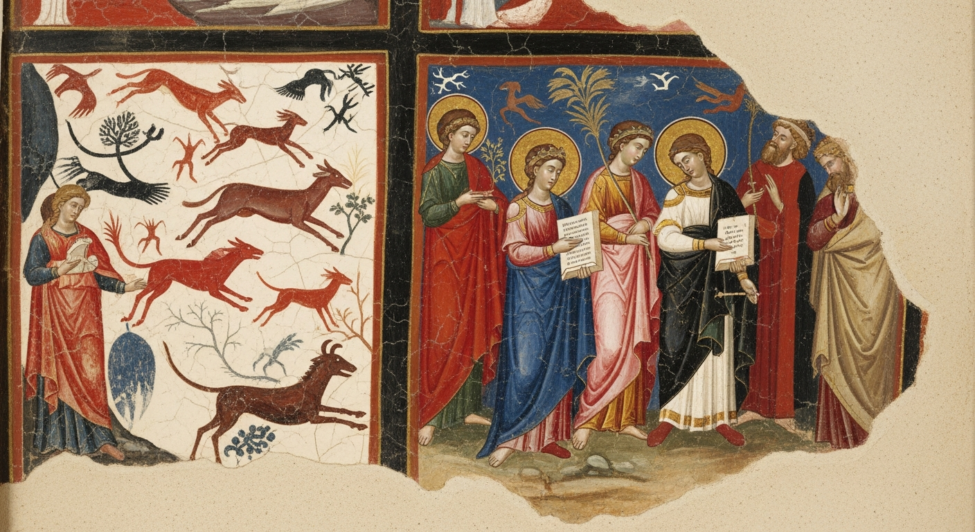
I still remember the first time I stood in front of one of Mark Rothko’s massive color fields; it wasn’t the composition that held me, but the sheer emotional weight of those vibrating reds and oranges. It reminded me that before a viewer even recognizes the subject of your artwork – whether it’s a bowl of fruit or a stormy landscape – they feel its atmosphere first. That immediate connection isn’t magic, but it is the silent language of color working its charm.
This is the tool that shapes our stories and directs the eye, much like Caravaggio used dramatic light to guide us exactly where he wanted us to look. Whether you are just mixing your first tentative gradient or refining a piece you’ve been working on for weeks, understanding your colors gives you a superpower: the ability to control the mood and movement across your canvas.
And here is where it gets interesting….
You don’t need a degree in chemistry to get this right. In this guide, we are going to explore the essential theory and history you actually need to turn a simple palette into a visual narrative. We’ll move from the basics to the bigger picture, helping you transform those tubes of paint into something that truly speaks.
Key Takeaways
- Colour theory builds the foundation for strong, intentional palettes.
- Warm and cool colours influence emotion, depth, and atmosphere.
- Colour schemes shape harmony, contrast, and storytelling.
- Art history reveals evolving colour use across cultures and eras.
- Colour psychology helps artists connect emotionally with viewers.
- Mixing techniques add richness, vibrancy, and control.
Understanding Colours in Painting
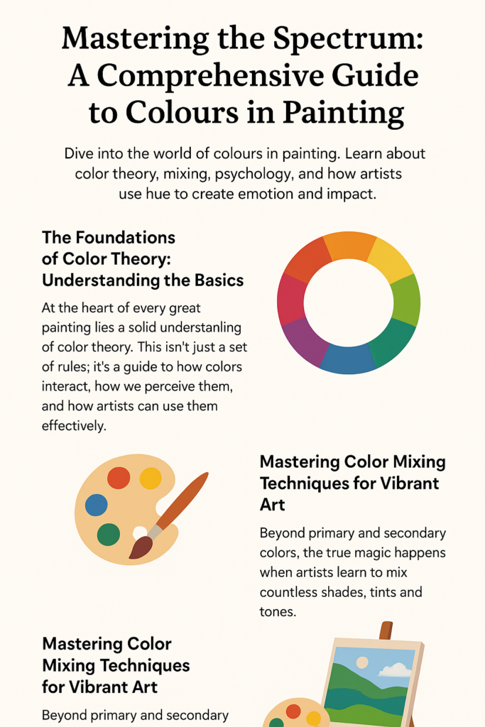
Colours in painting form the backbone of visual storytelling. Artists rely on colour to create depth, contrast, temperature, and atmosphere. Even before the viewer recognises the subject matter, they react emotionally to the colours used. Pastels can soothe, reds can energise, and muted tones can evoke nostalgia.
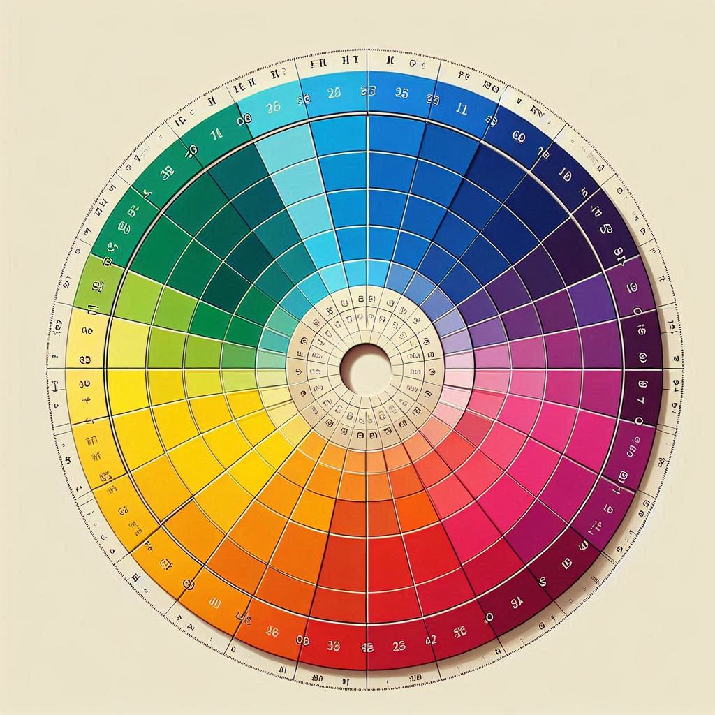
Mastery begins with the colour wheel and how hues interact—analogous palettes harmonise, complementary colours vibrate, and triadic schemes energise compositions. With colour understanding comes creative control.
The Foundations of Colour Theory
Colour theory teaches how colours behave and influence each other. The classic artist’s colour wheel includes:
- Primary colours: red, yellow, blue
- Secondary colours: green, orange, purple
- Tertiary colours: combinations such as red-orange or blue-green
Key components of colour theory include:
- Value: lightness or darkness
- Saturation: colour intensity
- Temperature: perceived warmth or coolness
“Colour is a power which directly influences the soul.”
Wassily Kandinsky
Historical movements like Impressionism and Renaissance portraiture demonstrate how artists used colour intentionally to shape mood, realism, and light.
Colour Psychology: The Emotional Language of Colour
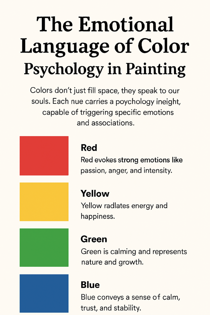
Colour psychology shapes how viewers emotionally interpret art. Even without technical knowledge, people respond instinctively to colour choices.
Emotional Associations
- Red: passion, danger, intensity
- Blue: calm, peace, stability
- Yellow: energy, happiness, optimism
- Green: nature, balance, growth
- Purple: mystery, creativity, spirituality
- Orange: enthusiasm, warmth, energy
- Black: elegance, mystery, power
- White: purity, simplicity, emptiness
Temperature plays a significant role too—warm colours tend to advance toward the viewer, while cool colours recede. This allows painters to control depth and emotional flow across the canvas.
Learn more about how subjects influence colour choices in our guide on painting genre and subject matter.
Mastering Colour Mixing Techniques
Colour mixing combines artistic intuition with knowledge of pigment behaviour. Artists consider opacity, tinting strength, granulation, and lightfastness when choosing colours.
Key Colour Characteristics
- Hue – the colour itself
- Saturation – intensity or dullness
- Value – lightness or darkness
Popular Colour Mixing Techniques
- Glazing: thin transparent layers for glowing depth
- Scumbling: dry-brushed texture for atmosphere
- Impasto: thick expressive brushstrokes
- Wet-on-wet: smooth transitions and soft blends
- Layering: stacked pigments for richer tones
Many artists prefer limited palettes for consistent harmony and easier mixing. For realism techniques, visit our guide on creating depth in paintings.
Common Colour Schemes in Painting
| Colour Scheme | Definition | Example Colours | Artistic Impact |
|---|---|---|---|
| Monochromatic | Single colour with value shifts | Light–Dark Blue | Calm, unified |
| Complementary | Opposites on the wheel | Red–Green | High contrast, dynamic |
| Analogous | Neighbouring colours | Blue–Green | Natural harmony |
| Triadic | Three evenly spaced colours | Red–Yellow–Blue | Balanced, vibrant |
| Warm Colours | Reds, oranges, yellows | Orange–Red | Energetic, advancing |
| Cool Colours | Blues, greens, violets | Blue–Green | Calm, receding |
Explore how these schemes evolved through history in our guide to painting styles and movements.
A Colourful Journey Through Art History
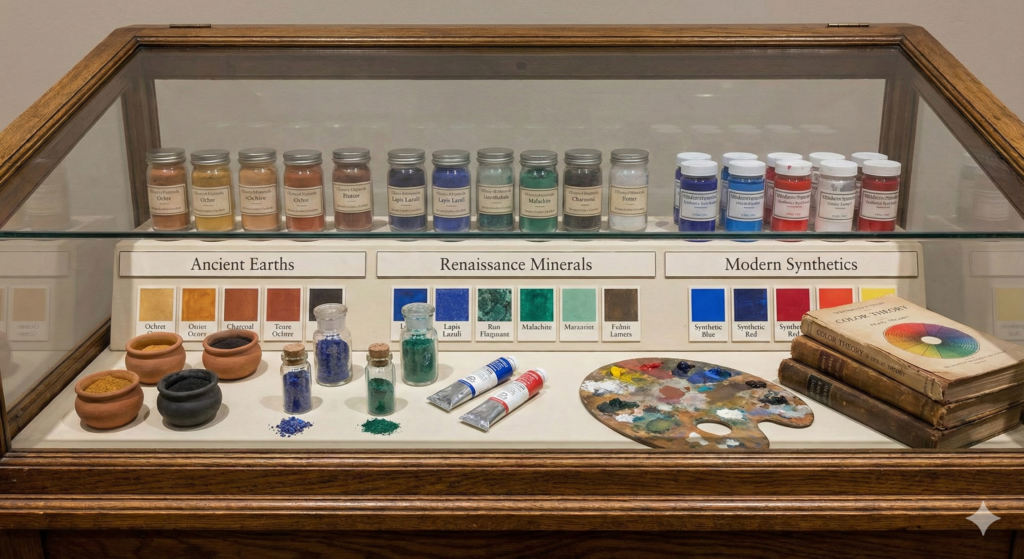
Colour in art has transformed across eras. Each period introduced new pigments, ideas, and techniques:
A Colourful Journey Through Art History
The colours in painting we see in museums were often dictated by the technology of the era. As chemistry advanced, so did the artist’s ability to capture light and emotion.
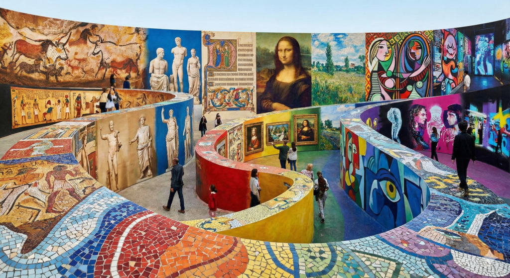
Ancient & Classical Art: The Earth Palette
In the ancient world, the artist’s palette was defined by geology. Painters relied heavily on “earth pigments” that could be dug straight from the ground—Yellow Ochre, Red Earth, Chalk White, and Carbon Black.
- Symbolism over Realism: Because bright blues and purples were rare and expensive (often imported), colour was often used symbolically rather than realistically. For example, Egyptian Blue, the first synthetic pigment, was used specifically to denote the divine.
- The Four-Colour Limit: Many Classical Greek painters restricted themselves to a specific “tetrachromacy” palette (red, yellow, black, and white) to show discipline and mastery over form without the distraction of “garish” colours.
The Renaissance: Alchemy and Light
The explosion of trade and early chemistry expanded the painter’s toolkit. This era saw the transition from egg tempera (which dried opaque and flat) to oil paint, which allowed for translucency.
- Lapis Lazuli: The most prized pigment of the era was Ultramarine blue, made from crushed semi-precious lapis lazuli stones. It was so expensive that contracts often specified exactly how much would be used for the robes of the Virgin Mary.
- Sfumato: Masters like Da Vinci used the new slow-drying oil paints to create sfumato—soft, smoky transitions between colours that eliminated harsh lines, creating lifelike volume.
Impressionism: The Tube Revolution
The 19th century brought the industrial revolution to art. The invention of the collapsible metal paint tube allowed artists to leave the studio and paint en plein air (outdoors).
- Capturing Light: Impressionists like Monet and Renoir stopped using black for shadows. Instead, they used complementary colours (like mixing purple into the shadows of a yellow hay stack) to create vibrant, vibrating light effects.
- Broken Colour: Rather than smoothing out gradients, they placed unmixed hues side-by-side. From a distance, the viewer’s eye “optically mixed” these spots of colour, creating a luminosity that traditional mixing could not achieve.
Fauvism: Colour as Emotion
In the early 20th century, a group of artists led by Henri Matisse were nicknamed Les Fauves (“The Wild Beasts”) because of their aggressive use of colour.
- Liberation from Reality: They broke the rule that colour had to describe the object. A tree could be red; a face could be green.
- Expressive Power: Colour was used purely for emotional impact and structural balance, prioritizing the artist’s internal feeling over the external reality.
Modern & Digital Art: Limitless Possibilities
Today, the definition of colours in painting has expanded beyond physical pigment.
The Digital Realm: Digital artists paint with light itself (RGB), allowing for neon saturations and glow effects that are physically impossible to achieve with traditional subtractive pigments.
Synthetic Chemistry: Modern acrylics and oil paints use synthetic organic pigments (like Phthalocyanines and Quinacridones) that are more intense, lightfast, and non-toxic than historical equivalents.
Lessons from the Masters: Iconic Uses of Colour
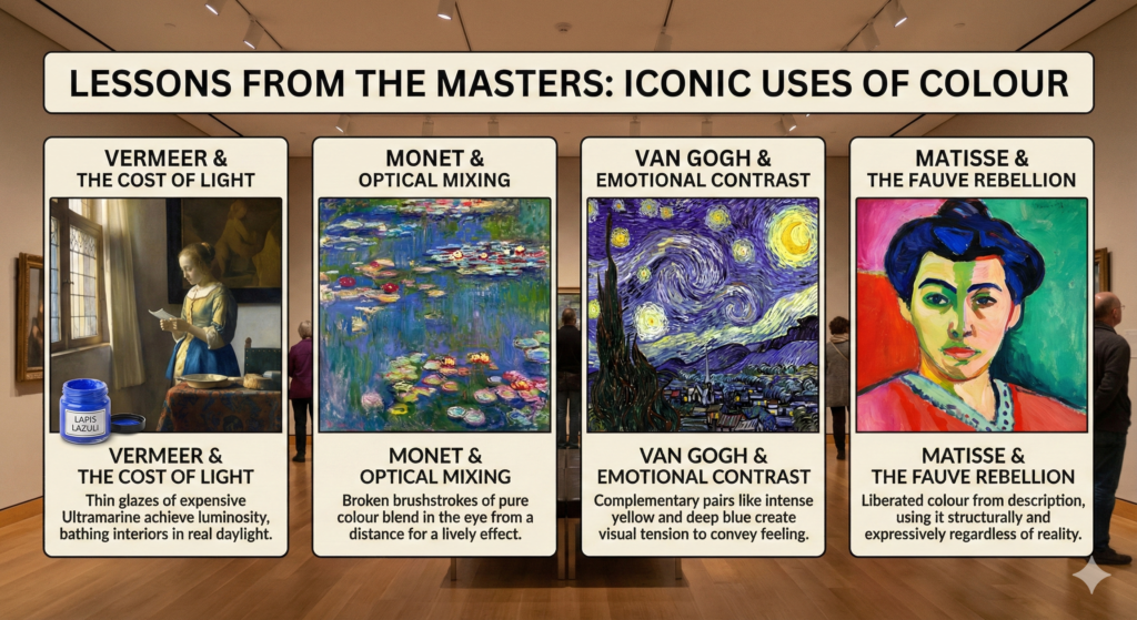
The greatest artists in history didn’t just copy the world around them; they manipulated colours in painting to alter the viewer’s perception.
- Johannes Vermeer & The Cost of Light: Vermeer is famous for his usage of natural Ultramarine (Lapis Lazuli), a pigment more expensive than gold at the time. By using it in thin glazes, he achieved a luminosity that made his interiors feel bathed in real daylight, a technique that defined the Dutch Golden Age.
- Claude Monet & Optical Mixing: Impressionists like Monet avoided mixing colours thoroughly on the palette. Instead, they placed broken brushstrokes of pure colour side-by-side (like red next to green). From a distance, the eye “mixes” them, creating a vibrating, lively effect known as “optical mixing.”
- Vincent van Gogh & Emotional Contrast: Van Gogh used colour to express feeling rather than visual realism. He frequently employed complementary pairs—intense yellows against deep violets and blues—to create visual tension and convey the emotional turbulence of the night sky.
- Henri Matisse & The Fauve Rebellion: Matisse and the Fauvists (“wild beasts”) liberated colour from description entirely. They might paint a face green or a tree red, proving that colour could be used structurally and expressively, regardless of the object’s real-life shade.
| Period / era | Availability pattern | Main sources and constraints | Example pigments / notes |
|---|---|---|---|
| Prehistoric (cave painting) | Very limited, strictly local | Naturally occurring earths and char; gathered from nearby deposits | Red/yellow ochres (iron oxides), charcoal black, chalk/kaolin whites; no stable blues |
| Ancient Egypt & early empires | Broader but still elite-controlled | Organized quarrying, early synthesis, trade along Nile and Mediterranean | Egyptian blue (first synthetic blue glass), malachite and azurite greens/blues, cinnabar red, improved ochres |
| Classical Greece–Rome | Wider palette for wealthy patrons | Empire-wide trade networks and specialist workshops | High-grade cinnabar vermilion, minium (red lead), imported ultramarine precursor lapis for luxury use, orpiment yellow, lead white |
| Medieval Europe | Uneven; monasteries and courts had best access | Trade via Venice and other hubs; guild control of recipes and supply | Natural ultramarine from lapis (extremely expensive), azurite blue, verdigris green, lead-tin yellow, insect reds (kermes, cochineal later) |
| Renaissance–Baroque | Gradual expansion but many colors still costly or toxic | Global trade (Age of Discovery) plus improved refining of minerals and lakes | Indian yellow, better vermilion, smalt blue glass, more stable lakes, broader use of lead white and earths |
| 18th century (early industry) | Noticeable growth, early industrial pigments | Discovery of new elements and laboratory-made inorganic colors, early factories | Prussian blue (first modern synthetic blue), chrome-based yellows/oranges, improved manufactured greens |
| 19th century | Rapid expansion; colors become cheaper and more consistent | Industrial chemistry, synthetic inorganic and early synthetic organic colorants | Synthetic ultramarine (cheap alternative to lapis blue), cadmium yellows/oranges, aniline dyes like mauveine, expanded chrome and cobalt ranges |
| Early 20th century | Mass availability to general public | Large-scale chemical industry; tube paints and ready-made colors widespread | Cadmium reds, modern opaque whites (zinc, titanium), early azo and diarylide organics, phthalocyanine blues/greens |
| Late 20th–21st century | Extremely broad, standardized global palette | Advanced organic pigment chemistry, strict regulations on toxicity and lightfastness | Quinacridones, modern azo and phthalo pigments, high-chroma, lightfast, non-toxic colors for most applications |
For more masterpieces with striking colour use, visit our list of iconic paintings.
Final Thoughts: Unlocking the Power of Colours in Painting
The world of colours in painting is vast, but it is also wonderfully expressive. Thinking back to that initial feeling of atmosphere I mentioned – like the weight of a Rothko or the drama of a Caravaggio – that is really what we are chasing here. By exploring the theory, psychology, and the messy joy of mixing, you are finding new ways to elevate your own artistic voice.
So, experiment boldly (and don’t be afraid to make a mistake or two). Let colour guide your storytelling, and remember that every shade you mix adds another layer to the narrative you are creating.
FAQs:
Q: Why do my colours look muddy when I mix them? A: “Mud” usually happens when you mix too many colours together, or when you mix complementary colours (like red and green) without intention. This desaturates the hue, turning it brown or grey. To keep colours in painting vibrant, try to limit your palette to just two or three pigments plus white, and avoid over-mixing on the palette.
Q: What is the difference between “warm” and “cool” versions of the same colour? A: Most primary colours have a “bias.” For example, a “warm red” (like Cadmium Red) leans toward orange, while a “cool red” (like Alizarin Crimson) leans toward purple. Knowing the bias of your tube paints helps you mix cleaner secondary colours—mixing a warm red with a warm yellow will give you a bright, punchy orange.
Q: Do I need to buy every colour tube available? A: No! In fact, many masters used a “limited palette” of only 3 to 5 colours. A split-primary palette (a warm and cool version of each primary) allows you to mix almost any hue you can imagine. Learning to mix from a limited set will teach you more about colours in painting than owning 50 different tubes ever could.
Q: How do I choose the right colour scheme for my painting? A: Start with the mood. If you want a calm, peaceful scene, an analogous scheme (colours next to each other, like blues and greens) works best. If you want high drama and energy, a complementary scheme (opposites like orange and blue) will create the necessary tension.
Q: Can I mix different brands or types of paint? A: You can usually mix different brands of the same type of paint (e.g., mixing Winsor & Newton oil with Gamblin oil). However, you generally cannot mix different mediums, such as oil and acrylic, directly together on the palette because they have different chemical drying processes (oil repels water).
Citations:
1. Pigments Through the Ages
- Source: WebExhibits (Institute for Dynamic Educational Advancement)
- Topic: A deep dive into the history, chemical makeup, and usage of pigments from antiquity to the modern era.
- Link: http://www.webexhibits.org/pigments/
2. Art Terms: Colour Theory
- Source: Tate Museum
- Topic: A comprehensive glossary and exploration of colour relationships, including the history of the colour wheel and optical mixing.
- Link: https://www.tate.org.uk/art/art-terms/c/colour-theory
3. Concerning the Spiritual in Art by Wassily Kandinsky
- Source: Project Gutenberg
- Topic: The full text of Kandinsky’s seminal 1910 work, which explores the psychological and spiritual impact of specific colours (source of the quote: “Colour is a power which directly influences the soul”).
- Link: https://www.gutenberg.org/ebooks/5321
4. The Heilbrunn Timeline of Art History
- Source: The Metropolitan Museum of Art (The Met)
- Topic: Essays on specific periods (such as Impressionism and the Renaissance) detailing how trade routes and technology influenced artistic production.
- Link: https://www.metmuseum.org/toah/
5. Interaction of Color by Josef Albers
- Source: Yale University Press
- Topic: While the full book is physical, Yale provides access to the mobile app and teaching resources based on Albers’ exercises, which remain the industry standard for understanding colour relativity.
- Link: https://albersfoundation.org/teaching/josef-albers/interaction-of-color/

