Understanding color theory basics is like learning the secret language of great artists. When Johannes Vermeer painted his masterpieces in 17th-century Holland, he didn’t use hundreds of colors like we might expect. Instead, this Dutch master created some of the most luminous and rich paintings in art history using just five simple pigments. His approach teaches us that mastering color theory fundamentals isn’t about having every color available—it’s about understanding how colors work together to create magic on canvas.
Key Points Summary
- Vermeer used only 5 colors to create his masterpieces
- Limited palettes create more harmonious paintings than using many colors
- Value studies are essential before applying any color theory
- Understanding warm and cool colors helps create depth and mood
- Modern artists can apply Vermeer’s techniques using digital tools and traditional methods

Understanding Color Theory Basics: The Foundation Every Artist Needs
Before diving into Vermeer’s secrets, let’s start with the fundamentals. Color theory basics begin with the color wheel—a simple tool that shows how colors relate to each other. Think of it like a family tree for colors.
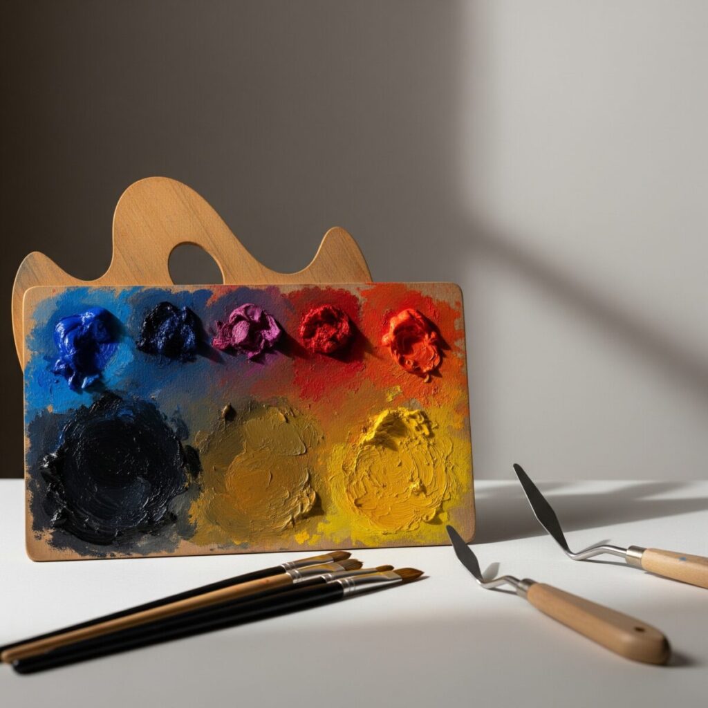
The color wheel starts with three primary colors: red, blue, and yellow. These are like the grandparents of all other colors because you can’t mix them from anything else. When you mix two primary colors, you get secondary colors: orange (red + yellow), green (blue + yellow), and purple (red + blue).
But here’s where it gets interesting. Colors also have temperature—some are warm (reds, oranges, yellows) and some are cool (blues, greens, purples). Warm colors seem to jump forward in a painting, while cool colors appear to recede. This simple concept is crucial for creating depth and mood in your artwork.
Understanding these color theory fundamentals helps explain why Vermeer’s limited approach worked so well. Instead of getting overwhelmed by choices, he focused on understanding how his five chosen colors interacted with each other.
Vermeer’s Revolutionary Limited Palette Approach

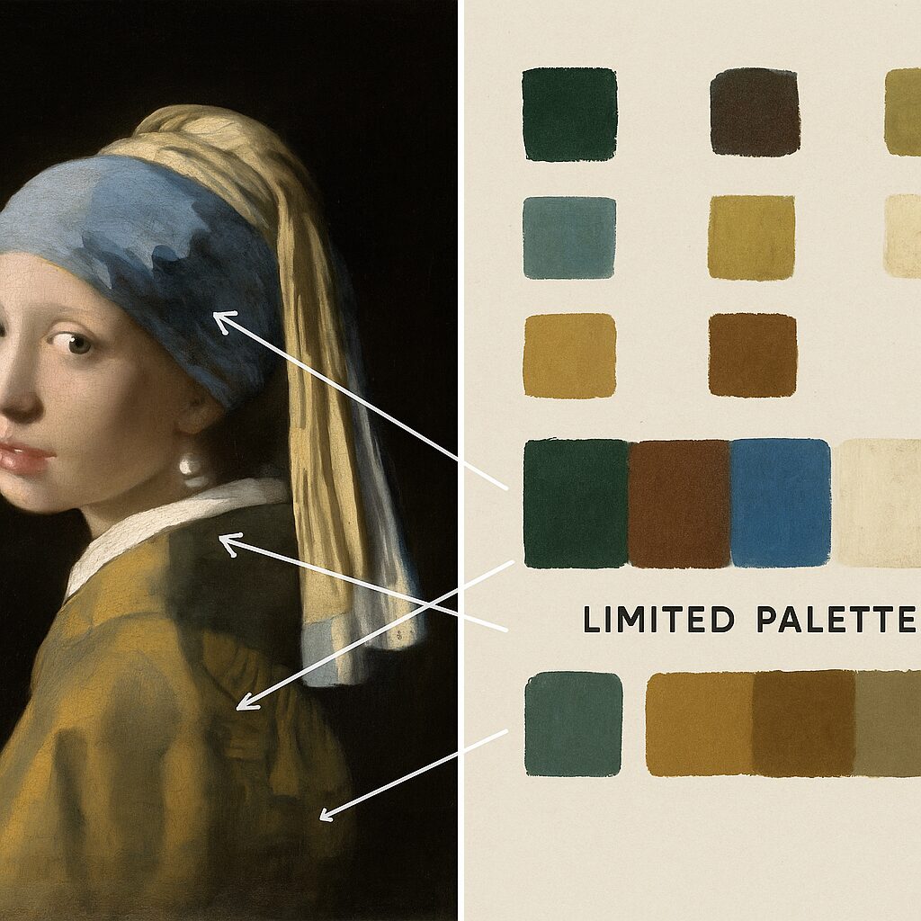
Johannes Vermeer, one of the most celebrated artists of the Dutch Golden Age, built his reputation on paintings that seemed to glow from within. His secret? A carefully chosen palette of just five pigments:
- Ultramarine blue – An expensive pigment made from lapis lazuli
- Lead white – The foundation for mixing lighter tones
- Yellow ochre – A warm, earthy yellow
- Vermillion red – A bright, warm red
- Burnt umber – A rich, dark brown
This might seem limiting, but Vermeer understood that restriction breeds creativity. By mastering these five colors, he could mix virtually any hue he needed while maintaining perfect color harmony throughout his paintings.
“The fewer colors you use, the more harmonious your painting becomes. Vermeer proved that limitation is actually liberation.”
The Science Behind Creating Rich Colors with Few Pigments

How did Vermeer create such rich, luminous effects with so few colors? The answer lies in understanding color mixing principles and layering techniques.
When you mix complementary colors (colors opposite each other on the color wheel), you create neutral grays and browns. But when you use colors that are close to each other on the wheel, you maintain vibrancy. Vermeer’s palette was carefully chosen so that most of his mixtures stayed vibrant rather than turning muddy.
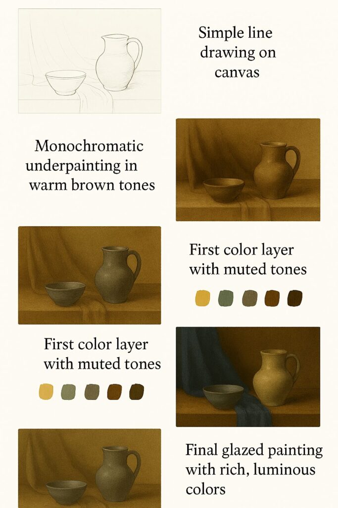
Vermeer also used a technique called glazing—applying thin, transparent layers of paint over dried underlayers. This created depth and luminosity that couldn’t be achieved by mixing colors directly on the palette. His painting techniques involved building up layers gradually, much like a photographer might adjust exposure and contrast.
Vermeer’s Color Mixing Strategy
| Base Color | Mixed With | Result | Used For |
|---|---|---|---|
| Ultramarine + White | Various ratios | Sky blues to pale highlights | Skies, fabric, shadows |
| Yellow ochre + White | Touch of red | Warm flesh tones | Skin, warm surfaces |
| Burnt umber + White | Blue undertones | Cool shadows | Shadow areas, hair |
| Vermillion + White | Yellow ochre | Warm highlights | Lips, warm reflections |
Value Studies: The Key to Successful Color Application
Before Vermeer ever touched color, he understood something crucial: value is more important than hue. Value refers to how light or dark something appears, regardless of its color. A successful painting depends more on correct values than on perfect color matching.
This is why many art fundamentals courses start with black and white exercises. When you can create a compelling image using only different shades of gray, adding color becomes much easier.
Think of value as the skeleton of your painting and color as the clothing. You need a strong skeleton before you can dress it up. Vermeer likely did careful value studies before beginning his color work, ensuring that his compositions would be strong regardless of the colors he chose.
Using Your Value Study Generator: A Step-by-Step Guide
Modern artists can use digital tools to understand value relationships better. A value study generator helps you see the light and dark patterns in any reference image:
- Upload your reference photo to the generator tool
- Adjust the value range using the slider (typically 1-10 values work best)
- Generate your black and white study to see the underlying structure
- Use this as a guide for your painting’s foundation
- Apply your limited palette over the established value structure
This approach mirrors what Vermeer did intuitively. By establishing strong values first, you ensure that your color choices will work harmoniously together.
Value Study Generator
Convert reference photos to grayscale value studies
Drag & Drop or Click to Upload
Supports JPG, PNG (Max 5MB)
