
Color theory in art is like having a secret map that guides you through the world of visual expression. Whether you’re just starting out with painting or wanting to improve your artistic skills, understanding how colors work together is one of the most powerful tools you can develop. The fascinating world of color theory gives artists a language to communicate feelings, create harmony, and guide viewers’ eyes through their artwork. This guide will break down the essential concepts of color theory in simple terms, helping you see the colorful world around you with new eyes and apply these principles to create more impactful art.
Key Points:
- Color theory provides the foundation for making informed color choices in art
- Understanding color relationships helps create harmonious compositions
- Color can dramatically affect mood and emotional response to artwork
- Basic color theory concepts include the color wheel, primary/secondary/tertiary colors, and color schemes
- Practical application of color theory improves artistic decision-making
What Is Color Theory in Art?
Color theory in art is a set of principles that explain how colors interact and how we perceive them. It’s like a recipe book that helps artists combine colors effectively. The study of color theory began centuries ago with scientists and artists like Sir Isaac Newton, Johann Wolfgang von Goethe, and Josef Albers, who all contributed to our understanding of how colors work.
At its core, color theory helps us understand why some colors look pleasing together while others clash. It explains how colors can create different moods, direct attention, and even affect our emotions. For beginners, learning color theory might seem overwhelming at first, but once you grasp the basics, you’ll have a powerful tool to enhance your artistic expression.
The Color Wheel: Your Artistic Compass
The color wheel is the foundation of color theory. Invented by Isaac Newton in 1666, it organizes colors in a circle to show their relationships with each other. Here’s a breakdown of the color wheel:
How to use this Color Wheel:
- Hover over any segment to highlight it and its complementary opposite.
- Primary colors are Red, Yellow, and Blue.
- Secondary colors sit between primaries: Orange, Green, and Purple.
- Tertiary colors fill the in-between spaces.
- Complementary pairs are linked by lines across the center.
Primary Colors
These are the three colors that can’t be created by mixing other colors:
- Red
- Yellow
- Blue
Think of primary colors as the “parents” of all other colors.
Secondary Colors
These colors are created by mixing two primary colors:
- Orange (red + yellow)
- Green (yellow + blue)
- Purple (blue + red)
Tertiary Colors
These are formed by mixing a primary color with an adjacent secondary color, creating six additional colors:
- Red-orange
- Yellow-orange
- Yellow-green
- Blue-green
- Blue-purple
- Red-purple
Understanding the color wheel gives you the foundation to explore more complex color relationships that can transform your artwork.

Essential Color Relationships
Once you understand the color wheel, you can explore different color relationships that create harmony in your artwork. These relationships form what artists call “color schemes” or “color harmonies.”
Complementary Colors
Complementary colors sit opposite each other on the color wheel (like red and green, blue and orange, or yellow and purple). When placed side by side, they create maximum contrast and make each other appear more vibrant. This can create a dynamic, energetic feel in your artwork.
As Johannes Itten, a famous color theorist, once said:
“The complementary contrast creates a curious equilibrium in the eye. The eye requires any color to bebalanced by its complementary color and will generate it if it is not present.”
Analogous Colors
Explore the 7 Color Schemes
Click on each scheme to learn more about how to use it in your artwork.
Monochromatic
Uses variations in lightness and saturation of a single color creating a subtle and harmonious look.
Best for: Creating a cohesive, elegant feeling with minimal distraction.
Example: Different shades of blue (e.g., Navy, Steel Blue, Sky Blue).
Analogous
Uses colors that are next to each other on the color wheel, creating a serene and comfortable design.
Best for: Natural-looking designs that need harmony without high contrast.
Example: Orange, YellowOrange, and Yellow (like autumn leaves).
Complementary
Uses colors that are opposite each other on the color wheel, creating maximum contrast and vibrance.
Best for: Designs that need to stand out and create energy or tension.
Example: Red and Green, Blue and Orange, or Purple and Yellow.
Split Complementary
Uses a base color plus the two colors adjacent to its complement, offering high contrast with less tension.
Best for: Beginners wanting vibrant designs with easier color harmony.
Example: Blue with YellowOrange and RedOrange.
Triadic
Uses three colors equally spaced around the color wheel, creating a vibrant and balanced design.
Best for: Bold, balanced designs with rich color contrast.
Example: Red, Yellow, and Blue (Primary Colors).
Tetradic (Rectangle)
Uses four colors arranged into two complementary color pairs, offering many possibilities for variation.
Best for: Complex designs that need variety while maintaining structure.
Example: Red, Green, BlueViolet, and YellowOrange.
Square
Uses four colors evenly spaced around the color wheel, combining balance and variety.
Best for: Energetic, dynamic compositions with equal color weight and visual interest.
Example: Red, Yellow, Green, and BlueViolet (spaced equally in hue).
Analogous colors are groups of three to five colors that sit next to each other on the color wheel (like blue, blue-green, and green). These create a harmonious, cohesive feeling and are often found in nature.
Triadic Colors
Triadic color schemes use three colors equally spaced around the color wheel (like red, yellow, and blue). This arrangement creates visual contrast while maintaining color harmony.
Monochromatic Colors
A monochromatic color scheme uses different shades, tints, and tones of a single color. This creates a cohesive look that's soothing to the eye.
You can explore more color relationships in our article about how to create mood with color choices.
The Psychology of Color
Colors aren't just visual elements—they trigger emotional responses. Understanding the psychological impact of colors can help you communicate specific feelings through your art.
Here's a simple breakdown of common color associations:
| Color | Common Emotional Associations |
|---|---|
| Red | Passion, energy, danger, excitement |
| Orange | Enthusiasm, creativity, warmth |
| Yellow | Happiness, optimism, caution |
| Green | Growth, harmony, freshness, calm |
| Blue | Trust, peace, stability, depth |
| Purple | Royalty, mystery, spirituality |
| Black | Elegance, power, formality |
| White | Purity, cleanliness, simplicity |
These associations can vary across cultures, but understanding them gives you another tool for expression. For a deeper dive into this topic, check out the psychology of color in portraits.
Color Properties: Hue, Value, and Saturation
To truly understand color theory in art, you need to know the three main properties of color:
- Hue: The pure color itself (red, blue, etc.)
- Value: The lightness or darkness of a color
- Saturation: The intensity or purity of a color
Adjusting these properties can dramatically change how colors appear and interact in your artwork.
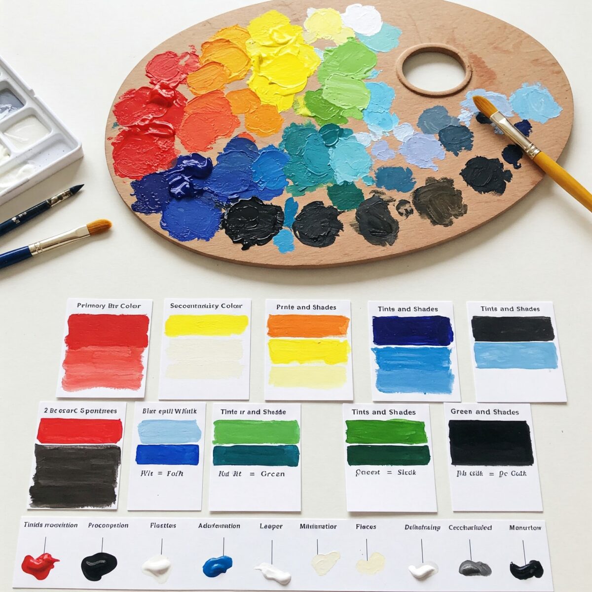
Practical Color Mixing
Understanding how to mix colors is where theory meets practice. Here are some basics to get you started:
Primary Color Mixing
- Red + Yellow = Orange
- Yellow + Blue = Green
- Blue + Red = Purple
Creating Tints, Shades, and Tones
- Tints: Add white to lighten a color
- Shades: Add black to darken a color
- Tones: Add gray to reduce a color's intensity
For more detailed information about color mixing, visit our color mixing primer guide.
Warm vs. Cool Colors

Colors are often categorized as either "warm" or "cool":
- Warm colors (reds, oranges, yellows) appear to advance toward the viewer and create feelings of energy and excitement.
- Cool colors (blues, greens, purples) appear to recede and create feelings of calm and serenity.
Understanding this concept helps create depth in your paintings and control the overall mood of your artwork.
Color Theory in Famous Artworks
Looking at how master artists use color theory can be incredibly educational. Artists like Vincent van Gogh, Claude Monet, and Mark Rothko all used color theory principles to create powerful emotional responses in their work.
For example, Van Gogh often used complementary colors (like blue and orange in "Starry Night") to create vibrant, emotionally charged scenes. You can learn more about his approach in our article about how to paint like Van Gogh.
The color guide in art history provides more examples of historical color usage.
Applying Color Theory in Your Art

Now that you understand the basics, here are some practical ways to apply color theory in your artwork:
- Start with a limited palette to better understand how colors interact
- Create color studies before starting a major project
- Use a color wheel reference until relationships become intuitive
- Observe colors in nature to understand harmonious combinations
- Document your color mixtures in a notebook for future reference
Remember that color theory is a tool, not a strict set of rules. Once you understand the principles, you can choose when to follow them and when to break them for creative effect.
Digital vs. Traditional Color Theory
It's worth noting that colors behave differently in digital art (RGB - additive color) compared to traditional painting (CMYK - subtractive color):
- In digital art, adding colors together eventually creates white
- In traditional painting, mixing colors together eventually creates a muddy brown
If you work in both mediums, check out our guide on how to make digital art look traditional to bridge these differences.
Common Color Theory Mistakes to Avoid
Even experienced artists sometimes make these color theory mistakes:
- Using too many colors (creating visual chaos)
- Not considering the lighting conditions of the scene
- Ignoring color context (how surrounding colors affect perception)
- Overusing vibrant colors (causing visual fatigue)
- Forgetting that colors appear differently on screen vs. in print
For more tips on avoiding mistakes, see our article on common painting mistakes beginners make.
Begin Your Color Theory Journey
Understanding color theory in art opens up endless possibilities for creative expression. Remember that while the concepts may seem technical at first, they'll become second nature with practice. Start by experimenting with simple color relationships, observe how colors interact in the world around you, and gradually build your color confidence.
External resources like the Adobe Color Wheel can help you explore color harmonies, and books like Josef Albers' "Interaction of Color" provide deeper insights for serious students.
Color theory in art isn't just about rules—it's about developing your eye to see the subtle relationships between colors and harnessing their power to communicate your artistic voice. With these foundations, you're well on your way to creating artwork that not only looks balanced and harmonious but also effectively conveys the emotions and ideas you want to express.
FAQ: Color Theory in Art
What are the 3 basic color theories?
The three basic color theories are: the traditional RYB (Red-Yellow-Blue) color theory used in art, the RGB (Red-Green-Blue) additive color theory used in digital displays, and the CMYK (Cyan-Magenta-Yellow-Black) subtractive color theory used in printing.
How do I learn color theory for painting?
Start by studying the color wheel and understanding primary, secondary, and tertiary colors. Practice mixing colors, experiment with different color schemes (complementary, analogous, etc.), observe how artists use color in masterpieces, and keep a color journal to document your discoveries.
What is the rule of 3 in color theory?
The rule of 3 in color theory typically refers to using three colors in your composition: a dominant color (about 60% of the design), a secondary color (about 30%), and an accent color (about 10%). This creates visual interest while maintaining harmony.
What are the 7 color schemes?
The seven traditional color schemes are: monochromatic (variations of a single color), analogous (colors next to each other on the wheel), complementary (opposite colors), split-complementary, triadic (three equally spaced colors), tetradic (four colors as two complementary pairs), and square (four colors equally spaced around the wheel). - see above for interactive element.

