
Want to capture the vibrant light and energy of the Impressionist masters? This beginner’s guide demystifies the impressionist color palette for beginners. It shows you exactly which tubes of paint you need to recreate the magic of Monet and Pissarro. You will learn the core colors required for a limited palette and how to mix dynamic shadows without using black. Grab your brushes and let us bring some luminous light to your canvas.

Have you ever stared at a blank canvas and felt completely overwhelmed by your paint options? You are not alone. When I teach my art classes, the biggest hurdle my students face is muddy colors. They mix too many paints together and lose that beautiful, vibrant glow.
If you want to fix this, you need the impressionist color palette for beginners. The secret weapon of the Impressionists was a limited, specific color palette focused entirely on capturing light. They did not use every color in the store. Instead, they relied on a few key pigments to create magic.
Whether you choose your painting medium in oil, acrylic, or watercolor, this approach will change how you paint. It is designed to be mindful, accessible, and completely free of intimidation. We will walk through the exact colors you need. You will discover how to blend them naturally and learn why tossing out your black paint might be the best decision you ever make.
What Is the Impressionist Color Palette?
The impressionist color palette is a limited selection of vibrant, warm, and cool colors designed to capture the transient effects of light. It relies on bright, modern pigments rather than the dark, muddy earth tones used by older generations of artists.
Before the 1860s, painters often used dark browns and heavy blacks to create shadows. The Impressionists changed everything. They realized that natural light is full of color. By focusing on color theory basics, they learned to recreate sunlight using bright yellows, reds, and blues.
A fascinating look at art history shows that Impressionists shifted away from traditional earth tones to newly invented, bright pigments available in metal tubes. This portability allowed them to paint outside and capture nature directly.
Essential Colors for Your Impressionist Palette
When I pack my bag for a plein air painting session, I keep things incredibly simple. You do not need thirty tubes of paint to create a masterpiece. You only need a few strong, reliable colors.
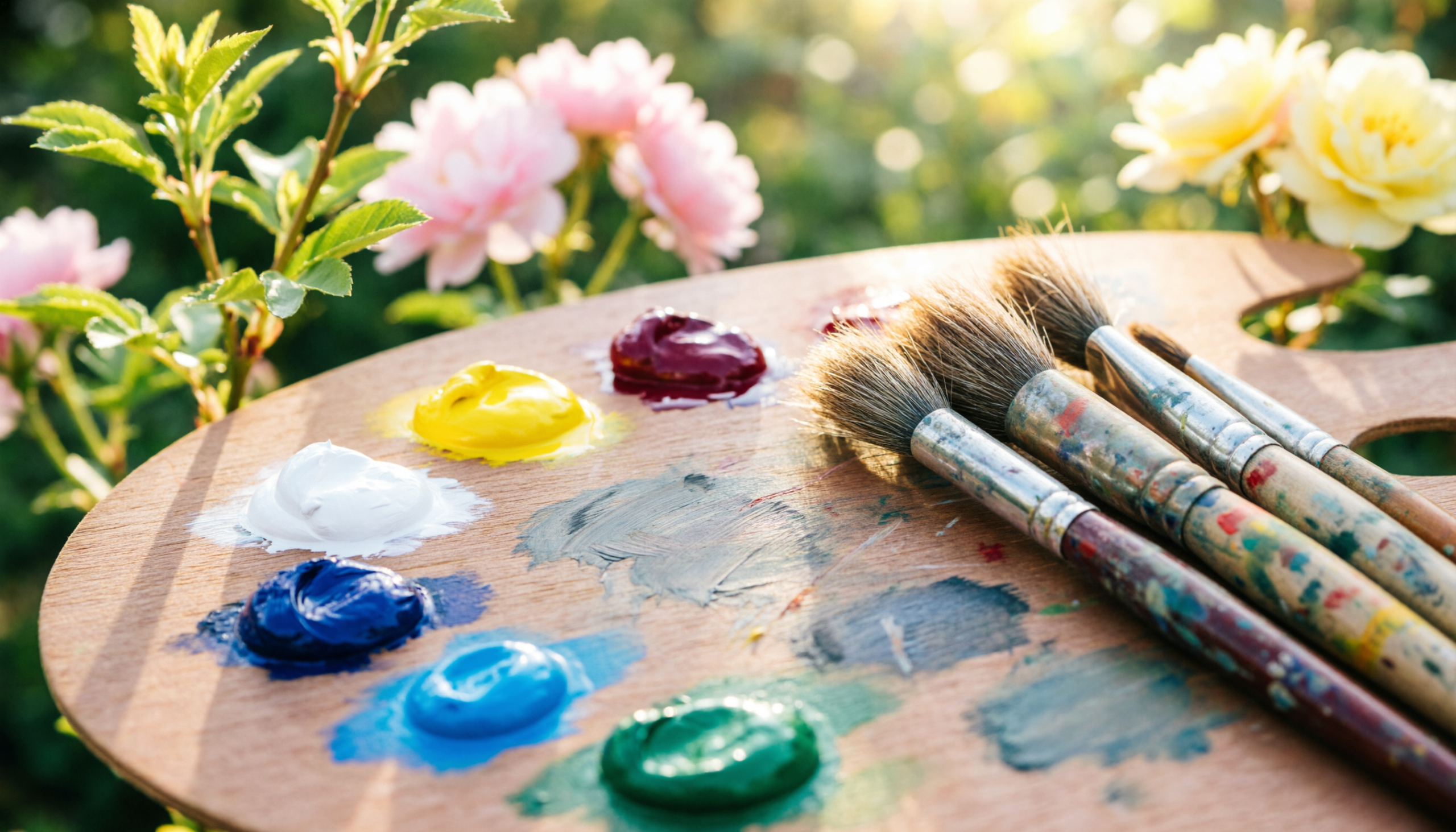
Start your collection with Titanium White. This is essential for tinting your other colors and adding bright highlights. Next, grab a Cadmium Yellow Light for your warm, sunny areas. You will also want a rich red like Alizarin Crimson for depth and warmth.
For your blues, French Ultramarine is perfect for deep shadows. Meanwhile, a bright Cerulean Blue is highly recommended for painting vibrant, realistic skies and gentle shadows. Finally, Viridian green adds a cool, natural touch to landscapes. This tight selection forces you to mix colors mindfully.
Why Did Impressionists Avoid Black Paint?
Impressionists avoided black paint because it makes shadows look flat and lifeless. Instead, they mixed complementary colors like blue and orange to create rich, colorful grays and atmospheric shadows that vibrate with natural light and energy.
Nature rarely contains pure black. If you look closely at a shadow on a sunny day, you will see deep blues, purples, and even dark greens. Black paint simply kills the light in your painting.
When we implemented this limited palette rule in my beginner workshops, my students saw immediate results. Their paintings stopped looking flat and started breathing with life. Experts note that mixing complementary colors directly on the canvas creates a much more convincing shadow than reaching for a tube of black paint.
How Do You Mix Colors Optically on the Canvas?

Optical mixing is a technique where you place small, distinct dabs of unmixed or partially mixed paint side by side on the canvas. From a distance, the viewer’s eye naturally blends these colors together, creating a vibrant and luminous effect.
This is often called the “broken color” technique. Instead of mixing a flat green on your palette, you might place a dab of yellow right next to a dab of blue.
This method keeps your colors incredibly fresh. Studies of classical techniques reveal that this broken color approach creates a shimmering effect that traditional blending simply cannot match. If you are used to smooth blending painting techniques, this might feel strange at first. However, it is a fun and therapeutic way to loosen up your brushwork.
Balancing Warm and Cool Colors in Landscapes
Understanding the relationship between warm and cool colors is the final puzzle piece. Warm colors like yellow and red seem to come forward in a painting. Cool colors like blue and purple appear to recede into the distance.
You can use this optical illusion to create incredible depth in your landscapes. Paint your sunny, foreground areas with warm tones. Then, push your background mountains or distant trees back using cool, bluish purples.
This simple push and pull of temperature makes your art feel three-dimensional. It is a brilliant way to guide the viewer’s eye exactly where you want it to go.
Conclusion
Mastering the impressionist color palette for beginners is a liberating experience. By restricting your paint tubes to a few vibrant colors, you remove the stress of endless choices. You also eliminate muddy mixtures and flat, lifeless shadows. Remember to avoid black paint, embrace optical mixing, and play with warm and cool temperatures.
Painting should be a joyful, therapeutic journey. I encourage you to grab your brushes, set up your limited palette, and try painting a simple garden scene today. Do not worry about perfection; just focus on the light. If you want to dive deeper into this fascinating art movement, learn more about impressionism on our blog. Happy painting!
Frequently Asked Questions
- Do I need oil paint to paint like an Impressionist? No, you do not need oil paint to achieve this style. You can successfully use acrylics or watercolors to create the same vibrant, broken color effects. The key is focusing on your brushwork and using a limited palette of bright colors.
- What is the best blue for an Impressionist sky? Cerulean Blue is widely considered the best choice for painting bright, realistic skies. It has a natural, airy quality that captures daylight beautifully. You can also mix it with a tiny touch of white for atmospheric perspective.
- How many colors did Monet actually use? Claude Monet typically used a very limited palette of about six to nine colors. He favored bright pigments like Cadmium Yellow, French Ultramarine, and Vermilion. He famously banished earth colors and black from his later palettes.
- What is a “mother color” in painting? A mother color is a single paint color that you mix into every other color on your palette. This technique creates a natural, unified harmony across your entire painting. It is a great trick for beginners to prevent clashing tones.
- Can I use acrylics for Impressionist painting? Absolutely. Acrylics dry quickly, which makes them perfect for layering the distinct, unblended brushstrokes required for Impressionism. Just remember to work swiftly or use a slow-drying medium to keep your colors workable.

