
Have you ever painted a portrait only to find that your subject looks flat, chalky, or downright lifeless? You’re not alone. Learning how to mix realistic skin tones is one of the most challenging skills in portrait painting, but it’s also one of the most rewarding. The good news is that master painters from centuries ago figured out the secrets to creating luminous, lifelike skin—and you can learn their techniques today.
Key Points Summary:
- Skin is not a single color but a complex mix of reds, yellows, blues, and everything in between
- Understanding color temperature (warm vs. cool) is essential for realistic portraits
- Old Masters used layering techniques like glazing to build luminous, translucent skin tones
- A limited palette often produces better results than dozens of colors
- Common mistakes include over-mixing colors and ignoring value shifts across the face
Why Pre-Mixed “Flesh” Colors Don’t Work
Let’s start with a truth bomb: that tube of “flesh tone” or “peach” paint in your art store won’t give you realistic skin. Why? Because human skin isn’t a flat, uniform color. It’s a translucent, multi-layered surface that reflects light, shows blood flow underneath, and changes color depending on the surrounding environment.

Think about it. Your cheeks might look rosy and warm, while your forehead appears cooler and slightly more neutral. Shadows under your chin pick up blue tones from the sky, while areas in direct sunlight practically glow with warmth. Understanding color theory is your first step toward capturing these subtle shifts. In particular, we explain about skin tones with watercolors
The Color Theory Behind Beautiful Skin Tones
Understanding the Three Primary Colors in Skin
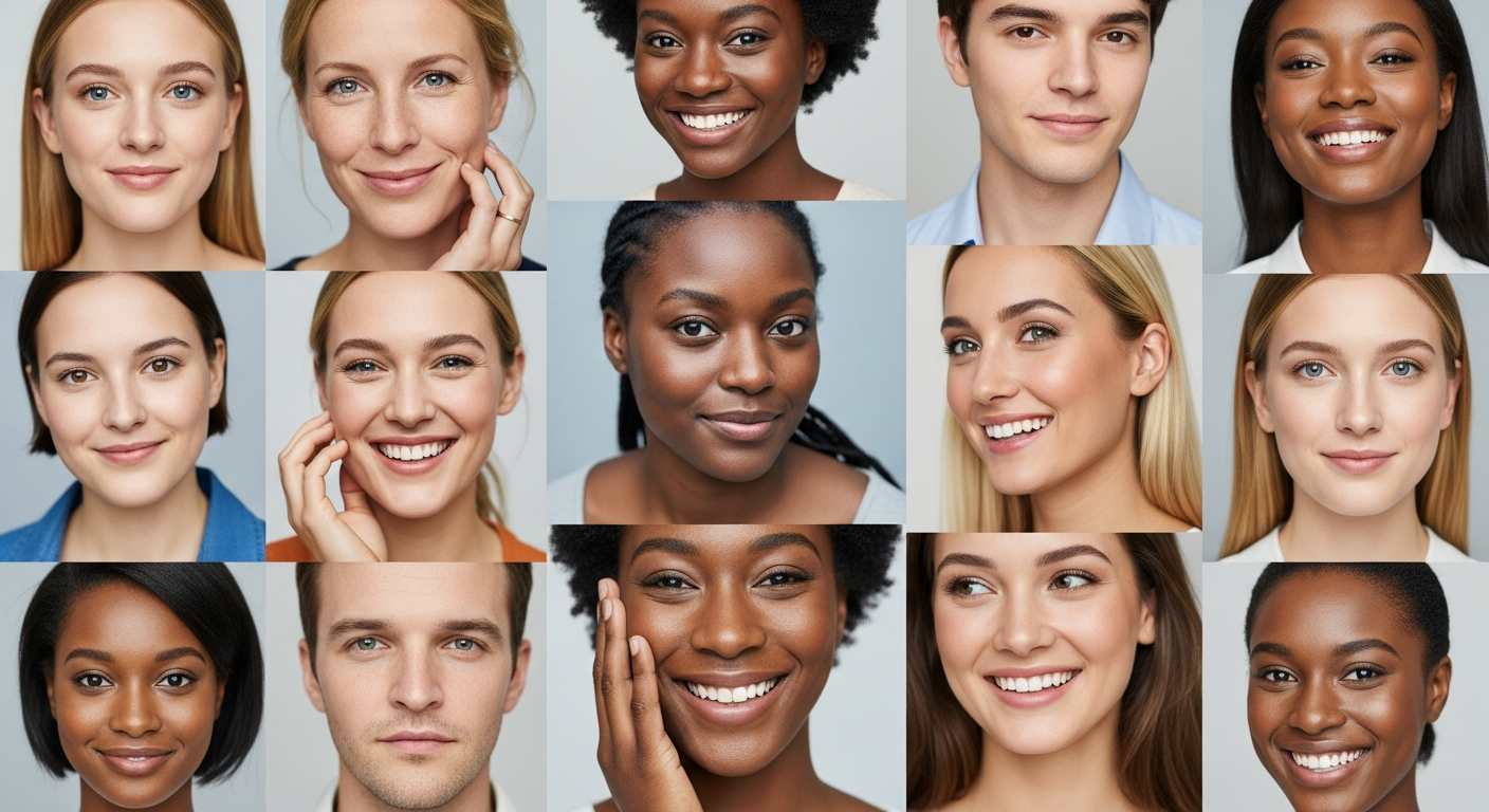
Every skin tone on Earth—from the palest northern European complexion to the deepest African skin—contains variations of the three primary colors: red, yellow, and blue. The trick is learning to balance these primaries in different proportions.
Here’s a simple breakdown:
| Skin Tone Type | Dominant Colors | Key Adjustments |
|---|---|---|
| Fair/Light | Yellow Ochre + White | Add touches of red for warmth |
| Medium | Raw Sienna + Yellow Ochre | Balance with burnt umber for depth |
| Olive | Yellow Ochre + Raw Umber + Green | Cool down with subtle blues |
| Deep/Dark | Burnt Umber + Raw Sienna | Warm with red oxide, cool with ultramarine |
Mastering Color Temperature
Color temperature is your secret weapon for mixing realistic skin tones. Warm colors (reds, oranges, yellows) advance toward the viewer, while cool colors (blues, greens, purples) recede. Master painters knew this instinctively.
On a typical face, you’ll find:
- Warmer areas: Cheeks, nose, ears, lips (more blood flow)
- Cooler areas: Forehead, chin, shadows (bone structure closer to surface)
- Coolest areas: Deep shadows, areas reflecting cool environmental light
According to research on classical painting techniques, artists like François Boucher and Thomas Gainsborough deliberately painted cool backgrounds to make their subjects’ warm skin tones appear even more vibrant by contrast.
The Zorn Palette: A Master’s Limited Approach

Swedish painter Anders Zorn created stunning, lifelike portraits using just four colors:
- Yellow Ochre
- Vermilion (or Cadmium Red Light)
- Ivory Black (or Bone Black)
- Titanium White
This limited palette proves you don’t need twenty tubes of paint to create beautiful skin tones. In fact, having fewer colors often helps you avoid “muddy” mixtures and forces you to really understand color relationships.
“The most important thing for the public to understand is that most of the difficulty in painting comes not from what you add, but from what you leave out.”
Anders Zorn
Watch this demonstration of the Zorn palette in action:
Essential Pigments for Your Skin Tone Palette
While the Zorn palette is excellent for beginners, you might want to expand your options as you advance. Here are the workhorses of skin tone mixing:
Warm Colors:
- Yellow Ochre (your base for most skin tones)
- Burnt Sienna (adds warmth and richness)
- Cadmium Red Light (for rosy areas)
- Transparent Red Oxide (for subtle warmth)
Cool Colors:
- Ultramarine Blue (for cooling shadows)
- Raw Umber (neutral, slightly cool)
- Alizarin Crimson (cool red for subtle shifts)
Neutralizers:
- Titanium White (opaque, for mixing lighter values)
- Burnt Umber (for deepening without going muddy)
The key is starting with a limited selection and gradually adding colors as you understand their properties. Learning proper paint mixing techniques will save you from purchasing unnecessary tubes.
Old Master Techniques for Luminous Skin
The Layering Method (Indirect Painting)

Renaissance and Baroque masters didn’t paint skin in one go. They built it up in transparent layers over time—a technique that creates an inner glow that’s impossible to achieve with direct painting alone.
Step 1: The Underpainting Start with a monochromatic layer called a grisaille (using grays) or verdaccio (using greenish-grays). This establishes all your values and forms without worrying about color yet.
Step 2: Glazing Once your underpainting is completely dry, apply thin, semi-transparent layers of color mixed with medium. Each layer modifies the layers beneath it, creating optical mixing that mimics the translucency of real skin.
Rembrandt was the undisputed master of this approach. His portraits seem to glow from within because he carefully built up warm and cool glazes over a solid value structure.
Step 3: Velatura and Final Details Add semi-opaque layers for adjustments, then finish with opaque highlights and details.
The Direct Painting Method (Alla Prima)
Not every master used layering. Spanish painter Joaquín Sorolla worked directly and quickly, capturing the effects of brilliant Mediterranean sunlight on skin. His secret? Paying close attention to temperature shifts and working with pure, clean brushstrokes.
The direct method requires confidence and observation skills, but it produces fresh, vibrant results. Learn more about different painting techniques and their applications.
How to Mix a Base Skin Tone
Let’s get practical. Here’s a simple formula for mixing realistic skin tones in oils or acrylics:
For Light Skin:
- Start with Yellow Ochre as your base
- Add a tiny touch of Cadmium Red Light
- Add white to lighten (but not too much!)
- Adjust coolness with a hint of blue if needed
For Medium Skin:
- Mix Yellow Ochre with Burnt Sienna
- Add a touch of Cadmium Red
- Adjust depth with Raw Umber
- Add white sparingly
For Deep Skin:
- Start with Burnt Umber as your base
- Add warmth with Burnt Sienna or Red Oxide
- Cool shadows with Ultramarine Blue
- Resist adding white—instead, use yellows to lighten
The Metropolitan Museum of Art’s conservation research on portrait paintings reveals that most masters started with a middle value and worked lighter and darker from there, rather than jumping to extremes immediately.
Common Mistakes That Make Skin Look Dead

Mistake #1: Over-Mixing When you stir paint too much on your palette, you kill its vibrancy. Mix just enough to combine colors, leaving some variation in your mixture.
Mistake #2: Ignoring Temperature Painting all areas of skin the same temperature makes faces look flat and artificial. Always ask yourself: “Is this area warmer or cooler than adjacent areas?”
Mistake #3: White Overload Adding too much white doesn’t just lighten—it also cools and chalks your colors. Try adding yellows or warm neutrals to lighten instead.
Mistake #4: No Value Structure Without a clear plan for lights and darks, your skin tones will look muddy no matter how perfect your colors are. Understanding values in painting is absolutely essential.
Mistake #5: Working from Bad References Poor quality photos with flat lighting or weird color casts will sabotage your efforts. Work from life when possible, or use high-quality, well-lit reference photos.
Practical Exercises to Master Skin Tones
Exercise 1: Create a Color Chart Mix and paint squares showing variations of skin tones—different values, temperatures, and levels of saturation. This becomes your personal reference guide.
Exercise 2: Copy the Masters Choose a small section of a Rembrandt or John Singer Sargent portrait and try to match the colors exactly. You’ll learn more from copying one square inch of a master painting than from painting ten complete portraits on your own.
Exercise 3: The Squint Test Squint your eyes when looking at your subject and your painting. This simplifies what you see and helps you judge values and overall color harmony more accurately.
Exercise 4: Paint a Single Object in Various Lighting Paint an egg or a sphere in different lighting conditions. This simple exercise teaches you how light affects form and color without the complexity of a full portrait.
Learning from Specific Masters
Rembrandt van Rijn used dramatic lighting (chiaroscuro) and rich, warm shadows. His secret included using transparent glazes of reds and browns over a solid underpainting, plus thick impasto for highlights.
Joaquín Sorolla was the master of outdoor light. He captured how sunlight warms skin tones while shadows pick up cool reflections from the sky—often painting with pure, unmixed strokes of color.
Diego Velázquez achieved remarkable realism through broken color technique—placing strokes of different colors side by side without blending, allowing the viewer’s eye to mix them optically.
Study these masters through museum collections and notice how they handled skin tones differently based on their unique approaches to light and color.
Bringing It All Together

I still remember the day a student asked me why her portrait looked “dead” even though she’d mixed what seemed like a perfect peach tone. I had her step back from her canvas, and we looked at her model again—really looked. “See those purple shadows under his cheekbones?” I said. “That hint of green along his jaw? The warm orange where the light hits his forehead?” Her eyes went wide. She’d been painting what she thought skin should look like rather than what was actually there. That moment changed how she approached portraiture forever.
Mixing realistic skin tones isn’t about memorizing formulas or buying special flesh-colored paints. It’s about training yourself to see what’s really happening on the surface of skin—that beautiful, translucent, ever-shifting organ that reflects light, absorbs color from its surroundings, and reveals the blood and structure beneath.
The Old Masters understood this deeply. They didn’t have fancy paint sets with pre-mixed skin tones. Instead, they developed systematic approaches using just a handful of carefully chosen colors. Take the Zorn palette—yellow ochre, vermillion, ivory black, and white. That’s it. Yet with those four colors, Anders Zorn painted some of the most convincing skin you’ll ever see.
Here’s where it gets interesting. Start with a limited palette like Zorn’s approach. Master your temperature shifts—warm where light hits, cool in the shadows. Practice building up layers the way Renaissance painters did, letting each thin glaze contribute to that luminous glow we associate with their work.
But most importantly? Train your eye. Learn to spot those subtle shifts in hue, value, and saturation that separate living, breathing skin from flat, lifeless color. Look for the unexpected colors—the lavenders, the greens, the golden yellows that you’d never guess were there until you really observe.
This takes patience. And practice. Lots of it. But as you work, you’ll develop an intuitive feel for mixing skin tones. You’ll stop reaching for “peach” and start thinking in terms of temperature, translucency, and light. Your portraits will transform from stiff studies into paintings that seem to breathe.
And that’s when you’ll understand what my student discovered that day—realistic skin isn’t about the perfect color. It’s about seeing truly.
Frequently Asked Questions
How do you mix realistic skin tones?
Mix realistic skin tones by starting with a base of Yellow Ochre, adding small amounts of red (Cadmium Red or Burnt Sienna) for warmth, and adjusting with white for lighter values or umber for darker values. Always consider color temperature—add cool blues for shadows and keep highlights warm.
What are some tips on how to mix skin tones using paints?
Start with a limited palette, mix on a white surface to judge colors accurately, work from middle values outward, and avoid over-mixing which creates muddy colors. Always mix more than you think you’ll need, and remember that skin contains all three primary colors in varying amounts.
Why is it that mixing skin tones is so darn difficult?
Skin tones are difficult because skin is translucent and multi-layered, constantly shifting in color based on lighting, blood flow, and environment. There’s no single “skin color”—faces contain dozens of subtle hue, value, and temperature variations that must work together harmoniously.
How do you make a natural skin color with acrylic paint?
For acrylics, start with Yellow Ochre or Raw Sienna, add touches of Cadmium Red Light and white, then adjust with Raw Umber or Ultramarine Blue. Work in thin layers since acrylics dry quickly, and keep a spray bottle handy to prevent your mixtures from drying out too fast.
How do you paint perfect skin tones?
Perfect skin tones come from observing carefully, understanding color temperature shifts across the face, establishing solid values first, and building up colors in layers. Study Old Masters like Rembrandt and practice regularly with color mixing exercises. There’s no shortcut—skill develops through consistent practice.
Additional Resources
- National Gallery Conservation Research on Portrait Techniques – Scientific analysis of Old Master painting methods
- Metropolitan Museum of Art Painting Collection – Study high-resolution images of master portraits
- National Gallery of Art Collection Search – Explore American and European portrait paintings
- Handprint: Artist’s Color Theory – Comprehensive guide to pigment properties and color mixing
- Golden Artist Colors Technical Resources – Scientific information about paint properties and mixing

