
Have you ever tried converting your favorite image into ASCII art, only to end up with a blurry, unrecognizable mess? You’re not alone. While ASCII art generators are amazing tools that can transform any image into text-based masterpieces, getting high-quality results requires more than just clicking “convert.” Learning how to improve ASCII art quality can turn your disappointing attempts into stunning digital artwork that actually looks like what you intended.

Key Points Summary
- Choose high-contrast source images with simple compositions for best results
- Optimize generator settings including character count, brightness, and contrast
- Select appropriate character ramps based on your desired detail level
- Pre-process images by adjusting resolution and converting to grayscale properly
- Use post-processing techniques to enhance spacing and fix common issues
- Troubleshoot common problems like distortion and poor contrast
Understanding ASCII Art Quality Factors
Before diving into specific techniques, it’s important to understand what makes ASCII art look good or bad. Unlike regular digital images that use pixels and colors, ASCII art relies on characters to create visual representations. The quality depends on several key factors that work together to create the final result.
Character density plays the biggest role in determining how detailed your ASCII art will look. Think of it like resolution in regular photos – more characters mean more detail, but too many can make the art look cluttered. The sweet spot usually falls between 80-150 characters width for most applications.
Brightness mapping is another crucial element. Each character in your ASCII art represents a different brightness level, from spaces (very light) to pound signs (very dark). Getting this mapping right ensures your converted image maintains proper contrast and recognizable features.

Pre-Processing Your Source Images
The quality of your ASCII art starts with choosing the right source image. Not all photos work equally well for ASCII conversion, and a little preparation can make a huge difference in your final results.
Selecting the Right Images
High-contrast images work best for ASCII conversion. Photos with clear distinctions between light and dark areas translate much better than images with subtle gradients. Portrait photos with dramatic lighting, architectural shots with strong shadows, or nature scenes with clear silhouettes typically produce excellent results.
Simple compositions are your friend. Busy images with lots of small details often become muddy when converted to ASCII. Instead, choose images with clear focal points and uncluttered backgrounds.
Resolution and Sizing Guidelines
| Image Type | Recommended Width | Character Count | Best Use |
|---|---|---|---|
| Social Media | 600-800px | 60-80 chars | Profile pictures, posts |
| Email Signatures | 400-600px | 40-60 chars | Professional signatures |
| Terminal Art | 1000-1200px | 100-120 chars | Command line displays |
| Web Design | 800-1000px | 80-100 chars | Website elements |
Before converting, resize your image to match your intended output size. Starting with the right dimensions prevents distortion and ensures better character mapping.
How to Improve ASCII Art Quality Through Generator Settings
Most people skip over the settings panel in their rush to convert images, but this is where the magic happens. Understanding these controls gives you the power to dramatically enhance your results.
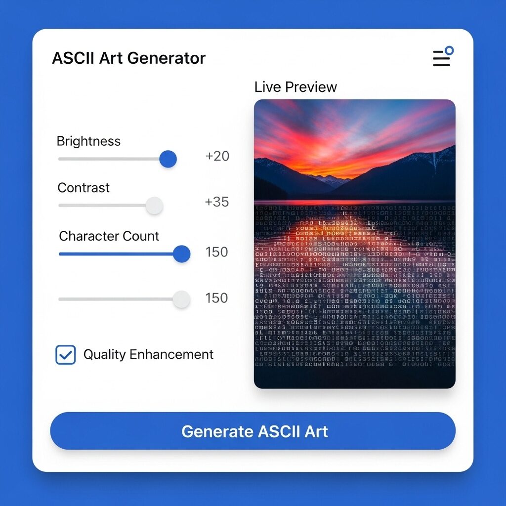
ASCII Art Generator
Welcome to the ASCII Art Generator! This tool helps you transform any image into text-based art.
To begin, click the “Image Preview” area to upload a picture from your device. Once your image appears, use the sliders to adjust the Brightness, Contrast, and level of detail with Character Count (width). You can choose to Invert with check-box. Once the image is uploaded use the zoom controls ( + or – ) to see the complete image. You can also choose different Character Sets.
Your creation will instantly appear in the output box below, where you can easily copy it to your clipboard or download as txt file. Enjoy bringing your images to life!
ASCII Studio
Local JSCharacter Count Settings
The character count setting controls how wide your ASCII art will be. More characters mean more detail, but there’s a point of diminishing returns. For most applications, 80-120 characters provide the best balance between detail and readability.
Start with your generator’s default setting, then gradually increase the character count until you see the level of detail you want. Remember that very high character counts can make your ASCII art difficult to view on smaller screens.
Brightness and Contrast Adjustments
These sliders control how the generator maps different brightness levels in your original image to ASCII characters. If your ASCII art looks too dark or too light, these are your primary tools for fixing the problem.
- Increase contrast when your ASCII art looks flat or lacks definition
- Adjust brightness when the overall image appears too dark or washed out
- Fine-tune both settings together for optimal results
Advanced Character Selection Techniques

The characters your generator uses make a enormous difference in the final quality. Most generators offer different character sets, and choosing the right one can transform mediocre results into professional-looking ASCII art.
Understanding Character Ramps
A character ramp is the set of characters arranged from lightest to darkest that your generator uses to represent different brightness levels. Here are the most common types:
Basic Ramp (10 characters): .-+*#
- Best for: Simple images, terminal displays
- Pros: Clean, readable, works everywhere
- Cons: Limited tonal range
Standard Ramp (20 characters): .:-=+*#%@
- Best for: General use, social media
- Pros: Good balance of detail and compatibility
- Cons: May lack fine gradations
Extended Ramp (40+ characters): Full ASCII character set
- Best for: Detailed artwork, professional applications
- Pros: Maximum tonal range and detail
- Cons: May not display correctly on all platforms
Custom Character Set Creation
For advanced users, creating custom character sets can yield even better results. Focus on characters that have distinct visual weights and avoid characters that look too similar at small sizes.
“The secret to professional ASCII art isn’t just the tool you use – it’s understanding how to optimize every setting for your specific image and intended use.”
Post-Processing and Enhancement Tips
Even after getting a good conversion, there’s often room for improvement through post-processing techniques. These manual adjustments can take your ASCII art from good to great.
Manual Touch-ups
Sometimes specific areas of your ASCII art need individual attention. Common fixes include:
- Replacing characters that don’t fit the overall brightness pattern
- Adjusting spacing in areas where the conversion created unwanted gaps
- Enhancing important features that got lost in the conversion process
Export Optimization

Different platforms and applications have different requirements for ASCII art display. Consider where you’ll be using your ASCII art and optimize accordingly:
- Social media: Ensure proper line breaks and character spacing
- Email: Test that special characters display correctly across email clients
- Web use: Consider HTML formatting and font consistency
Common Problems and Solutions
Even with proper technique, you’ll occasionally run into issues. Here are the most common problems and their solutions:
Distortion and Aspect Ratio Issues
Problem: Your ASCII art looks stretched or squashed compared to the original image.
Solution: Check your generator’s aspect ratio settings. Most generators allow you to lock aspect ratios or manually adjust the width-to-height relationship. For best results, maintain your original image’s proportions.
Brightness and Contrast Problems
Problem: ASCII art appears too dark, too light, or lacks contrast.
Solution: Revisit your brightness and contrast settings, but also consider your character ramp choice. Sometimes switching to a ramp with more variety in character weights solves the problem better than adjusting sliders.
Detail Loss Prevention
Problem: Important details from your original image disappear in the ASCII conversion.
Solution: Try increasing the character count first. If that doesn’t help, consider pre-processing your image to enhance the contrast in areas where detail is being lost.
Professional Applications and Use Cases

Understanding where and how to use high-quality ASCII art can inspire your creative projects and help you choose the right optimization approach.
Digital Marketing and Social Media
ASCII art is making a comeback in digital marketing, especially for brands wanting to stand out in crowded social media feeds. The nostalgic, handcrafted feel of well-executed ASCII art can grab attention and convey personality in ways that regular images can’t.
Programming and Technical Documentation
In the programming world, ASCII art serves both functional and aesthetic purposes. From command-line tool logos to code comment decorations, quality ASCII art can make technical documentation more engaging and memorable.
For more advanced digital artwork creation techniques, consider exploring how traditional art principles apply to digital mediums.
Tools and Resources for Better Results
While technique matters most, having the right tools can make the optimization process much easier. Here’s what to look for in a quality ASCII art generator:
- Multiple character ramps for different output styles
- Adjustable brightness and contrast controls for fine-tuning
- Preview capabilities to see changes in real-time
- Export options for different platforms and uses
- Batch processing for converting multiple images efficiently
Professional ASCII art generators often include additional features like color ASCII support and advanced dithering algorithms.
Advanced Techniques for Expert Results
Once you’ve mastered the basics, these advanced techniques can help you achieve professional-quality results that rival hand-crafted ASCII art.
Layered Conversion Approach
Instead of converting your entire image at once, try breaking complex images into layers. Convert the background, midground, and foreground separately, then combine them manually. This technique gives you much more control over the final result.
Selective Enhancement
Use image editing software to enhance specific areas of your source image before conversion. Increasing contrast in facial features, for example, can help ensure they remain visible in the ASCII version.
Hybrid Techniques
Combine multiple character ramps in a single piece. Use a detailed ramp for important areas and a simpler ramp for backgrounds. This approach mimics traditional art techniques where artists vary their level of detail based on importance.
For those interested in AI art generation tools, many modern ASCII generators now incorporate machine learning to improve automatic character selection and mapping.
Troubleshooting Your ASCII Art Quality Issues
When your ASCII art isn’t meeting expectations, systematic troubleshooting can help identify and fix the problem quickly.
Start with the source image. Is it high enough contrast? Are there too many small details? Sometimes the issue isn’t with your technique but with the image you’re trying to convert.
Check your settings systematically. Change one setting at a time and observe the results. This approach helps you understand how each control affects the final output.
Consider your viewing context. ASCII art that looks great on your computer screen might not work well when posted to social media or viewed on mobile devices.
Understanding color theory can also help you make better decisions about grayscale conversion and contrast enhancement.
Measuring and Improving Your Results
Learning to analyze your artwork objectively is crucial for continued improvement. Look at your ASCII art with fresh eyes and ask yourself:
- Are the most important elements clearly visible?
- Does the overall composition work well in text format?
- Would someone unfamiliar with the original image be able to recognize the subject?
Conclusion
Mastering the art of creating high-quality ASCII art takes practice, but the techniques covered in this guide will dramatically improve ASCII art quality from any generator. Remember that the best results come from understanding your tools, choosing appropriate source images, and taking time to optimize your settings for each specific project. Whether you’re creating ASCII art for social media, professional applications, or personal enjoyment, these optimization strategies will help you achieve results that truly stand out from basic conversions.
The key to consistent success is treating ASCII art generation as a craft rather than just a technical process. With patience and practice, you’ll develop an intuitive understanding of how to get the best results from any ASCII art generator, creating text-based masterpieces that capture the essence and beauty of your original images.
Frequently Asked Questions
Q: How do I make ASCII art clearer? A: Increase the character count, use a more detailed character ramp, and ensure your source image has high contrast. Also check that your brightness and contrast settings are optimized for your specific image.
Q: Why does my ASCII art look blurry? A: Blurry ASCII art usually results from using too few characters or poor contrast in the source image. Try increasing the character width and pre-processing your image to enhance contrast.
Q: What characters work best for ASCII art? A: The best character set depends on your needs. For general use, a standard 20-character ramp like .:-=+*#%@ works well. For maximum detail, use the full ASCII character set.
Q: How do I fix low quality ASCII art output? A: Start by checking your source image quality, then optimize your generator settings systematically. Increase character count, adjust brightness/contrast, and consider using a more detailed character ramp.
Q: What’s the best resolution for ASCII art conversion? A: For most applications, aim for 80-120 characters width. The optimal resolution depends on your intended use – social media posts work well at 60-80 characters, while detailed artwork can use 120+ characters.
Q: How do I enhance contrast in ASCII art? A: Use your generator’s contrast slider to increase the difference between light and dark areas. You can also pre-process your source image to enhance contrast before conversion.
Additional Resources
- ASCII Art Archive – Comprehensive collection of ASCII art examples and tutorials
- Text to ASCII Art Generator (TAAG) – Popular online ASCII text generator with multiple fonts
- ASCII Art Studio – Professional desktop software for advanced ASCII art creation
- Christopher Johnson’s ASCII Art Collection – Historical ASCII art archive and resources
- ASCII World – Community-driven ASCII art sharing platform
- FIGlet – Command-line ASCII art text generator with extensive font library

