The Pastel Artist’s Kaleidoscopic Playground
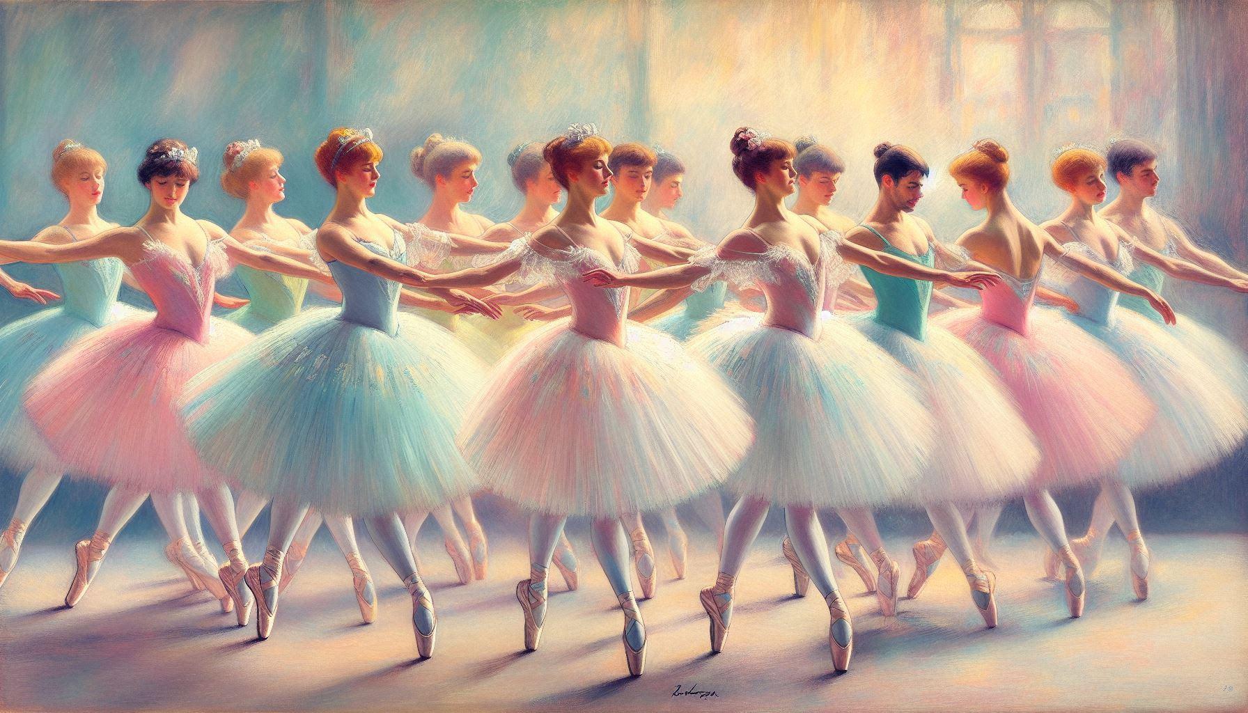
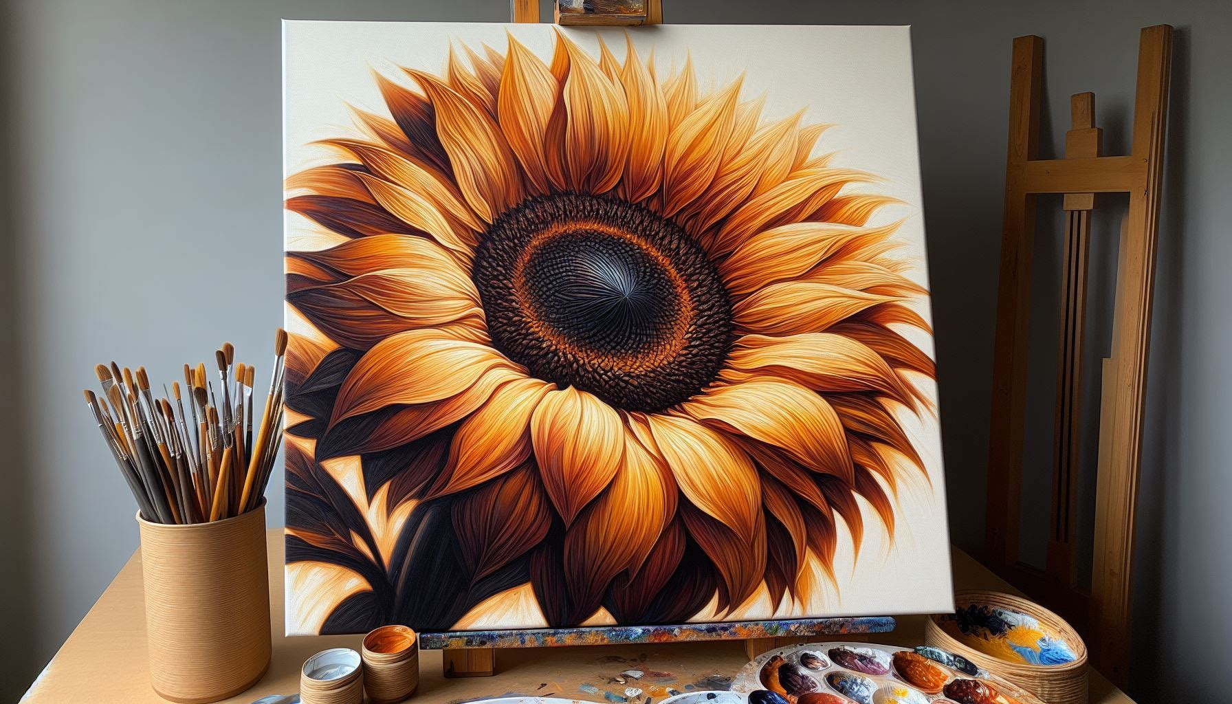
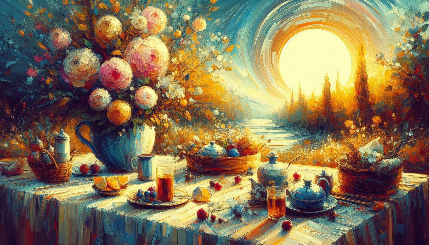
As a pastel artist, you have that magical box of powdery pigments loaded with vibrant possibilities in each and every stick. But have you ever suffered from wanting the perfect shade or blending those luscious colors together effortlessly? Fear not—today, we’ll journey together to make you a master of this wonderful craft: color mixing with pastels.
Common Challenges (and Exciting Solutions!)
One of the most frequent questions pastel enthusiasts ask is: “How can I create smooth, even color transitions without the pigments appearing muddy or chalky?“
Another common concern revolves around capturing the luminosity and depth of specific hues. “My blues always look flat, and my greens lack vibrancy – what am I missing?“
With a few simple techniques and a dash of practice, you’ll soon be whipping up a myriad of mouthwatering colors that sing from the paper.
The Magic of Layering
Unlike other mediums, color mixing with pastels relies heavily on the principle of layering. By applying thin, successive layers of different pastel hues, you can create an infinite spectrum of rich, glowing colors that seem to radiate from within the painting itself.
Follow these steps to get started:
- Establish a base layer using a lighter pastel shade that will act as your foundation.
- Top with complementary colors in light, feathery layers, varying your pressure and stroke direction.
- Blend, blend, blend! Use a soft tool (like a paper stump or your finger) to gently merge the layers.
PRO TIP: Experiment with different applicators (like sponges or tortillons) to achieve unique textures and effects in your color blending.

See how the colors meld together in seamless, radiant harmony?
The Buttery Beauty of Pastels
What makes pastels so effortlessly blendable? Their soft and velvety texture! Layering and blending the pigments creates a creamy, indulgent display of pure color.
This quality makes pastels an ideal medium for experimentation and spontaneity. Don’t be afraid to smudge, twist, and swirl your colors together – that’s where the real magic happens!
“With pastel, you can almost feel the colors melting together beneath your fingers,”
It’s this tactile, almost sculptural aspect of pastels that makes color blending such a joy.
Pro Tips For Next-Level Color Mixing
Ready to take your pastel color blending to even greater heights? Try implementing these pro tips:
Go Bold with Unexpected Combos: While traditional color theory is helpful, don’t be afraid to experiment with unique, unexpected hue pairings. Some of the most breathtaking pastel works feature beautifully clashing, vibrant colors.
Unify with a Tinted Ground: Before laying down your pastel layers, tone your surface with a neutral, tinted ground in a color like burnt sienna or blue-grey. This underlying hue will help unify all your colors for a cohesive finish.
Use the Subtractive Approach: Instead of endlessly layering pastels, try the “subtractive” method – start with a middle-value base color, then carve out highlights and shadows using lighter and darker pastels on top.
Incorporate Texturing Tools: For extra depth and dimension, use tools like coarse paper towels or coarse brushes to impart visually arresting textures right into your pastel layers as you blend.
Nurture Your Instincts
While technique is important, truly transcendent color mixing stems from your creative instincts and natural sense of color harmony. As you practice, pay close attention to the interactions between different hues.
Which colors complement each other beautifully? Which clashing tones create vibrant visual tension? Soon, you’ll start to see recurring patterns and develop a more intuitive feel for crafting sublime pastel color combinations.
PRO TIP: Study the works of pastel masters, like the luminous landscapes of Wolf Kahn or the sensual figurative pieces of Edmond Rudelle. Observe how they blend and harmonize their radiant color palettes.
So, what delectable pastel colors are you aching to whip up? What succulent, creamy blends are you yearning to caress onto the paper? Share your artistic adventures (and creations!) in the comments below!


