
Ever stood in front of a paint display, overwhelmed by the sea of hues? Or mixed colors only to end up with an unexpected muddy brown? You’re not alone. Many aspiring artists and designers grapple with the fundamentals of color theory, particularly when it comes to mixing colors and understanding pigments.
In this guide, we’ll demystify color theory basics, focusing on color mixing and pigments. Whether you’re a budding artist, a DIY enthusiast, or simply curious about the science behind colors, you’ll find practical insights to enhance your color mastery.
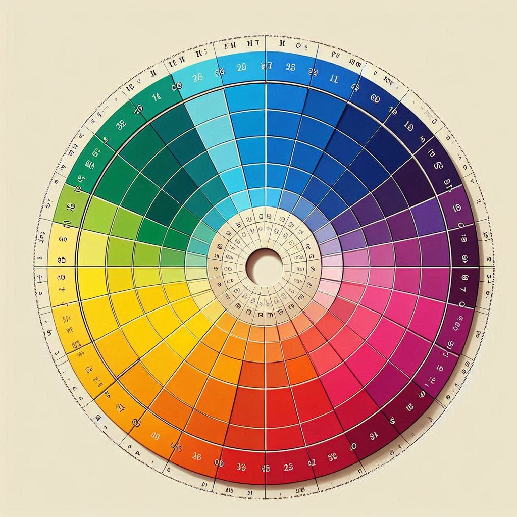
The Building Blocks: Primary, Secondary, and Tertiary Colors
At the heart of color theory lies the concept of primary colors. These are the fundamental hues from which all other colors can be created:
- Red
- Blue
- Yellow
When you mix two primary colors, you get secondary colors:
- Red + Blue = Purple
- Blue + Yellow = Green
- Yellow + Red = Orange
Tertiary colors are created by mixing a primary color with an adjacent secondary color on the color wheel. For example:
- Red + Purple = Red-Violet
- Blue + Green = Blue-Green
- Yellow + Orange = Yellow-Orange
Understanding these relationships is crucial for effective color mixing and pigment selection.
The Science Behind Pigments
Pigments are the physical substances that give color to paints, inks, and other materials. They work by selectively absorbing certain wavelengths of light while reflecting others. The reflected wavelengths are what we perceive as color.
Interesting Fact: Did you know that the human eye can detect over 1 million different colors? The science of color is based on the way that light interacts with our eyes and brains.
Different pigments have unique properties:
| Pigment Type | Characteristics | Common Uses |
|---|---|---|
| Organic | Bright, transparent | Inks, dyes |
| Inorganic | Opaque, durable | House paints, ceramics |
| Natural | Earth tones, variable quality | Traditional art, eco-friendly products |
| Synthetic | Consistent, wide range of colors | Modern paints, plastics |
When mixing pigments, it’s essential to understand their individual properties to achieve the desired results.
Color Mixing: Additive vs. Subtractive
There are two main types of color mixing:
- Additive Color Mixing: This is how light creates color. The primary colors are red, green, and blue (RGB). When all three are combined at full intensity, they produce white light.
- Subtractive Color Mixing: This is how pigments create color. The primary colors are cyan, magenta, and yellow (CMY). When all three are combined, they theoretically produce black, though in practice it’s often a dark brown.
Understanding the difference is crucial, especially when working across different media. For instance, a color that looks perfect on your computer screen (additive) might print differently on paper (subtractive).
TOOL: Pigment Color Mixer
Click here for our Tool that we have created to show the effect of mixing Pigments.
Practical Color Mixing Tips
- Start with a limited palette: Master mixing with just a few colors before expanding your range.
- Use a color wheel: It’s an invaluable tool for understanding color relationships.
- Mix in small amounts: It’s easier to add more than to take away.
- Keep notes: Record your color mixes for future reference.
- Experiment with different brands: Pigments can vary between manufacturers.
“In nature, light creates the color. In the picture, color creates the light.” – Hans Hofmann
The Psychology of Color
Colors aren’t just visual phenomena; they can evoke emotions and influence behavior. Understanding color psychology can greatly enhance your color mixing decisions:
- Red: Energy, passion, danger
- Blue: Calm, trust, stability
- Yellow: Happiness, optimism, caution
- Green: Nature, growth, harmony
- Purple: Royalty, luxury, creativity
- Orange: Enthusiasm, adventure, confidence
Consider these associations when choosing colors for your projects, whether you’re painting a room or designing a logo.
Common Color Mixing Challenges and Solutions
Challenge 1: Muddy Colors
Problem: You’re trying to mix a vibrant purple, but end up with a dull, brownish hue.
Solution: Ensure you’re using pure primary colors. If your “red” has a yellow undertone, it will muddy the purple. Try using a cooler red (like crimson) or even a magenta.
Challenge 2: Inconsistent Results
Problem: You can’t replicate a color mix you made previously.
Solution: Keep detailed notes of your color mixes, including brand names and proportions. Consider using a small scale to measure pigments for precise repeatability.
Challenge 3: Overwhelming Options
Problem: With so many pigments available, you’re not sure where to start.
Solution: Begin with a split primary palette: a warm and cool version of each primary color. This gives you more mixing options with fewer tubes of paint.
Advanced Color Theory: Complementary and Analogous Colors
As you delve deeper into color theory, you’ll encounter more complex relationships between colors:
- Complementary Colors: These are opposite each other on the color wheel (e.g., red and green). They create high contrast and vibrance when used together.
- Analogous Colors: These are next to each other on the color wheel (e.g., blue, blue-green, and green). They create harmonious, soothing color schemes.
Understanding these relationships can help you create more sophisticated color palettes and mixes.
Digital Color Mixing: A Modern Twist
While traditional color mixing with pigments remains essential for many artists, digital color mixing has opened up new possibilities:
- Precision: Digital tools allow for exact color matching and consistency across projects.
- Experimentation: You can quickly test different color combinations without wasting physical materials.
- Color Spaces: Understanding RGB, CMYK, and other color spaces is crucial for digital artists and designers.
However, it’s important to remember that colors can appear differently on screen versus in print or physical form. Always test your digital color mixes in the intended final medium.
Conclusion: Your Color Journey Begins
Color theory, mixing, and understanding pigments are lifelong pursuits. As you practice and experiment, you’ll develop an intuitive sense for how colors interact. Remember, there’s no substitute for hands-on experience. So grab your paints, open your digital color picker, and start exploring the vibrant world of color!
Whether you’re mixing pigments for a canvas or selecting hues for a website, the principles of color theory will guide you towards more harmonious, impactful color choices. Keep experimenting, stay curious, and watch as your color confidence grows with each mix.
Relevant External Resources:
- Color Matters – Basic Color Theory: https://colormatters.com/color-and-design/basic-color-theory
- Adobe Color Wheel: https://color.adobe.com/create/color-wheel
- Handprint – Modern Color Theory: https://www.handprint.com/HP/WCL/color18a.html

